7.22.24 — Lighting Up Minimalism
Over twenty years ago, a Manhattan neighborhood was just beginning to thrive, and a commercial gallery was already shutting its doors. It could be a lesson in gentrification, so often driven by the arts—the very studios and galleries that development would quickly chase away. Yet it was just perfect for Keith Sonnier. His light fixtures all but demand an industrial space in line with his industrial materials, while it takes an impressive setting to show off his art.
It was 2003, between Soho and Tribeca but to the west—a neighborhood not yet known as Hudson Square. And it was the last show at Ace, a humongous gallery that showcased artists who subvert a certain idea of art. One could get lost in it, not least when the art offers one’s sole illumination.  It happened when David Hammons left a gallery-goer with only the thin blue beam of a pocket flashlight, and it happened one last time with Sonnier and his brighter lights. It helped rescue him and Minimalism for a twenty-first century idea of subversion, and it had more than enough space for a proper retrospective. The artist, then in his sixties, had always one foot in “process art” and one in sculpture, and it showed that one never really had to choose.
Now Sonnier, who died in 2020, comes to Chelsea, at David Kordansky through August 9, where sculpture wins out right away. The process, in contrast, takes its time, as process will. Each work gets a partitioned space to itself, and each refuses to stick to the wall. Is it still Minimalism? After a recap of my past review, I pick up on the evolving present—together as a longer review and my latest upload. His very artistry may have hurt his reputation, but it could stand up to a changing city all the same.
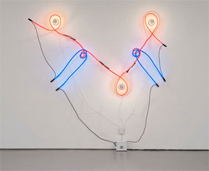
What do you think of when you think of a light fixture? It could be a backdrop for living, and a charming photograph has Keith Sonnier at ease in an armchair, with a fragile neon tube bursting out above. Not that he ever went for invisibility. A fluorescent tube for Dan Flavin may nestle neatly into a corner, much as metal plates for Carl Andre rest on the floor. They refuse to depart from the architecture of the room. Sonnier delights in it. His thinner tubes may rest on glass panes or trace a twisting path of their own.
Then again, you may think of the chill of fluorescent light, marquees, and advertising, a chill that you would never allow in your home. Sonnier, though, incorporates older incandescent bulbs nearly as readily as neon. In fact, neon may loop right around them, as well as around itself. It embodies a mantra from the 1960s, drawing in space. A fixture for Flavin all but dissolves the corner and itself, leaving only a soft glow that identifies the work with the space of the room. Sonnier’s has a life of its own.
Still, this is not home decor, and these are industrial fixtures through and through. The bulbs themselves have the steel cap of off-the-shelf hardware. He makes a point of not distinguishing the bulbs from the tubes, with titles like Neon Incandescent. The commercial and the sculptural are one and the same, and their final composition accepts and shapes them both. The 2003 show revisited his career as an empty landscape with one foot in urban reality and another in science fiction. This one sticks to abstract objects and real space.
It also sticks to three years, from 1968 to 1970, when Sonnier’s late Modernism had few challenges beyond itself. Minimalism was giving way to Post-Minimalism, a precursor of the Neo-Minimalism more common today. When Robert Irwin dissolves the work in light, he also multiplies the fixtures in a dizzying illusion. When Eva Hesse, Richard Tuttle, and Jackie Winsor put the neo in place, they evoke the tactile nature of space. The work becomes dangerously close to the human body. And Sonnier, who grew up in Louisiana’s Cajun country, calls one series Ba-O-Ba—Haitian French for the effect of moonlight on the skin.
He, too, impinges on the visitor and the room—and not solely as sculpture. Tubes cast their shadows like tentacles on the walls and floor. They may follow the top edge of the glass panes or cut across it. Light penetrates and reflects off the glass. The work is always just larger than life. Still, it retains its late modern logic. Colors do not stick to primaries, but rather to ROY G BIV.
With his measured excess, Sonnier’s could be the art of gentrification. It has lasted through the rise and fall of Soho, East Village art, Williamsburg, Bushwick, and now the Lower East Side. One can only guess at what that means for the rush to Tribeca. Sales had already begun to fall before the pandemic, and Chelsea itself has, I shall guess, dropped to half the size of its peak. Sonnier comes in November to Dia:Beacon, where Irwin has space for his own dizzying multiplicity in parallel lights.
Read more, now in a feature-length article on this site.