10.16.24 — Stop at Nothing

When a work takes over the gallery, is it site specific, or was the gallery an obstacle on the way to making art? For Leonardo Drew, the choices are inseparable.

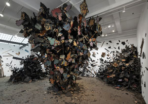
He makes work so massive and diffuse that it stops at nothing—if only as a figure of speech. In real life, Drew stops for everything, only to keep piling it on. The result is untitled, for who would dare pin it down, at Galerie Lelong through October 19? The walls themselves are a breath of light. Leonardo Drew's Untitled (Number 427) (Galerie Lelong, 2024)
Drew has been piling it on for a long time now. I first encountered him in what become one of this Web site’s first gallery tours, in early 1997, and again in 2001. I started the site with extended reviews of art’s deep history in museums, where my heart still lies. I had gone to galleries, though, and was just then seeing the departure from Soho in action. One dealer on the move, Mary Boone, had shaken things up on West Broadway with a scorn for late Modernism and a studied elegance, with such artists as Julian Schnabel, Eric Fischl, and David Salle. Drew, though, had little time for either elegance or scorn. He was trashing the place much as late modern art had done before.

Richard Serra had flung molten lead, at his own risk. Barry Le Va had broken glass, and Chris Burden had crawled across the wreckage. Artists have been sorting through the damage ever since. For Ilit Azoulay at the Jewish Museum, every loss is the bearer of memory in the Middle East. And one can look at Drew’s scraps a long time in search of something familiar, from his studio or his history. He is, after all, African American. He, though, has his eye elsewhere.

Another side of late Modernism nurtured the optical and physical qualities of nonstandard materials. Back when, Drew incorporated rust for its powdery texture and iron oxide glow. Now he combines wood scraps, glass and paint. They produce dark colors against the gallery’s freshly painted white. He also arranges them in square panels, hung on the walls much like squares for Ad Reinhardt. He asks to restore Reinhardt’s translucency, color, and approach to black while playing to the house.

Still, these are remnants, and he lets you know it. Back in the day, I saw a little too much theater. I saw a little too much theater. I compared the air of decay to the end of Planet of the Apes, the Statue of Liberty among the ruins, while less sure about what to curse. Drew can, though, be genuinely site specific, accepting what came before. When he turned to public sculpture in Madison Square Park at the start of the pandemic, he let the grass shine through. It was high time I revisited my own cynicism.

It is hard to dismiss outright work that covers the walls, nestles into a corner, and surrounds supporting columns. Scraps on the wall seem to rise as if from a single act of force, and the corner pile gives that force direction. Scraps on one column gather at top like a mushroom, while scraps on the other fall around the base. They look back to the artist’s studio while running free. They are anything but Reinhardt’s, but they still play with materials, darkness, color, and light. Theater or not, it is the show’s heart of glass.

Read more, now in a feature-length article on this site.
10.14.24 — Points of Departure

Korean art has a place of honor in any museum’s Asian wing, but it may still struggle to free itself from the intoxicating presence of China and Japan. What can match their legacy in ceramics and ink—or in portraiture and landscape?

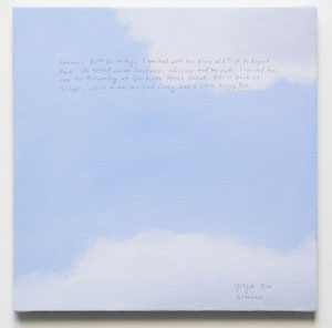
What can match their art’s restless hands and sensation of contemplation and rest? Would it help to include recent art, as a point of departure into the past? The Met does just that in its Korean gallery, as “Lineages,” through October 20. The result, though, says more about the present than its ancestry. It also confirms a disturbing trend in museums today. Byrom Kim's Sunday Painting, 01/19/14 (James Cohan gallery, 2014)I also work this together with a recent report on Korean art at the Guggenheim as a longer review and my latest upload.

More, and more, museums of art history consider themselves homes to modern and contemporary art as well—and it can cost them, as the Met learned in leasing the Met Breuer. One can see the appeal. Collectors must like a confirmation of their tastes, and that can translate into donations and gifts. The public may like a change from that boring old stuff others call art, and that, a museum hopes, can translate into attendance. Still, it takes money, too, and it can positively detract from older art. The Met’s modest Korean gallery has room for just thirty-two works, and now half are contemporary.

Who knew that Korean and Korean American art so much as had a deep past? Such luminaries as Lee Ufan and Byron Kim have a more obvious debt to Minimalism. (Hmm, maybe artists do not have to be “original” after all in order to stand out, now or long ago. They need only be aware of their world.) The Guggenheim situates Korea of the 1970s in a drive toward youth and experiment. At the Met, Nam June Paik proclaims that Life Has No Rewind Button, and a pioneer of video art should know.

Yet they do have a past, more than you ever knew. Ufan’s abstraction appears right after Bamboo in the Wind by Yi Jeong from more than seven hundred years ago and Blood Bamboo by Yang Gi-hun in 1906. Their vertically descending stains become his descending blues. It is From Line at that, surely a call-out to those who have worked in ink. And then come ink and gouache on paper strips by Kwon Young-woo in 1984 and a wild web of ink lines by Suh Se Ok in 1988.

Kim, in turn, has two monochrome panels in deep green, as abstract as one can get. Yet its glazes echo the materials that convert white porcelain into the paler green of celadon. Older Korean art perfected both. Their polish contrasts with the endless invention of Japanese ceramics, on view out in a corridor overlooking the Met’s great hall. I have my doubts about Kim, but other contemporaries have been eyeing the serenity and symmetry of older “moon jars” for sure. Seung-taek Lee makes his own in 1979, with the illusion of a bit of rope on top to tie it up, while Kim Whanki paints one as far back as 1954, in yellow on a red pedestal against soft green.

Of course, a jar may be the subject of still-life or a thing in itself, and the Met dedicates the gallery’s four walls to line, persons, places, and things. (Well, that should cover it.) It sounds innocuous enough, although line can become landscape, and landscape can take one to freely imagined places. Park Soo-keun in 1962 lingers over women beneath a tree, in textured oil, at once people and places. The most prominent person, a woman scientist from Lee Yootae in 1944, owes more to mid-century realism and a growing appreciation for professional women than to tradition. And sure, jars become things, at the center of the room, with two by Lee Bul in 2000 as the foot and pelvis of a cyborg.

One can still value a golden age that lasted nearly a millennium, until Europe sailed right in. Indeed, one had better. Where Chinese art once admired those who gave up power to stand outside of place and time, Kim Hong-joo in 1993 creates a layered, divided landscape, which the Met sees as commentary on a divided Korean peninsula. I prefer to think that Hong-joo got it right, but the Met still gets it wrong. Does my resistance to the contemporary make more sense in Asian art, which so often provided a greater tranquility? I just hate to see the past crowded out and forgotten.

Read more, now in a feature-length article on this site.
10.11.24 — Groundbreaking

Late in a groundbreaking career, Jacob Lawrence looked up from his work and had a revelation. The tools of his trade were everywhere around him, and suddenly they meant something more.

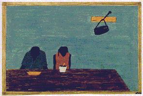
They were tools that he shared with others, the very people he painted—African Americans creating a place for themselves in America. These people created a community as well, a community of builders. In more than one sense, they were breaking ground themselves. Soon, too, they became the subject of Builders, at D. C. Moore in 1998 and at that very gallery this fall, through September 28 (and so sorry I could not post this in time for you to catch someone this important). Lawrence's Migration 10: They Were Very Poor (Museum of Modern Art, 1940–1944)

Of course, that sudden revelation never took place. Lawrence identified all along with his subjects and saw them as builders. It took decades for black Americans to claim their rightful place, a task that is still far from complete. He first described the community as itself a work in progress. You can see it in the titles of his most famous paintings, The Migration Series and Struggle. He was also a perfectly self-aware and reflective artist, happy enough to paint a compass and right-angle straightedge, with all the rigor they brought to drawing. He could see perfectly well that the same plane in a carpenter’s toolkit served him to make a stretcher and to make its edges clean.

When it comes down to it, Builders was only a coda to thirty years of relative decline. He painted the Great Migration from the rural south in tempera on sixty small panels in 1941, when he was just twenty-three, and his history of the American people as a struggle in 1954. His paintings of builders came just two years before his death in 2000. Perhaps he felt it as a renewal. He could go back to the flat bright colors and fields of black that he had introduced in tempera, but now he could apply drawing and color to a building. He could in turn apply those same patterns and colors to human flesh.

If Lawrence identified with his work and with a builder, he identified the builder’s work with the worker. Unfortunately, the gallery exhibits just one of twelve paintings together with work on paper, but it makes the point well. Buildings tilt at improbable angles, flattening the entire painted surface, while conveying mass and depth. They claims his work for both Modernism and realism. They give new meaning to formalism, too, with a carpenter’s insistence on form. And then the same brickwork covers the people, painterly brick by brick.

Still, I like to imagine a moment of discovery. I first saw The Migration Series in 1995, when it came as a revelation to me. (It led to one of the first reviews on this Web site.) The Met back then exhibited the series and Wassily Kandinsky in adjacent galleries, demanding a choice on the way in. Art history, it seemed to say, had made its choice, excluding a black man’s seeming crudeness in favor of Europe’s relentless experiment, and it was time to look at history anew. Besides, Kandinsky’s wild horses are a kind of folk art in themselves.

These days The Migration Series is on display in its entirety nearly all the time, in MoMA’s collection. Lawrence, though, is still looking back. He respected old-fashioned studio training, and he could use it to recall an African American’s roots. The gallery displays some of his weathered tools along with works in charcoal, pencil, and gouache, and their wood would never make it into a hardware store today. And yet the same care that goes into a builder’s anatomy powers wild, fragmentary shapes and colors. Storytelling approaches abstraction. And the white of a black man’s eyes matches the ghostly silhouettes of his tools.

Read more, now in a feature-length article on this site.
10.9.24 — Welcome to the Neighborhood

Hilary Pecis opens her home and studio to visitors. She takes one into the lives of her neighbors as well without so much as a person in sight—but what lives, and what a life.

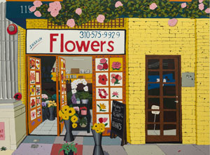
Once you have been inside, you may never want to leave. You never could take it all in, not when her compositions run every which way and there is so much to see. It gives new meaning to “pattern and decoration” in painting, without an unbroken pattern and with too many specifics in time and place to write it off as decoration. Now if only you could be sure that you would not stand out like a sore thumb, at David Kordansky through October 12. Hilary Pecis's Sharon Flowers (David Kordansky gallery, 2024)

Pecis deals not just in sunlight, but in sensation. She brings you close to share the intimacy and outside to take in the view. Cats glare back, as cats do, but so near that they could almost be in your lap—or you in theirs if only they had one. Books fill shelf after shelf, and you may want to step past the flowers to inventory every title. Besides, books, too, can be an arrangement of shapes and colors. So can coffee cups, tablecloths, chair cushions, and the furniture to hold it all.

The bursts of sensation keep coming on a front lawn where trees and flowers compete with the architecture, white stones on red soil, and each other. Here, it would seem, people celebrate Christmas year round, to judge by a plastic Madonna and shepherds. But no, this is LA or an ideal version of it, where welcoming warmth and sunlight last through December. Still, a New Yorker would recognize the signs of home. The shepherds could pass for family by the porch waiting to see you, like Brooklynites on a stoop. Just one painting leaves home entirely, but there, too, for a single destination—and the shop sells flowers.

Pattern and Decoration” arose in the 1970s as one more nail in Minimalism’s coffin. Artists like Valerie Jaudon and Miriam Schapiro combined feminism and excess. It also proclaimed painting’s special nowhere, where patterns matter more than what they cover. Pecis, in contrast, stuck to Southern California, but also to a sense of place. It seems only right that the flower shop gives its phone number on the awning. You could look up the area code online for a map of LA. You could look to the books, with an enviable choice of artists and philosophers, for a reminder of who you are.

Of course, they also define a class—a class of readers, but also of buyers. If the coffee cups have a further clash of geometry and color, you can assume that smart shoppers brought them home. These shoppers keep up with contemporary design and have the money to do so. But you could see that from the homes themselves, from the breadth of a porch and gabled roof to an alluring stairwell broken by shadows. I could easily feel guilty about belonging there. I may not live like this, but I do love the right artists and have read the right books.

Pecis can seem a lightweight—and ready confirmation of one’s suspicions about money in art. The show opened the week of New York art fairs, with their display of wealth. Still, she is not taking the easy way out. Maybe the movement artists better known in New York would look less comforting if they shared her sense of place. Her very wildness disrupts a skeptical narrative as well. The flower shop has its own profusion of signs and samples.

Read more, now in a feature-length article on this site.
10.7.24 — A Taste for Collecting

Say what you will about the Elizabeth and Jean-Marie Eveillard collection at the Morgan Library: the collectors have taste.

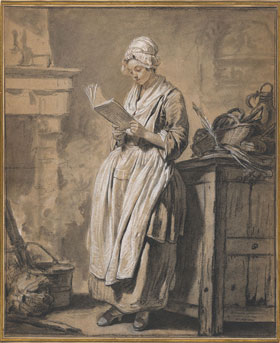
No doubt they must if they are to go about their self-appointed task, but they have good taste in museums, too. They had the taste to contribute to the Frick Collection, which displayed their gift just last year. Now they continue as donors to another of New York’s most treasured enclaves. The gift brings just over two dozen drawings to the Morgan, from the Baroque through early Modernism, through October 6, just in time for the Moore gift to the Morgan (and my apologies if you just missed it)—Jean-Baptiste Greuze's Kitchen Cook, Reading (Eveillard collection/Morgan Library, 1759)and I bring my reports of both together as a longer review and my latest upload. If it is a touch tasteful, you will understand. Just do not mistake a welcome plainness and discipline for good taste.

Those who caught the Eveillard gift at the Frick will know it all but exclusively for decorative art. That suited an institution in its temporary quarters on Madison Avenue, with separate rooms for decorative art. What, then, should one expect for J. P. Morgan’s domain as himself a collector? Would the drawings run once more to excess or rather to another side of the decorative arts—academicism in place of experiment. In the end, sobriety wins out, and it need not be all that tasteful. It illuminates how much study goes into seemingly wilder art.

Peter Paul Rubens brings his usual sweeping gestures and creative excess to a biblical scene, with alternative compositions that collide on a single sheet on their way into the sky. Something of his musculature and movement appears as well in John the Baptist by a lesser artist, Tanzio da Varallo, around 1620. What, then, should one make of a seated woman in a sober dress by Juan Gris, without a trace of Cubist fragmentation? Tired of the repetition and contortions in sculpture by Auguste Rodin? Here a female nude lies asleep. The composition follows that of a standing nude regardless, with her head above her feet, and a second pair of legs show the artist finding his way and bringing her awake.

Artists, then, had work to do on their way to paintings and prints. Some never get all that far, and the show has its share of minor names and failures. Rembrandt focuses on an emotionally and morally laden moment, Judas returning the thirty pieces of silver, but it is less than memorable. Others, though, revel in restraint. Antoine Watteau often does, while inventing Rococo lightness, but what of Romanticism and Théodore Géricault? Soon after The Raft of the Medusa, with its the heroics on the verge of death, he sketched ordinary workers unloading a cart.

As with Géricault, plain and simple may be in service of sympathy with those that art might easily have left out. Paul Signac poses his grandfather, mother, and maid for The Dining Rome. Eugène Delacroix tones down the action for his caretaker, Guercino for a Moor. Paul Gauguin abandons his mythic women for a Tahitian child. Jean-Baptiste Greuze dispenses for once with his moralism for a cook reading. The engraver who received the drawing called her a thief, but she looks absorbed in her work and her imagination.

More often still, the artists worked from studies because that is what they do. John Constable takes care for layers of landscape, but Pierre-Auguste Renoir in watercolor can linger on a handful of clouds or trees, too. Jacob Jordaens in the Baroque and Georges Seurat in Post-Impressionism alike show standing figures from behind, in full weight. Those who know his drawings will know how much his art depends on the discipline of Conte crayon in black and white. For Edgar Degas, every painting is akin to a study, here with wild horses rather than dancers. For Paul Cézanne, the interplay of experiment and experience is the essence of art.

There have been better drawings and more ambitious exhibitions. The Eveillard gift to the Frick already had me thinking of how much finer it will look integrated into the Frick mansion as context for art. Still, it gets at space between experiment and experience. A dreamer by Odilon Redon from 1898 surrenders herself to her dream, but she seems so still, and she could be looking inward or observing the sky. A swash of white could be an emblem of surrender, a bird, or a cloud. She is of a piece with the readers and observers in work to every side.

Read more, now in a feature-length article on this site.

10.4.24 — News of War

Topics: ,

Sometimes it seems that I have spent a lifetime listening to news of war and little but war. Just halfway through his twenties, Nabil Kanso must have felt the same. He spent the rest of his life bringing the news to others in paint.

For Kanso, news of war was always news from home. He fled war in Beirut for the United States, knowing full well that it put him at risk of another. It was 1966, and Vietnam was already tearing apart his adopted country, but to him it must have felt like more of the same. He painted armies, civilians, and a ravaged landscape, Nabil Kanso's The Confronting Mother (Martos, 1991)because who can look at any of these without seeing pain? He did not live to know war’s return to the Middle East and Ukraine. Yet the news he brings still seems altogether new, at Martos through October 5.

It all blends together, but not to numb the senses. And he did paint Vietnam and the Lebanese Civil War, but a title speaks only of Accumulated Agonies. He worked large, as if to claim for himself the entirety of art history as well. He had seen Disasters of War from Francisco de Goya and Goya’s graphic imagination, and he adopted Goya’s explicit violence and accumulating darkness. Warriors and their weapons take up the foreground, with near horizontals at center for rifles and the barriers they penetrate. Their diagonals give the paintings a kind of architecture while adding to the chaos.

As the poem goes, ignorant armies clash by night. The scale itself calls for heroics and history painting. The paintings would not be out of place in the American wing of the Met, but heroes, too, cry out in cruelty and terror. The scale recalls another kind of heroism as well. Kanso came to New York when Abstract Expressionism was a living memory. Artists had to paint big and messy, with visible brushwork covering every inch.

He has, as far as I know, pretty much dropped off the map, although he himself worked on the business side of art, as a dealer. “All-over painting” was itself out of fashion. So were representation and sentiment, and I do not mean to canonize him now. Something was in the air, though, with the Neo-Expressionism of Georg Baselitz and Anselm Kiefer, who looked back to the Holocaust and World War II. Kanso has something of their earnestness and, conversely, irony. He also knew the demand for color.

Kanso uses color for its own sake and for the horrors of war. It runs to blood red and fiery orange. Deep blue can suggest shadows, discolored flesh, or battle dress, perhaps from the Napoleonic wars. Color can also light up the anonymity of inarticulated faces. They can gather in arcs with red lips or in a crowd. One painting, though, sticks to a smaller canvas for a single face, The Confronting Mother.

Not that you would know its gender. Chalk white sets off large black eyes that speak of forced witness. Black tears drip from wide eyes, and flames run along its chin. Something or someone else intrudes at left, whether or not she can recognize it as hers. Maybe Kanso leaves so little explicit because he did not want to be known as the guy from Beirut. Or maybe he just knew at his death in 2019 that there would always be another war.

Read more, now in a feature-length article on this site.

« Newer PostsOlder Posts »