10.2.24 — Ideas for Abstraction
Minimalism begged to retire old ways of understanding art. To speak of a mirror or window onto nature seemed to call for something outside art beyond the thing itself. What is nature anyway, and why do you need to know?
At the same time, Minimalism insisted on the painted object in the gallery and on the picture plane. And that introduced a new platitude and a new need to look for rectangles, the grid. And then the revival of painting for the millennium blew that demand out of the water. 
Is it ever time to retire an old metaphor? Is it ever time to retire a love of painting for its own sake? Never, I hope, which is what keeps bringing me back to abstract art. “Overflow, Afterglow: Chromatic Abstraction” pleads for richness rather than rigor, while its artists are not all that expansive or abstract. Yto Barrada at the International Center of Photography finds abstraction lying around the darkroom, along with enough trash to call it Pop Art. Hasani Sahlehe and Patrick Wilson, in turn, bring things right back to the grid and the metaphors—and I work this together with recent reports on the first two shows as a longer review and my latest upload.
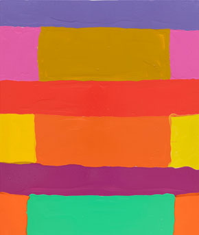
Sahlehe does not make stripe paintings. So why does his work seem, at least at first, to come down to horizontals with enhancements? The stripes are a bit wide as horizontals go, and he lays them on thickly, in acrylic gel. The medium gives each one the potential to lie flat or to shine. They give direction to fairly large paintings, vertical in format, with no bare canvas showing. Less than half, though, make it all the way across.
They cannot make it because shorter fields of color, close to verticals, get in the way. One could describe them as framing the horizontals, for frames within but refusing to mirror the complete painting. Fields depart from the grid in more subtle ways as well, besides their apparent thickness. They may have slightly curved edges, and which call attention to the overlap. Still, colors are bright, clean, and clear. An old way of painting looks both familiar and new, at Canada through October 5.
In all these ways, a grid becomes a process, and Sahlehe calls the show “Song Ideas,” as if to apologize for a work in progress. I cannot swear that they sing, but try not to ask for too much. A Georgia-based painter is not in the loop regardless, right? Not so fast. He shares the gallery with a group show that includes a hot artist, Xylor Jane, and a survivor, Joan Snyder, with no apologies necessary. The work leaves nothing further to do, other than to make more paintings.
I should be remiss not to credit the gallery. The artists who showed there before moving on would make a good wrap-up of the revival of painting all by themselves. Carrie Moyer, for one, has her latest with another newcomer to Tribeca, Alexander Gray through October 26. I have written about her more than once, with admiration for her fluid colors on a wide-open canvas, so just a quick mention, if I may. This time, seeming biological appendages add a further layer to all-over compositions, also enriched by pumice and ground semi-precious stone. They add to the varied application of paint, like spatters, as much as to its texture.
Speaking (yet again) of painting as mirror or window, Patrick Wilson makes it inescapable. His pale blues with the sheen of a mirror or window pane alone would do so, at Miles McEnery through October 26. He builds on rectangles of translucent color, each framed with a narrower field of the same color. Then he messes up the picture by arranging them in two columns or offset from one another. If a Minimalist would ask that color and the grid alone make a painting, Wilson is fine with that. They keep moving all the same.
This gallery has four spaces in Chelsea alone, and it favors abstraction. Everything looks good, but what stands out? Suzanne Caporael, in the gallery’s original space, takes pains with such familiar geometries. They could go unnoticed, were they not embedded in the indeterminate space of darker fields. Next door, Rico Gatson once again applies checkerboards of the simplest colors to anything from seeming warheads to patterns of radiation. If he is just calling attention to himself, give the credit or blame to painting.
Read more, now in a feature-length article on this site.