All the Same?
John Haberin New York City
Frank Stella, Milton Resnick, and Agnes Martin
Carrie Moyer, Ronnie Landfield, and Abstraction
Remember when painting all looked the same, at least to critics? No, not today, when everything from abstraction to video gaming goes into the same recipe, with the blender on high. I mean when Pop Art and Minimalism were fighting to determine whether magazines or industrial parts would represent high culture.
Several shows turn off the blender and look back, to when abstraction mattered. They include Frank Stella as he sought a new direction after the black stripes that made him the artist of the future. They include Milton Resnick or Agnes Martin as a cherished artist of the past. Younger artists notice, too. Take two versions of color-field painting, neither one strictly abstract. Carrie Moyer and Ronnie Landfield might not give one another a moment's thought, but high and low culture alike look the better for them both. 
Can abstraction survive only by losing its rigor? Maybe or maybe not, but it definitely need not lose touch with the rigors of the past. "Abstraction quoting abstraction" can mean irony or beauty, just as geometry can be a shortcut or a constraint. From early Modernism to the present, it has been up to each generation to decide. And then it is up to the next generation to ask what they were doing all along. It is a surprisingly good time to be looking back.
Seeing a difference
For an awful lot of people, art had become way too hard to tell apart. Abstract art had won, but at a cost. Pop Art and Minimalism may have thrived on mass production, while painting may have prided itself as the last bastion against it. Not everyone, however, could tell the difference. Make it Ad Reinhardt in his black paintings, Robert Ryman in white, or Andy Warhol at the Factory. The only question was whether they had become too blatant for their own good—or too subtle.
Philosophy thrived on the question, especially when it came to Andy Warhol, and the art object thrived on philosophy. For Arthur C. Danto, art was indiscernible apart from ideas, while for Nelson Goodman only a failure to look could neglect the differences. No wonder the blatant assaults of Neo-Expressionism and appropriation came as a relief, around 1980, and no wonder they seemed so eager to kill off modern painting. Who would still let a simple image throw them half way across a room? And who would still come up close to peer around the edges? For a refresher course, check out Frank Stella and Milton Resnick, and then try to decide which you would do first.
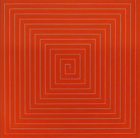
Chelsea revisits Frank Stella from 1961 to 1967, as he moved from the iconic black stripes that made his name right out of Princeton. In a contribution in red to the Benjamin Moore series, Stella treats the dividing lines as a continuous border, snaking its right-angled way from just off center to the edge. That "mitered maze" defined a square, and now and again into the late 1970s it spun off into concentric squares bleeding from fluorescent color into white. Another show sees Resnick in those years as "The Elephant in the Room," with its only geometry a thick hide of dark oils. And the closer one looks, the murkier and more colorful it becomes. Works like these defy reproduction, but is that only because they look so much the same?
Resnick, nearly twenty years older, depends on gesture, texture, and difference. Roberta Smith called him the "last Abstract Expressionist," while Stella treated all that as ancient history. Resnick's palette suggests the seafloor or something deposited by life. Stella's industrial alkyds refuse to identify art and nature, and they must have been unbelievably bright and distinct right out of the tube. As crusty in art as in life, Resnick has one up close to make out the differences, tempted or repelled by the touch, while Stella has one stepping back to see the whole. Resnick made imitation out of the question, while Stella helped make geometric abstraction the norm.
Actually, both went back to basics, at a time of flatness and the edge—but try turning the contrast around entirely. Stella is drawing, using asymmetry to define space, just as he does with his metal sculpture these days. One can follow the diagonals in a mitered maze, surprised each time they miss the center or a corner. With his adjacent squares, one can mistake the central verticals for pure color belonging to neither one. One can imagine the square on the left, in shades of gray, as a photographic appropriation of the other—or its afterimage. "What you see," Stella famously said, "is what you see," but only once you learn how to see.
Resnick is not handing out learner's permits. His crust could recall puke or induce it, a confrontation in fashion again today. It fits just fine with Sterling Ruby's ceramic waste or tons of poured metal by Matthew Barney, for an opera based on Norman Mailer. (Who would have guessed that Barney would find inspiration in an overblown egotist?) The disgust and temptation extend even to inkjet prints after TV, watered down and rephotographed by Sara Greenberger Rafferty. Julia Kristeva spoke of "powers of horror," and is Resnick their prophet, with Stella still sucking you and me into painting after all?
Nice and tough
Some artists are too nice for their own good. Some are too tough. Agnes Martin always paid the price of being both. Well before her death in 2004, she had become a museum piece and an ever so restrained one at that. She fell awkwardly for some between Abstract Expressionism and Minimalism, like Walter Darby Bannard. Yet her work in gray is both more solid and more varied than you may have dreamed. If you get tired of Pace's "Social Media" up the street or "Perpetual Revolution" elsewhere, or if your cell reception fails, you may find yourself picking up signals.
For a confused public, Minimalism long seemed to have kept Modernism's toughness without the grandeur. Things lay on the floor like Carl Andre or faded into office lighting like Dan Flavin, when they did not threaten like to drop several tons of rusted steel right on one's head. The alternatives, Pop Art and color-field painting, struck some as the opposite fallings-off, into cultural or perceptual lightness. It hardly helped that Martin, born in 1912, often called herself an Abstract Expressionist. It hardly helped, too, that she played the outsider—Canadian born and an escapee from one of New York's top dealers in 1957, first to Cuba and then to New Mexico. It hardly helped either that she was a woman, like Joan Mitchell, Georgia O'Keeffe with O'Keeffe drawings, and Ida Kohlmeyer with their strong hints of landscape before her.
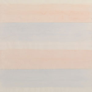
 If you sense a pattern of stubborn abstention, be grateful for it. Her twenty abstractions, all from the 1980s, are uncompromising, but in shades of gray. The gallery showed them at the time on 57th Street, but they look both more austere and more subtle. For starters, they do not skimp on size without overstatement. They weigh in at a pretty uniform six-foot square, reinforced by the large rooms, low lighting, and dark walls. Her use of pen as much as paint reinforces the scale, much as gesture did for postwar abstraction.
For another thing, they have a determined symmetry—more than perhaps anyone but Reinhardt. One work allows variation in shade or texture, but otherwise the fields of gray are on their own. Even Stella quickly went off into those angularly patterned stripes, and even Ken Noland left smeared, jagged targets. Martin's horizontal symmetry has the virtue of obviousness: it comes with the territory of horizontals. The vertical symmetry enforces something else again.
But what? Martin's museum-pieces generally run to soft primaries, earning their pale and their transparency from thin horizontals on white canvas. Nothing here looks anything less than solid. The horizontals run all the way from thin lines to thick bands, and their spacing varies as well, creating color fields without color. They do not depend on surprise or illusion, like the central cross that leaps out of Reinhardt's blackness just in time to scare one. They ask one to consider the differences.
These object lessons, with drawing or painting as object, have more relevance than ever. Art in the 1980s had moved on, abstraction was "dead," and Martin was old or "feminine"—all terms that now sound silly or flat-out complimentary. As for toughness, Richard Serra is back, but he and the public have met each other more than halfway. His torqued walls now extend to wheelchair-friendly mazes, and families stop to take one another's pictures. Chelsea is now an amusement park, literally so at the north end of the High Line, but one may still want something nice and tough. Surely Martin's color will look nicer and tougher next time.
Generations of color
"Her paintings lightly walk a line between Saturday morning cartoons and the fourth floor of MoMA." Wallace Whitney may be writing about Carrie Moyer, but he could be describing the boom in abstraction everywhere. Is everything old new again? Have artists rediscovered painting or broken free?
For a little under a month, one could compare Carrie Moyer on the Lower East Side, like Lily Ludlow at the same gallery, with an artist thirteen years her elder, in Chelsea. Both work in acrylic and let it flow, big time. One can contemplate its color and other pleasures, or one can dive in to look for representation. With Moyer that means women and other creatures, with Ronnie Landfield landscape. Neither rests on irony, and yet both are looking back. Only looking back gets trickier all the time.
Landfield came up in the tail end of color-field painting, already more than a little stubborn or retro. Helen Frankenthaler had introduced poured paint, and both Morris Louis and Ken Noland had turned from oil to acrylic—although it took water-soluble acrylics in the 1960s to combine the two. Landfield's compositions are much like Frankenthaler's 1973 Nature Abhors a Vacuum. He uses what look less like fields of color than brushstrokes the size of brooms, piled like mountains. A flat border at bottom, as with recent Brice Marden, and a looser expanse at top define a ground plain and horizon. I could dismiss them all as pretty pictures, but earth and sky lend stability and weight. 
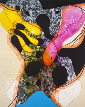
Moyer could be dismantling all this or going one better. Her sharply angled curves go back to cartoon strips, but also to Willem de Kooning around 1945. As with his Pink Angel, a woman's arms can hold out a place of repose or tentacles. Like de Kooning, too, Moyer likes acid colors, where Landfield riffs on a single primary. All sorts of things flourish in her acid bath, as if the spots and circles had bubbled up with organic life. Her one symmetric composition, a cylinder with a dome, might pass for lab equipment.
Postmodernism still has a useful lesson: when the old becomes new, it changes. Abstraction is no longer immutable, inevitable, or (heavens) dead, but a choice. It quotes and revisions the past and the street, just as Pop Art and appropriation quote and revision everything from art institutions to mass media. It slips out of that endless loop of old and new media, at the risk of becoming still another version of "anything goes." It is now anything but pure—and at times anything but abstract.
Where Landfield brushes, Moyer stains, and the stains create new colors, not to mention a mess. As one used to say about his generation, reproductions reduce them to cartoons. Where he nurtures stasis, she implies motion—although, with the exception of what look like shock waves forming at the head of a bullet or missile, the creepy-crawly kind. Where he uses canvas as ground, she uses canvas as a color, along with a ton of black. She likes drawing or even cartooning. She is learning to like painting all the same.
In fact, she seems to like it more all the time. Earlier shows used black or neutral colors to isolate figures. Here the black curves interrupt something closer to all-over painting. Think of when Jackson Pollock after Pollock's Mural was growing out of Surrealism and Surrealist drawing. She risks losing her menace, as with figures almost out of a gunfight. Yet abstraction is growing messier for a change, and so is its history.

Frank Stella ran at Paul Kasmin through October 29, 2011, Milton Resnick at Cheim & Read through October 29, Sterling Ruby at Andrea Rosen through October 15, Matthew Barney at Barbara Gladstone through October 22, Sara Greenberger Rafferty at Rachel Uffner through October 23, Agnes Martin at Pace through October 29, Richard Serra at Gagosian through November 26, Carrie Moyer at Canada through October 23, and Ronnie Landfield at Stephen Haller through October 15. Related reviews take up a Stella retrospective and Martin retrospective.


