Landscape, Light, and Minimalism
John Haberin New York City
Light and Landscape at Storm King
Dan Flavin and Ellsworth Kelly Drawings
"Light and Landscape" may sound redundant, but no more than pairing them both with Storm King. They should be a part of anyone's summer in the sun.
Somehow, more than one hundred works from the collection cannot upstage its Hudson River landscape. And that, in turn, accents the sculpture's command of space. More than half of "Light and Landscape" sticks instead to the visitor's center, like a more typical museum show. Yet its fourteen artists leave their most lasting impression when they engage the site. In the process, they also take one beyond the upstate art center, to the planet as a whole or the entire universe. Once or twice, they engage old neighbors as well. 
If any artist deserves a show called "Light and Landscape," surely Dan Flavin does. His fluorescent light fixtures transform an entire gallery into a field, but at the Morgan Library he has more on his mind. Should one cherish drawings, his drawings, as art—or for what they reveal about the artist? Flavin reveals a great deal on paper, but not just as a draftsman. He collected drawings as well, until his death in 1996, with much the same sense of light as in his sculpture. Now plant drawings by Ellsworth Kelly raise the same questions about the relationships between Minimalism, nature, and an artist's first thoughts.
Here comes the sun
To call the Storm King Art Center a sculpture garden hardly does justice to its five hundred acres of hills and light, a dozen miles across the Hudson from Dia:Beacon. Visitors who run up to the forty-ton stone Momo Taro, by Isamu Noguchi, do it at least in part for the sense of place. I first saw sculpture there at sunset, by David Smith, who saw any number of sunsets at his studio upstate. Storm King has one of Smith's Cubi right now, a shared gift to Storm King and the Whitney on display while the latter plots its move to the Meatpacking District. Flavin, like François Morellet, had his own fascination with light and the Hudson River School, but the curator of "Light and Landscape," Nora Lawrence, represents Flavin's generation with Donald Judd—and he, too, for once lets in the light. His steel box casts a broad amber triangle below.
Past shows have taken over more of the grounds for a single artist, like Alexander Calder in 2008—or allowed Maya Lin to reshape the land, for a "wavefield" of her own rolling hills. (Sculpture by Mark di Suvero, meanwhile, is on loan for a second summer to Governors Island, with two additional pieces this year.) Not this time, and human-size acrylic squiggles from Alyson Shotz change in color as one walks around them, in response to one's angle of vision and the polarization of sunlight. Peter Coffin creates a window that connects the indoor display to the world. Framed by film, over the course of a day or a season it casts different extents of yellow light on the floor. As one stands back, it also frames Luba by Ursula von Rydingsvard, outdoors in the collection.
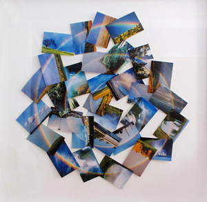
Roni Horn gathers in the light most simply. Her glass cylinder, transparent at top and opaque on sides that taper toward the top, gives the illusion of blue liquid in a pool of clouds. Horn also expands her horizon to Iceland, where she photographs a familiar subject in hot springs, while Coffin creates a spiral rainbow out of postcard-size found images. He alludes to Robert Smithson and Spiral Jetty, but one can see right off that artists may set aside the light in search of something greater. It could be a full moon in Chicago, which lends its color to the light released from William Lamson's solar panels at night. It could be lightening worldwide, which triggers flashes of the old lamps over the visitor's center entrance, thanks to Katie Paterson.
It could be gamma-ray bursts from distant stars, which somehow determine Paterson's colors shot once a day from a confetti canon. It could be the sun, which inspires a bit of easy-listening music that passes as sound art. (Coffin commissioned it from, yes, the composer years ago of a piece called "Storm King.") Sunlight also reflects off Shotz's picket fence or a curved mirror by Anish Kapoor. It interacts with Katie Holten's ordinary rock sundial, interweaves with Tobias Putrih's hyperboloid of fishing lines and lead weights, and rotates in a video composite by Diana Thater of NASA images. It casts the shadows of April leaves and of Holten herself in charcoal drawings.
That "something greater" could be the entirety of spacetime, whose average color allegedly matches Holten's bookshelves. They contain books about light and the planet, at least if one counts Thomas L. Friedman's The World Is Flat. Her color has changed since a previous version, presumably owing to redshift from the expanding universe—but then not just the universe is getting old. The conceptual side of light and landscape can get a little stale, too. You might or might not want to know your distance from the sun in light-minutes, on a chalkboard in Matthew Buckingham's cabinet that shuts at night. You might or might not think of Coffin's beehives as manufacturing "what light tastes like."
You might or might not think of nature's rhythms when you look at the panes of Lamson's "experimental greenhouse," their colors and raindrops created by casting them with sugar. I still wanted the light most, though, when it was most redundant, because most a part of its place. It enters the landscape with Lamson's reflective foil beneath a lake, angled like sunset on the summer solstice. It could become a part of New York State if Anthony McCall ever gets to transform a Hudson River walkway into a calendar with LEDs. The Poughkeepsie Railroad Bridge would begin in darkness in June and become fully lit on the shortest day of the year. For now, though, one may as well just peek into the kaleidoscope masquerading as a telescope, by Olafur Eliasson, and pretend that one has found light in landscape.
Illustrating Minimalism
Of course, not all works on paper are mere first thoughts. As early as the Renaissance portrait, artists took to silverpoint in part because its resistance to correction made it so demanding. The Renaissance arguably begins with manuscript illumination, and both Asian painting and Islamic art are rooted in calligraphy. Dan Flavin began as a painter, and he collected nineteenth-century Japanese drawing. Conversely, almost any medium allows afterthoughts. While artists always had to pull trial proofs to see where a print was heading, Rembrandt treated its successive stages as dynamic but distinct works.
With Rembrandt, art became synonymous with an individual creative act, to the point that David Hockney whines when Damien Hirst relies on assistants. The label action painting codified the idea of art as a window onto the artist's thought processes. Drawing still holds that promise. While Jackson Pollock and others mostly copied Picasso and Surrealism, pretty much only Willem de Kooning from those years had tried to draw like an "old master." Yet Modernism and Postmodernism alike fought back against the equation of art with the artist's intentions. And that brings things back to Flavin.
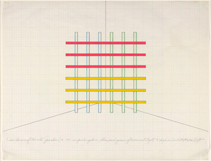
 Almost none of the hundred or so drawings at the Morgan Library can compare to the grid of fluorescent tubes that fills a corner with light and color, with their influence visible in such younger artists as Anne Katrine Senstad today. Still, they show something special, a Minimalist who loved to draw. Flavin copies Rembrandt and Paul Cézanne—the first for his contrasts of dark and light, the latter for his broken outlines and spare indications of depth. He sketches faces while working as a museum guard, an irresistible image in itself. And, needless to say, he sketches for his work, like Keith Sonnier in neon, too. He finds his way on paper from sails and Brooklyn tenements to Minimalism and from structures and materials to light.
Then again, why is that so needless to say? Flavin hardly needs a sketch to imagine the single diagonal fluorescent tube of his 1963 one (to William of Ockham). He hardly needs the multiple rotations of parallel lines, the longest at the center, leading to his 1964 "monument" 1 for V. Tatlin. All he needs is Ockham's razor. Yet he is drawing with light, much like the site-specific art of Jan Tichy after him—and much as Richard Serra would draw with darkness and mass. He first attaches lights to tapered boxes, like sculptural bases or pyramids. Already, he is dissolving matter and line into light and space, while assembling light and space into architecture.
As it happens, the Met had a small show in which Edgar Degas studies Rembrandt. Degas prints impose his own brooding youth on the latter's alertness. He also shows few signs yet of his obsessive observation, reserve, and desires. Flavin, in contrast, all but drowns Rembrandt in an ink wash, but one can see clearly who he values and why. Those same values go into his collecting. He ends up with lesser work and often lesser names, but they end up his.
He loves the Hudson River School, but more for open land and silken textures than for sublimity. He collects spareness and geometry, with Hans Arp (or Jan Arp, and also the partner of Sophie Taeuber-Arp), Piet Mondrian, and Barnett Newman. He collects friends, like Donald Judd and Robert Morris. No surprises here. Still, he also likes caricature and Hokusai's Japanese art. Like this modest but revealing exhibition, he is illustrating Minimalism.
Modern art's roots and branches
Ellsworth Kelly opens his "Plant Drawings" with a painting. It appears near the back of the Met's twentieth-century wing, too, rather than in the usual galleries for prints and drawings. This is the Kelly you knew, it says, the heir of American Modernism—nor his evil, nature-loving twin. So surprise, for the show runs to eighty drawings, as far back as a 1948 trip to Paris, surely with an eye to art's past. And Kelly, born in 1923, has kept drawing plants, for decades, although the largest concentration dates from around 1960, a crucial date for Minimalism and geometric abstraction. Could nature and tradition lie at the origins of both?
It is, I bet, a painting you know. With his Red Green Blue series, surveyed in New York in 2003, Kelly sets his own primary colors and the very tone of color in the 1960s. He equates painting with its elementary building blocks, much like Kelly's photography, but with the elements left to the artist alone. They have his usual hard edges and broad fields of color—as with his work just last year, as if squeezing the painting flat. The top of the red field slopes ever so slightly upward, while the top and bottom of the blue field face one another as concave curves. The painting's left and right edge interrupt them both, as if the blue belonged to a larger oval, while the blue in turn interrupts taller fields of green.
The drawings you may not know. They stick largely to outline drawings, in graphite or pen, with a similar weight for both—a focus of drawings in the collection of Jack Shear, president of the Ellsworth Kelly Foundation, as well. They include a few fruit, especially in an occasional early watercolor, but more often to leaves and wildflowers. Perhaps he did not wish to compete with Paul Cézanne and Cézanne drawing, although the fluid outlines have another modern precedent in Henri Matisse and Matisse's working methods. So, come to think of it, do the fields of color in his paintings. And Kelly still has enough interest in drawing's past to have worked as curator with the Morgan Library—which also just displayed Flavin's encounters between Minimalism and landscape.
Should one look for realism, then, in abstraction? Could that blue oval represent a leaf, the red the ground? The Morgan exhibits three of Kelly's sculptures right now, each a narrow slab of metal curving outward as it rises. Do they spread like trees? Conversely, could the plant drawings serve as a mere excuse for abstract form? I doubt it, in an artist for whom what you see is definitely what you get.
Still, one can find real parallels between paintings and drawings—and real insights into Kelly's abstraction. They start with the white of the paper, as ample as the color fields, and the slightly thicker than expected pencil line. Once he chose outline drawings, that was going to determine the bounds of his art, just as painting for him calls attention to itself. Leaves cluster or run along a slim branch, itself signifying line, pushing almost to the edge of the paper, just as his colors collide with the edge of the canvas. Depth arises strictly from overlap, just as that blue ambiguously interrupts or overlaps the green. Even in watercolor, gradations evoke hues more than highlights and shadows.
The drawings have the painter's usual asymmetry, perhaps their sole mark of subjectivity, without the least fear of monotony or repetition. Above all, they have his characteristic line, free but unhurried and controlled. A few early compositions allow details and even doodling, but from then on the edge of a leaf speaks for itself. Kelly loves the flatness of leaves, while lilies droop rather than spread. He also loves beans, peas, rubber, and wild grapes, in that cultivated space between nature and culture—the space of light and landscape. It is, he seems to say, the space of his art.

"Light and Landscape" ran at Storm King Art Center through November 11, 2012, "Dan Flavin: Drawing" at the The Morgan Library through July 1, "Rembrandt and Degas: Portrait of the Artist as a Young Man" at The Metropolitan Museum of Art through May 20, Ellsworth Kelly's plant drawings at The Metropolitan Museum of Art through September 3, and Kelly's sculptures at The Morgan Library through September 3. A related review looks at 2012 summer sculpture in New York City parks.


