9.30.24 — Voided

To wrap up from last time, Jenny Holzer started with something less public and more obscure. Diagrams taken from science and engineering bear not quite appropriate titles.

And then comes something surprising from so talkative an artist, emptiness. The show really does have empty bays. It becomes a collaboration with Frank Lloyd Wright and his museum, just as with Quiñones and countless others, but not without her usual defiance. When she first installed her crawl screen rising up, exhibitions started at the top and worked their way down. Jenny Holzer's Memorandum for Condoleeza Rice (Cheim and Read, 2006)

Silence allows voices to linger in memory, and it asks, too, just who gets to speak. Sure enough, when the artist first moved past crawl screens and truisms, it was to censorship. Paintings in oil of official documents have more than just the names blacked out. They run to near uniform blackness. One document duly states that it never mentions George Orwell, but that is after censorship. His file, now “voided,” once voided him.

Holzer’s first New York retrospective had a heavy bias toward recent work, at the time the marks of the censor. So does this one. Blame it if you like on the curator, Lauren Hinkson, but this artist hears living voices, and she wants her work to live in the present as well. She projects more messages on the museum’s façade at sunset early in the show’s run. When she at last returns to lies and clichés, it is to the unchallenged master of both. Trump and his party gild the lies, and so does she in silver and gold leaf.

Trump’s words appear on fragmented metal, ending in a loose pile on the floor, and her own marble lies up the ramp in fragments as well. Now if only he could be so easily consigned to the ash heap of history. One outburst portrays the January 7 uprising as an epic event, and more paintings capture the voices around him the day itself. Trump-appointed judges are determined to see that courtroom testimony comes only after the election, if it takes place at all. Smeared paint may not show Holzer at her best, but it will have to do. When the crawl screen pauses its messaging briefly to flash in red, it could be sounding the alarm.

Text like hers would look good on t-shirts, and one can see their influence on Rirkrit Tiravanija and his freebies reading The Odious Smell of Truth. Never mind his political neutrality and pandering. They parallel, too, John Baldessari and his California irony, but without his glib detachment. They have an echo as well in the terse anger of Glenn Ligon—or the sheer excess of another African American, Adam Pendleton. I leave Holzer’s influence on text art and her 2009 Whitney retrospective to earlier reviews. She has returned earlier to the Guggenheim, too, as curator of its collection, and you can check out the links for a far fuller picture.

The show’s biases raise tough questions. What is the point of a retrospective anyway? How do the certainties and complexities of Postmodernism look today? Holzer’s whole body of work explores biases, and even her squares of gold look like the marks of a censor. Still, the opening overflow of light, text, and color lingers longest and matters most. For once, the museum rotunda talks back.

Read more, now in a feature-length article on this site.
9.27.24 — Breaking the Silences

Jenny Holzer has a way with words. She also has a way with silence.

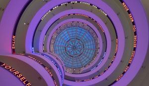
For a time her crawl screens were seemingly everywhere—speaking for you, standing up to you, and getting under your skin. Text art will never speak so forcefully and so elusively again. It made her not just the voice, but the voices of political and postmodern art. Were they never spoken aloud? Jenny Holzer's Installation for the Solomon R. Guggenheim Museum (Guggenheim Museum, 1989/2024)It brought her to street posters in the 1970s, for Truisms and Inflammatory Essays, and to the ramp of the Guggenheim in 1989. This is not sound art, although that has its place, but it echoes once again through the museum.

Now she recreates that work, but with additional words, because for her the same old words will never suffice. They ascend on LED along the rim of the ramp, facing outward onto the rotunda, with selected work from over fifty years in the bays by the wall, as “Light Line,” through September 29. It is a retrospective as a work in progress, her first in New York since 2009, and text keeps coming, apart from conspicuous gaps and silences. The empty bays and floors all but empty of art speak loudly, too. They allow her words to echo in the silence, and they bring out how much she refuses to say. As it happens, Joyce Kozloff in paint keeps up with the news, too, with maps, and I work this together with a report earlier this year on Kozloff as a longer review and my latest upload.

You may remember Jenny Holzer for the crawl screens, and you could almost take in her show at the Guggenheim without ever leaving the rotunda. It does not have much in the way of seating, but then her art does not run to creature comforts. You might have to stand and crane your head, but it is hard not to keep looking as the words ascend. They emerge from the lobby wall, come into view, and come into view again as they complete the circle and move on to the next. Their terse messages are instantly memorable—and ever so easy to forget as new messages finish them, contradict them, and supplant them. It says something that a review in The New York Times misquoted one of her best known.

Abuse of Power Comes as No Surprise, it goes, and you may have read it yourself on billboards, screen prints, and of course crawl screens. It has such an impact because it, too, may or may not come as a surprise. You are used, you may think, to politics as the abuse of power, and it may have driven you further to the left or to a protest vote for Donald J. Trump. The message can still come as a shock, though, if you expect “abuse of power” to end with something less banal, like a condemnation or an expression of pain. Truisms are often like that—temptingly obvious and temptingly easy to deride. In her hands, they are inflammatory all the same.

Holzer has perfected a voice that combines banality, truth, and lies. Which of the statements are hers? She is not saying, and none are so easy as you may have thought to dismiss. They speak of the need to lie next to someone and of the need to live apart. They veer into family, community, and politics, without distinguishing one from another. They could be personal confessions or the crushing voice of authority.

Her choice of LED works much the same way. It is the medium of advertising in Times Square, where she first took it up on commission in 1972—a medium devoted to gaining your trust and to taking you in. Yet it is also a medium of harsh whites and pixels, with the thrill and detachment of what was then the latest technology. I hope, though, that you will not end your trip in the lobby after all. Holzer got her start in other media, and more lies in store up the ramp. That includes the overflow of voices and silences.

The very year of her Guggenheim installation, she carved her truisms in marble benches and the dark stone of what might be a coffin. Do not expect comfortable seating or reverence for the dead. Media like these may last forever, but they, too, speak of transience. No one settles into park benches for long, and funerals are all about the brevity of life. The truisms began, though, as posters, and the exhibition proper begins with an Inflammatory Wall of them from around 1980. Make that four walls, on the full height of the two-story High Gallery just off the museum lobby.

It has room for nearly a thousand, in clashing colors and clashing messages. How an artist at age thirty accumulated so many in just three years is a marvel to itself. Still, they are not hers alone, regardless of who wrote them. She has invited another artist, Lee Quiñones, to scrawl right over them. It updates her presentation for street art while bringing out a crucial aspect of her work’s anonymity. She is bearing witness and giving voice to others—and I wrap this up next time with more recent work and the rest of her show.

Read more, now in a feature-length article on this site.
9.25.24 — His Finest Hour

“My back is scarred by the lash—that I could show you. I would if I could make visible the wounds of this system upon my soul.”

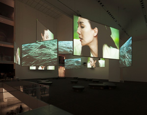
Frederick Douglass made the wounds of slavery visible for a generation of white Americans, starting before the system itself came to an end in the Civil War. Making visible is also the business of art, and Isaac Julien recreates an address by Douglass in all its eloquence, on “What to the Slave Is the Fourth of July?” And what is it, Julien asks implicitly, to African Americans today? The address provides the framework for an intimate look at the speaker’s life as a free man, Isaac Julien's Ten Thousand Waves (photo by Jonathan Muzikar, Museum of Modern Art, 2010)on video at MoMA. In the exhibition’s title, it poses Lessons of the Hour, through September 28. It asks, too, whether a divided nation can ever escape slavery’s lessons.

This could be Julien’s year. Douglass escaped slavery in at age twenty-one, in 1838, and Lessons of the Hour takes its title from a speech in 1894, a year before his death. Again on video, in the 2024 Whitney Biennial, Julien brings to life the Harlem Renaissance and its leading sculptor. He also curates an exhibition of that sculptor, and I bring together my reviews of that exhibition and Julien’s video as a longer review and my latest upload. As I wrote then, there is nothing savage about the art of Richmond Barthé—and, if there were, he would be the first to tame it. If you have any doubts, head right for Feral Benga, in a gallery retrospective of a thoroughly sophisticated artist.

“I have watched from the wharves,” Douglass said, “the slave ships in the Basin, anchored from the shore, with its cargoes full of human flesh. . . . In the still darkness of midnight, I have been often aroused by the dead heavy footsteps, and the piteous cries of the chained gangs that passed our door.” His words evoke pictures, and so does Isaac Julian, but less painful ones. He opens to trees, to a gentleman’s study and a woman sewing, and to the man himself, slowly leading a horse. He follows Douglass on the train, looking inward and perhaps creating those words in his head. He ends with Douglass standing tall on a mountain’s peak, like the statue of a hero.

He works in film, transferred to video, for the epic clarity of its color. It runs from day into night and from introspection to fireworks on, of course, the Fourth of July. It includes shots of an hourglass marking the hour, if not its lessons. Still, time and history have a way of playing tricks. Day breaks again after the fireworks, on its way to the mountain. The sands of time sometimes flow and sometimes stand still.

Julien hopes to encompass both reality and hope, especially when they collide. A hand picks cotton, but it might almost be picking white flowers for their beauty, with echoes soon after in yellow glistening on a tree. The audience for oratory files into a Methodist church with the bare architecture of an arena today. It includes blacks and whites, men and women—some in the fashion of the day, others in the present. Other clips borrow police surveillance tape of protests against police murder, although I somehow missed them. The video runs just under half an hour, but one can enter as one pleases and, in time, see the loop begin again.

I first encountered the artist, born in England, in London in 2003, already moving in and out of history. Two videos placed him both within a Trinidad community forty years earlier, after a poem by Derek Walcott, and a contemporary city much like Baltimore, where Douglass lived as well. When I caught up with Julien again, with Playtime in 2013, I worried that he fixed all too easily on his heroes and villains. (Do read my review then, for a fuller picture.) Has he finally found the hero he deserves? Has his hero found the response he deserves, in fireworks and, in church, applause?

As Douglass, Ray Fearon makes his character nuanced, steady, personal, and profound (and I wish that the museum took more care to credit him). Then again, I may have sold Julien short all along. Ten Thousand Waves, in 2010, already has many messages and many channels to mess them up. His latest video, a highlight of the Biennial, comes closer still to an installation and a hall of mirrors. It also moves easily in time, back to the Harlem Renaissance. Now MoMA presents Lessons of the Hour, first shown in 2019, as a historical document itself.

Douglass was the most photographed American of his time. And the curators, Ugochukwu-Smooth C. Nzewi with Erica DiBenedetto, set out photos, publications, and newspaper clippings, floor to ceiling and in cases. They also include the handwritten text of a speech on the role of images of black and white America. Is blackness once again “going dark,” feared by or invisible to white eyes? For Julien, Douglass speaks forcefully but never gets over his introspection, his memories, and his pain. “Anything, no matter what, to get rid of thinking!”

Read more, now in a feature-length article on this site.
9.23.24 — Hope Against Hope

Hope springs eternal. Each year the Governors Island Arts Center does its level best to fill the summer doldrums, and one can always hope.

At the top of stairs from the café, flags displays red roses and a message of “Yes,” while a bedsheet beside them shows what I took for a dreamer. Who would dare disturb its sleep, even for art? But then, as the show’s title has it, “Hope Is a Discipline,” Bony Ramirez's La Mamá De Perla (courtesy of the artist/Governors Island Arts Center, 2024)just this summer through September 29. Bread and Puppet Theater, which made both works, has been at it now for almost sixty years.

A display case tells its story. It began as a cross between activism and Off-Off-Broadway (or maybe Off-Off-Off Broadway) theater without ever quite ascending to the pantheon of performance art. Books and magazines speak of puppet making, but also justice and a dance of death for the victims of “Assistant Mass Murderer” Antony Blinkin, the secretary of state. I hardly know whether to call it dogmatism or discipline. And still Adama Delphine Fawundu, another contributor, can remember When the Spirits Dance. Twin tapestries drape onto the floor with pigments from Sierra Leone, herbs from Mali, “whispers” from Africa, and shells from Cuba, South Carolina, and Maine.

Africans, she insists “built this place,” which must have taken discipline and persistence. Still, hope for the future can be hard to sustain. Maggie Wong sets out a drafting table, painted an acid red and with a red blanket trailing behind it. It could be her work table, for a work in progress, but newsprint has already filled it with devotion and anger. But then a bedsheet smeared with house paint sounds discomforting enough on its own. Who can ensure that those dreams will not be nightmares?

Hope may envision a future, but the entire show looks back, much like the display case. Suneil Sanzgiri sees his video trilogy as a conversation with his father. And it, too, is cautious when it comes to hope. Grainy footage shows a protest in India, but also seemingly purposeless walks through dim corridors and closed courtyards. A second video, an “experimental documentary” by Kyori Jeon, bears Flesh-Witness. Solitary standing figures could be proud or weary, even as others help their companions onto a platform and wave their banners to those who can see.

Hope may be more evident in a second show sharing the space. When “Tropical Frequencies” looks back, it sees a continuing tradition. It is hardly the first to focus on Caribbean art and the Afro-Caribbean diaspora, nor the most memorable. It does, though, have an insistent interplay between painting and assemblage. It becomes an interplay between African American faces and ephemera as well. Quiara Torres sets a portrait within a pearly lamp or cage, where one can feel the confinement and almost smell an unseen candle.

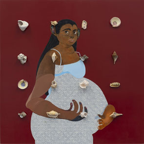
The portrait has its echoes in flat, earthy reds for a pregnant woman by Bony Ramirez—or a standing figure by Emily Manwaring, both with an overlay of shells. Still more shells hang from chains for Ramirez, along with coconuts. Are they relentlessly optimistic? The Kiss of Protection from Mosie Romney sure sounds reassuring, but Cheyenne Julien dots her figure with small red nails. I exited not by the main entrance, but back down those stairs toward the ferry, leaving the flowers and bedsheet behind. I might have abandoned all hope.

Read more, now in a feature-length article on this site.
9.20.24 — Visit from the Dutch

It was Christmas in July at the Morgan Library. No sooner did the small lobby gallery open with the Eveillard gift of drawings from several restless centuries than Santa was back in town. Eighty drawings from the Clement C. Moore collection are a promised gift—but more on him and Santa in a moment.

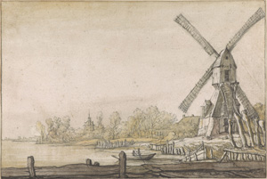
Aelbert Cuyp's Windmill by a River (Morgan Library, Clement C. Moore collection, c. 1640)It offers a chance to assess just what the great age of Dutch art meant for the Dutch. It may not be a compendium of stellar names and stellar prints, but that seems only right for an emerging nation. It suggests a collective enterprise tied up in the Dutch republic while reaching across Europe with its influence, at the Morgan through September 22.

Moore, I can only presume, descends from Clement Clarke Moore, although the Morgan does not say so. It must wish him to stand on his own as a scholar and now donor. The older Moore, of course, wrote “A Visit from Saint Nicholas,” about “the night before Christmas,” and that seems right, too. No one did more to convert a religious holiday to a secular one—and a gift to all mankind to a bag of toys for children. (Trust me, a Jew who benefited.) And no nation did more to assert a secular purpose for art.

It stays all the truer to that purpose in drawings. In The Hundred Guilder Print (nicknamed for its one-timer cost and extravagance), Rembrandt shows Jesus preaching, healing the sick, and reaching out to all. A quick sketch isolates a sick woman and a still more haunting face. The poor really will always be with us. A boy from Adriaen van de Velde, who could easily be their companion, catches what rest he can leaning on the jug that must have helped put him to sleep and given him what small pleasures he could claim. The angel of the Annunciation for Samuel van Hoogstraten seems to have dropped by just to say hello.

The show opens with Mannerism in the late 1500s, to show the emergence of a new art and a new century, although dates jump wildly back and forth. It has an alcove for what a past show at the Morgan (also with work from Moore) called “Rembrandt’s World,” but with more of his school than the man itself. It cares more for results than for chronology or artist, in an arrangement largely by subject. That includes France and Italy, where Cornelis van Poelenburch found inspiration for Dutch landscape in towering, glistening rocks. It includes close observation of butterflies and tulips, with none of the moralizing in still life as fresh but dying for Flemish artists of the time. It includes the Flemish themselves, like Jacob Jordaens, Peter Paul Rubens, and Anthony van Dyck.

Mostly, though, it describes a land and people. It unfolds during their long war of independence from Spain, but without a battle in sight. The royal fleet puts on a show in panorama, but not half so memorably as fishermen for Hendrick Avercamp, a lone man crossing a bridge for Guercino (an Italian), or the banks of a stream for Jacob van Ruisdael. A Roman general comes home to a public welcome, but it could be just another village festival. And gatherings are everywhere, only not so easy to tell from chance encounters and private outings. Hendrick Goltzius fills a sheet with nudes, as prelude to painted myth. They might have gathered for an afternoon in the sun.

Individuals come off as smart, casual, and vulnerable, with not a touch of Flemish bravura. A man from Peter Levy, quite possibly himself, might be dreaming or showing off. He also shares his dignity with herdsmen for Paulus Potter and Jan Lievens, who also supply the herd. The nation was built on their collective labor. It was built, too, on wind power, but windmills are just one landmark in a layered landscape. Aelbert Cuyp uses lighter strokes in chalk to deepen and distinguish the layers.

You can, if you like, tease out how he and others constructed a world. Esaias van de Velde replaces the aerial perspective of Harvesters for Pieter Bruegel with a close view. Moore has continued to collect past the Baroque, too, and a postscript carries him through Thomas Gainsborough, John Constable, and J. M. W. Turner with their greater confidence and drama. Then again, you can stick with the spirit of a plainer art. When Vincent van der Vinne sketches the Grote Kerk in Haarlem, he leaves family emblems on pillars at peculiar angles. The might show a lesser artist at work, human neglect, or the ravages of war.

Read more, now in a feature-length article on this site.
9.18.24 — Crafting the Middle Class

Crafting Modernity” tells a familiar story, about a world torn apart and renewed by Depression and world war. Only one thing: this time it unfolds with a tapestry, a table, and a chair—and on another continent entirely. Make yourself at home.

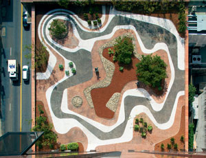
You know the story, about modern life and modern art. As recovery looked more and more urgent and more possible, it brought not a revival of the gilded age, but a home life that many more could call their own. Middle-class comforts included much that could not have existed before the twentieth century. Renowned artists and designers embraced the cause, with furnishings that many more could afford, without the stifling air of Edwardian wallpaper. Roberto Burle Marx's roof garden, Banco Safra, São Paulo (photo by Leonardo Finotti/Jewish Museum, 1983)In no time, capitalism made that cause a consumer revolution, as craft gave way to new technologies and new pressures to spend. If it thus took back its own promises, it sound surprisingly like change today—only centered not on Asia, Silicon Valley, or Madison Avenue, but Latin America at the Museum of Modern Art, through September 22.

If you have heard this story before, it may well be at MoMA as well. In 2015 it presented the same four decades of Latin American architecture, ending around 1980. You may recognize Oscar Niemeyer and Lina Bo Bardi, whose architecture appears along with others projected on the walls, as a backdrop for what might have stood inside. Here, though, they contribute furniture—Niemeyer a low table, suitable for stacking or a communal meal on the floor. Bo Bardi brings quite an array of chairs. Roberto Burle Marx, who with Niemeyer created buildings for the new capital city of Brasilia, has a painting, like a sketch toward the new interior design.

The museum is out to extend what one even means by design. Gego appears not for her wire sculpture, but for wiry white diagonals on a huge hanging. Olga de Amaral, also with art of the Andes now at the Met, and Cynthia Sargent display fabric as well—and I also work this together with an earlier report on that show at the Met as a longer review and my latest upload. Here, though, it appears not as art for itself but tapestry for the home. The filmed architecture, in turn, sticks to homes, not to massive public projects. It is remaking modern life one family at a time.

Still, it is remaking private life in public. Chairs appear by far the most often, not bedroom furniture, and films focus on exteriors and common spaces. The International Style favored slim columns and glass houses, which allow one to look out on nature, but also allow others to look in. The curators, Ana Elena Mallet and Amanda Forment, feature just six countries, to give their distinct traditions their due. At least one artist claims to draw on pre-Colombian art, but be careful. One might just as well speak of global art in a newly global economy.

A long wall diagrams each country’s social networks, like maps of the art world for Mark Lombardi. They testify instead to interactions and displacement. Naturally they include Josef Albers, Anni Albers, and others from the Bauhaus, but also Alexander Calder, Black Mountain College in New England, and ever so much more. In the show as a whole, artists can trace their origins to a dozen European nations and the United States. But you have heard that story before, too, about refugees from fascism who helped create postwar art. No wonder furniture had an eye to portability and reassembly in the face of exile—like Niemeyer’s Modulo, a “puzzle chair,” or lounge furniture from Roberto Matta that fits neatly together as a square.

Assembly and repetition also encourage the shift from craft to brand names. Antonio Bonet, Juan Kurchan, and Jorge Ferrari Hardoy (later Grupo Austral) gave their initials to the B.K.P. chair, a descendant of the Marcel Breuer chair with its tube frame and suspended leather. They conceived it not in Argentina, but in the Paris studio of Le Corbusier—and copies quickly entered Fallingwater, the Frank Lloyd Wright house, and the Museum of Modern Art. International enough for you? MoMA provided another spur to invention with a 1940 design competition. Several of the chairs look out on the museum’s sculpture garden now.

Both threads, craft and commerce, offer surprises. Other brand names include a logo for Olivetti typewriters. Ceramics, as with Colette Boccari, may depart from a perfect circle, as if fresh from the oven, without losing their subtle color. High tech can have an industrial look, too, like flashlights by Emilio Ambasz that could pass in reproduction for pipes. Much the same red plastic enlivens a bar cart, an ice bucket, and a TV. Sit down, turn on, and pour yourself a drink.

Read more, now in a feature-length article on this site.

Older Posts »