11.22.24 — The Ancestral Land Itself

Can there have been a first Aboriginal work of art? Yes and no, and Asia Society gives it a room to itself, but against a backdrop of churning waters projected on the walls. These are ancestral waters, and painting itself has a history without a beginning, in ancestral practices—and, an exhibition explains, in “patterns of the ancestral land itself.”

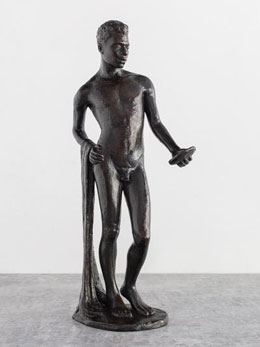
Wongu Munuŋgur's Djapu Miny'tji (Donald Thomson collection, 1942)That conjunction, of practices known only to clan and community but there for all to see, guides “Madayin,” eighty years of Aboriginal Australian bark painting, through January 5. The title means both the sacred and the beautiful, which is to say both a ritual and (oh, dear) fine art—and that 1935 point of origins has a back story as well as a backdrop. A white investigator had taken up the cause of four men in prison for murder, and Wongu Munuŋgur thanked him with a painting. Aboriginal painting had long worked in sand and on bare skin, but now it became reddish-brown pigment on eucalyptus bark. It became, too, the conjunction of the timeless and timely. Painters have been asking just how much to call it theirs ever since.

They live in Yirrkala, about halfway along Australia’s remote northern coast, and Asia Society supplies a map. The Yolŋu “knowledge holders” who curated the show were not entirely comfortable with that. To them, what a scientist might call a reference frame or a colonizer a navigational aid is a betrayal. The Yolŋu themselves had no written language, just a multiplicity of spoken languages, until Europeans showed up. To this day, artists refuse to adopt the patterns of other clans—not, they insist, out of scorn but out of respect. If all this “primitive art” starts to look the same, do bear that in mind.

If it still looks much the same, it will always take the long view. That opening work rests on the floor like Native American tapestry, while other work hangs vertically with dominant vertical fields. They afford space for ancestral beings, including snakes, sharks and men. Fish might be swimming upward as if swimming upstream. They might also be swimming into a trap, part of the myths and patterns at play, too. Layered on top in thicker pigments, often white, are rocks and clouds.

These are sacred spaces, and they articulate gurrutu, or kinship. More precisely, they picture a kinship system, encompassing art, country, and the environment—or lands, stories, and fire. Short diagonals dart back and forth against the verticals. Everything runs freely, supplying points of unrest and stability. These artists could not draw a straight line with a ruler if they tried. But then that would be mapping.

Museums have made a point these days of hanging long-past art beside contemporaries, like the Met with Japan, Korea, and Tibet. Contemporary art sells, and board members are collectors. It makes sense, though, when a people refuses a time line or a map. Asia Society draws on the show’s partners, the Kluge-Ruhe Aboriginal Art Collection of the University of Virginia and the Buku-Larrngay Mulka Centre in Australia, along with new commissions. So what's NEW!It also starts all over again one floor up.

The restart introduces women. They began to paint in the 1930s, too. Forms in their hands become larger and more prominent, like a starlit sky for Nyapanyapa Yunupinu. (Could this be the Yolŋu Starry Night?) They show humans as active today or all but eliminate them on the way to abstraction. And then comes one last room for half a dozen contemporaries.

They recall another beginning nearly eighty years ago, in the United States. Carlene West looks to the Surrealism that Jackson Pollock once had to leave behind, Riko Rennie and others to geometry and color. They may send you back to the rest of the exhibition to see what, if anything, has changed as Aboriginal art enters the mainstream. From the start, one motive for painting on bark was to swap with outsiders for food and provisions, and now it has earned its place in New York. Besides, there is always one problem with seeing the world as a system: the more it grows, the more it can fall apart.

Read more, now in a feature-length article on this site.
11.20.24 — A Riot Going On

Think keeping up with the news is hard? What about keeping up with the streets?

With “We Are Here,” the International Center of Photography exhibits “scenes from the streets,” through January 6, and its title is an assertion. It speaks for the show’s subjects, in sixteen countries, asserting their presence and demanding a voice. It speaks to the pace of the streets and the very nature MutualArtof photography, snapping away as best it can. We are here, it says, and soon we will be gone. What, though, will anyone remember? And what has happened to photography’s decisive moment?

Of course, Henri Cartier-Bresson coined “the decisive moment” to describe a vision of the present that not all photographers share—and I work this together with past reviews of Mark Steinmetz, Hans Breder, and Cartier-Bresson’s ideal as a longer review and my latest upload. Fashion photography or product photography needs time to create an image and to land a sale. Abstract photography asks to step out of time, even when it provides a window onto the photographer at work. From ICP’s founding, though, fifty years ago, it made photojournalism not a choice but a responsibility. It was not just keeping up with the news but making news. Lives were at stake.

Street photography can seem a casualty—or a foster child of silence and very fast time. You know what to expect at ICP, a city in motion. Look back to New York in the 1970s with Martha Cooper, when crime was at its peak, for empty lots and kids climbing the fences, if not the walls. Just crossing Canal Street with so many others is enough for Corky Lee. Skip ahead to the present, and collective motion means protest—for Freddie Gray in Baltimore with Devin Allen or for Women’s Day in Mexico City with Yolanda Andrade. Rest assured that the riot squad will turn up in force, even when no riot is going on.

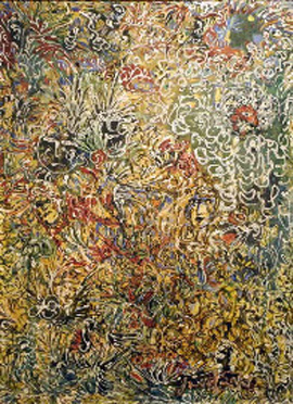
Anthony Hernandez's Screened Pictures X #106 (Yancey Richardson gallery, 2019)Look for symbols, like the American flag put to personal use. Look for protest signs and graffiti, like spray paint that rechristens the American West for Nicholas Galanin as No Name Creek and Indian Land. Look for Palestinians on a day at the beach, Ferris wheels, kids doing cartwheels, or everyone just hanging out. Look for displays of street fashion, one girl or woman at a time. Look for them all again and again. The thirty-odd photographers get several shots apiece to do them justice. Most are contemporary and barely known.

The trouble is that you very much can expect them, over and over. Nothing seems all that decisive. As one protest sign has it, for Vanessa Charlot, the people demand “full humanity.” Actual humans, though, can get forgotten along the way, as older street photographers like Ming Smith and William Klein would never have allowed. The photographs do not want to make isolated, iconic images, which is exhilarating. Something, though, is lost—be it the issues at stake in protest, the poignancy of outcomes, or photography’s experiments.

There are things worth remembering nonetheless, on top of the sheer weight of the familiar. Street lives matter. While many stick to black and white, a tribute to street photography’s past, color can tell a story, too. It can erupt in umbrellas for Janette Beckman or women together, in South Africa for Trevor Stuurman or and in China for Feg Li. They are not just showing off but being themselves. Smugglers cycle or cart their bright bundles for Romuald Hazoumè, and yellow caps make police no less dangerous for Lam Yik Fei.

Is a riot going on after all—a riot of color in the riot of the streets? Chastening to a critic, even the breaks in uniformity come more than once. I had admired Anthony Hernandez before for LA seen through a chain-link fence, but here the distancing comes again with Michael Wolf. Long exposures from Alexey Titarenko turn St. Petersburg into a city of ghosts. And then women in white at church in Nigeria for Stephen Tayo could be an extraterrestrial delegation for peace. This, too, is the street.

Read more, now in a feature-length article on this site.
11.18.24 — In the Shadow of Revolution

For more than fifty years, Mexican artists toiled in the shadow of revolution. So, too, does the Met with “Mexican Prints at the Vanguard,” through January 5.

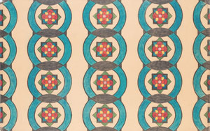
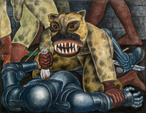
The Mexican Revolution took ten long years, starting in 1910, but artists before it could see it coming in all its violence. Well after, it served as a model and a call for change. To the left, and there were many on the left, it served as a cry to support for other revolutions, in Russia and Spain. Later still, it served as a bitter memory, Diego Rivera's Indian Warrior (courtesy of Rivera/Kahlo Trust, Smith College of Art, 1931)as a government dedicated to remaking the country and the world gave way to yet another dictator. Could, though, the cries put Mexico at the vanguard of twentieth-century art? Perhaps, but only by remaining in the trenches.

“Mexican Prints” is thoroughly out of fashion, which is to say seriously modern. These days, a proper Mexican revolution would be a cultural revolution, with women in the vanguard, like Amalia Mesa-Bains recently at El Museo del Barrio, and Mexican tradition their passion. The Met ends in 1955 as if to avoid all that. References to Pre-Colombian art do appear in square-jawed heads, but not often, and figures costumed for a carnival come only at the end, with Carlos Mérida, as one of the few spots of color. But then Mérida also produced an abstract composition, give or take a bird. Frida Kahlo, in native costume as a woman’s act of defiance, does not appear at all.

The curator, Mark McDonald, starts in the 1700s, but not with native tradition. He looks instead to Europe, much like a past show of “Painted in Mexico.” Later, Tina Modotti will depict soldiers with a debt to Baroque paintings of a Madonna rising. In between, artists turned to the satire of Honoré Daumier. But this was always art as illustration, in service to a cause. Text can overwhelm images. Tracts and newsletters precede starker lithographs by David Alfaro Siqueiros.

Of course, Siqueiros was also a muralist, and the show runs in parallel with Mexican murals. Diego Rivera, turns up a print after one of his most famous. Emiliano Zapata, the revolutionary, stands beside his horse. Rivera came to New York as well, for a show of his work at MoMA. José Clemente Orozco came as well, too, with a print of a vaudeville act in Harlem. Here or in Mexico, change was in the air.

Mexican prints first entered the museum’s collection at the instigation of a French artist, Jean Charlot, who moved to New York in 1928. He contributes a woodcut of Rich People in Hell. Others, too, adopted woodcuts for their jagged edges, with praise for Lenin and Stalin as the bombs fall. Siqueiros himself depicts a Trinity of Scoundrels. This is art and ideology in black and white. After the revolution, the new regime sponsored arts education. As that became a tool for state propaganda, Taller de Gráfica Popular (or Graphics Workshop for the People), took up the slack.

Still, something sets Mexican prints apart from Europe and America—and from their own easy answers: revolution comes at a cost, and death enters even in triumph. Zapata looks humble and heroic enough, but he stands astride a dead body. Rufino Tamayo pictures a native couple as heros, but they might be confronting hills on fire. Alfredo Zalce sees the Yucatan, a target of agrarian reform, as a paradise. Yet his figures struggle with the overgrowth.

Death enters even before the revolution. Celebrated in his time, José Guadalupe Posada continued the tradition of pages dense with text. Couples embrace, but “death is inexorable,” and wooers, bikers, and angels alike are skeletons. So is the “people’s editor.” Less well known, Emilio Amero stands apart in 1930 with a clock and telephone in Surrealism’s ghostly light. This is modernity, and art is in the vanguard, but it might end in darkness.

11.15.24 — Precious Lives and Precious Things

A wall lay in ruins, and Ilit Azoulay salvaged what she could. It must have been a tough choice of what to save and what to let go.

For Azoulay, trash can itself be precious, for it tells of the people who left it behind. And anything, no matter how revered and how precious, could one day soon end up in the trash. As the Jewish Museum has it, they are “Mere Things,” through January 5—Ilit Azoulay's Queendom: Panel #7 (courtesy of the artist/Lohaus Sominsky, Munich, 2022)and I work this together wish a past report on still life with thoughts of death by Rachael Catharine Anderson as a longer review and my latest upload.

Those ruins from Tel Aviv form the basis of Tree for Too One, as in (almost) “two for one” and “Tea for Two.” You can forgive Azoulay an easy pun and the old soft shoe. She puts things through a process very much like punning, which is to say art. It takes a full museum wall to display them all, some on shelves and others transformed again by photographing them, before displaying the photos as well. This is both physical collage and photocollage, and it leans a magnifying class on one its pieces—to aid in looking or to put under scrutiny what she sees. Earth tones help unify the work and preserve its real warmth.

Just how precious, though, is it? Azoulay is not saying, but a gasket can look like a wedding ring, and a tree (or whatever is left of it) grows right there, in a flower pot—falling to its right toward death. More objects rest in a display case a few feet away. That strangely human wish for meaning does the transforming, but so do snapshots salvaged from the site. They look all the more poignant for their bright smiles and clumsy prints, set amid a sophisticated work of photography. People, too, can become objects and images, but as testimony to lives.

This is not NIMBY—not a protest against construction in the country’s most cosmopolitan city. A pressing need for housing dates back even before the international accord that promised a state of Israel and a Palestinian state. Refugees to Israel knew all about displacement, much like art. Builders were so desperate, the museum explains, that they built walls from whatever lay at hand. And yes, that was another way of valuing and preserving trash. Azoulay need only reveal what walls once hid.

Museums go through a similar process of deciding what to value every day. No surprise then, if the rest of work since 2010 responds to museum collections. None is exactly site specific, because it is also continuing its transformations. Again and again, she seeks parallels among disparate objects, like a piper and a stone saint. A photocollage makes objects from the Jewish Museum itself take flight, as Unity Totem. Azoulay produced her most massive work while in residence at a museum in Berlin, where she lives. As the title has it, there are Shifting Degrees of Certainty.

Two more works start with photographs of objects in the Israel Museum and the Museum for Islamic Art, both in Jerusalem. No surprise there, too—not when Israel still seeks safety and Palestine its due recognition. No surprise as well if the first includes HVAC units and other museum infrastructure. That work includes a collage of human cutouts and stone, while fragments of Arab art become a magician’s robe. Once again people are the most precious object of all. As the work after the Israel Museum has it, No Thing Dies.

The curator, Shira Backer, stresses how much the artist relies on digital magic. “A pebble becomes a boulder, the handle of a ewer the scepter of a queen.” I was struck instead by the weight of images—not just the emotional weight, but the physical weight of museum objects. The eighty-five photos from Berlin have distinct shapes and separate frames, nesting together like a single precious structure. Born in Israel in 1972, she keeps returning to both her origins and Berlin. The work provides a tour of physical space as well.

Read more, now in a feature-length article on this site.
11.13.24 — Counting the Seconds

You may find yourself counting the seconds at the Whitney, but why bother? Mark Armijo McKnight counts them off as no impatient human ever could. Who knows what that will leave a gay artist or the viewer when it is done? McKnight’s film makes his gender as hard to pin down as his landscapes, but everything counts—and I work this together with a recent report on a show at Wave Hill of queering nature as a longer review and my latest upload.

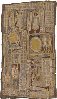
Dark clouds loom over a full wall, as ominous accompaniment. Will it ever end, and will the darkness? And then at last, after a totally black screen, the shot comes to rest on an otherworldly landscape and a metronome. Mark Armijo McKnight's Clouds (Decreation) (Whitney Museum of American Art, 2024)It is McKnight’s coming to be as a gay male and an American artist. It is also his “Decreation,” through January 5. He just happens to leave something temptingly incomplete along the way.

McKnight takes his title from Simone Weil, who began as an activist and ended as a mystic. As a mere child in a Jewish family, she spoke out against World War I. Through a lifetime of poor health, she stood up for trade unions and, like Gerda Taro and Robert Capa, the republican cause in the Spanish Civil War. In the end, though, she had a vision of the loss of self before a Christian god. It was as if her entire life had been shot out of the barrel of a gun, never to return. A photo from McKnight could well depict just that.

In reality, its puff of smoke belongs to clouds, wispy bright ones, as does a trail of smoke. It evokes Western skies in a great tradition of American art, of Ansel Adams in photography or paintings and drawings by Georgia O’Keeffe. A dreamer might say that it belongs, too, to the promise of an expanding nation—and an activist to its violence against Native Americans. McKnight could well identify with them all. The curators, Drew Sawyer with Nakai Falcón, surround the film with just half a dozen large photographs and two sculptures. They fall somewhere between a single installation, a premature retrospective, and the decreation of the artist’s dreams.

Titles speak of The Black Space, matter, sleep, and dreams, and McKnight writes of the “queer refusal of the disinterested gaze.” More than one photo shows naked bodies entwined and out of doors. They are all but indiscernible from strangely biomorphic hills—or an animal’s corpse in the dried grass and weeds. The photos stick to black and white, the film to sixteen millimeters, as if caught in an embodied world before the digital. Anti-Matter, also a photograph, looks all too material. Even the sculpture, concrete blocks with serious chips at their base, might be coming apart.

The film is in a tradition of lushness and austerity. It is going nowhere fast, like films by Michael Snow or the Empire State Building for Andy Warhol. The relentless ticking of a metronome recalls Minimalism in music and the refusal to make music at all in John Cage. McKnight says that he drew on György Ligeti, the Hungarian-Austrian composer of “micropolyphony.” While the film closes in on just one metronome, one can hear many more through speakers high on the facing wall. He swears that one could see them all if only the camera drew back.

Things happen when they happen and no more. The ticking continues, loudly, and comes to an end as abruptly as it began. Circles, incised in concrete and crossed by diagonals, could each belong to a clock face lacking numbers. Like the film, they gesture to passing moments but refuse to tell time. I cannot swear what “Decreation” has to say about mysticism, gender, the environment, or the United States. Still, it speaks loudly, and McKnight can claim the lushness and austerity as his own.

Read more, now in a feature-length article on this site.
11.11.24 — Back to the Garden

It was 1972, and environmentalists were desperate. At least Helen Mayer and Newton Harrison were, and they sought a “survivalist alternative” where you might never expect it, in a work of art—and I work this together with past reports on summery sculpture indoors and out in Harlem Sculpture Gardens and by Alexis Rockman and Tiril Hasselknippe as a longer and fuller review in my latest upload.

Their Survival Piece (the fifth of seven) made its debut that year in the gallery at Cal State Fullerton. In its Portable Orchard, nature had an assist from recycled redwood and artificial light. Now the Whitney recreates it, Kevin Roche, John Dinkeloo, and Dan Kiley's Ford Foundation (Renovation Architect: Gensler, 1967/2018)through January 1, and one can hear their urgency. “To survive as a species,” they wrote, “we are going to have to learn how to grow our own food and take care of ourselves.” So why has it gone all but forgotten? And why does it look so calm, so composed, and so green?

The Harrisons were themselves survivors. Like the fruit of their “sustainable food system,” they lived to a ripe old age. They would be in their nineties were they alive today. Their indoor citrus grove includes all that one might wish, including lemons, limes, grapefruit, and naval and mandarin oranges, each carefully labeled. On the First of July, just days after the opening at the Whitney, young fruit had already begun to appear. As if to proclaim their eco-friendliness, they were all still green.

To appreciate it, though, you may have to get past the rhetoric. The enterprise sounds not just urgent, but downright bureaucratic. It speaks of not natural farming, which in any case takes more land to feed the millions, but natural farming practices—and they are not just obsolete, but “cannot be taken for granted.” You must get past the contradictions as well. This may be sustainable agriculture, but not for eating. If it makes you think of Rirkrit Tiravanija, “relational esthetics,” interactive art, free food, and sharing, forget it, and do not touch.

Perhaps the contradictions come with the territory, where fears mix with love. The Whole Earth Catalog appeared in 1972, Silent Spring was ten years old, and the Whitney has copies of both. Like the EPA, established in 1970, they attest to urgency, but also to hope. Artists may have felt a sense of desperation as well, as late modern art gave way to criticism and chaos. Besides, fears are easier to understand than ever in light of climate change. Yet artists like Maya Lin do not just conserve the environment, but transform it.

The orchard flourishes all the same. The Whitney has removed its eighth-floor partitions, leaving a wide-open room with planters in neat rows. They share their redwood hexagons with parallel light tubes directly above. As trees grow, their peaks extend into those upper hexagons as well. Other survival pieces included a hog pasture, a fishery, and an entire farm, all portable. Here a uniform design and strong colors carry the day.

It is tendentious all the same. This is not the future, sustainable or otherwise. It is art, and a true New York landmark shows what that might mean. Back from college in the 1970s, I was rediscovering the city, its neighborhoods and its architecture. The Ford Foundation on East 42nd Street offered a glorious respite from my minimum-wage job barely a block away. Like the Harrisons, it, too, took nature indoors and artifice into nature.

Finished in 1967, its twelve stories of offices surround a soaring atrium—a place for walking, sitting, and contemplation. Greenery blossoms out from the balconies and rises from the floor. A collaboration between Dan Kiley, the landscape architect (whose other landmarks include Gateway Arch National Park in St. Louis), and Kevin Roche and John Dinkeloo (who also designed the Met’s American wing), it brought a temperate environment and a seamless flow of plants, trees, pink stone, and rusted steel. It has its surfeit of good intentions, too, no doubt. It has after all, been the Ford Foundation Center for Social Justice since restoration in 2019 (and I described it at greater length then). Still, by comparison, that citrus grove is a lemon.

Read more, now in a feature-length article on this site.
Older Posts »