Under Construction
John Haberin New York City
Phyllida Barlow, Anna Maria Maiolino, and Bernard Kirschenbaum
Jim Osman and Mateo López
Phyllida Barlow has a fondness for construction sites. That could explain the Brit's return to New York, where scaffolding has taken on epic proportions—and to Chelsea, where the High Line would loom over traffic even if new and impending condos did not. Her sculpture, though, is anything but slickly luxuriant.
She shared a gallery with Anna Maria Maiolino, for a global understanding, while Bernard Kirschenbaum composed his self-portrait from more than thirty years of plain old plane geometry. Was it Post-Minimalism or a Hyper-Minimalism? Together, they show art under construction, even as it seems to fall apart. 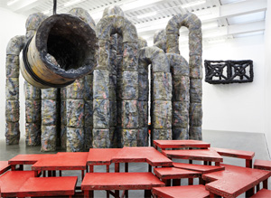 But then Jim Osman and Mateo López are still picking up the pieces, stacked or not. Will things start looking up?
Under construction
Minimalism has always had two minds about construction and deconstruction. It runs to modular, but it also brings art closer to the ground. Soon enough, too, art started to self-destruct before one's eyes, in sliced canvas by Lucio Fontana, Homage to New York by Jean Tinguely, and Peter Fischli and David Weiss. Phyllida Barlow, though, keeps building, and she stood out from 2018 summer sculpture on High Line by her work's sheer mass—as if fragments of an adjacent project had landed there by mistake. Now she incorporates steel, cement, timbers, scrim, polyurethane, synthetic polymer, and indeed just about anything but glass. After her entry at the 2017 Venice Biennale, Barlow abandons the British pavilion's posh setting for a future home.
The lack of transparency is no accident. She asks you not to spy on your neighbors, but rather to eye your surroundings for where you may stand next. Six years back, Barlow's "Siege" resembled an obstacle course or a classroom, with little room to move among the desks. As its title suggested, it seemed to have dug in for the long haul. Here an arch leads only to a thicker echo in gray slabs on the floor. One can hardly resist taking its narrow measure by entering, and one has no choice then but to back out.
One large sculpture multiplies its steel arcs into a fence, while another could pass for wrecking balls. It could, that is, if it did not itself look a bit of a wreck. While Barlow turned decades ago to abstraction, she is focused in her seventies on construction, as both process and imagery. She bases some works on channels used for pouring cement, but they take shape in cement as well. The same work mimes both construction and destruction, while the part becomes the whole.
Stability is always at issue with titles like Prop and Tilt. Stacked platforms at shifting angles have triangular feet like large teeth. Steel tops cement blocks and vice versa. Works like these approach Minimalism and Anthony Caro, but with an edge. They do not, though, mean to be merely threatening. Gobs of spray paint have harsh colors, like warning signs at construction sites, but spray is a kind of exploration, and the colors also add delight. They bring construction indoors, only to find itself beneath the gallery's ceiling pipes in bright red.
Upstairs, Anna Maria Maiolino brings further play between Minimalism and Post-Minimalism, the cast and the mold. Born in Italy, Maiolino lives in Brazil, and her art has reference points in both. Like Arte Povera, she slices right through things, including laser-cut black stainless steel boxes. And like Grupo Fuente, she combines geometry and human form. Photos of human eyes give skin the texture of a weathered landscape. Clay shaped within the gallery adds a further play between hand and site, from an artist who appeared a year earlier in a show on the theme of "Delirious."
Not that Maiolino is rubbing in the risk that something might go wrong. As with those European and South American art movements, laceration can add up to elegance and weathering to comfort. She calls the show "Errância Poética" (or poetic wanderings), after sculpture in mortar like archaeological digs, and she relishes the freedom to wander and the poetry. On video, an actor lies face down on the floor, but it looks less like abasement than a well-earned rest. Poured ink on acrylic comes closer to Tong Yang-Tze and Chinese calligraphy than to Jackson Pollock drips, while casts in the shape of large worms have the gentlest of ripples. Profundity and poetry are the stuff of life, and so is the recovery of Latin American art and women artists, but there is always a future under construction downstairs and outdoors.
Squaring the circle
A Minimalist self-portrait must sound like a rather reserved affair, just as a typewriter drawing by Carl Andre will not develop into an autobiography or a novel. With its regular geometries and found industrial parts, Minimalism at its peak boasts of its anonymity. With Richard Serra in molten lead and rusted steel, that anonymity bears right down on you. Bernard Kirschenbaum ends his Self-Portrait with little more than an enormous empty circle. It is out not to reveal him, but to encompass you. Yet its regularity and even its emptiness are an illusion.
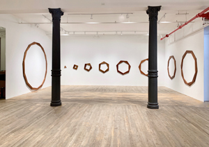 That slim circle looks a bit jagged because it is. Kirschenbaum has fit together strips of cherry wood, taking clear pleasure in their smooth surface, hard edges, rich color, varied lightness, and well-crafted joints. He was working in 1980, in his mid-fifties, when a Post-Minimalist like Martin Puryear or Roland Gebhardt worked in polished wood and Kiki Smith put her body on the line, as a self-portrait of a long-suffering humanity. "Cherry wood" in fact translates the artist's name from German, although he was born in New York and fought for his country in World War II. Still, that is as far as his confession or its irregularity will go. Both are rule based, like the chaos of a wall drawing for Sol LeWitt, but with shorter and simpler rules.
His Tribeca gallery's largest installation to date, Self-Portrait starts three walls away with an equilateral triangle small enough to hold in one's hands. Next to it hangs an ordinary square, but with space for the triangle nested within. Next to that is a pentagon with space for the square. Lather, rinse, and repeat until you get to twelve and thirteen sides, never finding their mathematical limit in a circle—and indeed a mathematician uses inscribed polygons like these to estimate pi. Which came first, the square chicken or the triangular egg? I said "starts," but you can just as well think of the thirteen pieces fitting together into one solid figure or progressively cut out. You can take equal pleasure in watching them come together across an entire room or spinning out.
Kirschenbaum took a long time getting to his portrait, but also a long time watching it spin out. Self-Portrait has its actual start two years earlier with a single drawing of nested polygons. One can relish either their regularity, meaning in math equal sides, or the arbitrary angles at which he sets one against the next. He was still obsessed with them and random processes in Accumulations, a print from 2012. Its first sheet has just one polygon, while the last has them all over the place. You can appreciate the clutter or stand back to see little more than blank pages.
He showed at some of New York's edgiest galleries, but he had little visibility at his death in 2016. He must have remained too obsessed and too minimal. Still, he has his share of complexity and contemporary materials. Two untitled works from 1996 make use of laser-cut Plexiglas. They even add color. One consists of a grid of twelve squares, each two feet on a side—in bright primary colors, complementary colors, gray, and black. Naturally the laser cuts outline regular polygons, placed at random.
On the wall to its right, dozens of solid polygons spin out in a wealth of color. This version looks even larger, less regular, and more colorful, but you will have already guessed that they are the cuts. Both versions are effectively wall drawings on white. Again, which came first? And are they analog or digital? Filling in the puzzle or the portrait is up to you.
To wander or to live
Is it painting, sculpture, installation, or architecture? Are these spaces to wander or spaces to live? I asked the first barely two years ago of Jim Osman, the second of Mateo López, who has gone on to share a gallery with Cindy Ji Hye Kim. Yet the same words could apply to both artists, and the only sensible answer is yes. Now both are back and raising the same questions. A single medium can keep on asking.
 López then had a retrospective at the Drawing Center, but his new work feels almost as compendious. It also plays up the friendliness and familiarity of his off-center Minimalism. It has a duly minimal Modular Structure, akin to those of Carl Andre and Donald Judd, but with panels of iron, powder, book binding, and empty space, like a stand-in for painting or a light box still to come. It has the spare geometry and clean surfaces of hinged plywood and stacked benches as well. It has a black hand rail of police batons just in case something or everything trips you up.
It should, for López is in the business of upsetting media. He is not so much transforming one object into another as putting both on hold. Besides, how much sense does a banister make without a stairwell, and just how comforting rather than threatening are police batons? Whose space is this anyway? He asks much the same with large painted rectangles on a side wall, playing against the unpainted remainder or facing physical partitions. He leaves it open whether he is painting with architecture or designing architecture with paint.
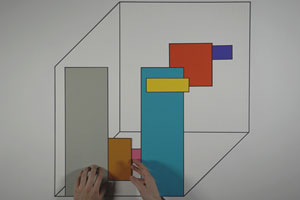
Overall, he is moving more from an interdisciplinary artist and performer to a designer and painter. In a low-tech show, the instinct appears in stop-action video, like a rapid-fire slide show. The small and already dated monitor rests on a platform close to the floor, along with half a dozen other pieces, and it might seem to encompass them all. It consists, though, of yellow modules that López arranges in succession from largely horizontal to largely vertical and back. It is the show's sole touch of bright color, and he might as well be painting on the spot. He might also be making a point of not being there at all.
Osman could almost be putting on the same show. Just past the door, he even stacks unpainted furniture. It adds up to a taller stack than the other artist's at that. It asserts that the new work will be his "Walnut Series," and it asserts, too, that it will relate to the working environment of his studio. As before, he has smaller painted constructions as well. Their parts recall dowels, but also the cones and cylinders of prewar abstraction.
In both cases, Osman is becoming less hesitant. He is also rooting his work more clearly in Modernism and everyday materials. The large work is more unified and the smaller constructions more frontal. Rather than tackle both him and López from scratch, permit me to refer you to the past reviews linked from their names just above. You can then decide whether Osman's work is still jerry-built and still framing the picture plane—and whether López is still dancing, still playing on his body, and still playing with words. Once again, in questioning the work of art, the best answer is usually yes.

Phyllida Barlow and Anna Maria Maiolino at Hauser & Wirth through December 22, 2018. Bernard Kirschenbaum ran at Postmasters through August 24, 2019, Jim Osman at Lesley Heller through February 17, and Mateo López at Casey Kaplan through February 16. Related reviews look at Osman and López, who has also gone on to share a gallery with Cindy Ji Hye Kim.
