11.18.24 — In the Shadow of Revolution

For more than fifty years, Mexican artists toiled in the shadow of revolution. So, too, does the Met with “Mexican Prints at the Vanguard,” through January 5.

The Mexican Revolution took ten long years, starting in 1910, but artists before it could see it coming in all its violence. Well after, it served as a model and a call for change. To the left, and there were many on the left, it served as a cry to support for other revolutions, in Russia and Spain. Later still, it served as a bitter memory, MutualArtas a government dedicated to remaking the country and the world gave way to yet another dictator. Could, though, the cries put Mexico at the vanguard of twentieth-century art? Perhaps, but only by remaining in the trenches.

“Mexican Prints” is thoroughly out of fashion, which is to say seriously modern. These days, a proper Mexican revolution would be a cultural revolution, with women in the vanguard, like Amalia Mesa-Bains recently at El Museo del Barrio, and Mexican tradition their passion. The Met ends in 1955 as if to avoid all that. References to Pre-Colombian art do appear in square-jawed heads, but not often, and figures costumed for a carnival come only at the end, with Carlos Mérida, as one of the few spots of color. But then Mérida also produced an abstract composition, give or take a bird. Frida Kahlo, in native costume as a woman’s act of defiance, does not appear at all.

The curator, Mark McDonald, starts in the 1700s, but not with native tradition. He looks instead to Europe, much like a past show of “Painted in Mexico.” Later, Tina Modotti will depict soldiers with a debt to Baroque paintings of a Madonna rising. In between, artists turned to the satire of Honoré Daumier. But this was always art as illustration, in service to a cause. Text can overwhelm images. Tracts and newsletters precede starker lithographs by David Alfaro Siqueiros.

Diego Rivera's Indian Warrior (courtesy of Rivera/Kahlo Trust, Smith College of Art, 1931)Of course, Siqueiros was also a muralist, and the show runs in parallel with Mexican murals. Diego Rivera, turns up a print after one of his most famous. Emiliano Zapata, the revolutionary, stands beside his horse. Rivera came to New York as well, for a show of his work at MoMA. José Clemente Orozco came as well, too, with a print of a vaudeville act in Harlem. Here or in Mexico, change was in the air.

Mexican prints first entered the museum’s collection at the instigation of a French artist, Jean Charlot, who moved to New York in 1928. He contributes a woodcut of Rich People in Hell. Others, too, adopted woodcuts for their jagged edges, with praise for Lenin and Stalin as the bombs fall. Siqueiros himself depicts a Trinity of Scoundrels. This is art and ideology in black and white. After the revolution, the new regime sponsored arts education. As that became a tool for state propaganda, Taller de Gráfica Popular (or Graphics Workshop for the People), took up the slack.

Still, something sets Mexican prints apart from Europe and America—and from their own easy answers: revolution comes at a cost, and death enters even in triumph. Zapata looks humble and heroic enough, but he stands astride a dead body. Rufino Tamayo pictures a native couple as heros, but they might be confronting hills on fire. Alfredo Zalce sees the Yucatan, a target of agrarian reform, as a paradise. Yet his figures struggle with the overgrowth.

Death enters even before the revolution. Celebrated in his time, José Guadalupe Posada continued the tradition of pages dense with text. Couples embrace, but “death is inexorable,” and wooers, bikers, and angels alike are skeletons. So is the “people’s editor.” Less well known, Emilio Amero stands apart in 1930 with a clock and telephone in Surrealism’s ghostly light. This is modernity, and art is in the vanguard, but it might end in darkness.

11.8.24 — Which Came First?

The oldest work in a show of “Chinese Painting and Calligraphy” is neither painting nor calligraphy. You might not know that, though, which only adds to its fascination at The Met.

It sure looks like calligraphy, but the characters have turned a ghostly white. Nor do they appear alongside a landscape as in so much Chinese art, although they seem to inhabit one—blending into a rocky, watery, or forested expanse. from Eastern Zhou dynasty artist's set of ten rubbings (Metropolitan Museum, 5th c. B.C.E.)It takes on the texture of landscape as well, with eerie white slabs against a grainy black. As long ago as the fifth century B.C.E., an unknown artisan carved the cryptic characters into stone before rubbing them with ink and transferring them onto paper. Long before photography, it is the ultimate paper negative. It should have you wondering at the relationship between painting and calligraphy in the centuries of art to come, through January 5.

Chinese painting and calligraphy—it must sound like the entirety of Chinese art. And the Met often rehangs its Asian wing to showcase its collection, most recently in its space for Korean art. Sometimes the rooms for China convey a theme, like “Companions in Solitude,” whereas this time they approach a comprehensive history. Far be it from me to try for one myself. Consider then an amateur’s chance impressions and a single question: what are painting and calligraphy doing together in the first place?

You may take for granted that Chinese poetry and landscape were conceived together, in contemplating art and nature. That early work, though, has no true landscape at all, and each stage in its creation ruled out the fluency and precision of a fine brush in the artist’s hand. Other works have at most a token inscription, in descending letters. The Met throws in other media as well, with enamelware, porcelain, and silver for what the painted images represent. The installation ends with three scrolls of portrait busts from the 1700s. The interplay between Asia and the West has begun in earnest, and the fluidity of ink has given way to hard outlines and firm color.

Those portraits may compile a family history or a procession of scholars, but then most Chinese art looks to its ancestors. Could a backward glance be the secret of pairing art and text as well? The show opens with exactly what you might expect—sheets of painting and calligraphy mounted together. They stake out a point of origin, a millennium ago or more, only they date from up to three hundred years apart, and dates for either one are hard to pin down. The Met calls its hanging “roughly” chronological, and you can see why. It can still display a coherent history.

Is it about shared visions or influences, and can one even tell the two apart? Often the text, clear and dark, vies with the subtlety and lightness of painting, but which came first? Calligraphy here may be a colophon (which, I fear, the Met does not trouble to translate)—not the date and place of publication as in printing practices today, but a kind of commentary, in poetry and prose. By the 1600s, though, poetry comes can take priority as well. Does that make the whole an illustrated book? If so, calligraphy is itself an art, both text and illustration.

Remember an old truth in Western literature—that the greatest of all must die, but trees live on as a glimpse of eternity? Shitao, a poet, knows that “no old tree can gain its youth again” either, and it makes him wonder why he writes. Poignant as it is, it returns to the theme of authority and ancestry. They are explicit when armies gather and palaces hold sway. They are clearer still in the 1300s, with drawings of women at court. They have hair like helmets, in parallel stokes that a greater freedom has yet to disturb.

Power may yet require accommodations (and the Met never once mentions religion). The women look after their children or stake a claim for themselves—at least one dressed as a man. Nestled trees with a crown in their branches may stand for Mongol rule or a peace surpassing it. In the fifteenth century, with Fang Congyi and others, authority must take a back seat to a softer handling, a mistier landscape, and a “beneficent rain.” A scroll’s long format from Zhang Yucai makes that rain all the more encompassing. Ancestry is everything, but there is no looking back.

Calligraphy, too, takes on a life of its own—bold to the point of ink blots, although never again the spatters of that ancient rubbing on stone drums. You can almost imagine a history akin to that of European art, from the certainties of the Middle Ages to the artistic personalities of the Renaissance. The Baroque, in this history, would take one last step, at risk of losing art’s hand-won playfulness and atmosphere. Simplistic? Sure, and I cannot claim the expertise to say more. Still, it undermines the settled truths of a single, shared role and loving collaboration for calligraphy and painting.

Read more, now in a feature-length article on this site.
11.1.24 — An Ode Without an Urn

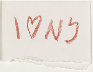
Forget John Keats, at least for a moment. Spare yourself a recital of “Ode on a Grecian Urn.” The Met looks back far earlier, to the origins of Western civilization in Cycladic art. As far as I know, all its creators were men, and their subjects were female, but this is not the male point of view that you may expect from Greek art. There are no warriors or their rewards, no earthly or unearthly grace. Cycladic female figure (Metropolitan Museum, c. 2400–2200 B.C.E.)There is only the wish to journey together, to trade, and to survive.

Before a Grecian urn, hundreds or even thousands of years before, there was art, but not exactly Greek art. Before the great cities of Greek tragedies and Homeric myths, before there was much so much as a written language to describe them, culture flourished in a broad cluster of islands in the Aegean Sea, about midway between the mainland to the west and present-day Turkey. It had to be seagoing, for its livelihood, and it had to have a tough existence. Much of its art was created to bury with someone’s remains. Now the Met does its best to bring Cycladic art back to life, but it, too, has to move on fast. It has to cover twenty-five hundred years and four civilizations.

The Met announced new galleries for Cycladic art, opening January 25, but did not make a fuss over the matter. There are no signs directing visitors to them, although there is more than enough verbiage inside. In practice, they come down to a single room in the galleries for Greek art, although with space for more than a hundred fifty works. You may rush right past on your way between the museum’s great hall and its southern wing. Two works appear just outside, maybe just enough to arouse your curiosity. How can they look so unlike a hero, a helmet, or a Grecian urn?

Whatever it is, it has its own appeal quite apart from its history. The standing nudes by the entrance, with no need for a pedestal, look downright modern. They influenced Constantin Brancusi, Alberto Giacometti, and Amedeo Modigliani, who felt a kinship with their very simplicity—their gentle curves, frontal poses, and approach to abstraction. One might mistake their pure white marble, abundant in the region, for limestone. Smaller figures within the galleries, almost like dolls, take the shape of violins, although violins did not yet exist either. Pablo Picasso and Cubism, with all their instruments and music, would have approved.

The Met has rehung it all to acknowledge Leonard N. Stern, the collector who contributed it—and to acknowledge a settlement reached with Greece, which will own the work but leave it on loan to New York. It is also a boast and a correction. Just when Mesopotamian women were giving voice to the early Bronze age, others were active, too, and I work this together with my earlier report on just that as a longer review and my latest upload. I did not know much about the civilizations or the art, although I can take comfort that, when it comes down to it, no one else does either. Written records did not exist, and technical analysis of old marble cannot deliver authenticity or anywhere exact dates. Paint would have covered its seeming brightness, and chemical analysis can identify the pigments, in more colors than a Grecian urn.

The time line is at least as fascinating as the work. It begins before 3000 B.C.E., about as old a look at human creation as there is. It is not yet the Iron Age, so the carving of marble (with glass, the surfaces refined with emery and pumice) is quite a feat. The carvings have almost childlike features, with a recurring motif of crossed arms, and jugs have distinguishing collars and handles, but their purpose is less clear. The figures are women, suggesting hopes for fertility for a people that knew endless deaths. Yet they are barely female—their hips and breasts as flat as, well, a violin.

The room turns to the Minoan civilization in Crete, after roughly 2000 B.C.E., and then to Myceneans on the mainland, after 1000 B.C.E.. More familiar Greek art, with kraters, or (sure enough) vases in red against black or vice versa, did not begin until around 700 B.C.E., and the Green alphabet emerged not long before. Minoan and Mycenean culture also runs to more useful and decorative art, like pins for clothing and seals, with real or imagined animals. The Greeks changed everything with their focus on youths and men, as warriors and most often in groups, in procession. Their patterns are less bold and their figures more sketchy than Cycladic art, and they cannot honor the dead one by one, but they could be more broadly imagined as ancestors. What to make of the new masculine values, even in light of Homer, is a fascinating question in itself.

Read more, now in a feature-length article on this site.
10.14.24 — Points of Departure

Korean art has a place of honor in any museum’s Asian wing, but it may still struggle to free itself from the intoxicating presence of China and Japan. What can match their legacy in ceramics and ink—or in portraiture and landscape?

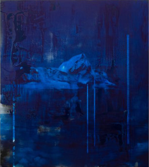
What can match their art’s restless hands and sensation of contemplation and rest? Would it help to include recent art, as a point of departure into the past? The Met does just that in its Korean gallery, as “Lineages,” through October 20. The result, though, says more about the present than its ancestry. It also confirms a disturbing trend in museums today. Byrom Kim's Sunday Painting, 01/19/14 (James Cohan gallery, 2014)I also work this together with a recent report on Korean art at the Guggenheim as a longer review and my latest upload.

More, and more, museums of art history consider themselves homes to modern and contemporary art as well—and it can cost them, as the Met learned in leasing the Met Breuer. One can see the appeal. Collectors must like a confirmation of their tastes, and that can translate into donations and gifts. The public may like a change from that boring old stuff others call art, and that, a museum hopes, can translate into attendance. Still, it takes money, too, and it can positively detract from older art. The Met’s modest Korean gallery has room for just thirty-two works, and now half are contemporary.

Who knew that Korean and Korean American art so much as had a deep past? Such luminaries as Lee Ufan and Byron Kim have a more obvious debt to Minimalism. (Hmm, maybe artists do not have to be “original” after all in order to stand out, now or long ago. They need only be aware of their world.) The Guggenheim situates Korea of the 1970s in a drive toward youth and experiment. At the Met, Nam June Paik proclaims that Life Has No Rewind Button, and a pioneer of video art should know.

Yet they do have a past, more than you ever knew. Ufan’s abstraction appears right after Bamboo in the Wind by Yi Jeong from more than seven hundred years ago and Blood Bamboo by Yang Gi-hun in 1906. Their vertically descending stains become his descending blues. It is From Line at that, surely a call-out to those who have worked in ink. And then come ink and gouache on paper strips by Kwon Young-woo in 1984 and a wild web of ink lines by Suh Se Ok in 1988.

Kim, in turn, has two monochrome panels in deep green, as abstract as one can get. Yet its glazes echo the materials that convert white porcelain into the paler green of celadon. Older Korean art perfected both. Their polish contrasts with the endless invention of Japanese ceramics, on view out in a corridor overlooking the Met’s great hall. I have my doubts about Kim, but other contemporaries have been eyeing the serenity and symmetry of older “moon jars” for sure. Seung-taek Lee makes his own in 1979, with the illusion of a bit of rope on top to tie it up, while Kim Whanki paints one as far back as 1954, in yellow on a red pedestal against soft green.

Of course, a jar may be the subject of still-life or a thing in itself, and the Met dedicates the gallery’s four walls to line, persons, places, and things. (Well, that should cover it.) It sounds innocuous enough, although line can become landscape, and landscape can take one to freely imagined places. Park Soo-keun in 1962 lingers over women beneath a tree, in textured oil, at once people and places. The most prominent person, a woman scientist from Lee Yootae in 1944, owes more to mid-century realism and a growing appreciation for professional women than to tradition. And sure, jars become things, at the center of the room, with two by Lee Bul in 2000 as the foot and pelvis of a cyborg.

One can still value a golden age that lasted nearly a millennium, until Europe sailed right in. Indeed, one had better. Where Chinese art once admired those who gave up power to stand outside of place and time, Kim Hong-joo in 1993 creates a layered, divided landscape, which the Met sees as commentary on a divided Korean peninsula. I prefer to think that Hong-joo got it right, but the Met still gets it wrong. Does my resistance to the contemporary make more sense in Asian art, which so often provided a greater tranquility? I just hate to see the past crowded out and forgotten.

Read more, now in a feature-length article on this site.

8.6.24 — A Child Is Born

A child was born in Gaza after her mother’s death, to an uncertain fate. Soon she, too, lay dead, I read in The New York Times, but what if she had lived, and what is it like to be a child in time of war?

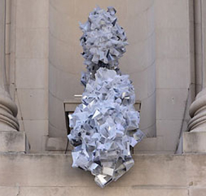
To pick up from last time on New York summer sculpture, the question has become a staple of wartime journalism, with good reason. Articles like this one are crowd-pleasers—poignant, humane, hopeful, a bit of a cliché, and all too close at hand. So, too, is what I came to see, sculpture on the Met roof by Petrit Halilaj through October 27. He treats casualties of war not as numbers, but as budding lives and artists themselves.

Halilaj pictures not them but what they see, and he should know. Born in Kosovo in 1986, he was just five when a decade of Balkan wars began. He spent a year in Kukes II, a refugee camp in Albania, and an inscription along the base of one large work reads Return to Kukes. It is, though, the outlines of his remembered home, now destroyed. Sculpture since David Smith, Alexander Calder, and Gego has often boasted of “drawing in space.” And here a child’s drawing translates easily into slim, jagged lines of bronze and steel.

Halilaj, now based in Berlin, calls the show his Abetare, after an alphabet primer in Albania. On one trip home, he visited a museum of ethnology (a former museum of natural history) that had salvaged classroom desks from the Balkans, and he takes his imagery from what children had drawn or carved there, as children will. This is not just his home, but also theirs. Nor is it just his spider in a second sculpture, with the nasty smirk of a knowing child. Its shadows cling to the Met roof like graffiti, and so do smaller works, like one reading HERE. And here we are.

Other pieces include Batman (alas, not Spiderman), a proclamation that 2 + 2 = 5, a large flower, and a star, in what aspires to a child’s whole universe, but this is not just for children. Batman hangs upside-down like an actual bat, the math could be an act of rebellion or a refugee’s loss of years of school, the house looks near to collapse, and the giant spider owes a debt to Louise Bourgeois. (Her spider in Dia:Beacon was long my laptop’s lock screen.) Nor is the roof altogether suitable for children—not when it serves as a bar during summer. Art in past summers has been more site-specific, like table settings by Adrian Villar Rojas or a curved wall by Héctor Zamora, but Halilaj uses every inch he can. Two pigeons on the roof of the roof might have flown in from Central Park.

It pays to look up, all the more so because the Met has raised hedges atop the roof’s low walls. They add to the summer’s greenery and, just perhaps, public safety, but hide the view. And Halilaj is, at heart, always looking up. An angel poses on his spider, as if looking over its shoulder, and the pigeons could doves of peace. An eye could be a child’s or the ancient Egyptian symbol of prosperity and protection. The tilted house will survive as a work of art.

Still not quite ready to enter Central Park? A bright pink-purple missile defends the park entrance by the Plaza Hotel, as Parabolic Light. Fred Eversley through August 25 stands with the California “Light and Space” artists of the 1960s, like Larry Bell and Doug Wheeler, although he owes his translucent materials to more high-tech materials. Just hope he does not start a world war over who will inherit Minimalism. If he does, I am rooting for the spider. I am also set to leave Manhattan altogether in search of art, and I continue next time with Huma Bhabha in Brooklyn Bridge Park.

Read more, now in a feature-length article on this site.
7.12.24 — A Renaissance Finds Its Art

“Lift every voice and sing, / Till earth and heaven ring.” For two splendid decades after World War I, with Jim Crow still a vivid memory, there was a place for African Americans to believe in “a song of hope.”

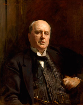
What was the Harlem Renaissance, and where would a Renaissance be without painting? It must sound obvious, but even now people argue over the period’s legacy and its substance. With “The Harlem Renaissance and Transatlantic Modernism,” through July 28, not every voice is singing. Politics is largely absent, and jazz itself is all but silent. Modernism seems curiously far away. Winold Reiss's Langston Hughes (National Portrait Gallery, c. 1925)Yet the Met makes an overdue case for its art—and it is the subject of a much longer and fuller review as my latest upload.

You may think of the Harlem Renaissance as above all a literary movement, with Zora Neale Hurston and Jean Toomer in fiction, Countee Cullen in poetry, and Langston Hughes towering over both forms of expression. James Weldon Johnson, at the head of the NAACP, wrote of a “flowering of Negro literature.” You may think of it as a flourishing of theater, dance, and music, with such jazz greats as Duke Ellington, Fats Waller, Fletcher Henderson, and Bessie Smith—and Johnson himself composed hymns, including what some have called the black national anthem, “Lift Every Voice and Sing.” Or you may think of it as a broader intellectual achievement. It stands as a rebirth for black culture itself. Hubert Harrison spoke of the “New Negro” as early as 1917, and Alain Locke took that for the title of an anthology of fiction, poetry, and essays in 1925.

It was surely a rebirth for Harlem, neither the first nor the last. Harlem had served Dutch farmers and then city dwellers, as the first elevated trains headed uptown and a wave of European immigrants, many of them Jewish, sought affordable housing. Things changed once again in the twentieth century, as the Afro-Caribbean diaspora reached New York along with the Great Migration from the rural, racially oppressive South. Jazz came north from New Orleans with it, Louis Armstrong included, to found the swing era. The Apollo Theater had opened in 1914—improbably enough, for burlesque shows aimed at whites. It became the fabled venue for blacks only some twenty years later, thanks to a new Jewish owner.

The Met boasts right off of literary and cultural ferment. It opens with portraits of Locke and Hughes by Winold Reiss, Hurston by Aaron Douglas, and Johnson by Laura Wheeler Waring. Reiss, a German who found the rest of New York boring, brings his wiry black outlines broken only by the meticulous realism of his faces, suiting Locke’s hauteur and intellect. The pale patterned backdrop to Hughes hints at a ferment within painting itself, in early modern art. Douglas and Waring stick more closely to realism to flatter their subjects and their dignity. Then come portraits and street scenes, where ordinary men and women get to dress up, too.

The curator, Denise Murrell, is introducing not just a culture. She is assembling the artists who will render it. All three from that first room will turn up often, as will Archibald Motley and William H. Johnson. Motley brings the intensity of artificial light to equally unsettling narratives. Johnson has the brighter colors, flatter renderings, and impasto of folk art. Together, they set out the possibilities that other artists will explore, in a show of one hundred sixty works.

The show’s greatest pleasure is that it need not answer the charge. It can only keep looking for more. Sure, here Harlem itself lacks specifics, if not fashion sense. Yet a final room, easy enough to miss on the way out, does take to the street, for the eighteen feet of The Block, from 1971. Romare Bearden, then in his sixties, had been around the block, “Harlem on My Mind” was two years gone, and the Harlem Renaissance was history. The mural’s triumph may drive home the movement’s limits—or its importance for the future.

Read more, now in a feature-length article on this site.

Older Posts »