Is It Post-Minimalism Yet?
John Haberin New York City
Richard Artschwager and Wade Guyton
Richard Artschwager was ahead of his time. In 1964 he painted the Whitney Museum on Madison Avenue, with the documentary precision of black and white. It was, for the record, a cloudy day.
Only one thing: the building dates from 1966. Artschwager painted it (from a rendering in the papers) with his characteristic detachment, in acrylic on Celotex, the fiberboard then used as ceiling tile or insulation. It functions as a kind of signature for an artist who does everything he can to refuse such ideals as expression, originality, or a signature. Its coarse surface announces anything but the immediacy of a photograph, and he painted after an image of the future in The Times. With his icy mix of photorealism, Pop Art, conceptual art, and industrial materials, Artschwager was making Post-Minimalism from the very start of Minimalism. 
His running at the Whitney a floor above Wade Guyton, a much younger artist who has earned much the same label, makes him more forward-looking still. Did it also make Artschwager contemporary, at age eighty-eight, until his death so soon after the show has closed? He never quite goes out of museum fashion, while always standing a bit outside his time. His retrospective (his second now, after twenty-five years) makes for a solid and discomforting exhibition. As for Guyton, he may sound nothing like an heir to Minimalism. Yet he, too, depends on Minimalism's geometries and warehoused materials.
The invisible exclamation
The Whitney can hardly resist opening with its own idealized portrait, understandably so. It is already looking back, on its way to abandoning the Marcel Breuer landmark for the Meatpacking District. Actually, Artschwager is there, too. He has stuck nine of his black blps, or lozenge-shaped marks (blps, pronounced "blips," to you), along the length of the High Line—starting on the Whitney's future home. They approach invisibility, even with a map, as I can attest from bitter experience. I bet the artist would consider that a compliment.
He is also looking backward, for he assembled his repertoire in six productive years, starting in 1962 and including two works in the groundbreaking show "Primary Structures" at the Jewish Museum. The Whitney includes the paintings, in all their studious objectivity. If they seem wrenched from some forgotten Cold War or corporate headline, they probably were. It includes the blps and exclamation points, both with their three-dimensional counterparts in formica or rubberized horsehair. Not many artists seem less likely to raise their voice, but an exclamation point also enters the retrospective's title, "Artschwager!" It is all over but the shouting.
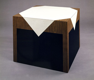
Those years include further lamination on wood, for thoroughly nonfunctional and not at all abstract geometry. No one will ever touch the stops of his organ, set their feet under his table, or turn the pages of his imposing book. Nor can one deny their formal symmetry. No one can, for they are solid blocks, and no one would dare. More rubber bristles line the few objects that do have recesses, like an otherwise empty drawer. Art here, they seem to say, is in short supply.
The repertoire runs quite the gamut, in a decade known more for its unrelenting logic. Just say the name Frank Stella, Sol LeWitt, Josef Albers, Dan Flavin, or Carl Andre, and you know what you were getting back then. Still, Artschwager's choices hardly lack for determination, like the roughness of Celotex. They also lend themselves naturally to hybrids, as with the bristly furniture. One of the first paintings, a triptych, is actually formica—and metal frames adds their blunt texture to Celotex. The bottom of a drawer could equally be hair, glass, a mirror, or empty space.
These are hard objects—at a time when the call for "art as objecthood," out of Clement Greenberg, was giving way to Minimalism's theater. Artschwager does not often let one look away to rethink the surrounding space, not even when a blp lands on a window. He keeps his distance, and the viewer must as well. No wonder he makes art in an actual park, the High Line, so hard to find. Still, he chooses work laden with sounds and presences, as with musical instruments. A painted geometry looks like a graveyard but represents an amplifier.
No wonder, too, that he finds realism attractive, for it insists on a world one thinks one knows. It is a world claiming absolute authority, like the open book merged with its pedestal after a huge Bible or Koran. It is also a world in the process of self-destruction, as with a Train Wreck from 1968 or a whole series on high-rise demolition, from the early 1970s. Somehow, he seems to say, the two go together, the authority and the destruction. A painting from 1964, New Housing, recalls when Robert Moses left his stamp on New York City with them both. Urban architecture and political architecture have been responding ever since.
Post-everything
If Artschwager stood outside his time, even compared to the more biomorphic Post-Minimalism in Eva Hesse, Lygia Clark, or Lee Bontecou, he was not only looking forward. He came late and with a history. He had his first solo show at age forty-two, at Leo Castelli in 1965. Born in the nation's capital, he moved west as a child, to New Mexico, with the urban easterner's way of seeing isolation and exile in the open spaces rather than freedom. It shows in a watercolor from 1958 and his very first work on Celotex, desert landscapes from 1962. He painted Pastorals again in the late 1990s, along with potatoes, but they look like testimony from the Holocaust.
He was old enough to have fought in World War II, and he took up art after studying science. His father was an agricultural scientist, background that may enter both his sculpted lab shelving and his near clinical detachment. He made furniture for money, presumably working furniture, and photographed babies. Another early Celotex shows one smiling, and it is not heart-warming. One can look for parallels in Andy Warhol, another artist with a commercial background. Warhol's version of pop culture, too, has a decidedly morbid side.
He sketches Saint Paul on the Road to Damascus in 1960, but his Damascus moment came the next year, with blond scrap wood held together by screws and suspended from the ceiling. It does not look like much, and it does not have the shapes or subjects of sculpture to come. Still, it told him to stop searching for the ideals of others. Maybe it told him, too, to look back at the craft he had already been practicing, to do better. The whole idea of the readymade seems foreign to him. He would rather paint over or laminate it.
He approaches politics with the same lack of rush to judgment. A self-portrait hangs alongside George W. Bush and Osama bin Laden, and they look ingratiating by comparison. He paints the U.S. embassy in Moscow as Building Riddled with Listening Devices, but a year after the fall of the Berlin Wall. A 1968 portrait of Holly Solomon, the dealer, is so lovely as for once to approach sentiment. He also takes a break from devastation in the early 1970s for posh interiors, in perspective, with fine art. They lack the anger of "institutional critique" of museums and collectors, but they also lack people.
He proposes a Brutalist public monument in 1978, on the scale of a plaza, surely knowing that Hamburg would never build it. Still, Artschwager can almost get to like success. Sculpture from the 1990s resembles shipping crates more than furniture, more barren but also less confrontational. With Celotex out of business in 2003, he looks for texture not to industry but to fine paper. Paintings from the last ten years reprise old themes in color. He adapts a family interior after Edouard Vuillard, and one hardly knows whose memories he is exploring. He adopts the windows of the Whitney and the High Line.
Still, the intensity has dropped sharply in forty years, and not much else has happened. What, then, of the paintings and furniture of the 1960s, in all their ghostly outlines, rigid triangles, and felt confrontation? Were they innovative or just apart? The question seems only right for a time so post-everything, and so does his retrospective. Curated by Jennifer Gross of the Yale University Art Gallery, it allows one to see the quirks and obsessions behind the detachment and destruction. It seems only right, too, that he lost Celotex because lawsuits over asbestos helped drive it to bankruptcy.
X marks the spot
"I never really enjoyed drawing or art classes. I would prefer to sit in front of the TV or play video games." Wade Guyton was talking about a childhood in small-town Tennessee, but he was surely establishing his credentials for New York now. That is, after all, what hip young artists do—meaning prefer pop culture to fine art and video games to standing for hours working. The Whitney calls its midcareer survey "Wade Guyton OS," as if he were competing with OS X Snow Leopard or Mountain Lion—and the dominant motif is an X. Guyton sets it there with a printer.
All the same it is art, and he knows it—and that, too, is part of his credentials. (He spoke, Carol Vogel wrote for The Times, "unapologetically.") He first marked the spot by hand, in 2002, in felt tip over book pages—and much of his output since amounts to book pages fed through an ordinary inkjet printer, cataloguing such influences as Joseph Beuys, Martin Kippenberger, Kenneth Noland, and Mies van der Rohe. Together, they operate between painting, conceptual art, and design, and so does he. The show's largest works consist of red and green stripes, akin at once to Noland and Christmas wrapping paper. They are also brand new and site specific, framing the trapezoidal depth of a Marcel Breuer window.
 The scattered geometry of X's releases something of his aspirations to art and culture. So does being able by now to afford a colossal printer through which he can feed linen. The letters soon grow, closer both to product logos and to abstraction, even as he is determined to put the Post in Post-Minimalism. Already the simple design elements suggest Richard Tuttle, but now Guyton nurses them as painting. He folds the linen in half before feeding it through twice, allowing seams and misalignments. He accepts the printer's traces as smears, but they also reflect an artist's pride in gesture.
In 2008 he covers a still-visible black letter entirely in black, give or take the marks of color registration, and a kind of brooding Minimalism is complete. More recent work nurtures gradations. The book pages from a decade ago survive, but transplanted to almost an entire floor of display cabinets—the last empty except for the display base in blue paper. A few other clippings rest on the cross of a stretcher, including one of a Frank Stella Protractor. Guyton pays tribute to Modernism as pop culture in his collaborations with Kelley Walker, with entire stacks of abstraction, somewhere between studio, storage, and furniture. Alone, he seems that much more in love with his place in modern art.
The Whitney sticks to his solo act, rather than include Guyton/Walker and their coconut lamps, which may explain why so much dates from just 2006 and 2007. Born in 1972, Guyton comes to New York as an urban scavenger—inverting a wood pile found on the street and converting exhibition announcements into brushy or mildly explosive digital compositions. He appears among emerging artists at PS1 in 2005, smashing a found Mies tube chair into elegant twists. He exhibits five such chairs in 2007, bought on eBay but intact and each a different color, as Untitled Action Sculpture—and so much for the action. Maybe the most impressive work, also from that year, could pass for industrial chairs, too, and I only wish that one could sit, just as I wish that I could get my feet under Artschwager's table. They also bring in a second letter, U, the same letter that stands against images of fire from the year before.
They are colorful images, with a photographic clarity out of Gerhard Richter and Richter's late work. A long row of that letter, in mirrored stainless steel, could pass for a single sculpture—and an impressive one. Each has its own dimensions, although I wonder how they will hold up something more than chic collectibles. I wonder that about the whole show, caught up in hipster and fine art credentials, while coming to a screeching halt five years before its ending. U's could refer to YOU and to US, but Guyton's strength is not depth of allusion. For now, it is his operating system, and complex programs in art are just not going to run.

Richard Artschwager ran at The Whitney Museum of American Art through February 3, 2013, "Wade Guyton OS" through January 13. Artschwager died only six days after his retrospective came to an end. A related review takes up Richard Artschwager in landscape.


