Photography in Orbit
John Haberin New York City
Thomas Ruff, Darren Almond, and Letha Wilson
Photography has finally outgrown smartphones. With Thomas Ruff, even Mars looks small by comparison.
Make that ma.r.s., short for NASA's Mars Reconnaissance Survey—and the source of high-res images for some equally high-tech photo-manipulation. The planet's surface looks dizzying enough on its own, thank you, but Ruff overprints it in two colors. Put on the cheap 3D glasses, the kind with red and green lenses, and you can imagine walking right into its craters. Unlike the prints and the gallery, they barely contain you. A second series runs taller still. At just under eight feet, the swirling abstractions have lost any hint of their origins as photograms, beyond their ghostly contrast between black and white. 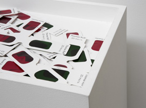
They also typify a serious strain in photography. Make that all too serious, with large prints and global aspirations, much like the commercial pressure toward oversized installations. I recommend checking out Darren Almond on a busy day. He may not literally take your breath away, but he may well leave you wondering about the status of life on earth. Yet the impulse to manipulate space and time can still keep one guessing, maybe especially when a photographer has the sense to return to native ground. Meanwhile Letha Wilson creates her own ruined landscapes as a geologic map of America, on a more intimate scale, after photographing grander ones.
The big picture
With Thomas Ruff, you may feel manipulated, because you are. From only a few feet away, his Mars looks all but flat. Yet to experience a crater's actual size, one would have to step back. And photograms, by definition, are the direct imprint of objects, on a photosensitive surface exposed to light. Whatever happens on this scale to the thing itself, from Man Ray to E. E. Smith—or its ghostly forgetting? Is it worth the artist's grand gesture, all to bring photography closer to László Moholy-Nagy at the Bauhaus, the origins of abstraction, and fine art?
Not that photography was waiting till now to think big. Ruff turned monumental twenty-five years ago, with faces too cropped to count as portraits rather than presences. Thomas Struth captures museum interiors at nearly life size, to put the institution and viewer alike on the spot, while Thomas Demand projects his paper models on much the same scale. (What is it with these Germans named Thomas?) Even Richard Misrach has felt the temptation to print his American landscapes larger than before, including his new beach pictures, like an overworked artist's summer vacation. Grandeur has become the norm in other ways as well, as with displays in series for Bernd and Hilla Becher.
It can mean a grander time scale as well, as with the camera obscura for Vera Lutter—or with long exposures and seven continents for Darren Almond. Thierry Cohen, for another, photographs familiar skylines under glittering skies, but the skylines are dark, doctored to dim their artificial lights. He shot the stars from a different location, halfway around the world, then merged them with the city, as if nature had taken its revenge. (Cohen shares a gallery with Lloyd Ziff's photographs of Robert Mapplethorpe and Patti Smith from 1968 and 1969, and that means in retrospect competing with the best of them, but they will never, ever look so innocent again.) Does it matter that Cohen's stars would in fact have shown above the city at just the right time? Maybe not, any more than it matters just what Ruff used for his photograms, for photography is thinking big.
But why? One answer is simply the technology that makes this resolution possible, and I do not mean the iPhone. (See, the devil made me do it—or at least made me buy larger inkjet printers.) Painting since Abstract Expressionism, Gerhard Richter, and Richter's late work has supplied models as well, as have Minimalism's theater and Postmodernism's assault on the natural. Ruff, Demand, Cohen, and Jeff Wall are all staging rather than documenting the world before them. Without the glasses, Ruff's colored streaks look downright painterly.
Photography always had aspirations. "Faking It" at the Met went back before Photoshop, including the "leap into the void" from Yves Klein that erased his safety net. "Photography and the American Civil War" shows the medium reaching for an impact from the very start, with stereo views of the dead. That does not even count conventions borrowed from painting, such as posing soldiers with their weapons. Later, Alfred Stieglitz was at the center of American Modernism, and he was never just taking pictures. With another recent trend, keeping Polaroids alive, photographers may seem nostalgic for simpler times—but the slow pace of "instant photography" rebels against snapshots in its own way.
Do monumental prints, then, merely update past excesses for big markets? Maybe, but money changes everything. If you think of Ruff as lobby art, you will not be surprised to find his Mars in the lobby for Gagosian up on Madison Avenue. It you think of him instead as shooting holes in convention, transforming Modernism into manipulation, you can relish the beauty and the transformation. Then again, if you worry that collectors now take pride in seeing through conventions, too, who am I to argue? Sometimes the most vivid pictures are shallower than they appear.
A trip to earth
Darren Almond is in a position to know about life on earth. The British photographer manages to cover all seven continents, from polar ice under an icy-white sky to tropical waters bathed in light. One can cross the planet just by turning one's head. Judging by the distances and the dates, he must have moved fast, but he sure took his time along the way. He often worked by moonlight, the exposures taking up to an hour. Another photo shows the traces of planets or stars, in broken but still perfect circles in the sky.
They are breathtaking enough—and not only because of scale, although the show has room for only sixteen. (Hey, there are plenty bigger out there these days, when art in search of sales is so often out to impress.) They are also very much composed. One sees the drama of a waterfall from behind a black outcropping and a long horizontal of jagged cliffs from the air. A bright river rises up past bare branches and its own shallow eddies, before disappearing behind trees beneath distant mountains. Woods make their dark cross like a scar on a verdant plain.
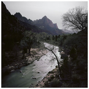 In each case, the foreground invites one in while keeping one out. The cliffs could be a flyover with nowhere to land, the bright river the start of a journey in some epic trilogy yet to be filmed. Almond's forbidding point of view no doubt helps determine the size of the prints: anything smaller would make contemplating danger easy—and anything larger would immerse one in the landscapes, as in Chernobyl for Diana Thater. Almond's own video installation two years back purported to describe a monk's "walking meditation," but there is no easy walking or meditating here.
One cannot even find one's way around—not unlike his ghostly figure on multiple screens in 2010, stumbling forward with a lantern or the woods. The new pictures are not arranged geographically, like a National Geographic special or guided tour, and their titles, although specific when it comes to place and time, do not bother to name the continent or nation. The tropics and star trails are in Hawaii, the waterfall in Iceland, the river in Colorado, and the grass in New Zealand, but I know only because I have access to the Web. No human beings are visible to call any of them their home. The dislocation extends to time as well as space, but then time is space when one can simply turn one's head. The long exposures give the appearance of broad daylight under a full moon.
The exposures also make photography a science experiment, much as it was in its origins—not excluding an experiment on the gallery-goer. An exotic device, on display along with the prints, is said to measure electromagnetic radiation. Its foil sheets and glass jar could come right out of an antique laboratory. The whole show resembles a research report by extraterrestrials on their first visit to planet earth. Conversely, if the places look utterly uninhabited (or downright uninhabitable), one could oneself be approaching a distant planet. I told you right off that breathing might be difficult.
If it sounds more than a little pretentious, it is. It is also representative of the latest twists and turns in the notion of the sublime. These visions are not mutually exclusive, just as Abstract Expressionism helped to create fresh interest in the Hudson River School, but they are distinct all the same. A spiritual and esthetic ideal in its origins, the sublime took on a sense of nation building in nineteenth-century America, of self-making in the time of Jackson Pollock, of ego-tripping for Matthew Barney, and now a kind of ego-undoing in the hands of an upmarket gallery and an inward-looking photographer. Where painters like Asher Durand or F. E. Church set their scale in contrast to mere humans, Almond excludes people—and where they poised on the edge of a continent, he crosses all the continents on the way to another world. Get out your spacesuit for a trip to earth.
Cementing America
Letha Wilson reaches some impressive heights, too, and why not? She did, after all, shape them herself, from plywood, museum board, and cement. Well, maybe not entirely, for each work entails actual photography, from a mythic American landscape. Wilson like Sam Falls looks up close at rock faces and vegetation, from New England to the country of sagebrush and salt flats. She pulls back, too, for horizontal clouds above a slowly rising horizon. And then she adds her own.
The photograph comes first, at a gallery known for the medium, and nothing succumbs to the trend for the oversized and overstated. At its simplest, a storm cloud folds up like a fan, as it to promise relief from drier weather. More often, paper provided a mold, with photography later laid over or peeking through. Two mountains appear through neat circular holes in an apparent rock face, which owes its variations to four colors of poured concrete. Nothing at all appears where a smooth diagonal of wood once crossed another mold, but C prints layer the irregular surface without creasing. The fictive landscape might have evolved in geologic time.
Titles like Photogram New York (Colorado) or Salt Flats Cement Dip instantly announce a hybrid. Copper Pink Sand Dunes does so more subtly, since the copper pink refers to a sharp dab of paint. Yet the titles also imply displacement—a work not entirely at home outdoors or in. It says something that one has cliffs up close and peaks at a distance, but nothing in between. Displacement may simply go with the territory for the Badlands of outlaws. Here, though, an artist had to create it. 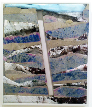
For an American, not to mention an American artist, there is always something defining about the great outdoors. There is also something hard to live up to. This is, after all, the Maine of Winslow Homer and his American stories and the west of the Hudson River School—where even a cement dip shares takes on the translucency of light and sky. Photograms, here too pierced by flaps and photos, recall Surrealism. The media also draw on both collage and Minimalism, like a slim column with the Grand Tetons sticking out from either side. The photos take on the physical heft of what they represent.
At least one can imagine that they do, while stepping up to inspect the damage. Wilson echoes a common theme in politics and photography, much as when Misrach encountered lunch tables on salt flats: disturbance of the land colors American, environmental, or human history—and a contested history at that. Wilson's hybrids also suggest how, for many, the very idea of nature is always a human construction. A few years back in Socrates Sculpture Park, she built on Minimalism's geometry to stage the ideal of a community garden. Now the image itself stakes out a physical terrain, as another successor to the machine in the garden.
The environment sure looks more natural than in the gallery's previous show. It also looks far more human. Lynne Cohen photographed offices and community centers, from 1971 to 1988, finding but with no hint of employment or community. She found walls lined with birds, clouds, and moose heads, but they chased out the people long ago. More often than not, even during a war game (Play at Your Own . . .), one can hardly put one's finger on just what is out of place. Maybe that is because, for once, it is the world one knows all too well.

Thomas Ruff ran at David Zwirner through April 27, 2013, Richard Misrach's "On the Beach, 2.0" at Pace through June 29, Thierry Cohen and Lloyd Ziff at Danziger through May 4, "Faking It" at The Metropolitan Museum of Art through January 27, "Photography and the American Civil War" at the Met through September 2, and Darren Almond at Matthew Marks through April 21. (Almond's earlier video ran through June 26, 2010.) Letha Wilson ran at Higher Pictures through January 26, 2013, Lynne Cohen through December 8, 2012.
