6.10.24 — Promoting Promotion
Where was my ad blocker when I could use it? Where was it, say, in 1844? That was when Henry Fox Talbot photographed fine glassware by any standards, but just what was he advertising? His print is not saying, and neither is the Met. It is nonetheless “The Real Thing,” opening a show of that name of product photography, through August 4. It sums up changes in how photography saw itself as well as things—and how advertising emerged as a product, too. 
Talbot could hardly count as advertising, when the very idea was hard to conceive. Photography took too much care and attention for that, and publications able to handle it did not exist. Besides, the medium had other purposes—as staged dramas, portraits, or experiments. Fragments of bishop’s miters were surely not for sale, although the anonymous photograph might have been. Is the Met, then, cheating or seeking a broader context in history? The show’s subtitle speaks of “Unpackaging Product Photography,” but where is product photography without the package?
Art has long had a love-hate relationship with photography—and photos with packaging. Each year the AIPAD photography fair bends over backward to look like art, while the Jewish Museum has exhibited magazine photography and the International Center of Photography a provocative fashion photographer who died of AIDS. Then, too, art has always promoted images, going back to Renaissance princes, pharaohs, and kings. And the Met explains its earliest photos as promoting the medium. In truth, it is also looking for an excuse to display its collection and gifts from the Ford Motor Company. It proceeds modestly, though, with a small show.
Advertising in the modern sense emerged with the twentieth century, awkwardly at first but reluctant to give up claims to modern art. A sample from around 1913 features (seriously) the National Blank Book. Reproducibility became more than half the point, with golf balls, drill bits, and soaps. It was not, though, the only point, and Stella F. Simon leans on a violin’s elegance around 1930 to compose a picture. Many identified themselves with a movement, like Piet Zwart with De Stijl in the Netherlands and many more with Surrealism—were advertising not surreal enough in itself. André Kertész doubles a fork and redoubles it with its shadow.
Grete Stern and Ellen Auerbach as Ringl + Pitt could embrace advertising while mocking it. Others had fewer doubts. August Sander photographs for once not a German worker, but what a worker might produce—light bulbs spiraling into darkness and depth. James Van Der Zee sets his eye this time out not on salons, town cars, and the Harlem Renaissance, but on a wig. Is it product photography, a preparatory study, or merely a discard? The wig rests off to the side against a black background, looking as small as can ever be.
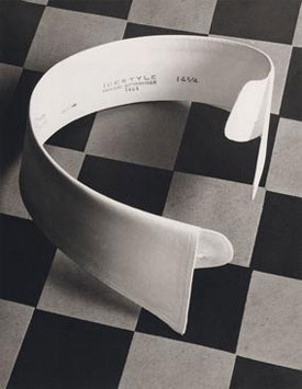
Advertising, too, has its evolution, from the blank book. Of course, it acquires text. While the Met’s online image for the show features a shoe, in the actual ad it is subordinate to the stylish wearer, who can boast that “I Know Value.” Paul Outerbridge first poses a shirt collar against a tilted checkerboard, for the play of flatness and depth, black and white. Twenty years later, in 1940, his color photo turns to coffee drinkers (of A&P coffee), one in an apron and the rest in suits, as a meeting among men. He might be moving from product photography as an art to the thing in itself.
Advertising began before the turn of the century, but without photography. Just down the hall, “The Art of the Literary Poster” spans what one used to call the gay nineties, through June 11, for what readers then might have called the new woman and the modern man. Covers for Harper’s, by Edward Penfield, appeal to the reader’s sophistication, with images like a March hare that play on the month. Calendar and poster art by Will H. Bradley, Joseph Christian Leyendecker, and Ethel Reed show a life of leisure and activity, like cycling and tennis. All have much the same art nouveau styling, from the Leonard A. Lauder collection. One might still receive a calendar in the mail today a as fund raiser, for those lucky few with a big kitchen and not a cell phone in sight.
Read more, now in a feature-length article on this site.