Abstraction and Excess
John Haberin New York City
Reed Danziger, Gary Petersen, and Sarah Cain
Ryan Wallace, David Rhodes, and Joanne Greenbaum
Part of the pleasure of painting is the mark of the artist's hand. This long after Modernism and Postmodernism, is that enough?
Fortunately, it does not have to be. Part of the pleasure, too, is seeing that personal gesture take shape in a uniquely public space. For Reed Danziger and Gary Petersen, it means assembling a complex composition bit by bit. 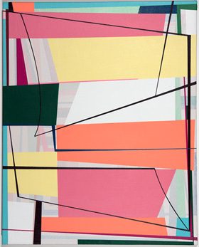 For Sarah Cain and Ryan Wallace, it means extending the painted object to the gallery walls and floors. For David Rhodes and Joanne Greenbaum, it means going big. In each case, it raises the question of when abstraction becomes excess.
Breaking rhythm
A public space for art could be the space of a big canvas and geometric form—or of found objects and found images. It is necessarily the space of the artist, the viewer, and the gallery. The tension between public and private is also a tension between convention and authenticity. It animates conflicting interpretations of Abstract Expressionism, as formalism or "action painting." It animates the transition from there to Pop Art, Minimalism, and beyond. It persists through skepticism about such loaded words as originality and the avant-garde.
It takes on new dimensions with the return of painting, now for big markets, with everyone out to make an impact at all costs. I fell for it once again this fall with Agnes Martin, for whom repeated traces add up to a glow. I fell for it with a single work by Debra Ramsay that unfolds over more than twenty feet of color while tumbling from ceiling to floor. Zipora Fried even manages to combine the two strategies. Paper up to thirty feet long drapes over something like towel racks overhead, so that its single colors are visible from both sides. Only up close do the apparent washes resolve into colored pencil.
Not every display of excess requires a mural scale, and not every display of detail has to be fussy or compulsive. Reed Danziger mounts paper on panel, for the intimacy of drawing or easel painting. The work becomes more detailed the longer one looks, but with every sign of spontaneity. It also subordinates detail and gesture to imagery that traditionally stands for spontaneity, that of nature. Her swirls may look like eddies, storm clouds, or breaking ice. One could call them oceanic, calligraphic, or crafted.
Titles encourage associations with nature, like Folding and Faulting or Renewal. They also suggest a deliberate or spontaneous symmetry breaking, like Expand/Disperse, Unstable Entanglement, or Break/Down. The image tends to stop short of filling a white or pale blue field, again suggesting both objects in a landscape and works in progress. Brighter colors appear like accidents of reflected light. The swirls, mostly in white, remain dominant for all the action. It cannot be easy.
Danziger builds toward the swirls in layers. First come watercolor and powdered graphite, with contrasting textures and a contrast between color and detail. Then comes oil, in narrow rectangles and arcs. Finer strokes in white look less like grids than skeins or microchips. Compared to her earlier work, they have become less hard-edged and less isolated at the painting's center. That helps integrate the layers.
The gallery's previous show relied similarly on broken symmetries and layering. Gary Petersen paints progressively off-kilter geometries—quadrilaterals piled high, slipping against one another and crossed by colored disks, lines, or curves. Patterns like these could end up merely arbitrary, but a recent wall painting may have helped push him toward both control and excess. Typically he gets the patterns started, paints over them in translucent white, and then picks up the patterns again. The same signature colors appear twice this way, first muted and then bright. He, too, is reaching for complexity without breaking rhythm.
Figure and ground
Any New Yorker can tell you: there is magic in the streets. Maybe not the actual sidewalks, where one looks down not for the play of light and shadow, but to avoid chewing gum or worse. (How do those people who cannot stop talking or texting cope?) Rather, the very grid of pavement and, on a larger scale, urban planning carries one to that ever-changing mix of old favorites and chance encounters to all sides. 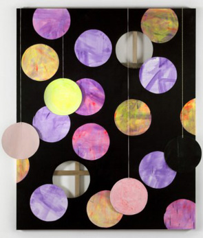 Cindy Sherman might serve as an emblem in that shot from Untitled Film Stills—looking up warily, offering the choice of a woman's self-possession or fears and, to either side, architecture old and new.
Of course, the grid also belongs to Minimalism, and so do light and shadows. Where older sculpture rose into an endless column, it lay flat to the ground—all the while taking in the viewer and the surrounding space. And where older art shouted don't touch, invited visitors to walk on it. So, big time, does Sarah Cain. She covers the floors with stripes, grids, and swirls, but as anything but minimal. Step right in, they say, but this time to join the party.
Her very title out of astrophysics, "Dark Matter," promises to suck you in. It also promises, well, a gravity that she happily denies. Colors and patterns run riot, all the way to the walls and then some. Canvases continue the compendium of styles. Curves out of Christopher Wool overlay stains in party colors. Just in case that were not enough, some paintings throw in found objects—including sunglasses, pinwheels, and money.
Ryan Wallace, too, plays with figure and ground. His title, "Surveyor," also suggests an eye on the city. His quiet passage between collage and paint recalls Henry Rothman, who did indeed find inspiration in sidewalks. Wallace, though, takes matters indoors quite as much as Cain. Previous installations began with raised floors, and his large canvases, overlaid with additional strips, play on reflections from those floors on the space of the gallery. For good measure, he now sets his old floors vertically.
Like Cain, Wallace presents two bodies of work while plainly linking the two. The turn to the vertical enhances the effect twice over. On the one hand, it feels more self-effacing than a false floor. On the other hand, it focuses more clearly on the gallery, by covering the entrance partition. Like Andre, it also presents a tiling, in Perspex and other materials. They vary from shiny to worn with, as for Robert Ryman, the bolts and tacks all part of the show.
If Wallace is deadly serious, Cain is anything but. The objects become a little too precious. Few paintings stand out on their own, apart from the excess and mixed media everywhere else these days. Then again, they do not have to stand out. They need only find a space for painting between two and three dimensions, like the colored disks in her previous work. Chelsea streets seem downright calming by comparison, but art is asking for more.
Maxing out
If you do not know David Rhodes from his easel paintings, you can view a sample in his gallery's back office. If you do not know his more customary work, on the scale of expressionisms past and present, the show has two of those as well. First, though, you will have to get past the first room, and that takes some doing. The painting there is almost certain to stop you in your tracks. In fact, its white stripes on a black field will introduce his idea of tracks. It is also big.
That does not sound like much by itself, but the painting insists on it. At just under ten feet tall, it breaks with the viewer's scale—or the artist's. 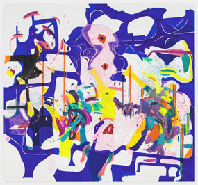 One cannot easily imagine him circling it on the floor, like Jackson Pollock, to leave his mark. One may well wonder how it came to exist at all. Nor is it quite site specific, stopping at least a foot below the ceiling. It becomes an object all its own.
Its vocabulary is simple enough. The stripes run diagonally, just off the vertical. They vary in width, but never more than an inch. They often come to a point before giving out, piercing the black like lightning. Of the roughly two dozen in that first big painting, only a handful connect the top and bottom edge. They supply a sense of structure, though, to the painting's motion.
A second work runs across two panels, while the third shifts from outsize portrait to landscape mode. Each has its own rhythm. The gap in the diptych makes the motion more jagged, while its orientation pulls the third closer to black. (The small paintings in the office feel like mere sketches by comparison.) In earlier work, Rhodes allows slightly broader or denser parallels that take the results closer to Op Art. This show succeeds more fully, thanks to its electric rhythms and deeper black.
Rhodes is hardly the first to apply minimal means to maximum effect. Patterning and scale recall wall paintings by Sol LeWitt, but without an algorithm—and with a sharper break with the wall. Size has become a factor in more representational work, too, as for Katherine Bernhardt elsewhere. It adds market value to Neo-Expressionism. He is not the first in that space alone to stick to one work to a room, like Rebecca Smith, or to use scale and surfaces to disrupt abstraction, like Stephen Maine. Even large, though, Rhodes maintains his blackness.
Still others use maximal means to maximal effect, like Joanne Greenbaum in work up to twelve feet on a side. Whites bury the artist's brilliant traces in ink, oil crayon, and marker, with oil, acrylic, and vinyl layered over that. Their bright colors lend a painting a fragile unity, while a smear at the center of more than a few color fields tears them apart. New work extends to a third dimension with the same pop sensibility, in porcelain or metal shaped like torn felt or shredded cabbage. Now that anything goes, from realism to abstraction, it is harder to justify anything, apart from routine retreads of Abstract Expressionism. The challenge of justifying it, in fact, becomes half the game.

Debra Ramsay ran at Odetta through October 9, 2016, Zipora Fried at On Stellar Rays through December 11, Reed Danziger at McKenzie through December 4, Gary Petersen at that gallery through October 16, Sarah Cain at Galerie Lelong through October 15, Ryan Wallace at Susan Inglett through October 15, David Rhodes at Hionas through June 25, and Joanne Greenbaum at Rachel Uffner through July 1.
