Love Me Tender
John Haberin New York City
Robert Indiana and Christopher Wool
Go ahead and die. That would be a harsh message in December's season of love, especially from an artist known for the word LOVE. Yet Robert Indiana loved to send messages, the way advertisers delight in product placement. No one did more to put the pop in Pop Art.
Indiana did not necessarily want you to die. Yet he did reduce humanity to its coarse essentials, more than once at that, with EAT and DIE against stark fields of black and red. The Whitney Museum insists that he meant it, too. This is graphic arts, in every sense of the word, and it is "Beyond LOVE." Indiana still chafes at the four-letter word that, he feels, has others writing off his career. Here love is most certainly not all you need. 
Speaking of mixed messages, Christopher Wool was looking for trouble. He filled a painting with it in 1989, on two lines, but as TRBL—shorn of vowels, shorn of space, shorn of unity, and shorn of meaning. It looks starker yet in black enamel on aluminum, its sans serif letters broken by white lines, as in a primitive stencil. Had he expressed trouble, mimed it, or redoubled it? Had he detoxified it or objectified it? PLEASE PLEASE PLEASE PLEASE PLEASE screams another text in his Guggenheim retrospective, but with no one to mollify or to answer.
Live free or die
Love may not be all you need, but it sure comes close. Not even John Lennon and Yoko Ono did more to make love a cultural icon. Robert Indiana painted the word in red beneath four stars in 1961, the year before Eat/Die and, as it happens, Hug. He created the more familiar image of LO atop VE in 1966, as a design for Christmas cards for MoMA, and he riffed on it often. He may object to its fame, but he gets just as angry when others borrow it. A room for the borrowings would make a cultural history all to itself.
Did it really hold him back? Probably not, for no artist feels that much pressure to repeat a single image, not even Raphael with his Madonnas. Willem de Kooning and Philip Guston, to name just two, came under fire for shifting style and subject outright in an age of abstraction, but that is something else again. Besides, there is no such thing as bad publicity. An artist whose career trailed off nearly forty years ago ought to know. His very outrage serves as a marketing message, for the retrospective—and early reviews happily picked it up.
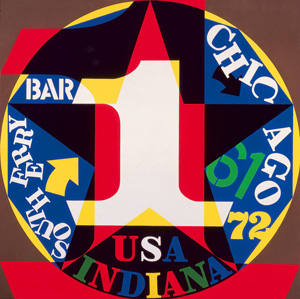
The curator, Barbara Haskell, argues that all along he was critiquing the reduction of a word to a commodity, by setting the O at an angle. I had my doubts right in the lobby, beside a shiny aluminum version with flashing lights, but she has a point, and it applies not just to him. Pop Art moved easily between sex and death, like Wayne Thiebaud in Thiebaud drawings between cake and icing, Ed Ruscha between diners and gunpowder, James Rosenquist between lipstick and fighter planes, Andy Warhol between Marilyn and the electric chair, or Roy Lichtenstein between brushstrokes and the bathroom. When Indiana paints Love Is God, one can question whether God is love. And museum-goers will quickly recognize his contributions beyond LOVE, such as his many crisp, concentric circles, numbers, and stars. They update the American modern of The Figure 5 in Gold, by Charles Demuth, for a world of exit signs and Formula 1 racers.
They are corporate logos for the American dream, much as roadside marquees still shout EAT. Is it a coincidence that the letters in diner almost spell die? If Indiana settled too easily for an American icon, he embraced the chance to speak for America. He did it in 1958, when Robert Clark renamed himself for his birth state. He turned thirty that year, and he had already had an American life, with a stint in the Air Force and education on the G.I. Bill. He moved to Lower Manhattan in 1956, when artists like Ellsworth Kelly were finding cheap space—and he scavenged the docks not just for cheap materials, but also for a history.
He already loved words as much as images, much like another master of insults, Mel Bochner. He was delighted that Herman Melville had set the opening of Moby Dick nearby. He also does not pay so much tribute to his influences as claim them as his own. He paints the Brooklyn Bridge after Joseph Stella because Walt Whitman had celebrated it before them both, and he loved Demuth's Precisionism for quoting William Carlos Williams. Let a conceptual artist or a Surrealist use text to subvert the image. Indiana wants only that you remember.
He is taking himself seriously—and his subjects drily. Robert Rauschenberg would have called his assemblages of used wheels, nails, and wood combine paintings. He prefers herms, after ancient monuments to the gods. He paints gesso or gold orbs and fan-shaped leaves, because ginkgo trees can change sex, although the results look like advertising for Kelly's next exhibition. Even earlier, he paints black heads like totems, accompanied by the words of the Biblical "handwriting on the wall." One hardly knows whether to call them solemn, funky, or funny.
Logos for the American dream
The American Dream supplies the title for more than one explosion of colors, numbers, and words. And the numbers run well beyond 5, and the words include take all and tilt. They also include Native American tribes (with text by Henry Wadsworth Longfellow), as well as southern states that had sent African Americans and civil-rights workers to their deaths. Indiana's politics is as earnest as the rest of his "sinister pop," but he took stances before they were popular all the same. For him, the American dream is not exactly a nightmare. Yet it is a high-stakes gamble with too many losers.
Mostly, he has that one explosion, of barely half a decade. He does design costumes and sets in 1976 for a production of The Mother of Us All, the opera about Susan B. Anthony by Gertrude Stein and Virgil Thomson. He may have liked that a romantic lead has the name Indiana, but he must have liked more its politics and its poetry. He brings to it the same hard edges and bright contrasts as ever, only this time with cut paper. Two years later, he moves to an island in Maine, happy to claim more of the American century when he discovers that Marsden Hartley had spent a summer there. It triggers an elegy in paint, and pretty much that is that.
The Whitney goes beyond that first decade and beyond love, but one may wonder whether Indiana ever will. Maybe words mattered too much to him, and he simply ran out of words. Maybe LOVE itself was a happy accident. Its psychedelic colors may stand for the summer of love, but MoMA choose them from among four samples. Then, too, maybe he ran up against the limits of text art with something to say. It might be something vital, but it can still silence the thoughts around it.
Indiana almost dropped off the map, right when the irony of the 1980s was recovering politics and pop culture for art. He had grown more relevant, but also more suspect. He has said that Eat/Die made him think of his mother, always asking if he had had enough to eat. Still, he does not easily do guilt, and others were too busy shouting guilty. For some, language teaches the treachery of images. He just wanted to put language and images in your face.
He must have seemed too sincere, but also too fancy. This artist did not linger on the MGM lion and untitled film stills. He took his style from advertising, but his content from art and literature. His series in Maine invokes the German officer that Hartley loved. It is not the first of his references to homosexuality, but not everyone will recognize the name. The series also includes Marilyn Monroe, in The Metamorphosis of Norma Jean Mortenson, but for once words lie behind a colored haze.
Indiana created logos for a transformation of America. From the first, on the docks, he spoke of altering "the Lost into the Found, Junk into Art, the Neglected into the Wanted, the Unloved into the Loved" (that word again). One can almost quit without entering the museum, with just the images facing the street, for he makes it hard to tell paintings from posters. No wonder they are also so hard to forget. The artist may complain, but he created the ultimate marketing campaigns for love and death. Guess which one became the leading brand?
Looking for TRBL
Christopher Wool, the Guggenheim notes, speaks an "aggressive urban vernacular"—and not just with words. In photographs from the mid-1990s, his walk home from the East Village looks like as a disaster area, every bit as much as the scene of a fire two years later. As a sign in one reads, "Welcome to dirty filthy Chinatown." Patterns derive from paint rollers used as a cheap substitute for wallpaper, and they come with so many gaps and smudges as to be useless as decoration. Flowers spread in and out of blackness. I might have taken an ink-blot test and failed.
One might fail the test right in the lobby, with a red abstraction from 2001. One could mistake its off-center stain for something from the permanent collection, like an unusually assertive Joan Miró. Up close, though, one has to notice the dots of a silkscreen, its acid color, and its harsh white ground. But then it is only, the title explains, a Minor Mishap. Wool has already been crossing silkscreens with freehand curves—or digitally reprocessing his works and silkscreening them again. As his abstractions grow, up to ten feet tall, they only grow scarier.
 They also keep questioning what there is to fear but fear itself. As ink, acrylic, or enamel masses toward the center, is one witnessing a collapse or an emergence? When Wool wields a spray gun, is he drawing, doodling, or vandalism—and can he vandalize himself? When two paintings share an alcove on the museum's ramp, one might almost copy the other, but then how can a copy be such a failure? Silkscreened flowers are bound to recall Andy Warhol, Ben-Day dots Roy Lichtenstein, black enamel Frank Stella, and drips Jackson Pollock. Wool could be Pollock's evil twin.
At least he could be playing the part while getting over a fever. He clearly enjoys working and reworking a painting, these days mostly on linen (and another friend of his, James Nares, has made a brushstroke a painting's lush subject matter). Unlike late Warhol, Wool does not want to settle for a screen print's regularity or commercial illustration, and even his dots break up. When splotches resemble correction fluid, he must take pride in knowing that, before word processing, it was applied by hand. Even in text, the irregular letter spacing is not just about obstacles to intelligibility. One remembers them all the same for the chill.
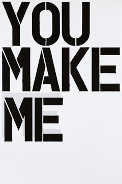
Born in 1955, Wool made his public mark with the text paintings, and their chill still sets them apart, despite a banality convenient to the art market and collectors. This text is not political, polemical, a step toward abstraction, or an existential dilemma. It does not wear its irony on its sleeve, although Wool does collaborate on borscht belt jokes with Richard Prince. Unlike Indiana (who relished the stencil font, too), he does not care deeply whether you love or die. He is just pounding home the rhythms, like Richard Hell and the Voidoids, whose You Make Me serves as another text. When he quotes Sell the House Sell the Car Sell the Kids, from a lost soul in Apocalypse Now, it is hard to say which he likes more, the message or its source.
The curator, Katherine Brinson, wants to see Wool as more than words. She gives them little space, even compared to the past decade, and none at all to early work. She sees a continuum of "doubt and insistent questioning"—and she may know that, for Jacques Derrida and deconstruction, a text "under erasure" is always productive of new meanings. She includes his moments in full color and his "gray painting," as he calls broad brushstrokes that mix black and white. Still, Wool sees dark extremes, as with the text of paranoiac, comedian, terrorist, adversary, psychotic, absurdist, authority, and informant. He may play troublemaker or victim, but it is up to you to find a space in between.

Robert Indiana ran at The Whitney Museum of American Art through January 5, 2014, Christopher Wool at The Solomon R. Guggenheim Museum through January 22.


