Digging Deeper
John Haberin New York City
Colin Keefe and Tony Ingrisano
Rebecca Smith and Christopher Astley
Infrastructure. It could mean a city's crumbling into ruin or the nation's future. Sometimes, too, it could mean a work of art.
"Urban systems"? "Strata"? Both may have you imagining excavations deep within New York. In fact, they supply titles for abstract art, in works on paper by Colin Keefe and Tony Ingrisano and in sculpture by Rebecca Smith. Painting, too, is back and digging deeper, only starting with Christopher Astley.
The infrastructure of abstract art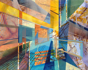
Infrastructure represents a city's layered history, and so of course can art. Infrastructure may serve site and subject, from Paris for Nadar to rubbings of manhole covers for Sari Dienes. And then there is art's investment in urban growth or a city's investment in art, from the Whitney downtown to the future of Detroit. Michael Elmgreen and Ingar Dragset have restaged existing infrastructure with their pretend subway station and Rafael Lozano-Hemmer with his Voice Tunnel. Matthew Jensen uses utility poles to punctuate his crossing the United States. It could mark the triumph or disappearance of rural America.
Infrastructure can drive abstract art as well. Piet Mondrian had his Broadway Boogie-Woogie, and one speaks of Abstract Expressionism as the New York School. More recently, artists have conceived their work as what a curator called a "tone poem" to the city. The density of the urban grid appears in drawings by Simon Fowler, paintings by Vivien Abrams Collens and Ben Boothby (pictured here), and photo collage by Diana Cooper. Vera Lutter has long approached abstraction, as in a ghostly photo of Lower Manhattan's ferry landings on view at the Emily Fisher Landau Center. Now Colin Keefe and Tony Ingrisano dare one to follow the connections. One could even call it a trend.
Keefe calls his drawings "Methods for Breeding Urban Systems," and Ingrisano mines everything from power grids to river beds. Apparently nature can breed urban systems, too. (As it happens, Ingrisano is followed a month later by dizzying constructions of cut paper and Mylar by Fran Siegel, on an impressive dizzying scale and with still more explicit reminders of urban mappings.) They have in common a fondness for detail, complexity, and the multiple layers underpinning a city—as in Keefe's use of the plural, for methods and systems. They also take the grid and let it grow to the point of chaos. In the process, they make hidden systems visible.
Keefe's drawings look as much organic as industrial. They could pass for spreading foliage or micrographs of disease. Buildings appear as bare outlines surrounded by a darker intricacy, as if left behind. Ingrisano, though, earns his complexity quite another way, through an interest in structure. He is also learning to use contrasting colors and layers to lead the eye. The results look less familiar, because they truly are normally invisible, but entirely real.
The layers progress from tiny cells to larger single units, often in blue or purple, to near tapestries. Then come the connecting tissue of lines running every which way and finally sparer clusters of diagonals on top, often as the brightest colors and the firmest guide. Every so often lines project into a cube edge-on. Just once, patterns extend across a further grid of nine smaller panels. They may represent perspective studies or city squares—in one case, as Omaha. New York no longer has the last word when it comes to running out of control.
Layering runs, too, to the craft of their making. Ingrisano applies graphite, ink, and acrylic to a tight weave of cut paper on canvas. Sometimes he rearranges the cut elements along the way. Both artists approach infrastructure with an eye to the past, where networks today are more likely to have digital overtones. Still, art has a way of privileging the visual and the physical, and who knows? If one looks hard enough for something else, it may yet be there.
Geologic time
A show called "Strata" does not sound as if it were going anywhere soon. Maybe in geologic time, and that speaks well for Rebecca Smith. With just four works, one to a room, you can take your time as well. Look how the colors change from the off-white of the assemblage up front to the bright red and green against black in the back—or from sculptural layer to layer. Look to the side to let the elements detach themselves from each other and the wall. Look to the play of shadows, as more loops and lines.
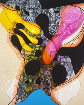 A title like Bending the Hard Way asks for patience, too. Think of a wheel maker's craft, and several of the slim elements outline warped circles. One might well mistake at least some for wood rather than metal. They suggest what Frank Stella might be like if his "Exotic Birds" were not flying across the wall—or what Elizabeth Murray would be like if her shaped canvases were not bursting apart. They are not paintings, although layered curves are a prominent part of the revival of painting, too, as with Amy Sillman, Carrie Moyer, and Angelina Gualdoni. Yet they hold the wall with plenty of space around them.
Not that sculpture here is sitting still, no more than abstract sculpture for Richard Van Buren. Smith is always breaking symmetry—not subtly, but almost casually. The subtitle of the work in off-white, (Triangle, Tulip, Circle, Pentagon, Oblong), makes it clear enough that the center cannot hold. For the work in back, the four red spots could be the corners of a badly warped parallelogram, setting the black teeth off-kilter. One spot also allows her to hang a green donut in honeycombed aluminum. A third work has a central cross, but with one line projecting in front and the other projecting behind.
Like Post-Minimalism, they invoke the body along with industrial materials and human purposes. Other subtitles mention an eye, a crown, a "device," a snowflake, and a home. The cross comes closest to something disturbingly organic, with bits of pipe stuffed with steel wool. Mostly, though, they hang steady, even if much of a fourth work hangs on axe handles. In each, the fixed supports are as much a part of the art as the open polygons and wiry curves. Another eye might have let pieces share a room, to let them bounce off one another, but they hold up well stable and apart.
Speaking of Moyer and Gualdoni, both are having their most animated shows yet. More now, they minimize the hints of representation while insisting on its relevance, much like Sillman's latest. Things may settle into a cocktail glass, a vase, a greenhouse, or something else—or not. For Moyer, twin arches frame nearly identical curvaceous shapes, like a reminder to look twice. For Gualdoni, interiors may stop dead at a stage curtain or give way to a view from above. For both artists, painting stands somewhere between architecture and experiment.
Both again run through the means of painting. Moyer's stained or sprayed canvas competes for dominance with fields of clear, bright color. Gualdoni's settings may have become elusive, but the light and structure within them only intensifies, aided by paint staining through the canvas from the back. Do I still have my doubts? As with much painting these days, anything goes. Yet the work is running wild and thinking big.
Hitting bedrock
When Smith speaks of her sculpture as "Strata," could she be promising other layers still unearthed? And when Keefe or Ingrisano finds formal patterns in urban infrastructure, could nother ask what lies still further beneath? Christopher Astley does, even as he layers oil on gesso himself. He also calls his work "Conglomerations: Backfill Slag Scree." It might have surfaced of its own accord amid construction seemingly everywhere on the Lower East Side these days. 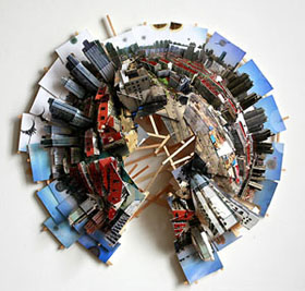 The upheaval could give way at any moment to yet another gallery.
Astley has not exactly hit bedrock. His compositions have too much swirling and layering for that, right up to the edge of the canvas, like rockface in photography for Letha Wilson. The patches closest to white stone could just as well pass for sky, more colorful ones for sunlight. They seem more volatile than primeval, much like the planet in geologic models today. Nor does he suppress entirely the illusion of a third dimension on top of the layered depth. A long row of small panels adds another dimension of time and space.
The paintings have a sense of mass and structure along with process and gesture. If that sounds traditional enough, it is a thread running from Abstract Expressionism through Minimalism and earthworks, with shifting tensions along the way. The earth tones have perhaps their closest parallels in Jackson Pollock, without Pollock's black. Gesso, a medium of gypsum and plaster, is also an obvious extension of building and earth. As it happens, the artist has ditched canvas for panel, after using fabric in sculpture. There mass expands and settles of its own accord, with only partly predictable results.
Till now, Astley has used colored or striped fabric as molds for concrete—piled like trash bags, the contents of a homeless shelter, or leftovers from a painting by Philip Guston. It bulges as it will, sometimes bursting the bags. The he adds to the textures and colors by sewing them back up and spattering some with paint. The paintings, while lighter and more improvisatory, also have greater structure and sudden glints of color. They truly could belong to a construction site. Their creamy layers, though, are not wasted.
Even a thread on abstraction should note a representation of actual infrastructure, in three dimensions. One by Isidro Blasco has (with apologies) already closed. Then again, it opened right after New York threatened to shut the nearest subway down. With dates already slipping, the Metropolitan Transit Authority asks to eliminate the L train between Manhattan and Brooklyn for years, to restore the East River tunnel. The cost of Hurricane Sandy keeps climbing. By the end, you may remember access to Bushwick from this one show.
Blasco works in collage and with the city from New York to Shanghai, as in the March 2016 edition of Art on Paper, the art fair. Often his photographs stick close to the wall and to a tourist's giddiness at back alleys, open spaces, and major attractions, although not without an awareness of chaos, incomplete adaptation, and urban displacement. Here, though, his model city rises upward and spreads outward while digging well beneath. A few successive subway stops take over the room, like a single station. His timing was coincidental, but the line has never looked this clean or as close to a maze. Leave a more measured infrastructure to abstraction.

Colin Keefe ran at Robert Henry Contemporary through February 21, 2016, Tony Ingrisano at Lesley Heller through February 14, Fran Siegel at Heller through May 15, Rebecca Smith at Hionas through March 12, Angelina Gualdoni at Asya Geisberg through April 2, Carrie Moyer at D. C. Moore through March 26, Christopher Astley at Tracy Williams through May 1, and Isidro Blasco at Black & White through April 10.
