Abstraction on Stage
John Haberin New York City
Guyton/Walker and Jacqueline Humphries
Creating the Modern Stage
Installation art has all but taken over the scene. Much of contemporary art is a performance, with the performers trashing as many galleries as possible. Even new media that play silently on a small screen now look restrained.
One could whine about the excess, revel in it, or look for clues to its meaning in the city's economics and real estate. And why not? I have tried them all. Eventually, though, the installation had to sweep up traditional media, including abstraction. It might even have bitten off more than it can chew. 
Guyton/Walker and Liz Deschenes both treat an imagined artist's studio as a theater, with painting as its stage set. In her smart twist on the Bauhaus, Modernism looks healthier than ever. In fact, it looks very much like silvery color fields by Jacqueline Humphries or an evocation of early photography by Marco Breuer. Modernism had aspirations to theater all along anyway. The Morgan Library traces "Creating the Modern Stage," and it looks strangely old-fashioned.
Neo-neo-geo
Guyton/Walker keep trying to get modern art to cut loose. The pair just hates the thought that modern artists might share credit for it. Geometric abstraction, they seem to say, had better keep up with the times. With luck, it might surpass their own conceptual art.
Wade Guyton and Kelley Walker stood out in 2005 shows of emerging artists. In "Greater New York," Guyton smashed a Bauhaus chair by Marcel Breuer into a tubular mess. At SculptureCenter, they exhibited what soon became a ubiquitous gallery fixture, a coconut lamp. Different as they seem, both works look for organic form in an icon of Modernism. Each also floats somewhere between celebration and mockery. The show back at SculptureCenter pretty well sums up that no-man's-land in its title, "Make It Now"—caught between "make it new" and "make it trendy."
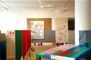
Now the assault on art advances past Modernism. The crime scene shifts, too, from the museum to the artists' studio. It also holds a record number of works in progress. Canvas leans against the wall or rests in stacks on the floor. It tilts on drywall lifts, like industrial-scale easel paintings. Much the same inkjet and silkscreen patterns have taken over a workbench, a Formica table, and dozens of paint cans.
The painting technique and the sheer repetition cite Postmodernism. So do the images, including smears, stripes, tropical fruit, skewed checkerboards, and large colored dots. Do the artists care who else has pulled all this before? Those who matter will already know the points of reference—Gerhard Richter and Richter's late work, Andy Warhol, James Rosenquist, Roy Lichtenstein, and Damien Hirst, to name a few. Richard Artschwager combined Pop Art and Minimalism with his Formica table patterns in 1964. This is Neo-Geo with a vengeance.
If Guyton/Walker did not exist, the press release would have to invent them, along with its fashionable vocabulary of interventions. Critique of the "originality of the avant-garde" has definitely lost its originality, not to mention its authenticity. When even Hirst's dot paintings become the target, Postmodernism is definitely in trouble. Or is that the point? To their credit, Guyton/Walker may bury the art object, but objects run riot over a riotous gallery space. For a moment, I could even wonder about the paint in those checkerboard cans.
Liz Deschenes, too, treats Modernism as high concept in a material world. Tilt/Swing "materializes" a 1935 work by Herbert Bayer, who had moved from the Bauhaus to Vogue. Six silver panels encircle a small room—flat against walls and floor or tilted against corners. They form an enormous eye, with the viewer its pupil, while also reflecting the viewer's eye back upon itself. They are also photograms, or photographs without a lens, and over the course of the exhibition the patina slightly blackened. Compared to Deschenes's previous abstract photography or that of Wolfgang Tillmans, I found them too schematic, and yet I kept going back downtown to watch the art literally catch fire.
Silver anniversary
Like Deschenes, Jacqueline Humphries can look old-fashioned or trendy, usually at the same time. Her silver pigment surely helps. Flat or decorative, a mirror or a blur, it almost takes over her latest paintings. They have also acquired an edge.
The edge may literally cut across the paint. She might have painted over a straightedge or pressed it into wet pigment. At other times, the edge belongs to the image, such as black brushstrokes radiating outward at odd angles. Often it follows a diagonal, although one painting has a target at its center. Still, it rarely conforms precisely to a logical subdivision of the painting's actual edge. In other words, it makes a bit of a mess of color-field painting.
Humphries relishes the mess, but also the field of silver. She layers it over or under the target or, more often, a large blotch of bright color, as if a balloon filled with it had landed on the canvas. That alone could seem either hip or old-fashioned. Adolf Gottlieb, the Abstract Expressionist, used bursts of red pigment as image and as structural element, while Josh Smith now churns out messy abstract paintings like child's play—or like an emerging artist's assembly-line product. As industrial pigment, silver looks back to Minimalism. It also anticipates the dark edge of recent electroplating by Jacob Kassay.
Humphries has long allowed drips and overlays to take over from patterns, such as repeated verticals or grid marks. Now the edgy texture and silvery finish help them take shape. The edge recalls the old idea of a painting that makes itself. Jasper Johns pursued it with his own targets and marks of a straightedge, and he hardly minds infringing on his own patent. Humphries, too, can look overly familiar in reproduction. Up close, though, the black, silver, and diagonals leave an impression.
If silver makes you think first of chemical salts in old-time photography, Marco Breuer has your idea of abstraction. The circular trails on black will make you think not of targets, but of time lapse photographs of the stars. Loopier tracks may make you think the stars have gone mad. Circles, symmetric totems, and random holes charring white paper might not be photography at all. Maybe Breuer stubbed out a few too many cigarettes in the studio late at night. Maybe that explains the fire that drove his gallery to its new location.
Actually the holes are shotgun blasts aimed at a box of photographic paper, like an improvised light box. The circles come from scratching into the paper on a turntable, while the other tracks come from the artist's hand—either scratching into paper on the floor or exposing it with lights strapped to his fingers. For the more uniform charred yellow, he exposed the paper to old flashbulbs. The results sacrifice past elegance for conceptual edge, a gain I think, although perhaps also a transition. They also resemble in concept a photogram, as the silhouette of an object on sensitized paper. However, where Man Ray and his photograms, like so much of Surrealism, ditched the technique in favor of the thing itself, Breuer in effect ditches the object for the mark of the photographic process alone.
Staging Modernism
All the world's a stage, except for modern art. Try to find your way through the space of Cubism. And yet Modernism altered theater design dramatically. The Morgan Library offers fifty examples, in sketches from its permanent collection. Not surprisingly then, "Creating the Modern Stage" comes with a certain tension about just what is modern and just what is on stage. Theater accepted modernity only slowly, even as modern life became more like theater.
 Michael Fried supplies a classic account, starting in the eighteenth century. The avant-garde turned against history and genre painting, with their moral lessons and the illusion of a stage set. Instead of a scene, painting became an object and a challenge—in the shared space of the viewer, like the curtain ripped aside in Les Demoiselles d'Avignon. Sculpture, too, came down off its pedestal. Abstraction shredded the illusion once and for all. It took Postmodernism to bring back theatrical gestures, but as a kind of immorality play.
The Morgan starts with a country that came reluctantly to Modernism anyway. Edouard Vuillard designed sets for Ibsen productions in Paris, and Edward Gordon Craig in England started to do away with period detail and realistic stage sets. The theater became emptier, with just a few monumental columns to elevate the action. The show traces a similar evolution in Germany and America—starting with Max Reinhardt, an Austrian-born director in Berlin before he fled the Nazis in 1933. Robert Edmond Jones, educated at Harvard, collaborated with Arnold Schoenberg in 1924, on a ghostly music drama bathed in colored lights. At the Player's Club, Yale Rep, and on Broadway, Eugene O'Neill's family dramas got a housecleaning, thanks to Jo Mielziner and others.
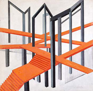
Things changed more suddenly in Russia, where Kazimir Malevich and Alexander Rodchenko applied the same vocabulary to painting, sculpture, and monuments to the revolution. At the Morgan, Alexandra Exter and Natalia Goncharova do much the same for the stage. In America, too, Norman Bel Geddes studied painting and met Frank Lloyd Wright before his designs for the Metropolitan Opera. One will not see it here, but Geddes also created "Futurama," as General Motors called its pavilion for the 1939 New York World's Fair. Except for Russia, though, much of the show looks curiously old-fashioned. Only at the very end does America accept abstraction, with Ming Cho Lee's open frame—itself a quiet reflection of the architecture for Lincoln Center.
These sets go for seriousness, grandeur, and elegance. When Cubism piles on collage, it keeps the props and throws the stage away, and one could say the same about Wright and the city. These designers elevate an empty stage to new heights. For one thing, they are finding their way into and out of Romanticism, in "creating the modern stage." Even Schoenberg's is a transitional work, Die Glückliche Hand, between tonalism and serialism. They also reflect the biases of the Morgan's collection, the gift of an American set designer, Donald Oenslager.
For all that, art and theater were different, and neither could encompass what Richard Wagner called a "total work of art." The lingering Romanticism here still defines modern productions of Wagner. The Morgan subtitles its show "Designs for Theater and Opera," but the same ideal of austere beauty also characterizes modern dance like that of Alvin Ailey, and a design for Diaghilev also appears. Theater itself after World War II had to give up more of the stage, as with Arthur Miller's After the Fall, in which characters sit on bleachers. Then, too, after Pop Art, politics, and the Web, art had to rediscover the theatricality of everyday life.

Guyton/Walker ran at Greene Naftali through August 7, 2009, Liz Deschenes at Miguel Abreu through June 14, Jacqueline Humphries at Greene Naftali through May 16, Marco Breuer at Von Lintel through June 13, and "Creating the Modern Stage" at The Morgan Library through August 16.


