Lyricism and Rigor
John Haberin New York City
The Fullness of Color, Marking Time, and the 1970s
Larry Zox and Rob de Oude
Maybe you think of late modern art as a locus of experiment—a time of industrial materials, typewritten text, and performance. Or maybe you think first of a stifling uniformity, before Neo-Expressionism and Postmodernism changed things for good.
The Guggenheim sees instead two trends, one as colorful as the other is somber and gray. It sees them as so distinct that it keeps them two tiers of the ramp apart. And it sees them both as process and as painting. Down in Chelsea, Larry Zox finds a way to bridge the difference even then, if only for a moment, with lyricism and rigor.  Not that the choices are altogether past. Rob de Oude revisits them today in the light of Op Art.
Fullness and absence
Visitors to the museum for the closing days of "Artistic License," guest-curated works from the museum's collection, might have hesitated to step off the ramp, twice, for still more. If they did, they might have thought that they had encountered more of the same—two more guest curators, with very different interests. "The Fullness of Color" reserves a modest room for some notably immodest work, in chevrons, stripes, and daubs, but always intense color. And then, two tiers up, you may see only an absence of color. Where the ramp in-between has selections by Carrie Mae Weems in black and white, "Marking Time" explores the murky space in between. Even a triptych by Brice Marden, running from green to pink, amounts to uncommon shades of gray.
Color-field painting got its start with Joan Mitchell and Helen Frankenthaler, hot on the heels of Abstract Expressionism, and I mean red hot. And "The Fullness of Color" should stop you in your tracks once and for all. "Marking Time" merely does everything it can to slow you down. Roman Opalka got his start by covering a canvas with numbers, starting at 1, in white on gray—and then, when he had done, starting another canvas precisely where he had left off. He was still counting in the tens of thousands ten years later, around 1975. He is self-effacing rather than expressive, in accord with the Minimalism of his time, and the two shows seem decades apart in their sensibility.
But no, the concurrent shows span concurrent years, when painting was not just alive but imperative—or, for a politically minded critic, even oppressive. For the Guggenheim, it was also a single protracted labor of love. Was Abstract Expressionism about, as competing narratives have it, action or abstraction, art as gesture or art as object? Here they come together, with process as the key to form. That should come as no surprise in "The Fullness of Color," with its stains (from Frankenthaler and Kenneth Noland), pours (from Morris Louis), painstaking stripes and repeated patterns (from Gene Davis and Paul Feeley), and spray paint (from Jules Olitski). Yet upstairs, too, the museum argues, artists are marking time.
They call attention to time with the artist's handwriting. Henri Michaux has his ink stains and Park Sep-Bo his Ecriture (French for writing), in short, near parallel strokes of graphite and oil. Agnes Martin lays down a grid in dense, fine lines so that optical activity emerges on its own from irregularity and accident. Handwriting for Jacob El Hanani recalls copying as a discipline—most especially the copying of religious texts. Several artists add more while the first layer is still wet, like David Reed, who speaks of his brush as the body in motion. Zarina compares her paper pierced with needles to skin.
Do stains require unprimed canvas? The artists upstairs allow bare canvas to show through. Robert Ryman does, at the edges of his eight-foot square of white on white. Marden may not, but he does stop short of the bottom edge, so that gravity can fill the rest. Was spray paint a disturbing novelty in fine art? Upstairs, Chryssa works with a rubber stamp, based on pages from The New York Times, while Marden spreads his oil and wax with a spatula.
No one needs to retell the story of the 1960s and their impact, not at this point, and no one could in a mere twenty works. The Guggenheim departs from old stories only in including Alma Thomas, the African American artist, along with Wojciech Fangor from Poland and Toshinobu Onosato from Japan. It is, you might say, just marking time. Still, it accords with the year's welcome emphasis on museum collections, as with the expanded MoMA, and it has a real point about time. Handwriting connects Minimalism to gestural abstraction before it and to graffiti and street art yet to come—although the artists refuse a signature or a tag. "Self-effacing" is also a present participle, a verb form, and it takes time.
The U.S. open
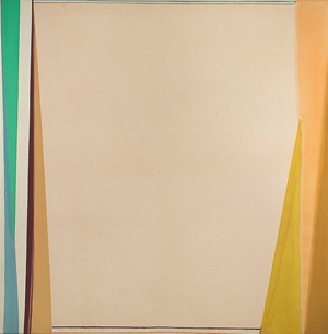
In 1972, just midway through his thirties, Larry Zox had a breakthrough. He must have wondered, too, whether he had broken through the warring impulses in his art. He may have felt them as dueling imperatives in painting itself. Zox was frankly never among the most prominent artists of his time, but he had a reputation all the same—or maybe two. Like Stanley Boxer, he had witnessed the birth of color-field painting at first hand, and people still often associate them both with lyrical abstraction. Yet he had also witnessed the turn against lyricism and expressionism, and he had incorporated that turn into his art.
His work from the 1960s resembles off-kilter mosaics, with broad stripes offset from one another. His flat colors accentuate the offset, with a mix of brightness and earthiness. He increasingly kept to hard edges, like one perpetual bold italic Z. They have much in common with the hard-edged madness in Frank Stella—especially the Protractor paintings, which began only toward the end of the decade. Zox had learned, no doubt, from Stella's earlier stripes, but he got here first, only with a different drafting tool.
Maybe, though, he missed the lyricism. Maybe he wondered if had really attained the sense of motion that his geometry worked so hard to impart, or maybe he wondered if motion were not a distraction. Regardless, for the next three years he ditched the geometry, apart from that of the canvas itself. Colors lighten, intensify, and stain right into larger, taller paintings—and then his brush adds framing elements, like a window onto the action. The result was his Open series. Given talk at the time of the triumph of American painting, maybe he should have called it the U.S. Open.
A painting here can have several competing frames, much as earlier work can have clashing Z's. The frames can be fairly long and thin or very long and thin, and they can run right into one another. Zox relishes their irregularity, as marks of his brush. He does not appear to my eye to have poured paint, like Louis, but he was happy enough to lay down paint only to watch it run. His minimal means and the frame's proximity to the edge of the canvas link the work to its time, while the huge areas of color within link him to Louis and Mark Rothko. He had found a way to unite Minimalism and color fields—or rigor and expression.
In retrospect, the dueling imperatives were more fragile than they seemed. In no time, critics were denying the very possibility of an essence of painting. In retrospect, too, painting both was and was not central to Minimalism. It shared Minimalism's spare means, geometry, ordinary materials (like house paint for Stella and the prominent bolts holding canvas to the wall for Robert Ryman)—and the whole talk of a medium as its subject and "what you see is what you get." Even when it departed from "art as object" in the interest of light and space, as with Mary Corse and Agnes Martin, it had its parallels in sculpture by Doug Wheeler out west and Dan Flavin back east. Still, painting had to differ, in not refusing a traditional medium and not deferring to the place of the work in its surrounding space.
Maybe Zox knew all along the fragility of his resolution. Before long, he added more overt gestures. Critics were insisting that painting is dead, not imagining its chaotic resurgence today, but he kept painting until his death in 2006. Museums have long favored the zigzags from the 1960s anyway. Still, the fragility only adds, to my mind, to the greater force of that resolution. It invites lingering and contemplation, even as the real world is waiting to break in.
Off your feet
After more than fifty years, Op Art can still knock you off your feet. Maybe not literally—or at least I do not recall museum warnings, while videos with flashing lights carry them all the time. But Bridget Riley knew what she was doing in 1963 when she titled a painting Fall.  If Riley's sweeping curves do not make you nauseous or dizzy, they should still leave you impressed. Just how does its surface seem to darken as the waves grow denser toward the bottom, and is black or white the figure or the ground?
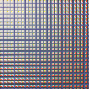
For all its optical activity, art like this has a delicate balance—and so it is with Rob de Oude today. He is after not so much sensory overload as a treat for senses,d in the illusion of light. His intricate patterns may hold several colors, including a mild flesh tone or off white, but they come together as a single field of color as the receptacle for light. It can seem to wash gently over a painting, as gallery lights never could, or to emanate from within. It can radiate out from the center, the edge, or seemingly nowhere at all. It just is.
Like tightrope walking, a successful balancing act takes grace, but also patient preparation. Unlike Riley, he relies on the grid and a dense one at that, exactly one, two, or feet on a side. Each cell of the grid holds up to six nested squares, sharing a corner rather than, as for Josef Albers, a not quite common center. Each square derives from broader bands running past a cell, and the outer square may function as a thick band running the height or width of a painting. Practically any color can provide the brightness. de Oude may tilt the grid, for a greater emphasis on space and motion, as with Tumble Toss, or leave it upright, for Spatial Ambiguity. He is not above painterly excess, with a title like To the Nines, but then, as with Photon Fade or Light of Day, there is always the chance for stillness and light.
When I first encountered de Oude, on a weekend of Bushwick open studios, I was struck by his bravura vying with conservatism, but most of all by the evidence of his hand. It is inescapable in the broader bands and milder tones up close. (He was in a gallery along with Gary Petersen, and his present Lower East Side gallery has picked up the slack from Bushwick's decline with both.) He makes a point of that, too. His brush really can cross the entire panel or canvas, with the assist of only an adjustable guide. Tape is out, and his earlier busy diagonals and the illusion of curves running every which way are gone.
Op Art has always made critics queasy—and not just physically. John Russell dismissed its "trumpery distractions," only to do his best to rescue Riley from Op Art. If that sounds like trickery, too, the movement came at a time late Modernism, when trumpery was at best a distraction and at worst a betrayal of the very nature of art. Still, its repeated patterns fit with Minimalism all along. As Russell points out, Riley takes Modernism's "formal language," then "strips the image of its anecdotal element" and "ends up with a statement that is as terse as it is compelling." Her remaining trickery brings out paintings "inner tensions," and one can say the same about de Oude as well.
Does the world really need another backward glance? When it comes down to it, Op Art also has elements of Pop Art in its slam-bang effects. (You can almost hear the "kapow" from a comic strip quotation by Roy Lichtenstein. And pop culture has had a continued influence, even when painting was thought to be dead. Now its eclecticism seems downright prescient, although it could still stand a little discipline. Maybe de Oude can help.

"The Fullness of Color" and "Marking Time" ran at The Solomon R. Guggenheim Museum through March 14, 2021, Larry Zox at Berry Campbell through December 20, 2019. Rob de Oude ran at McKenzie through February 16, 2020.


