What Began as Abstraction
John Haberin New York City
Pat Steir, Joan Snyder, and Mernet Larsen
Maybe art after Covid-19 only feels like an embarrassment of riches, for all the constraints. To the faithful, gallery reopenings are that welcome. Or maybe the feeling just attests to a new welcome for painting, the bigger and splashier the better.
It has long been coming, and it is not simply derivative—not when it can quote these days anything under the sun. Not, too, when fall 2020 in the galleries includes welcome attention to women. At least three have been at it for years and are not just now gaining recognition (and I look separately at Howardena Pindell, now in her seventies). Pat Steir picks up where a 2005 show of her waterfalls left off, this time on paper, while Joan Snyder and Mernet Larsen update their play against nature and the grid.  If that suggests a figurative side to abstraction and an abstract side to figuration, it is blissfully contemporary. How impressive, then, that they are continuing very much as usual at age eighty.
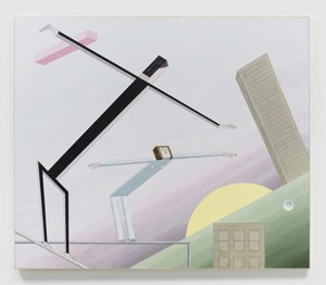
Not that the figurative side has to privilege nature. Why should the sun alone take to the sky? But then why should it be an easy flight? In Larsen's Dawn, a woman leans upward and forward, arms outstretched like a bird or a plane. If she seems nonetheless earthbound and awkward, Larsen has a way of bringing things back to earth. If people here seem more familiar as elements of abstract art, that, too, is part of their humanity.
Her long black veil
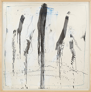
No one takes abstraction back to nature like Pat Steir. Her imagery spans traditions from the Romantic landscape of French landscape drawings to Abstract Expressionism. Are her gently rippling surfaces too pretty for their own good, like the early "Abstract Impressionism" of Philip Guston? Do her waterfalls reach too quickly for the sublime? They are all part of the show, and in works on paper, one can see the show taking shape. The command of scale in her large paintings took preparation.
Sometimes, like any signature work, hers may say too much about what to expect in the future. That often happens when a painter achieves maturity. Yet it gives substance to drip painting, poured paint, and gesture as at once materials and image. And what could be more fluid than watercolor and ink? They bring out how freely her oil and tempera flow as well. They claim abstract art for women in contemporary art from Ingrid Calame and Valerie Jaudon to the present, like American Abstract Artists before them.
Steir developed her waterfalls in the 1980s, when many were questioning the viability of painting. They ask formalism to compete with imagery but also decoration. They warn against interpreting the appearance of water or decorative fabric as feminine while asserting the place of a woman in shaping art. They recall echoes of nature in such older, indisputably rigorous artists as Lee Krasner. They recall canyons and waterfalls in the Hudson River School as well, just in case you have not read enough theses about the American sublime. It might be time to cast those aside.
Steir adds something else as well. By suggesting a veil across the surface, she makes explicit the canvas as itself a soft, flat fabric. Like an old-school formalist, she identifies the shallow depth of the image with the support as much as the paint, while the allusion to fabric adds the possibility of pulling back the canvas to reveal a greater depth. Morris Louis in his Veils works the same way, although his mixed colors literally merge with the fabric. Steir in turn layers her image on top, as artifice doubling surface. The flatness of calligraphy remains.
A horizontal painting, as remarkable for its size as for its beauty, places a Louis-like veil across most of its surface. Others add metallic paint into her more typical vertical format. Recent watercolors adhere most strictly to simplicity amid the excess. With all these, she is pushing at notions of grandeur and permanence, at the risk of complacency. She is detaching the image even further from its ground, while embracing decoration more than ever. The acid metal colors risk the yuck factor, a welcome risk taking.
The formula still allows for surprises. The horizontal painting becomes asymmetric at its left and right edges. A nearly black painting, like that of Christopher Stout but with an added curlicue of blackness on top, restores the fabric of paint as a tactile and not just formal substance. The first invites one to engage the work as an old-fashioned mural, walking right across it in order to watch the image and the room unfold. The second invites one to look at black again in order to see more. They revisit a time when abstraction was in question, if only to wonder at what has changed.
Summer surprised us
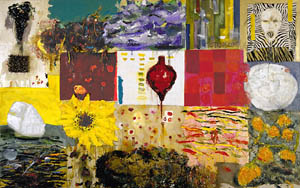
It was a long summer of confinement in the arts. So it is with Joan Snyder, whose show finally moved from online alone and into the space of the gallery. She calls it "The Summer Becomes a Room," knowing her art's way of escaping confinement. If that room was at first only a metaphor, a virtual viewing room, it now outgrows the gallery's main space as well, starting by the front desk. She also spills out from a single canvas, into diptychs and triptychs—and with paint so thick that it may take on the shape of flowers. It is and is not "pure paint."
 She has seen and produced plenty, in what began as itself a second flowering of color-field painting. It had patches of bright colors on fields of white, much as for Joan Mitchell before her. Snyder, though, acknowledged a growing rigor in art by building a painting from parallel brushstrokes. In time that, too, was not enough. If Mitchell's abstractions suggest ponds and gardens, like the broad fields of Claude Monet at Giverny, Snyder soon turned that into imagery. Her work acknowledges the rigor of others and herself, while exceeding it.
One could see her development in retrospective at the Jewish Museum in 2005. One can see it here, too, in a single work with an apt title. Anatomy of a Summer Painting has her trademark stacked horizontals with their softly rounded edges. One could hardly mistake them for elements of geometric abstraction or, at the same time, the marks of a brush trailing off into fibers at each end. They are personal but not mechanical in any sense. They take up the left canvas in a diptych, where the warm summer afternoon deepens into night. They also share the space with thinner strokes that verge on symbols and, sure enough, flowers.
Flowering, then, is at once form, imagery, and a metaphor for painting. The third part of a triptych rests atop the others, giving room for the sinewy verticals of a weeping cherry tree. Flowering also describes such materials as herbs, poppy pods, and, in the show's title painting, rosebuds. Not that she has become literal minded. She also adopts cloth flowers and papier-mâché. Burlap here and there could pass for just another coarse patch of paint or the sieve through which everything has come.
Work like this has to be the worst conceivable candidate for a "virtual exhibition," even amid cautious gallery reopenings. Snyder inherits late Modernism's emphasis on materials and art as object, along with the optical richness of oils. You just have to be there. In fact, the work online becomes rewarding after all once you were. After so much density, you can settle in for a long second look.
The theme of summer contributes to the play of rigor and excess. A rectangle within more than one canvas, as thickly built as the flowers, could stand for a seed bed or an echo of the framing edge. Other patches of color invoke the grid, too, broad and messy as they are. Horror Vacui recognizes the drive to excess in its very title, but as pleasure rather than horror. Darker than usual red, purple, brown, and blue stop just short of clashing, building instead to the hush of a summer night. In this room, there is always room for more.
The crack of dawn
Dawn for Mernet Larsen is a quiet time, the sky almost filling a painting with its blue tinged with red. It is an oddly busy time as well, in a city that, you can be sure, never gets to sleep. The sun is already bright yellow and larger than life as it rises from behind a green slope and a four- or five-story building, its shades still drawn for the night. Is that off-white spot in front the moon, and why does a skyscraper tilt along with the slope? Regardless, a man and a woman are taking to the sky. Her head falls right at the painting's center, much as her body occupies a middle position in depth between the larger man and the sun. 
This is a balancing act, quite apart from a building's precarious isolation. The pair are not actually flying, but rather poised on girders—like construction workers at lunch, in a classic photo of the future Rockefeller Center. Still, their flat bodies make them more like toy gliders than human beings, and the man balances a shorter pink beam on his arm as well. Do circles, rectangles, and an ascent into the void remind you of something? Larsen takes her composition from El Lissitzky and Russian Constructivism, and then she feels free to populate it with something like everyday life. If it is a restless kind of life, its people are, after all, up at the crack of dawn.
Early Soviet art was up at the crack of dawn, too—the dawn of a revolution. It projects calm and stasis, after the busier pioneering abstract art of Hilma af Klint with her symbol systems and Robert Delaunay with his color wheels. You can look at a black square by Kazimir Malevich for a long time, and it is not, thank goodness, going anywhere fast. At the same time, it seems always in flight. It is no coincidence that another artist caught up then in a revolutionary impulse, Marc Chagall, is more famous for a fiddler on the roof. Thanks to Larsen's wooden figures, I may have to think of Minimalism's boards and floor tiles as soaring, too.
Still, her figures do not so much fly as float—and not at all of their own accord. They may toil and trudge as well. A family prepares for a departure, but it does not look easy loading a truck on a cold winter's day, especially when its content will include an entire stone building, the post office. Larsen's world has people to keep them in line as well. A woman bends over a body on a gurney, an office worker looks up to an imposing head in the sky, and a tall soldier stands guard over bare plaza and a stalled highway. At least one person already lies dead.
Something looks out of place even in the best of circumstances. A robotic astronaut brings his tools to a space walk, but a train halfway circles the planet below, on what is sure to be a long trip. Four figures look uncomfortable sharing a restaurant table, and the only thing on their plate is a ball-and-stick model of the solar system. The winter family includes a penguin, and who knows if they are vacationing or fleeing home? As Bob Dylan sang, the post office has been stolen, and the mailbox is locked.
Still, things are not all grim, not in this floating, funny painted world. I had not known of her, but Larsen has been at this a long time. If she has moved more and more to narrative, Chagall had to move on from plane geometry, too. She retains, though, Lissitzky's evident brushwork, even in the plainest of surfaces. What served him as a token of paint itself lends her flat actors a physical presence touched with sunlight, in their place between night and day, earth and sky.

Pat Steir ran at Cheim & Read through May 7, 2005, and with her waterfalls as works on paper at Lévy Gorvy through October 1, 2020. Joan Snyder ran at Canada through October 17, 2020, Mernet Larsen at James Cohan through January 23, 2021.


