Back to Basics
John Haberin New York City
Gallery-Going: Soho in 1997
Mark Tansey in 2004
For a moment, Soho is back to basics. Sound implausible? Yes, I still forget where to turn next. With dozens of dealers, plus all the stores taking on the name "gallery," how could I? Amid the crowds of suburban shoppers, I even want to go home.
At least I often want to move on. There is too much else left to do, now that many Soho galleries have moved some two miles northwest, all the way to the Chelsea Piers. That makes a full afternoon of art harder than ever. After all, with 57th Street and the Upper East Side, one has to catch quite a few venues. 
So, yes, I still may feel all too eager to get it over with downtown. I had days like that in the past, but now I seem to have a better excuse. Only something has happened. The landscape is changing again. I had better update my map before getting down to some of the better downtown shows—by Mark di Suvero, Elizabeth Murray, and Mark Tansey.
Getting pretension
Chelsea promised to rescue art, by giving serious dealers a serious neighborhood. And it did, but not the way anyone had imagined. Too often, Chelsea angles for blue-chip only. Symbolically, its galleries abandoned within a month their plan to put Soho shopping hours aside. Those promises of Sundays hours must have sounded way too idealistic.
Chelsea acts right now as a common ground for the settled, like a preview of the Whitney Biennial. Meanwhile, Soho sadly has driven out many of the most dedicated galleries. They left a core of familiar faces and unfamiliar experiments.
Easy, man, I thought this spring on one long walk from the foot of Manhattan: I choose my targets. No, wait. I can even go a step beyond. From the moment I hit Castelli, the gallery of Jasper Johns and untold others, I can pretend to know what new work by Ed Ruscha will look like. I already know that his stenciled words have more politicized meanings than in past years, and I can even pronounce his name. (It rhymes with the first syllable of déjà vu.)
In sum, thanks to Chelsea, I had discovered pretension. Thankfully, it took only a single gallery for my confidence to vanish. Those stenciled words look bolder and less easily sardonic than in former shows. And like Ruscha himself, Soho looks not dead now, but rather on a sort of elegant vacation. Ironically, with less to call provocative, serious, and other solemn words, one can start to plan one's trip to Soho. It repays a patient visit.
Even late in the spring, with galleries angling toward summer, provocation remains alive. Luhring Augustine had a small Pollock in its group show. I could see again his uncomfortable debts to late Picasso. I could again see Abstract Expressionism as a specific, American turn from Surrealism and Cubism. Meanwhile, at Nancy Hoffman, Carolyn Brady had all-too-accessible but still enticing large watercolors of gardens. Up close, they looked less pat, as befitting their review in the Times, but barely.
Mark di Suvero and Elizabeth Murray
However, I most wanted to see certain other shows. Mark di Suvero had taken over Gagosian for his most ambitious work ever—including his helping to found the Socrates Sculpture Garden and his frequent other outdoor displays, as on Governors Island. Three vertical risers anchor the room's corners, and across them an equally huge beam soars to touch the ceiling.
It sounds like Minimalism again: it places viewers within the space of the work. Indeed, it resembles important shows that have taken place at the Paula Cooper Gallery, both in her old Soho space and then again in Chelsea. Even the risers, with arcs out of Frank Stella in his "Protractors," reminded me of the 1960s. But that is only one part of it. The anchors draw the sculpture down as they pull the gallery into the space above. So do the installation's mass and, for di Suvero, an unusually literal use of the materials.
For once the beams keep their associations with industrial objects and New York's old factory neighborhoods. I imagined the arcs not as protractors, but as shipyard hoists. A lone rope dangled loosely from the main horizontal. To associations with mass, material, space, and industry, one might add suicide. The work stood freely but ominously, and once again a human presence had entered—literally and by its absence.
Elizabeth Murray uses Pace's own large space, but for a scattering of large paintings. My favorites of hers will always be the early ones that shattered into fragments. Like Stella again, the canvas and its supports almost structured the work logically, but the art went on and fought with itself anyway.
Since then, like Guston in his later works, Murray has kept to simpler drawings, giving to abstraction almost Pop overtones. I imagine cast-off pipes, shoes, and clothing. But I do not imagine enough. Frankly, I am bored.
Mark Tansey
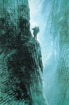
For almost three years, I found myself dying to see new works from Mark Tansey. Tansey earned a name for himself with layered irony about modern art. He took subjects resembling grand history painting, with a proper Victorian composition. Then he painted them in white and a single color, like sepia photography. But now it got interesting.
The large scale and raw, scumbled texture call up abstract art. Meanwhile, figures in the painting claim to be out of not history, but art history, and they draw out critical clichés. "The triumph of American painting" became Abstract Expressionists signing the World War I armistice. Another claimed to depict Derrida querying de Man. The deconstructionists, or some other men just as good, struggled as they tumbled from a cliff like Holmes and Moriarity.
Tansey deserved his smiles, but he did not settle for parody. He seemed to show painting as a language—and not exactly as a code, to use the jargon of structuralism. Instead, one faced three or four conflicting codes, and he made fun of the code breakers.
The newest paintings, at Curt Marcus, look prettier. I am sorry to say, however, that they do not advance matters any further. I am not sure how much to admire a prettified joke.
Tansey still puns on representation and abstraction. One painting shows a scene from all four conflicting directions. One can read it standing upside-down, sideways, or simply with the right textbook. The scumbled surface, its focus pointing every which way, is almost as beautiful as a fine rock face. I only wished that I had seen more going on—or at least footnotes. In several of these, I was definitely not up to being the code breaker.
A postscript: Tansey in 2004
Mark Tansey is easy to dismiss as a one-joke artist, and while even he no longer wants to tell it, I still laugh. His signature paintings of a decade before displayed skill, style, and above all a good ear. The large canvases reproduced classic scenes, but with a narrative twist. Holmes and Moriarity locked in their death struggle at Reichenbach Falls became Derrida Queries de Man. A World War I surrender became The Triumph of the New York School, with the Surrealist clan quite recognizable, should one know and care enough.
Tansey's monochrome contributed at once to the sense of reality and, conversely, of deft quotation from ages past. By focusing the eye on the modeling of forms in three dimensions, grisaille has a way of heightening the illusion while keeping the world at a distance. The Northern Renaissance often used it on the flip side of an altarpiece wings, to look like sculpture sprung to life. As a bridge between the viewer's space and the mythic world of the painted interior, it offered a kind of superior reality—what Barbara Savedoff terms "a higher ontological status," and yet neither the intense, sensual revelation of one's own world or the Biblical one inside. In other words, it showed off the illusion as much as the ontology, making the art and the ritual in which it partook one's necessary gateway to discovery.
Unlike art of the past, however, Tansey plainly used monochrome to refer to a familiar marker of both authenticity and detachment from the present. I mean sepia photographs. He thus suggests that everything about the story was a quotation. And indeed it worked, because this guy knew what to quote. He had a true feel for culture, both pop culture and the culture of art. One recognized the scenes instantly, but as old favorites more than present preoccupations.
His latest paintings grow, if possible, more skillful, with looser brushwork and the abandonment of sepia tones for an intense blue. As before, they present a redoubled illusion, this time with one half much harder to find. If one looks hard enough or, more likely, has a crib sheet, the rugged landscapes reveal any number of the faces. A giant snowball morphs into Karl Marx. Others hide in miniature in a mountain face or, on a larger scale, in anamorphic projection.
Naturally he chooses the faces of philosophers, and naturally he chooses philosophers currently hot in that fairy-tale world of critical theory. No doubt I visit that same Cloud Cuckoo Land myself when I can afford to travel. And naturally the means of illusion, as well as the idea of a commentary on illusion, belong to a critical history of art. Who could mention anamorphic projection without citing the skull in Holbein's The Ambassadors, if only because I have trouble naming another instance of it?
When I see the new works, I stop laughing, because the jokes now seem less sure. The point of monochrome becomes harder to pin down, as does the point of the quotations or even the point of finding them. I doubt I found the half of them, and I wondered if I should bother. Their saving grace for me is now less intellectual than painterly. The broader brush and the subtext make the old puzzle of art and illusion less about the faces behind the landscape than about landscape's cohering before one's eyes. Call it the diminished rewards of mastery from a painter old enough to enter Gagosian's enormous sanctum, but I find it arresting in its own way.

Ed Rusha showed in the late spring of 1997 at Leo Castelli, while Jackson Pollock appeared in a small group show at Luhring Augustine. Carolyn Brady at Nancy Hoffman, Mark di Suvero at Gagosian's former Soho space, Elizabeth Murray at Pace downtown, and Mark Tansey at Curt Marcus all had solo shows. Tansey's show at Gagosian, in Chelsea, ran through December 18, 2004.


