Popping Minimalism's Balloon
John Haberin New York City
Anish Kapoor, Joel Shapiro, and Mark di Suvero
Anish Kapoor likes dark interiors and sweeping curves, while Mark di Suvero built big and open. Joel Shapiro started small, spare, and evocative, and now his sculpture all but flies apart. Does any of them deserve the label Post-Minimalism?
People used to throw around the term all the time. It fit with a sense of new possibilities. It fit with Postmodernism, when theory and practice alike demanded a critical look at the recent past. It also fit with a real concern for Modernism and older media. Painting or sculpture was not dead, and it had not all become Neo-Expressionism or negation. 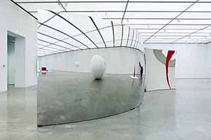
These days, even that may not satisfy anyone. It can sound like a compromise, in a real war zone. Modernism can sound confining now. Postmodernism can sound dangerous or evasive—often to the same people. Kapoor, Shapiro, and di Suvero picked up where Minimalism left off, and critics take pains to describe them as contemporary. As it happens, one calls his new work Memory, but the others remember most.
The ICA in Boston has given Kapoor his first U.S. museum survey, and two years later the Guggenheim gives him a chance to make over the tower galleries in his own image. Born in 1954, he likes steel, geometry and mirrors, not to mention an industrial scale, but also curves. Is he aiming for a smooth and polished grandeur, like a proper Brit, or the decorative side of contemporary sculpture, like Ken Price? Take your pick, but Shapiro, born in 1941, and di Suvero, born in 1933, choose neither. Shapiro began on a smaller scale, with a rebellious streak that still looks young today, even after his own later and larger constructions. He and di Suvero are also in closer touch with formalism and the moving emptiness surrounding it.
Mirroring Minimalism
Is the Institute for Contemporary Art in Boston falling into Modernism's trap of idealizing the young and "the primitive"? Probably, but a new museum has to start somewhere, and two shows facing off across the elevator bank make a helpful contrast. To one side, a mix of hot young artists winds through smaller rooms. With the theme of "Street Level," the ICA is talking young, hot, raw, and tough. To the other side, England's best-known living sculptor shows off the unbroken main gallery. This time, the ICA is talking contemporary but still modernist.
Where the smaller rooms try a bit too hard to look trendy, here the ICA tries ever so hard to look classy. Yet Anish Kapoor could fit into the same narratives of internationalism and colonialism as across the way. He could also be refusing them. Born in Bombay, Kapoor works in London. His biomorphic curves could oppose nature and local traditions to high Modernism. They could also insist on Minimalism's clear geometries, industrial materials, and mass set firmly on the ground.
Kapoor sets out bulges and cavities in red or transparent resin. Mirrored walls disguise their curvature as they shatter, stretch, invert, or multiply one's reflection. A viewer participates in the distortions by approaching the art or by standing away. Yet the sculpture resists penetration by the hand or eye. It offers the nurturing promise of a cocoon, like Hlobo's. Its silvery surfaces also resemble the overpriced living-room accessories evoked at the ICA by Thomas Hirschhorn and Josiah McElheny.
Kapoor's works on paper, not on display here, show his roots in drawing. Like a painter, too, he may let additional resin splatter onto the wall or floor. The work in three dimensions thrives most on a bare list of its parameters—sculpture and skin, clarity and illusion, inside and outside, biology and geometry, artistry and prefabricated materials. It also gets one asking how he does it, even when the optics are quite straightforward. Kapoor would rather play artist than rebel or magician. That entails, however, that one acknowledge just who is in charge.
In short, Kapoor exemplifies one version of Post-Minimalism, much like Lygia Clark or the fluid paintings of the 1970s by Mary Heilmann and others than the conceptual and formal interplay of Richard Artschwager. Maybe the decorative veneer goes down way too easily. However, one can always accept the pretension, stand in front of the mirrors, and have fun. One can also look for hints of a young building's future directions. Young and old, in the galleries and on the street, in two dimensions and three, the artists on view are telling similar stories. Only a few thus far, however, pack an ending.
Ironically, Kapoor had more space that very summer at his dealer's two Chelsea galleries. The ICA's limits suit him better, letting the themes and variations take better care of themselves. Will they prove limits all the same? The varied galleries, modest ceilings, and openness to the water, by Diller Scofidio + Renfro, mark a welcome contrast to the renovated MoMA or New Museum. A single show could make fascinating use of every one of these spaces. Either way, Boston's harbor and art scene could use a shot across the bow.
Sculpture inside and out
Kapoor lets art and architecture show off. In Boston, that matters. Otherwise, the architecture could trick one into grabbing a seat on the bleachers, looking out onto the harbor, and forgetting the whole museum. Thanks to him, one gets to know a gallery, literally, inside and out. Back in New York, though, somehow even that may not be enough.
Memory packs tightly into the Guggenheim Museum—so tightly, in fact, that one gets to know it only in stages. Across from the permanent collection, one might mistake the first tower gallery for being closed. At most, it appears to hold a black square. On a closer look, that surface is an open window. It holds out enormous depth, like Ad Reinhardt on steroids, and it trades Reinhardt's monasticism for a quirky mystery. To see what really lies in the darkness of a work's actual interior, one has to exit and start over from the other side.
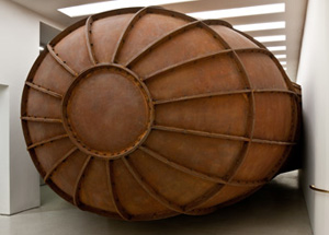 Ascending the ramp, one faces more or less the opposite constraints. The lighting is excellent, and the sculpture's bulk is quite clear. It can hardly help standing out, given its twenty-four tons of Cor-Ten steel plates, like a ribbed diving bell or zeppelin. This time, though, it pretty much bars access completely. Not to worry, for one gets one last chance, through a third entry point with room to spare. No single view says it all.
That series of partial histories allows another novelty, site-specific art for two sites. Meant for both New York and the Guggenheim's branch in Berlin, where it appeared in 2008, Memory takes off from Kapoor's perception that each space divides interestingly in three. That has to surprise someone like me, who thinks of the tower galleries as a boxy addition, but he gives it three relationships to the Frank Lloyd Wright structure. One can approach off the rotunda, off Wassily Kandinsky, or off to the rear. Conversely, the work's immense curves relate the box to Wright's landmark.
Site-specific art that disguises the site, a black square that refuses formalism's flatness, sweeping curves—they all display Kapoor's trademark Post-Minimalism. They have the fluid mass of his 2008 Boston retrospective. All the same, the shift from bright colors and biomorphic outlines to packed masses of rusting steel pushes past his limits. They bring him closer to Minimalism after all, like cuts in wood for Roland Gebhardt. So does the play on contraries like inside and out, two and three dimensions, form and illusion, mass and space. Hey, Richard Serra and his steel walls cut off vistas, too.
Ah, but if only the contraries felt less like an inventory or checklist, and if only they did not lead so neatly from one stage to the next, without exactly testing one's memory. Rather than surprises or threats, it all comes laden with an old-fashioned narrative of revelation. The curator, Sandhini Poddar, imagines a sequence like mine, starting from the museum's Kandinsky heart—and from Modernism to the present. In ascending the ramp, though, a visitor could instead speak of progressive discovery, from a steel wall to a sense of depth. Maybe one should focus instead on the sculpture for its own magic. The steel balloon might have inflated or crashed only moments ago.
Not in Kansas anymore
For thirty years now, Joel Shapiro has felt as familiar as one's very own childhood. Even now, so long after Jeff Koons and neo-Dada, Minimalism is the official language of public sculpture and public memorials. And for a while Minimalism banished sculpture's not-so-secret weapon from Michelangelo to Giacometti, the human form. Shapiro brought them together. Who now could tear them apart?
He starts with thick beams of metal and wood. They hold together with solder, bolts, chains, and little else, especially not gravity. Their tottering geometries are already part of a city's industrial history, especially when they land in sculpture gardens and summer parks—where his more recent work looks better than ever. They also look like stick figures, but as an awkward grownup might imagine them. Dancing or falling, like di Suvero's anchored beams, they hang in there all the same. They could be someone you know or yourself—only, like David after all, slightly larger than life.
For all that, the native New Yorker started small. Shapiro's early sculpture is tiny and devoid of life but as personal as the past. 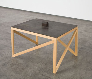 A cast-iron chair from 1977 rises all of three inches off the floor, which might as well extend forever. Bronze houses or barns run not much larger. Their stiff edges, hard materials, closed shapes, and scale keep them at a distance. They seem to reside not in a gallery, but in memory. For many critics these days, they belong to anything but Minimalism.
Perhaps, and perhaps those years began as a rebuke to Minimalism, just as P.S. 1 and MoMA imagined in "1969." From 1969 to 1971, Shapiro worked in wood rather than industrial materials. A wooden coffin or the carved-out shell of a boat sure looks representational. A tiny mannequin, the kind from an art-supply store, has broken into bits. Where Carl Andre uses regularity and repetition, they fall where they may. If, as Michael Fried complained long ago, Minimalism turns the gallery into a theater, these remain objects of art and of contemplation, only somewhere apart.
Of course, memory (like Memory) is a tricky thing. Critics like to think that they have put late Modernism behind them by now. Yet with his turn to cast metal, Shapiro also embraced Minimalism. At the very least, he made it his own. Already in wood, the randomness and shattered elements got along just fine with entropy, a favorite idea of Robert Smithson. And then for Shapiro factory and sculptural materials took over the joint.
They have abstraction's regular geometries, including a trapezoidal prism—or indeed the very first hint of a stick figure on so small a scale. A house on a short pedestal connects to the iron plane below it. Another house sticks out from the wall at eye level, with a door and windows, and one wall piece consists of merely a plane and a square hole, leading to hollow metal sticking down. Their dialogue of open and closed, empty and full, explores the formal vocabulary of sculpture, and art this small makes one aware of oneself and the room quite as much as Andre or Dan Flavin does. Work so rigorous and haunting can never fully belong to Minimalism, any more than to the childhood on a farm Shapiro and I never had. After Soho and Chelsea, art is not in Kansas anymore.
Dissolving Minimalism
Mark di Suvero fills Paula Cooper's main space so neatly that I had trouble believing he had not designed the sculpture for the gallery—or vice versa. The space seems meant to hold the Great Pyramid, and the artist comes close. His tripod nestles into to the skylight, while one metal rod and two rough-hewn wood beams spread comfortably onto the floor. Add a few braces, another pole hoisting a beam toward the ceiling, and what looks like an oil drum in wood perched on one foot, and you have something. At the very least, you have something soaring, solid, and very much in the present.
The work in fact spans not just an impossibly large gallery, but also two years of the 1960s, back when he was friends with Danny Lyon. It makes sense then, that he shared Chelsea with two versions of Shapiro. With his early work, Shapiro was moving from architecture to stick figures and from memory traces to action. His new work flies all over the place, with fragments of colored planes suspended by mere threads from the ceiling. He dares one to be caught in their network. It seems uncharacteristically light and shapeless, but then he had a sense of play all along.
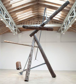 di Suvero shows his aspirations even in smaller and more recent sculpture in the front gallery. Cut and forged from rusted steel sheets, they depart gently from symmetry, in a play on the human figure, but also on two and three dimensions. They amount to his homage first to Surrealism and then to David Smith. The big work, in contrast, is his Calder stabile, only it refuses to stay put. Shapiro's new work is his Calder mobile, down to the bright colors, only fixed in place. Both represented a moment when Minimalism's rigor was dissolving, but in different directions.
di Suvero, seven years older, directed it back to abstract sculpture, while Shapiro overlapped what critics then called new-image painting. One aims high and larger than life, while the other leaves tiny houses like memory traces. One throws his weight around, while the other cracks a wistful smile. Yet they do belong to a shared moment, when industrial materials could once again show their rough edges. Both fight against gravity, while Andre still tiled the floor and Serra propped lead and steel against the wall. Both have moved easily between indoors and out, when Minimalism still celebrated the gallery as a white cube.
And dissolving it was from the very moment it began. The deconstruction began with Serra's torn shreds and with earthworks, and Shapiro builds on those. His stick figures may dance, but they barely stand. Yet di Suvero has a more awkward side than I remembered. At Cooper, one can hardly say what serves as a cantilever and what as ballast. Even at twenty-four feet tall, among the largest of his works, calls attention to its open structure.
Like Ed Atkins, they inherited the notion of entropy from Robert Smithson, and they struggled with it nearly as much as Thomas Pynchon. They did not fight for formalism but against paranoia. Shapiro's colored threads definitely do not make a global conspiracy or a text in structuralism. Maybe they gain a little in resonance, though, after the financial scandals. Julie Mehretu or Elliott Hundley might find something in common with them as drawing. Just do not push on those threads too hard.

Anish Kapoor ran at Boston's Institute of Contemporary Art through September 7, 2008, and at Barbara Gladstone through June 22. His "Memory" ran at The Solomon R. Guggenheim Museum through March 28, 2010, Joel Shapiro at Paula Cooper through February 13 and at Pace through May 15, and Mark di Suvero at Paula Cooper through June 30. A related article looks at Shapiro's later, grander outdoor work in summer sculpture parks.
