Casting Aspersions
John Haberin New York City
The Ministry of Truth—Minitrue, in Newspeak—was startlingly different from any other object in sight. It was an enormous pyramidal structure of glittering white concrete, soaring up, terrace after terrace . . . .
— George Orwell, 1984
Rachel Whiteread
Outside of video art, silence can still speak louder than words. For Rachel Whiteread, it can also weigh a ton.
When Whiteread looks at space, she sees personal possessions that can no longer disturb the emptiness. In her casts from these objects, she evokes entire lives that can no longer break the silence. 
As her work gains in scale and majesty, she may risk drowning their voices in her own high seriousness. It pays off, but it has me puzzling over choices in art today. It makes an interesting contrast, too, with more modest and entertaining household objects, in sculpture from Sydney Blum. A postscript brings Whiteread up to date for 2006. Together, they show artists in turn abstracting from ordinary things, enlarging them, and finally drawing back in scale to the everyday.
Art takes a bath
More than a decade ago, Whiteread found her niche—in more ways than one. She casts the space around and within things. A bathtub becomes a cross between a time capsule and an outsize pill. A water tower glows like a nuclear reactor above the heart of urban space. Books from the Holocaust stand not just unread but also unseen, as in a similar memorial by Louise Nevelson, and yet paper's crumpled edges testify to the loss of objects, traditions, and lives. Sculpture cast from a house leaves a dwelling forever vacant. Even more, it positively denies the presence of home.
Whiteread gives the dignity of sculpture to what critics quickly termed "negative" spaces. At the same time, her outspoken negative disturbs the dignity of fine art. Familiar forms take on an eerily unfamiliar shape. The mix of materials, including resins, preserves real life with the emotional resonance of a memorial and the coldness of a laboratory experiment. Between the two, art takes a bath.
Whiteread's cultural appropriation placed her among the Young British Artists. So did the shock of the unfamiliar and its apparent rehash of men and women in Pop Art. Her bathtub appeared in "Sensation," as if to complete the bathroom display with Chris Ofili and his poop Madonna. Still, it seemed designed to impress rather than to repel, much like a kitchen for Mark Leckey. It the casts can look threateningly institutional, they also clearly aim for the museum and public spaces. Her negative house actually stood outdoors, and her negative plinth shunted traffic as firmly as the original.
Compared to the YBA, she also has a closer relationship with the 1960s. Like Pop Art, she sticks to the inanimate rather than dead cows, and she gives her found objects an iconic significance, like an artist's tools cast in bronze by Fiona Connor. Like Minimalism, she calls attention to the space around traditional sculpture, the space in which the viewer may move as well. Her whole idea derives from some casts of Bruce Nauman. One could mistake her cast of tiles for a floor piece by Carl Andre.
Like both Pop Art and Minimalism, too, her technique makes the work infinitely reproducible—at least in principle. The anonymity and attention to absence all recall heavy critical trends of those decades. From structuralism and post-structuralism to feminism, words like authenticity, presence, and the originality of the avant-garde became suspect. When I hear of negatives spaces or casting, I think of photographic negatives and commercial reproduction. Had enough fine art? Knock it off.
Still, one cannot step on the same assembly line twice. Whiteread's appropriation of appropriation happily accepts the loss of some of its critical edge. The work's sculptural weight and beauty, too, return it to an older pattern of fine art. She restores to art another side of Modernism, well before the 1960s—a focus on craft and the banality of the everyday.
Stairway to heaven
Consider her contrast with Pop Art and Minimalism, from the very beginning. Pop commits one to found objects and images. In Andy Warhol or Robert Rauschenberg, one remembers the brand names and associations filtered through mass media. One remembers, too, the painterly gestures and hard-edged stencils. Through them both, art keeps intruding on life.
Whiteread makes her object rather than discovers it, and it remains an object rather than an image. She takes things too lowly for even a brand name, like that bathtub. She takes books whose text and signs no longer circulate. Her smooth finishes and irregular surfaces look neither personal nor mechanized. The tiles form a square right on the gallery floor, but Andre would have eradicated its detailed texture of raised parallels.
Minimalism, meanwhile, looks behind the object to an arena of action. The viewer or the performer enters in real time, as much a part of the work as changes in light and air. Such a theater unfolds anywhere but in urban and suburban reality, however. The work may dissolve, or it may never reach completion. The settings may depend on the sterility of a modern gallery or museum—or the remote setting and large scale of earthworks.
Whiteread takes her images from urban life, much like casts and models for Beverly Buchanan before her, and she makes space into something solid, sculptural, and complete. One stands outside the art, barred from touching it and with no means of entry. One cannot take a bath in that lump. One cannot penetrate either the house or its cast. The trace of its windows looks forbidding indeed. They also look very much one's own as that Rauschenberg bed turned upright—or the commodity culture of a Brillo box—never will.
In short, she speaks for the absent, but with all the connotations of art. The concept of a cast itself recalls an older idea of art-making. Bronze statuary came into existence the same way. At her Holocaust memorial, one can see again how Minimalism has transformed into today's official language of grieving. Part of me can never see her name without thinking of "white bread." The same neutral color she favors could make one disown the substance of art, or it could remind one all too well of the facelessness of institutions.
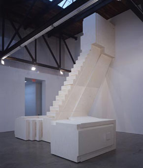
With Whiteread's winter 2003 installation, a stairway almost literally to heaven, these trends sit uneasily with one another. One has those paradoxes of presence and absence, the monumentality, and the nostalgia. And it may well add up to her most audacious display.
Accentuate the negative
Whiteread casts a staircase. Two short, straight flights mount from opposite sides to a central platform. From there, at right angles to the initial steps, the stairwell ascends an entire story. It invades the whole gallery, nesting into the triangular rafters. It draws one's eye seamlessly to the skylight above.
Sure, she had cast an entire house before, but here an indoor setting accentuates the scale. Like her subject matter, Whiteread at last truly approaches architecture. Or am I only imagining the original site? For the first time in her work, I no longer know. For one thing, as with tiles the year before, she chooses an object whose very geometry muddles a distinction between positive and negative. Stairs could serve as the template for their own reproduction.
In addition, she rotates the whole by a quarter turn. The lower steps run horizontally, perpendicular to the ground. They leave one as confused as the interlocking stairs in an Escher print. They also give the sculpture a broad, seemingly insurmountable base. I had no clue how the stairwell ran or where it began. I had no idea how anyone could reach the shoulder-high first platform.
Has she betrayed the point of her own art? By blurring the negative, she seems to have fallen heavily for the positive. She takes sculpture and monument entirely out of their quotation marks. I felt that I was looking up at a marvel of a lost civilization, like a Mayan pyramid. And yet instead of a ruin, I saw something as pristine as late Modernism. This work has the beauty and amazement of both, if not quite their way of bringing the sublime back to earth.
Whiteread may at last have overcome the least traces of smugness. She really is seeing and feeling the space around her. She finally is questioning the object that she makes from it. With no firm distinction between positive and negative, she cannot fall into exalting absence as a thing. The negative of a negative has become a positive—the world in which the work and viewer live.
So has she sold out or triumphed? Has she become the last modern, the last postmodern, or the latest to give up on both of them? Probably all at once. Like the horrific performance by Marina Abramovic amid a gallery's sterile grandeur three months before, she gets one rethinking the beauty and treachery of art institutions. By all means, accentuate the negative, but the positives keep coming back.
Cleaning up
Okay, I admit it. Whiteread's stairway does not exactly leave one smiling. Her art has a way of elevating particulars while eradicating particular impressions and feelings. As it happens, the very same spring Vera Lutter was using direct impressions and large scale for ghostly photograms. Each woman artist does her best to transcend gender, not to mention humor. Hey, this is serious stuff. 
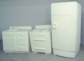
A third woman artist makes what look like still more neutral casts. However, Sydney Blum sneaks all the fun back in, and she shows how almost the same images and media can take almost the opposite connotations. In her work, household objects reclaim their history. Blum's refrigerators look like dark plaster, and her kitchen stoves retain their glittering, unspoiled white. Actually, she fashions the fridges from a dense mix of cement, peat, and spices. She carves the stoves out of foam rubber. One can still see the traces of a knife.
The materials show a work's artistry and substance. The spices and knives also evoke a woman's traditional world. I thought of Martha Rosler, in a video, marching through the letters of the alphabet with sharp knives. The choice of models—probably from the artist's childhood—also creates a history.
The clunky modesty of this sculpture forbids any grand claims, but neither art nor gender issues fare any worse for that. However, the piece that caught my eye most does get aggressive. Blum fills the rest of the long gallery with more peat and cement. They form old vacuum cleaners, a horde of them, one hose spilling onto another. They seemed to have gone on a rampage together, like animals. As with Rosler, I hardly knew whether to stare, to assist in good housekeeping, or to run for cover.
The tubular creatures seem caught in the act, cast, and frozen in time. Will the art—or a woman—escape into the present? I shall let you know when I stop laughing.
For something only slightly more safe and pretentious, Blum turned in spring 2005 to wire constructions. Except for their small scale, one might compare them more obviously to Alan Saret, say, or John Chamberlain. However, they typically work a little like recent Frank Stella, in the combination of coiling and an implied geometric frame. In Blum's case, the coiled wire typically forms the work's center, with the wire straightening out a bit into rectangles around that. Blum does use paint here, but it does not call attention to itself. It just makes a single coil appear an assemblage of color.
The incredibly shrinking Whiteread
Could Whiteread's cast of characters shrink, too? In 2006, she makes a case that good things come in small packages. She puts another fresh cast on things—this time, white plaster casts of ordinary cartons. As usual, she creates something beautiful and deceptively familiar from the space within and around everyday objects. In a scene of galleries and fairs that reduces art to packaging, however, has she become all too complicitous?
Whiteread's approach could sum up the promises of several decades. Like Modernism, she pares representation to its essentials, both to "defamiliarize" reality and to reveal sculpture as an object in the world. Like Minimalism, she plays with block-like, repeated forms derived more from Home Depot than Pearl Paint. However, where these made the space surrounding the art object part of the work, with the the viewer an active participant, she makes that "negative space" itself into solid art. The mind games and concern for a sculptural object seem at once very contemporary and comfortingly old-fashioned. No wonder she emerged from the Young British Artists, an environment obsessed with both shock and tradition.
Whiteread's plain shapes and ghostly colors suggest memorials, and she often appears to be creating memory plays out the lives of her viewers. Cast bookshelves served as a Holocaust Memorial as much as sketches for Hannelore Baron. However, as the market for art objects grows, she may seem its servant even more than the usual run of chaotic, entropic installations. When her cast stairwell evoked the pyramids of a lost civilization, I wondered if the grandeur did not outweigh the puzzlement. And now, with casts of cartons that look like solid gifts, one might question whether the gallery as showroom has taken over entirely.
I have my own doubts. I have trouble reading the new work's paradoxes as a critique of consumerism or the art world. It has too much its own momentum. It is not going to turn into a metaphor for the artist's own enterprise, like the work of Andrea Zittel.
However, that momentum has a lot going for it. Whiteread really has taken the perplexity of positive and negative space to another level, by creating content for packaging that has lost its referent. She has also backed off the monumentality that disturbed me. These things may seem too reproducible or too precious, but only because she allows them to remain ordinary and small.
Best of all, the surfaces respond well to the original paper, cardboard, or fabric. They look about to crinkle or crumble in one's hands. That helps undermine their pretension but hardly their visual delicacy. I kept lingering over the edges, almost forgetting that anything lies within. Given the obvious weight of plaster cubes, it also translates the game of object and space into something more tactile. The strong valuation of beauty and objecthood may leave Whiteread under a cloud, but at least for now I can call it a cloud of plaster dust.

Rachel Whiteread's stair piece ran through March 29, 2003, at Luhring Augustine, which then also installed the floor tiles, which date from 2001, in a group show through May 3. Her packages ran through April 1, 2006. Sydney Blum ran through April 19 at Kim Foster, with a considerably later show through April 23, 2005.


