7.31.24 — Facing Catastrophe

To pick up from last time on “Coal + Ice at Asia Society, photographs out front document each step in the narrative, from coal to ice. Geng Yunsheng photographs Chinese miners dragging their burden across dry hills and at rest underground, with no certainty that they will ever see the light of day.

Camille Seaman has icebergs from both the earth’s poles, her photos saturated in blood red and ice blue. Gideon Mendel adds the consequences of climate change for India, where flooding has left homeowners literally underwater. Yet he means to show not despair but a return home. One man has begun to ladle out the water with a steel tub. Camille Seaman's Iceberg in Blood Red Sea, Lemaire Channel, Antarctica (courtesy of the artist, 2016)

Is it a good start or a sadly comic ending? Such is the dilemma of climate change. A man in water up to his neck recalls a young black male popping up from a manhole in a classic photo (now in the Dean collection) by Gordon Parks, with much the same mix of comedy and fear. Parks himself puts in an appearance, with his own photographs of miners, as do Lewis Hines and Bruce Davidson, while shots of factory towers include Bernd and Hilla Becher. And here, too, something may sound all wrong. What is one to make of a group show of nearly forty artists, some who have never set foot in Asia?

A step inside provides a breathtaking answer. Credit the enormous photo and video collage to the curators, Susan Meiselas (a Magnum photographer in her own right, now on view at the International Center of Photography) and Jeroen de Vries. Identifying the contributors for each image is next to impossible, even with a plastic card just outside. If the show is flawed, it is less by dogmatism than by just that cinematic flash. As a poster upstairs asks, “What good is the house on the hill when the valley is on fire?” Here not just the landscape is fiery.

That poster belongs to one of a handful of special projects, which are immersive in a very different way: they serve as hopes for the future and actions for you, in the present. They can be as modest as a poem, by Jane Hirshfield, or as extravagant as a vision of New York in 2050, by Superflux. Make that two visions, of shortness of breath and long relief. They open with dark skyscrapers consumed in a deep red mist. And then a second chamber imagines a greener, wetter New York, with every boulevard now a waterway or a beach.

Both chambers place you at their center, facing your own reflection in a mirror. It can be a proud or embarrassing encounter, and it is not the show’s final demand. Jake Barton sets out postcards with still more fiery, futuristic images—not just for your enjoyment, but for your signature on the back and an invitation to “chat with your future self.” Pull out your phone, text “The Accelerator,” and read what you can do in reply. Maya Lin is more welcoming still, with an interactive Web site for global climate information. Lin, whose credentials as an Asian American include her architecture for New York’s Museum of Chinese in America, has been committed to the intersection of art and climate change for some time.

Their technology leaves what once were “new media,” in Asian video and photographs, in the dust. Still, for all their optimism, the projects raise their own doubts for the future. Has New York in 2050 converted automobile traffic into a day at the beach, or has it made the best of rising seas? Jamey Stillings takes his video camera to renewable energy, but the windmills look eerily close to white crosses in the mega-video a floor below. Clifford Ross, whose questions about climate line the stairs, headed straight for the New York coast for a hurricane—a seeming tidal wave aimed at him. “Coal + Ice” wants to supply an antidote to fire and despair, but neither is all that far away.

Read more, now in a feature-length article on this site.
7.29.24 — Breathtaking

Climate change is simply breathtaking. So it is at Asia Society—not just coal dust and flames choking the air, but an epic multimedia experience that the Star Wars or Marvel universe would envy.

Coal + Ice” should have anyone taking a deep breath at what climate change means for the very near future, through August 11. It may humanize the apocalypse, almost to the exclusion of policy and politics, but the human stories at its heart hit home, and so for all my qualms does the visual overkill. Is this the future of planet earth? It must seem so, in a show that ranges from video to texting. Yet it is rooted in photography from the last century, when the costs had already begun to hit home. Separating the past from the future, it wants to say, is up to you—and I work this together with an earlier report on sustainable architecture as a longer review and my latest upload.

“Coal + Ice” must sound like a mistake. Surely the proper pairing is “Fire and Ice,” as in a poem of that name by Robert Frost. For Frost, they were metaphors of how the world will end, in desire or hatred. For Asia Society, they are fact and visceral sensation. Coal dust is what blackens the face of a miner in a photo by Song Chao, the worker already sinister and laden with chains. Ice is what is in retreat, even as it still cloaks Everest, in a flight over the Himalayas by David Breashears.

Fire is spreading, too, in video of wildfires by Noah Berger and of drought in California’s Central Valley by Matt Black. Like melting ice, these are consequences of climate change, with burning coal its most potent contributor. They and more fill a single large room as a sweeping immersive experience. Photos and video by dozens of artists play out on monitors and museum walls, from floor to ceiling. While one end of the room has coal and the other ice, with fire in between, there is no set entry or exit. Things, they seem to say, will continue without end until people say otherwise, starting now.

All this can be fact or overkill, and this review is necessrily getting long. Allow me to wrap it up next time.

Read more, now in a feature-length article on this site.
7.26.24 — Collecting Memories

Amalia Mesa-Bains has been collecting fragments of a life for decades now, and the lives in her art go back deeper still. “Archaeology of Memory” is at once a career retrospective, a family history, and a great tradition. These are both personal and collective memories, and at age eighty she is still digging.

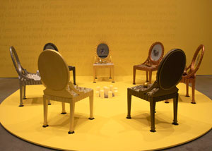
The concluding work at El Museo del Barrio, through August 11, is no more than a circle of chairs, laden with shiny fragments. It is her Circle of Ancestors, but she leaves it to you to imagine them as people. The tchotchkes would make for uncomfortable seating for anyone. The circle facing inward, toward candles on the floor, could assert her place or exclude her—just as, she implies, Amalia Mesa-Bains's Circle of Ancestors (photo by Daria Lugina, Rena Bransten gallery/Berkeley Art Museum, 1995)the art scene and the United States have turned their backs on Mexican American women like her. She claims the memories as hers all the same. For so obsessive a collector, the claim will always be a work in progress.

Mesa-Bains lived and worked through the heyday of the “Pictures generation” and critical theory, and her show’s title plays on The Archaeology of Knowledge, by Michel Foucault. He sees knowledge itself as a means of dominance, but does she? Well, yes and no. El Museo del Barrio sticks to work from the last thirty years, much of it from the 1990s, including the four “chapters” of Venus Envy brought at last together. It is by no means satisfied with penis envy, but by no means triumphant. This is the territory of Queen of the Waters, Mother of the Land of the Dead.

The chapters start with First Holy Communion, Moments Before the End, and surely, some might say, the Catholic church is as repressive an institution as any. A life-size doll lies beneath its blanket as if dead. Maybe so, but display cases contain flower petals, family snapshots, lace dresses, and white curtains along with saints. The installation also has a dressing-room table, for more of a girl’s or a woman’s world. Later a “great green monster,” the proverbial earth mother reduced to wallowing in earth, has a hand-held mirror, too. For Mesa-Bains, parodies and protests are never easy to distinguish from models and memories.

The next chapter comes to a proper library, a fine-wood table laden with the Bible, a skull, a compass, and a globe. It belongs to Sor Juana Inés de la Cruz, a seventeenth-century scholar, proto-feminist, and nun. It is just one of the chapter’s “enclosures,” including a harem along with A Virgin’s Garden, adapted from illuminated manuscripts. Apparently the artist can claim the Enlightenment and the Renaissance as her own, too. The final chapter, The Road to Paris and Its Aftermath, has a large photo of the Arc de Triomphe draped in electric colors. Mesa-Bains can claim the city of the Mona Lisa, Gertrude Stein, and Modernism as well.

Just a year ago at the museum, her sphere seemed more modest. She was at the center of a show of “Domesticanx” and domesticity, including younger artists (and I leave a proper report to my review then). Even now, she conceives of her installations as altares, or home altars, and ofrendas, or domestic offerings to the dead. Yet her claims here cover a lot of ground, and so do her memories. The solo exhibition could serve as a model for other museums, returning to one exhibition to add context and depth. It need not leave the past behind.

Mesa-Bains still treats personal and collective memories as one thing. As a guard said when I asked where to begin, anywhere, because it is all “a thing,” and he was right. The remaining chapter centers on codices, or ancient manuscripts, and botanical texts from the past, both overlaid with snapshots and paints. It does so, she says, because she loves them, but they have a personal meaning as well. She worked on them while recovering from a near-fatal accident. Her faith in herbal healing is sentimental as can be, like so much of her art, but the pipettes and vials are evocative all the same.

As another title has it, these are Private Landscapes and Public Territories. One last work could never be hers along. It turns to the border with Mexico for What the River Gave Me. Growing up in California as the child of illegal immigrants, she could not have known it as an obstacle or seen it shine, but no matter. The water becomes half globes of blown glass, set on a bed of shattered glass between banks of vaguely humanoid brown earth. Let it shine.

Read more, now in a feature-length article on this site.
7.24.24 — Fun, Fun, Fun

Paula Wilson serves up not just a show, but a compendium of her art. At a time when nontraditional materials have become a priority, she brings no shortage of those as well, at Bortolami through August 30.

Now that weaving has become an assertion of women’s work as fine art, she leads straight to what must surely pass for just that. It might be a self-portrait, only larger than life, or an empty dress. At a time, too, when glass and ceramics have attained dignity as art and design, she gives the media a history in stained glass. Steel tracery outlines an image, while gallery light passes through like sunlight. Virginia Overton's Untitled (Suspended Beam) (Socrates Sculpture Park, 2018)

In a show called “The Wind Keeps Time,” first impressions may soon be gone with the wind. Wilson has a reputation as a mixed-media artist, and the show includes video as well, but she is still a painter with a trust in imagery. I first encountered her in summer group shows in 2013, with an entire catalog, as I wrote then, of painting, architecture, and remembered pleasures. She executed it, though, in tapestry, or so I think, but it simulated bricks, grillwork, decorative reliefs, and graffiti. Here what looks like something else entirely is most likely a print or acrylic. Only a true painter would see its potential for imagery and light.

That portrait stands face front at the center of the back wall, at the gallery’s second, shared space up the block from its first. The rest fills the room in front of it, largely apart from the walls. If that suggests a chapel dedicated to the artist herself or to women, it includes simulated stained glass. It frames a girl’s image as well, the silhouette of a dancer in sunlight. It might almost be a magazine clipping—and the entire show a kind of collage. Wilson can make pretentious claims into free play.

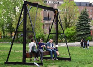
Virginia Overton, too, takes materials off the wall as something tangible and a place to play. Her 2016 terrace sculpture for the new Whitney Museum gave it a reflecting pool or perhaps a real one. Her 2018 summer sculpture in Socrates Sculpture Park in Queens turned brown steel into a swing. She also parked the very symbol of American freedom out front. Did that mean a car? She may not have taken one to the principal space for Wilson’s gallery, but then Tribeca parking is a nightmare.

You may find yourself thinking of cars facing silvery metal inside the gallery. You may feel the momentum of a moving car from its physical presence as well, through August 9. Her most impressive work fills the long central wall with foot-wide strips of it, rippling across the space. A smaller work fills three walls of a side room. Up close from the moment one enters, it demands attention to beaten metal and to every bolt. Thin, darker beams curve apart from an apex at the top, held together by a clip even as they threaten to fly away.

Overton has salvaged them all from the archetype of the great American highway, a sign, which she disassembled strip by strip, beam by beam, and bolt by bolt. The gallery’s Web site shows none of this—only cars parked outside an establishment that I hope never to patronize. Puzzling or not, it rings true. The house number on the building behind them even matches that of a pricier Tribeca dealer right across the street. Park yourself inside to relish the shine before it fades. Art will have fun, fun, fun till her daddy takes the T-Bird away.

Read more, now in a feature-length article on this site.

7.22.24 — Lighting Up Minimalism

Over twenty years ago, a Manhattan neighborhood was just beginning to thrive, and a commercial gallery was already shutting its doors. It could be a lesson in gentrification, so often driven by the arts—the very studios and galleries that development would quickly chase away. Yet it was just perfect for Keith Sonnier. His light fixtures all but demand an industrial space in line with his industrial materials, while it takes an impressive setting to show off his art.

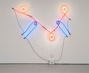
It was 2003, between Soho and Tribeca but to the west—a neighborhood not yet known as Hudson Square. And it was the last show at Ace, a humongous gallery that showcased artists who subvert a certain idea of art. One could get lost in it, not least when the art offers one’s sole illumination. Keith Sonnier's Neon Incandescent VI (David Kordansky gallery, 1968)It happened when David Hammons left a gallery-goer with only the thin blue beam of a pocket flashlight, and it happened one last time with Sonnier and his brighter lights. It helped rescue him and Minimalism for a twenty-first century idea of subversion, and it had more than enough space for a proper retrospective. The artist, then in his sixties, had always one foot in “process art” and one in sculpture, and it showed that one never really had to choose.

Now Sonnier, who died in 2020, comes to Chelsea, at David Kordansky through August 9, where sculpture wins out right away. The process, in contrast, takes its time, as process will. Each work gets a partitioned space to itself, and each refuses to stick to the wall. Is it still Minimalism? After a recap of my past review, I pick up on the evolving present—together as a longer review and my latest upload. His very artistry may have hurt his reputation, but it could stand up to a changing city all the same.

What do you think of when you think of a light fixture? It could be a backdrop for living, and a charming photograph has Keith Sonnier at ease in an armchair, with a fragile neon tube bursting out above. Not that he ever went for invisibility. A fluorescent tube for Dan Flavin may nestle neatly into a corner, much as metal plates for Carl Andre rest on the floor. They refuse to depart from the architecture of the room. Sonnier delights in it. His thinner tubes may rest on glass panes or trace a twisting path of their own.

Then again, you may think of the chill of fluorescent light, marquees, and advertising, a chill that you would never allow in your home. Sonnier, though, incorporates older incandescent bulbs nearly as readily as neon. In fact, neon may loop right around them, as well as around itself. It embodies a mantra from the 1960s, drawing in space. A fixture for Flavin all but dissolves the corner and itself, leaving only a soft glow that identifies the work with the space of the room. Sonnier’s has a life of its own.

Still, this is not home decor, and these are industrial fixtures through and through. The bulbs themselves have the steel cap of off-the-shelf hardware. He makes a point of not distinguishing the bulbs from the tubes, with titles like Neon Incandescent. The commercial and the sculptural are one and the same, and their final composition accepts and shapes them both. The 2003 show revisited his career as an empty landscape with one foot in urban reality and another in science fiction. This one sticks to abstract objects and real space.

It also sticks to three years, from 1968 to 1970, when Sonnier’s late Modernism had few challenges beyond itself. Minimalism was giving way to Post-Minimalism, a precursor of the Neo-Minimalism more common today. When Robert Irwin dissolves the work in light, he also multiplies the fixtures in a dizzying illusion. When Eva Hesse, Richard Tuttle, and Jackie Winsor put the neo in place, they evoke the tactile nature of space. The work becomes dangerously close to the human body. And Sonnier, who grew up in Louisiana’s Cajun country, calls one series Ba-O-Ba—Haitian French for the effect of moonlight on the skin.

He, too, impinges on the visitor and the room—and not solely as sculpture. Tubes cast their shadows like tentacles on the walls and floor. They may follow the top edge of the glass panes or cut across it. Light penetrates and reflects off the glass. The work is always just larger than life. Still, it retains its late modern logic. Colors do not stick to primaries, but rather to ROY G BIV.

With his measured excess, Sonnier’s could be the art of gentrification. It has lasted through the rise and fall of Soho, East Village art, Williamsburg, Bushwick, and now the Lower East Side. One can only guess at what that means for the rush to Tribeca. Sales had already begun to fall before the pandemic, and Chelsea itself has, I shall guess, dropped to half the size of its peak. Sonnier comes in November to Dia:Beacon, where Irwin has space for his own dizzying multiplicity in parallel lights.

Read more, now in a feature-length article on this site.

7.19.24 — The Old Song and Dance

An American in Paris, the classic film, was not, as the saying goes, based on a true story. It does, though, come close to the stories of dozens of artists after World War II—the stories of “Americans in Paris,” at NYU’s Grey Art Museum through July 20.

William N. Copley was not the sort to break into dance like Gene Kelly as an aspiring artist in the movie, but he was plainly enjoying himself. He adds a distinctly American touch to the French flag, with the silhouette of a bottle on each color field in a further permutation of the good old red, white and blue. It suited a city in which a starving artist could afford dinner and drinks in cafés, William N. Copley's Imaginary Flag for France (courtesy of the artist/Kewenig Galerie, 1972)with or without Jean-Paul Sartre and Simone de Beauvoir. One could rent a hotel room on the cheap as well, although with water for that bottle down the hall or in a public shower. Copley did not yet have his familiar cartoon style, but he was already playing with outlines and stereotypes. And others, too, were taking in French art while leaving it behind.

Artists might stay in Paris after the fighting, for who could leave the city altogether behind? Or they might return on the GI bill, which paid for studies abroad (and Fernand Léger himself was giving lessons). They might feel themselves in a tradition of Americans in Paris, like Mary Cassatt in pursuit of a singularly American Impressionism or Gertrude Stein and her circle, at the very heart of modern art. Where a year in Paris was once a demand on any artist, now it meant taking chances on yourself and whom you might become. Who needed music by George Gershwin when Americans were, increasingly, the stars. In truth, the “school of Paris” was past its prime in 1951, the year of the film, but “Americans in Paris” has ten more years to come, closer and closer to the postwar art you know.

The large show reverses the conventional picture. You may think first of Europeans fleeing to America for their careers, like Hans Hoffman, or their very lives, like Arshile Gorky. You may think of French art then as an increasingly watered-down Surrealism—the kind that Americans like Jackson Pollock back in New York had to outgrow. You may think of other Americans working their way through a dark prewar realism, like Adolph Gottlieb in still life or Mark Rothko in the subways. The Grey Museum has little other than abstraction, in coarse metal and painting. This could be Abstract Expressionism and then Minimalism by another name.

To be sure, Americans had a lot to learn. The show opens in the late 1940s with Kenneth Noland, with not a hint of his targets. He embeds cryptic symbols in black. Al Held has an almost uniform blackness, with thick, heavy brushstrokes far from the deep space of his wilder geometry. Nancy Spero paints darkly, too, and with an uncharacteristic tenderness—unless, that is, her Lovers is a rape scene. In no time, though, she is as confrontational as ever, with foul language in paint in French and English.

If they had a lot to learn, they had to learn it from each other or on their own. Many an artist heads to Paris for its museums, but quotations here are few and far between. The show does have a “salon” for what they might have seen in galleries and studios. It looks overly busy and largely irrelevant. Finer artists had at least an eye on the United States, where the action had begun. They lived in Paris, after all, not under a rock.

This could almost be a survey of postwar American art apart from Pop Art. Fluid colors in a shifting field of red, from Ed Clark, approach Gorky. Sam Francis and Claire Falkenstein leave plenty of room for brushwork on a field of white, like color-field painting for Noland or Joan Mitchell. Sure enough, Mitchell turns up as well. Others, too, had the germ of their art from the beginning, like comic-strip figures for Peter Saul, irony for William N. Copley, or a spare geometry for Carmen Herrera. Her red stripe across the bottom of a painting both anchors it and makes it pop.

They work big, and they push toward the edge of the canvas. William Klein, better known for urban photography, lends shadows to geometry, while thin white triangles cut across like arrows. Ellsworth Kelly spans more than one panel, although not yet shaped canvas. His curved green on white looks ahead to later work as well. By the show’s end, the school of Paris had few lessons left to give. It was not the first time that Europe had something to learn from visitors from the United States.

Read more, now in a feature-length article on this site.

Older Posts »