Housing Politics
John Haberin New York City
Architecture: 9 + 1 Ways of Being Political
Henri Labrouste and Nineteenth-Century Paris
Can architecture finds its political voice? Where Modernism sought to remake the world, architects seem to be settling for real-estate values. They look up, with Donald Trump and Hudson Yards, but to luxury towers. They look ahead, but only to look back, to an abandoned freight line in Chelsea or a classic carousel in Dumbo. Instead of common ground, they seek gentrification and tourism. The personal is no longer the political, but the pocketbook.
Now the Museum of Modern Art wants to redo the math—by the simple expedient of counting on its fingers. With "9 + 1 Ways of Being Political," it remembers when modern architecture stood for something.  "New modes of urban life had to be devised and the architectural imagination had to be conjured." But something went awry. As economics took over from politics, the show argues, that left architecture in the service of the powerful, and change will take some doing. In fact, it will take charting the landscape ever since.
The curators, Pedro Gadanho and Margo Weller, thus lay out "fifty years of political stances in architecture and urban design." Yet the politics of architecture goes back far longer and to far more traditional and more innovative public spaces. Henri Labrouste explored it in nineteenth-century Paris, when he created a national library. Some people worry about the death of books. Others would simply upgrade their tablet or reader. I worry most about the loss of bookstores and libraries.
Burning down the house
The story of architecture and urban life is Gadanho's and Weller's, although the examples so far are mine, and they have a point. Theirs is a history not of Modernism, from the Bauhaus and the Russian revolution to postwar society, but of the last fifty years. It stops uncomfortably short of architecture and political choices in the present, but the present is scary enough. Pricey housing from Frank Gehry has leapt ahead of construction at Ground Zero in shaping the Lower Manhattan skyline. Chelsea and Lower East Side galleries weave past one new high-rise condo after another, not to mention the tourist parade grounds of the High Line. Michael Kimmelman in The Times has dismissed One World Trade Center but praised a covered walkway north of Battery Park City as the twenty-first century equivalent of the great European gallerias, but it covers Goldman-Sachs and the restaurants that the firm invited downtown, so that the financial sector could have lunch.
The story begins familiarly enough, and it has echoes in contemporary artists as well. The glass box began as an ideal, critics have long insisted, but it became a sad model of capitalist efficiency. Housing projects became not a means for integration into a functioning economy, but permanent holding pens for those who lost out. In response, architects have turned to "radical stances," "iconoclasm," and the "politics of the domestic." But something is awry here, too. I quote the titles of three of the exhibition's nine sections—and if they seem somewhere between vague, perfunctory, and jargon ridden, so does the exhibition.
You can picture what to expect, but you would be wrong. Fifty years of trying have not brought about sustainable growth and American belief in the public sector. How about real affordable housing, a return to the street grid as a unifying force, investment in mass transit and urban infrastructure, and the creation of common spaces for recreation and as meeting points? How about seeing beyond suburban sprawl, now that the promises of space and freedom have run out? How about political action, for a say in where funds can and should go? Just in the last months, those themes led the Modern to "Foreclosed: Rehousing the American Dream."
You will see none of that here, which leaves more than enough to consider. Even with "Foreclosed," practicalities seemed much overdue, but "9 + 1" dispenses with them altogether—except to make fun of those who depend on them. In two concluding videos, Andrès Jaque's Ikea Disobedients navigates the aisles, while Reynold Reynolds and Patrick Jolley watch a white male relax as his house burns down, they helpfully explain, "from the inside out." (Well, duh, and is that a good thing?) It also retreats into nostalgia, despite the promise of a better future. One can practically hear Talking Heads singing "Burning Down the House."
The third section is about deconstruction, meaning architecture of the late twentieth century influenced by postmodern philosophy. The entire show, though, comes off as a modest update of MoMA's pioneering 1988 survey of that trend. The nine sections run chronologically and by theme, but with overlap that gets in the way of laying out alternatives. The very assault on Modernism as institution, in the opening section and a section about glass skins, seems stuck in a rut. Far too much retreats into fantasy as well. The second section focuses on fictional architecture, especially dystopian fiction, but almost everything on view remains unbuilt.
The fictions do contribute something—but by unsettling the whole plea for politics. Each section includes artists alongside architects, just as with the video, sometimes with little relation to architecture. Each section also has a wall label and thumbnail pointing to related work in the museum, adding to that broader artistic context. And art, including political art, always points to something beyond politics. The show wants to view architecture as more politics than economics or esthetics. It ends up showing all four as essential and interdependent.
Politics without foundations
The first section starts artfully enough, with Gunter Rambow's grainy lithograph of an office tower demolished in one fell swoop, as if Modernism had succumbed to dynamite almost before it began. Buckminster Fuller is on the case, working with Shoji Sadao on a project for Japan. Cedric Price's Fun Palace for east London imagines a self-contained "university of the streets," although it does not look all that much fun. And fun here is hard to come by. It does not come with Didier Faustino's tiny, confining basketball court at the top of a stark, white Stairway to Heaven—a "civic monument to solitary play." It does not come with SHoP architects and their Museum of Sex, although I am developing a soft spot for their new Barclay's sports arena in Brooklyn.
The curators try to have a little fun themselves, as with section labels that one can tear off their pegs as souvenirs. The posters flutter in the air conditioning, just short of spreading aimlessly across the floor as one more crumbling ruin. A taped line on the floor appears to forbid one's even approaching fictions like Bernard Tschumi's Manhattan Transcripts Project. A press preview gamely explained to guards and visitors alike that it is a joke. One may see instead abandonment and dystopia, like Klaus Staeck's greenery flowering from the ruins of crossed highways. Or one may see only the museum, paying one more tribute to itself.
The divisions and dystopias never go away. Hans Hollein means his Aircraft Carrier City to show that "everything is architecture," but he suggests instead that everything is a fortress of isolation. Rem Koolhaus describes a walled London, divided between a "behavioral sink" and a good city with "voluntary prisoners of architecture," like prisoners of Modernism itself. The chill becomes explicit with meditations on transparency and the glass box. United Architects uses acrylic and polymer to mold translucent, irregular skyscrapers that seem to collapse as they rise. Dan Graham combines mirrors and windows, so that looking out becomes looking in.
 Artists get their say, from Gordon Matta-Clark, who smashes a warehouse about to fall anyway, to Barbara Kruger, who introduces a section on "brandscapes" with I Shop Therefore I Am. Christian Zervos and Jason Crum planned to decorate Lower Manhattan walls with their colorful geometry and no evident politics at all—in outdoor murals commissioned, naturally enough, by MoMA. Vito Acconci follows strangers through a city, and like Eugene Richards Ai Weiwei gives the finger to Tiananmen Square. When Lebbeus Woods says that his 1999 Terrain is "not intended for realization," he, too, speaks as an artist. Yet all of these imply loss of privacy rather than redemption. And all these, too, may leave one demanding actual change.
"9 + 1" opens with posters for Occupy Wall Street, which so far has produced no foundations at all. It has aspired to none, and its tents and library have been swept away. In the real world, though, foundations matter, and architecture has always stood for something. In fact, as Groucho Marx said about a certain woman, it stood for plenty. Every urban plan is political, from the Roman forum to the Renaissance ideal city to the Champs-Elysée to today. Hitler notoriously began as an architect. If "9 + 1" contributes anything, it is a reminder of the necessary nexus of culture, economics, and politics.
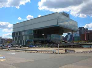
If the museum hovers over the entire show, it cannot escape that nexus either. In a brief video, Diller + Scofidio—architects (although only recently known for anything so mundane as a building) of the High Line, a redeveloped Lincoln Center, and the Institute for Contemporary Art in Boston—drill holes in the Modern, but the museum's walls still stand. Its much celebrated 2004 renovation seems mostly designed to profit from an apartment tower. Jean Nouvel's vision of "dematerialization" became a gift to the museum, and yet Nouvel also designed the most exclusive condo in Chelsea. President Obama's "you didn't build that" carried its own plea to join politics to economics. In a display of dystopias, deconstruction, desires, and unfinished business, it takes on new meaning.
An archaeology of knowledge
Both bookstores and libraries are public spaces holding private worlds. At the Bibliothèque Nationale, the great national library in Paris, strangers still sit together at long tables under twin vaulted bays lit by high windows and old-fashioned table lamps, immersed in their reading. The rows of tables, cast-iron arches, and the central pillars between them carry the eye into a depth like that of the majestic period train stations. It is not a coincidence. As architect, Henri Labrouste devoted a little more than fifteen years to the Bibliothèque Nationale, until his death in 1875, at a time when Paris under Baron Haussmann was becoming a modern city, as seen by Charles Marville, of broad boulevards and clashing desires. And Labrouste, too, was celebrated for his part in that transformation, but toward a wholly new kind of city—a community of knowledge.
His career took off in just such a community, thanks to five years at the French Academy in Rome, with trips to Pompeii, Tuscany, and a former Greek colony south of Naples. Art and architecture were becoming caught up in a new science of archaeology, and Labrouste took interest in both public and private spaces.  He drew the Pantheon and Trajan's Column, exquisitely shaded, but also the remains of ancient homes, tombs, markets, and a medieval monastery—with a challenge at times to say which is which. He studied rises, domes, and bays, but also decorative borders and carvings, features that survive in all his work. As curators, Barry Bergdoll, Corinne Bélier, and Marc Le Coeur speak of a search for the "expressive everyday." They call his retrospective at the Museum of Modern Art "Structure Brought to Light."
How does one show off architecture in the space of museum galleries? For starters, get a great draftsman, and Labrouste fits the bill. He had learned from J. A. D. Ingres, who sketched his portrait. It shows a side of Ingres beyond classicism and flatness, an analytic side—and that word applies to Labrouste in spades. He is interested in both carving and built structure. Whether in iron or in stone, he looks forward to the modernist ideal of drawing in space.
MoMA tries a little too hard to credit him apart from the pioneer of that combination, Eugène Viollet-le-Duc, but it has a point. Labrouste knew the younger man's achievement well, but he shied away from Viollet-le-Duc's Gothic revival or the cantilevered drama of an 1864 project for an assembly hall. He preferred plain arched windows and a presiding geometry. With the Bibliothèque Sainte-Genèvieve, from 1838 to 1850, he aligns his plans with the Greek cross of the Pantheon next door. He also leads visitors up a floor to the reading room, surrounded by the larger of two rows of windows—a clear break with older hierarchies. As a later generation would have it, form follows function.
With Sainte-Genèvieve, he had already created the first public library, with some of the first reliance on gas lighting. The floor below holds the stacks, just as at the New York Public Library today. With the the Bibliothèque Nationale's larger and more varied holdings, he uses the length of the building and a central dome to separate stacks and reading room. Yet the relationship between public and private still makes a good working definition of architecture or art. In New York, the stacks support the entire structure, like a metaphor for the construction of a community of knowledge. When people object to a plan to ship many of those books to New Jersey, to make way for a lending library, they are responding to more than the inconvenience.
The show sees Labrouste as an influence on everything from Richard Morris Hunt's skylit library pavilion through Louis Sullivan or Le Corbusier. The 1888 Boston Public Library by McKim, Mead & White closely follows another of Labrouste's stone façades, from the more sinister side of his archaeology of knowledge. He designed a hospice for the mentally ill, a prison, and an agricultural camp for orphaned children. Michel Foucault, the French theorist of modernity's all-seeing eye, would be pleased. And maybe Labrouste, who had supervised the return of Napoleon's ashes to Paris in 1840, was not exactly a revolutionary. Yet his cast-iron transformation of a royal library to a truly national one still marks a revolution.

"9 + 1 Ways of Being Political: Fifty Years of Political Stances in Architecture and Urban Design" ran at The Museum of Modern Art through March 25, 2013, with performances at MoMA PS1 on September 16 and 23, 2012. "Henri Labrouste: Structure Brought to Light" ran at MoMA through through June 24, 2013.


