High Times I
John Haberin New York City
The High Line and the Ideal City
Imagine the ideal city. Modernism did, again and again. From Surrealist landscapes to the architecture that shaped twentieth-century cities, Modernism kept reaching higher, toward something purer and less confining. And, again and again, it failed to reach fruition, blocked out the sky, found only nightmares, or fell into disuse and disrepair.
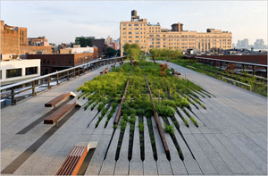
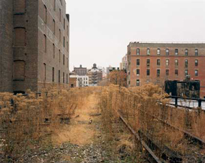
Now the High Line offers a contrasting ideal, an elevated park for Manhattan's far west side. On the very ruins of the industrial city, a railway bed crumbling into rusted metal and weeds, it promises an alternative. In plans on view at the Museum of Modern Art, it navigates between street life and the Hudson River. It encompasses a city's past economic activity and present leisure. In photographs by Joel Sternfeld of the abandoned railway that once served factories and warehouses on the far west side, it creates a city as pristine as nature. But does it mark a break with Modernism's dystopias or yet another prescription for failure? 
In this two-part review, I begin with Modernism's ideal city, Jane Jacobs, and the movement for urban preservation. I then turn to its 2005 plans and the limits of the High Line as parkland. The second part finds real life after all behind the ideals. There I take up the excitement of the High Line in its 2009 opening. I discover still more in its second stage in 2011, with sculpture by Sarah Sze, although funding for a third stage remains uncertain. It is still uncertain, too, whether the park provides or denies a context in history and human needs, but New Yorkers are enjoying every moment.
Modernism's Babel
The nineteenth century all but belonged to the landscape. From Romanticism to Impressionism, it described people on the edge between city and country. John Constable, Hudson River School artists such as Asher Durand or F. E. Church, and Claude Monet—all saw in that contested border a place to test the active imagination. As an exhibition of George Inness put it, art discovered the "visionary landscape." With its singular combination of idealism, irony, and commitment to the brute reality of living from day to day, Modernism could well stand for the city. No wonder textbooks so often identify it with Paris and New York, and yet it, too, had its visions.
Take two framing moments. In 1917, Le Corbusier issued Vers une Architecture. When looking toward an architecture, toward that still-unrealized whole, who even needs the word new? Here and in his many projects, he imagined "a fresh start," in tall residences as powerful, affordable, and quick to assemble as Ford's assembly-line automobiles. With towers and gardens set off from the street, they would rescue life from the hellish darkness of cities like Charles Dickens's London. The date of the Russian revolution ushered in other artistic dreams as well.
The ideal city has served ever since for target practice, as for Seher Shah—or, in the hands of Gordon Matta-Clark, the physical destruction of Day's End. Michel Foucault and others have described Modernism as a frightening extension of the all-seeing eye. Preservationists find the ideal city's legacy in crime-ridden, fortress-like housing projects, now only slowly giving way to bulldozers, decontrol, and reform. Architects still fear its explosive mixture of populism and an urban planner's total control, even as a show called "Foreclosed" extends them all to suburbia. The mix lingers on in the very name of perhaps its worst and final gesture, the Robin Hood Gardens in East London. Peter and Alison Smith created that brutalist project in 1972.
Architects, critics, and neighborhoods took notice. As a Village resident herself argued, urban planning had to attend to patterns of life. Jane Jacobs proposed the urban grid, still a model in art for Vivien Abrams Collens and Ben Boothby—incorporating living, shopping, and recreation—as a source of community and even loveliness. She began planning The Death and Life of Cities in 1958. Outrage against another elevated threat to the Village, Robert Moses's 1961 plans for a highway, spurred the new urbanism in earnest. So did exurbia, which mirrors the vertical city's isolation in its gated communities.
Modernism may have been looking up, to escape a darker past, but its every elevation cast a shadow. Around 1970, Michael Heizer began to imagine another City. Its dirt and thirty-ton concrete slabs aim to remake the Nevada desert in perfect alignments. Although Heizer completed the first "complex" by 1980, the work remains incomplete and, by the artist's strict intentions, inaccessible. From 1917 to 1972, each vision rises above the land and its inhabitants, barring its future transformation. The move to Joshua Tree, California, of Andrea Zittel and her Wagon Stations, updates his project for the year 2000.
Elevated cities have achieved their impact only in incompletion, abandonment, or destruction. The Sixth Avenue elevated train, commemorated by John Sloan, was destroyed long ago to allow Greenwich Village to live. It recalls a still earlier parable of the ideal city, the Tower of Babel. Perhaps the Lord was looking forward to Postmodernism, when in response he "confused the language of all the earth." Conversely, Modernism's pattern of overreaching and collapse ties its utopias to the vital turmoil of the city, as in a mock underground station by Michael Elmgreen and Ingar Dragset. New architecture, like the dizzying but brusque forms of Zaha Hadid, has the double burden of criticizing its failures and matching its turmoil.
Ground Zero plus one
Ever since Jacobs and the destruction of the old Penn Station, public and private efforts have contributed to the redevelopment and greening of central cities and fringe neighborhoods, and both efforts are needed. Can they extend to Lower Manhattan? The High Line promises just such a partnership, thanks to gradual additions leading to varied environments and ecosystems up to 34th Street. Besides a model and sketches, the Modern's 2005 exhibition included some of the proposal's antecedents, in architectural plans from the museum's rich permanent collection. It also had Joel Sternfeld's photographs the moment before development, with wild vegetation inaccessible to those below. Sternfeld's passion did much to move the project from a wild idea through neighborhood controversy and on to museum backing.
The line's advocates see it as a recovery of such vistas, along with layers of urban history. (Christoph Morlinghaus does something similar at the Modern, in giving the TWA terminal by Eero Saarinen an aura today.)  They imagine the High Line as a blow against the usual models of development. Rather than ripping out the past and putting high rises in its place, they propose to take as givens the freight line's curve, its location, its dark iron, and its overgrowth of life. They look to a design by James Corner Field Operations in collaboration with Diller Scofidio + Renfro, a firm praised by the Whitney for its "aberrant architecture" and desirners of the future expanded MoMA They imagine a final rusted-iron nail in the coffin of the ideal city.
That ideal can make the familiar name for the World Trade Center site sound eerily appropriate: in effect, they refuse to build from Ground Zero, just as the National September 11 Memorial sinks into the site. However, what if they actually further Le Corbusier's top-down approach? What if they, too, offer a scheme detached from existing patterns of human activity? Is it enough to add a dollop of Minimalist entropy, a politically correct bow to context, and the American dream of unspoiled nature? I want to ask how well the High Line is doing not by popularity alone, but by its own measures.
The High Line promises to address its multiple contexts as Modernism never would—including the city grid, the development of an arts district, parkland, sites for summer sculpture, and notions of urban history. The project cannot respect the grid, because the original freight line does not. It rises above in mid-block, passes through buildings, and does not follow a straight line. While it creates street traffic, it does not exactly encourage normal pedestrian patterns. One can hardly (or not legally) Rollerblade through the High Line, and one must bother with an elevator to wheel a baby's stroller along it. It blocks views of the Hudson from the east, and it hides the skyline as one walks away from the river.
It detaches Eleventh Avenue from the rest of town, including the middle-class London Terrace apartments. It casts a heavy shadow across the street, both literally and in its form. I doubt that anyone has taken much pleasure in the freight line's underside, and only one thing in the plans changes that. A modernist glass box, of all things, surrounds the south entrance stairwell. Imagine Central Park placed behind a one-story rusted iron and glass wall. I suspect that its neighbors would not have the same affection for it.
Not surprisingly, business and real-estate interests long wanted the line simply torn down. Who wished to guarantee its structural integrity anyway? One can phrase the issue as commercial development versus preservation and recreational use. However, one can equally well describe it as gentrification. It marks one more stage in the influx of a new, wealthier gallery clientele at the expense of a mixed-use community—one that, until recently, few even dared called Chelsea. It has encouraged more luxury apartments, for people willing to pay to overlook the tracks.
From grid to parkland
Has contextual architecture, then, temporarily forgotten that a huge gallery district and museum cosponsors have commercial and institutional commitments of their own? Patrick Mimran has mounted pretend billboards along the line, with gnomic messages about the purity of art. The High Line's higher aims, however, can sound all too pure. As for parkland, the High Line proposes itself solely as an end, a destination, like a botanical garden but for wildflowers. The 2005 scale model, with its bristles of pretend tawny wild species, reminds me of the world's largest hairbrush. Sternfeld's photographs, in turn, remind me of the New Jersey Meadowlands imported into Manhattan.
At last New Yorkers, as Robert Smithson advised, are "learning from New Jersey." The line promises the greening of the west side, like Little Island rising nearby, but it lies at odds with how and why people use parks. They wander through them, as more attractive than alternative routes. They use them for their own purposes, as for strolling or jogging. Only when tourists and artists intervene, as with The Gates, or when a parks has earned its critical mass in other ways do they take it as a destination for sightseeing. New Yorkers and others are flocking to the High Line for that and more, but greening is another matter.
Parks encourage use in many ways. They seek integration into street patterns, as with Madison Square. They achieve scope and versatility, as with Central Park. They formally incorporate dog runs, athletic fields, and playgrounds. While Hudson River Park amounts in places to little more than a bicycle path, it connects streets to the river. And it takes on additional, unanticipated uses over time—already everything from a trapeze school and batting cage to schlock photography and an art fair out on the piers.
In contrast, the High Line creates one more raised garden city after all, only in the image of an abandoned lot. It has much in common with other efforts to preserve ruin, in proposals to leave the other Ground Zero as a memorial. At the remodeled Brooklyn Museum, another raised platform, one walks up the museum's stairs, looks about to one's chagrin, and walks right back down. Each comes packaged as an unchanging destination. Each proposes a fixed relationship to the past, an act of preservation that removes the present from the dimension of time. And each pays homage to something that has died.
Even the Tower of Babel may have returned. In its tight space, placing visitors face to face, the High Line may suggest a community in which everyone is watching, and it incorporates surveillance cameras to deter crime. Elizabeth Diller and Ricardo Scofidio have often used anonymous materials, cameras, confined spaces, and images of global travel. In this way they have invoked a post-urban space in which no one is at home and everyone is a spy. Will visitors discover the wild beauty in Sternfeld's patches of nature or look the other way? Will they see the flowers or only, like James Bleecker, dark enclosures below?
No wonder the High Line feels so at home among earlier architectural visions, what one show has called its "Burgeoning Geometries." That, in fact, rather than rebellion and preservation is what makes the High Line work after all. For all its limits, the park has proved me at least partly wrong. The Modern happens to have knocked down a few old buildings in the last few years, while the High Line burgeons outward. Like the Tower of Babel as painted by Pieter Bruegel, on closer inspection it has exactly the variety of activity that Jacobs sought to bring to earth. As seen in the second part of this review, architecture and the economy may be crushing individual hopes, but enough individuals are still voting with their feet.

Plans for the High Line, by James Corner Field Operations and Diller Scofidio + Renfro (in collaboration with Piet Oudolf, the horticultural designer) with photographs by Joel Sternfeld, ran through October 31, 2005, at the Museum of Modern Art. Gossip about the Whitney's plans for the Meatpacking District surfaced in late October 2006, and it broke ground for a new home in May 2011. The High Line opened its first stage to the public on June 9, 2009, and its second stage June 7, 2011. Further plans for the development of the far west side include a "floating park," designed by Thomas Heatherwick. A related article puts all this in context of decade in architecture.


