On the Waterfront
John Haberin New York City
The Institute of Contemporary Art, Boston
Nicholas Hlobo, Mark Bradford, and William Cordova
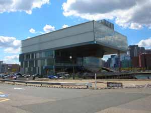
Even from half a mile away, Boston's ICA presents a challenge—and not just the challenge of contemporary art: find the front door. One might expect as much from Diller Scofidio + Renfro, a firm that has helped put the arch in architects. On my first belated visit, I was not even sure that I had properly entered, and yet I grew more at home the longer I stayed. 
Inside on a Labor Day weekend, the small museum crammed in at least five separate exhibitions for its second summer. They introduce the fledgling permanent collection. They return to "Street Level," to find Nicholas Hlobo, Mark Bradford, and William Cordova out to track multinational cultures and life on the street. As described in an accompanying review, they also give a first U.S. museum survey to sculpture by Anish Kapoor. Together with the architecture, these exhibitions show a museum finding its profile in edgy subject matter and traditional media.
Anti-Brutalism
From across the Seaport District's formidable expanse of parking lots and construction sites, the Institute of Contemporary Art presents an unbroken and decidedly corporate exterior, in flat panes of pale metal and acid-green glass. On the side, it presents more a silhouette than a façade, dominated by a top floor cantilevered out and away toward the harbor. A first-time visitor enters as much for guidance as for the art. Circulating the building in hope of more, one would have found only a café entrance anyway. Managed by Wolfgang Puck, the café seems of a piece with the luxury high-rises underway nearby. If this district ever merges into the fabric of the city, like the Whitney's future home in the Meatpacking District, it will relegate those who actually make contemporary art somewhere else entirely.
Nor does the ICA seem all that functional a museum until one gets to know it. A gift shop with an even better disguised entrance fills out the first floor, a theater and hidden offices the next two, relegating art to the fourth floor. Could that striking stairwell outside allow an alternative approach to the galleries? No, it merely helps in ascending wooden bleachers on the hidden side, facing the water. There people sit over lunch and contemplate a boardwalk by the harbor, as if waiting for the show to begin. Where the reopened New Museum dominates the Bowery with the drama of its stacked cubes, the ICA focuses attention on anything but a politics of architecture or itself.
The architects have a habit of focusing attention on focusing attention—and an affinity for water. Their best-known earlier building dissolves its entrance in mist. Their Whitney retrospective, like their bar in the Seagram Building, made use of surveillance cameras, with visitors as both spied upon and spies. On closer acquaintance, the top floor has the trappings of a stage set for a high-tech spy film. A video room plus two parallel corridors, one for the elevators and one half hidden but with the sole hint of natural light, connect the two gallery areas. Watch out for the chase sequence.
The video room includes banks of computers on tiers as in a lecture hall, but with a window onto the water in place of a stage. Back outside and above the bleachers, it descends right out of the building's wall like a retractable monitor. The computers also give the first hint that the architects really do have a taste for function, style, and at times even drama. The cantilevered hulk permits reasonably large, flexible galleries that the New Museum frankly lacks. The wing to one side of the elevators allows a single unbroken space, the other a maze of more varied and manageable rooms, including alcoves suitable for video. Back outside, the entrance façade frames two floors with a broad white loop, to draw out playfully the building's nested layers and stairs.
Elizabeth Diller and Ricardo Scofidio embody some notable—and notably disturbing—trends. They treat a museum as a locus for celebrity architects, much as have Renzo Piano and his workshop, Herzog and de Meuron, Sergio Calatrava, or Yoshio Taniguchi. In turn, they treat architecture as a locus for theory. Some of those experiments have worked, and some have simply fed into a network of museum blockbusters, celebrity artists, and critical hosannas—and, in the future, they may feed into The Shed at Hudson Yards and the Museum of Modern Art in much the same way. Here, though, the designers are not just turning on past museum architecture. They are out to democratize it.
Where Marcel Breuer's cantilevered Whitney bulks out toward the street, the ICA thrusts away from the street, refusing Brutalism and its "Concrete Utopia" for its game of chicken. Where Breuer set the Whitney behind a moat, forcing the uninvited to stand before the drawbridge, the ICA's top floor nestles a place by the water for anyone to sit for free. The computer banks invite unsupervised play. The computers have not yet found their educational mission, and the museum itself makes a fetish of protecting art from its viewers. Do not, however, blame the architects—especially for the warning signs everywhere and the taped lines on the floor. If their plans for the High Line and High Line extension ever come to pass in Chelsea, it, too, will not merge passively into the city.
The permanent contemporary
For my late summer visit, Dave Muller devoted the lobby wall to a genealogy of rock music, ending blandly in the mid-1970s with the Eagles. The British invasion comes out of nowhere, a tribute to nostalgia and short memories. Upstairs continues the architecture's face-off between accessibility and trendiness. The Brooklyn Museum, which takes both to mean the least common denominator, could learn something. The exhibitions suggest not so much a mirror of the community as a canny extension of it.
Before its move to a new building at the close of 2006, the ICA did not have space for a permanent collection and did not aspire to one. Now a selection takes up a good quarter of the galleries. For a city with so little gallery action and such conservative ways, it aims for the trendy. For a city with the pride of a small town, especially when the Red Sox play at home, it has a decidedly international cast. For such an isolated waterfront location, it takes all this to mean a portrait of street life—young, multiracial, defiant, mostly poor, and eager for a piece of the action. Like a city badly in need of an arts scene, it can dream.
One could well recognize the choices from New York or even more from London. Unlike a Whitney Biennial, it runs to two-dimensional media, counting a video monitor as two dimensions. It also runs to a sloppy or nasty take on representation, like a continuation of the Young British Artists. Most often, that means a half-obliterated portraiture, as with Lucy McKenzie's translucent shadows on a grid out of Piet Mondrian. Marlene Dumas paints friends, children, and skeletons in the same sketchy, muted tones, like David Hockney after a night in jail. The marching woman's outline by Julian Opie brings much the same cast to video.
Kai Althoff lends a similar style more obvious political overtones, but without having anything much to say about politics. His skateboarder, German police, and serial killer look about equally friendly. Thomas Hirschhorn and Josiah McElheny give their urban relics patinas of gold and silver, while Ambreen Butt paints hers in the costumes of Persian miniatures. Photographs by Philip-Lorca diCorcia and Roe Ethridge put a high gloss on in-your-face city life. Nan Goldin here might have tutored them all, while the one distinctly older artist, Louise Bourgeois, in effect certifies their not quite repressed sexuality as art. Once again Louise Bourgeois looks different amid every generation of contemporary art—and pertinent to them all.
By this time, anyone who has attended an international arts fair is entitled to mutter yadda yadda yadda. Nor is that altogether a criticism. Maybe Boston has located contemporary art, without the ponderous themes of the New Museum, just as it presents its new architecture with a little less hype and a lot more welcome space for art. Still, edgy ought to mean something more—like searing or funny. McKenzie makes a fine start, and Cornelia Parker takes searing literally. She suspends black wooden fragments from the ceiling, as if a Minimalist cube had caught on fire, burst upward, and reassembled.
As usual, Christian Jankowski tells a good story. In his video, the artist as male hunter-gatherer heads for the supermarket aisle with his longbow at point-blank range. At checkout, the clerk hardly bats an eye, so long as the arrows do not interfere with the bar codes. Fresh out of the New Museum, the first of 7 Lights by Paul Chan looks as haunting as ever, with an even longer and more apocalyptic view of civilization. And Kadia Attia's cube, like Parker's, seems to catch fire as it melts away, although as a parable about the international political economy. Isolated on the video projection, the stacked sugar cubes dowsed in oil look as monumental as a funeral pyre—and, as the points of white sink, they appear to leap up against the black liquid like flames.
Leveling the streets
The adjacent galleries do their best to continue the permanent collection. Perhaps they are on their way to entering it, and Tara Donovan will be along any minute this fall. Nicholas Hlobo continues the internationalism, the identity politics, the traditional media, and their unraveling. In his most striking work, the South African sews through canvas, in large tracks of brightly colored thread. His tiny solo show also introduces a note of abstraction, with loose black scrawls on a white ground. Each piece seems like an experiment on the way to a clearer and more coherent body of art.
Hlobo, who appeared this year among African artists at the Studio Museum, applies a similar technique to a big brown cocoon or seed case. Its plainer threads may nurture the body within or stop its sprouting, just as the colored weave may function as figure come to life or as a fatal piercing of the ground. Elsewhere his threads take on independent life as sculpture, as recently for Amy Cutler. Presumably the black scrawl on white iterates them yet again, like the reversal in a photographic negative. The attractive play of art and craft, image and abstraction, and two and three dimensions allegedly has something to do with the Xhosa language and traditions. Perhaps next time he can make clearer what, lest he seem like Ghada Amer piously cleansed of the feminism and the sex.
Hlobo could equally continue "Street Level," in the very next rooms. Its three artists come from Los Angeles, Peru, and South Africa, but they could well be sharing the same inner-city streets. They could be sharing the streets that diCorcia photographs as well. Mark Bradford represents those streets, replicates them, and abstracts away from them. He finds posters around LA, gives them a serious pummeling, and assembles them in dense fields of largely black and tan. Every so often, advertising's more intense palette bursts through, and the bolt of color takes on a pattern of its own.
In the 2006 Biennial and again later at the Whitney, I had seen the results as drab and humorless. They seemed at once remote from the culture that they appropriate and literal-minded in their representation of urban decay. Here I grew to appreciate the variations. One canvas can mimic graffiti, another transform it into abstraction, another revel in its weariness, and another leave one searching for the advertising and other messages largely obliterated. His largest and latest paintings can indeed do all these at once. Painting does not get more ambitious than this, and yet have these three artists truly found street level or just leveled the streets?
William Cordova, who has also appeared among emerging artists at the Studio Museum, has exactly the literalness and lack of style that Mark Bradford escapes with ambition and style. Sure, Cordova's sketch of a truck against gold leaf appropriates fine art in the name of urban desolation, and his tower of stereo speakers could have grown from a lot of gigs and late nights out. Yes, I get it, and it makes a good case for sticking to an iPod. Robin Rhode can be more of a one-trick pony, but with a remarkably athletic trick. The South African sketches in chalk on the pavement, then poses lying against it in stop-action photographs and video that put him at the center not just of performance art, but of drawing. He appears to dunk a basketball, flip over on a skateboard, steal a few major appliances, and make over an abandoned automobile, and it is even convincing.
Group shows can bring out similarities, elucidate variations, or merely obliterate differences. Here the artists sure seem to belong together, but where? Should one worry that Rhode's or Cordova's street scene looks more like LA than Mark Bradford's original? Does poverty trump culture, or do cultural differences enforce much the same debilitating segregation everywhere? How does it differ from the tribal culture or the culture of Western abstraction in Hlobo's South Africa—much less the country of David Goldblatt, Tracey Rose, or Zwelethu Mthethwa? For now, along with the permanent collection, they say less about the streets than about a promising museum looking for the front lines.

Dave Muller ran at Boston's Institute of Contemporary Art through October 12, 2008, Nicholas Hlobo through October 26, "Street Level" through October 9, and, as reviewed separately, Anish Kapoor through September 7. I also draw on a fresh look at Mark Bradford at Sikkema Jenkins through December 22, 2012.


