Not Just a Landmark
John Haberin New York City
Frank Gehry and the Philadelphia Museum of Art
The Philadelphia Museum of Art is not just a landmark, on a broad, green avenue facing City Hall. It is the very emblem of a city, just as the Liberty Bell and Independence Hall in the Old City are emblems of a nation.
Boston's Museum of Fine Art has a similar position along the Fenway, but not many head that way just to climb its steps. The Met has older, wider, and to my mind classier stairs, but then Rocky did not use them to call himself a champion. Not everyone, then, will be disappointed that the Philadelphia Museum's east entrance is closed for now. They were not going inside anyway. The rest of us may not mind either, for we can get to get to know another face of the museum—with architecture by Frank Gehry. His expansion transforms the entire building while insisting on how little has changed. 
In the back door
Architecture is notoriously conservative. If it seems as if every New York museum has turned to Renzo Piano, from the Morgan Library to the Whitney, he sure comes close. Gehry himself had made his name with departures from Modernism's glass box well before the rippling face of an apartment tower made it to New York's financial district welcomed and offices for Barry Diller and his entertainment empire made it to Chelsea. Even now, at age ninety-two, he slips into the Philadelphia Museum through the back door, and so can you. Better still, head to a side entrance and down a long vaulted corridor with no art in sight. It leads to a hall with impressive stairs of its own.
Could you have stumbled into the main entrance after all? No, but you will surely do so later, and the 1894 Diana by Augustus Saint-Gaudens (his only nude) still stands atop its grand central stairs—much as she once stood as a weather vane above Madison Square Garden in New York. And no, here two sets of stairs curve to the side, breaking the symmetry. A floor above, stairs diverge further, almost as if floating in space. They have the polished blond wood of a twenty-first century home rather than stone as well. They also leave room for ambitious art.
Is that it, then? Is this just another museum or library with dreams of empty space rather than of art? No again, for it serves a clear purpose, as further connecting the galleries. It also works as a display space, even as artists struggle to fill the dismal atrium of the expanded Museum of Modern Art—or, like Amanda Williams, to empty it out. Teresita Fernández uses the two-story wall for Fire, a map of the United States in black, its charcoal also descending like long threads. The country, like the map, may be reduced to ashes, and who is she to say whether it will endure?
Then, too, this is not another brutal museum addition. The exterior is the same as ever, and even the hall came before, thanks to a past renovation by Robert Venturi and Denise Scott Brown. Gehry has merely repurposed it and emptied it out, ditching an admissions desk. His entire expansion is an opening up. The vaulted tunnels date to the museum's birth in 1928, only now open to the public, while former offices and dining options have become a full first floor of new galleries. Where other museums seem more concerned for arenas and amenities than for art, the Philadelphia museum takes the opposite route—although a balcony café has its views and a larger one keeps up a thriving business.
Besides opening things up, Gehry also throws in a few twists. Like the wild stairs in Lenfest Hall, expansion plays with and against the museum's strengths. You may feel totally at sea, even as you land somewhere familiar after all. I had just come off one of the new galleries, for American art through the mid-nineteenth century, when a passage took me further upstairs—and to more American art. The remaining new galleries offer recent art and special exhibitions. American and contemporary art, the museum wants to say, were at its heart all along.
These galleries are flexible but traditional, far from Gehry's Guggenheim Bilbao or Disney Hall in Los Angeles. Not a curve in sight. A corridor outside "New Grit," contemporary art from Philadelphia, grants Odili Donald Odita more space than he has ever had, and his abstract art takes advantage of it (with murals that will remain on view after the show is gone). Some walls in the early American wing are painted in period fashion. Rooms also integrate the decorative arts, but then, too, so did the old museum. A medieval court might have wandered in from the Cloisters.
Posing as life
The museum cannot resist the pressure to feature contemporary art. That pressure that has taken the Morgan Library to Betye Saar and David Hockney and risked driving the Met, through the Met Breuer, to bankruptcy. Recent art turns up again in galleries for works on paper—with a focus on "unexpected surfaces" and "everyday materials," like flattened cardboard boxes from Robert Rauschenberg. Obviously, too, art today must address diversity. The museum reopened with an exhibition of Senga Nengudi, an African American woman who bridges sculpture and performance. Rooms for modern art continue into the present with "Fault Lines," five abstract artists from South Asia.
"New Grit" even sounds woke, but little is all that gritty. Street portraits in photography looks proud but bland, and a recitation on video pales beside blunt text paintings by Ken Lum and Wilmer Wilson IV. Yet black faces may also emit seeming starlight with Tiona Nekkia McClodden and her Black American Epic. African American abstraction also appears, with Odita and Howardena Pindell. Pindell returns upstairs as well, with a hole-puncher. Elusive histories slip in and out of in and out of interiors and landscape by Jesse Krimes, Becky Suss, Micah Danges, Tim Portlock, and Alex Da Corte as well.
Diversity enters again where you may least expect it, with early American art, even as the Brooklyn Museum rehangs its American wing with greater weight to Native American art and people of color. Gustavus Hesselius painted Native Americans around 1735—a full century before another visitor from Switzerland, Karl Bodmer. Their faces are weathered, worn, and knowing. A Mexican artist appears as well, merging native and European traditions. Miguel Cabrera paints Our Lady as a colorful icon. Still, the most drastic revisionism comes in what remains seemingly unchanged. If you think the museum treats furniture on a par with painting, wait until you get here.
As with so much else, the wing changes everything just by doubling down. Almost everything could pass for a period room, with painting in context—a context that it may never have had in life. Does George Washington by Charles Willson Peale hang above the president's actual fireplace? Is a woman by Gilbert Stuart seated above her personal chair, and are Peale's two sons ascending real stairs as well? You might almost think so. You might mistake the trees in a woman's portrait by Thomas Sully for her study, like the writing desk below the frame.
The strategy has a real point: the most ornate furniture becomes studies from life, and so does the most formal period of American art. The rooms include still life, genre painting, family portraits, and one heck of a bedstead, but not one Declaration of Independence or act of war. This Washington is not crossing the Delaware, and he might not even be in office. Some decorative art is humble as well, like metal tailings. Just remember that one sitter is a famous actress, and the whole appearance of ordinary life is often a pose.
The expansion doubles the space for American art, but there, too, continuity entails revisionism. You might expect a story that begins with colonial America to end with the new republic. You might think of the Hudson River School as a new breadth and a new beginning still to come. Yet the new galleries have space for Thomas Cole, so that his so that his breakthrough landscape painting has a more mundane history. If that fails to do justice to Romanticism and realism, the story continues upstairs. As with Pindell and contemporary art, people have a way of coming back.
More than real estate
The second and third floor bring fewer surprises, apart from the perpetual surprise of older Asian, European, modern, and American art. Each has its wing, just as before. There is nothing comparable to the "fall reveal" of MoMA's permanent collection (with the 2021 reveal due any minute) or the Skylight Project at the Met. In truth, Philadelphia might not have the nation's finest collection, but it could well have the most representative of a broad history. It also has a way of digging deep. After those two floors for American art, the Met's American wing (with its own gilded cast of Diana) could be jealous.
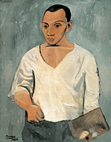
 The second floor brings that home with three full rooms for Thomas Eakins. They have a collective impact beyond even The Gross Clinic, his anatomy lesson in a rapt operating theater from 1875, taken alone. And yes, there is plenty more of Cole and his contemporaries. The museum has its share of greatest hits—like Saint Francis by Jan van Eyck, Prometheus by Peter Paul Rubens, and The Large Bathers by Paul Cézanne. Still, the display treats them more as jumping-off points. Maybe it must, when a self-portrait by Pablo Picasso stops well short of Cubism.
Other artists have done much the same—like Francis Bacon, who converted an archbishop for Titian, half hidden behind a veil, into an existential crisis. More and more this visit, I found myself doing so as well. My favorite painting in the collection, a Crucifixion by Rogier van der Weyden from around 1460, strikes just the right balance between prominence and a guide to others. One can glimpse it from across the entire floor, past a carving on the same theme. And then one can see its poses in adjacent rooms for the Northern Renaissance, in work after work. As in a painting by Gerard David, they came to stand for the very idea of death and transfiguration.
Rogier himself meant it as an invitation to more. Its two panels would most likely have served as the outer wings of an altarpiece, becoming a Renaissance diptych when the wings closed. It is less stark than I remembered, but no less intense. John the Baptist leans forward to support Mary in her collapse, while the bare garment covering the waist of Jesus rises in a supernatural wind. John's pink robe gives way to her gentle blue. Daringly, hers also laps onto the right-hand panel with the cross, as if reaching for her son, for death, and for life.
I did not come to pick winners or, worse, to judge an entire museum. I came to see still another costly museum expansion. I came to see, too, whether that opportunity has a fatal cost in its bows to the marketplace for art. I felt instead old delights and new hopes. Gehry undoes much of the previous renovation just as Diller Scofidio + Renfro at MoMA salvaged what they could from a disastrous expansion in 2004. And he does so by keeping his own proclivity for spectacle in check.
It is a huge change all the same. These are new conceptions of old spaces. The main entrance will reopen at some point, and he will have had a hand in that, adding windows. Still, this is one renovation that centers on the collection. Even now, the museum seems unlikely to attract major traveling exhibitions, the kind that attract tourists and even the likes of me. It also centers on more than real estate. Benjamin Franklin Parkway has its condos, but none of them will tower over the Philadelphia Museum of Art.

The expanded Philadelphia Museum of Art opened to the public on May 7, 2021. "New Grit" ran through August 22, Senga Nengudi through July 25, and "Fault Lines" through October 10. Teresita Fernández ran through May 31, 2022. I return shortly for Jasper Johns in retrospective.


