Abstract Architecture
John Haberin New York City
Cordy Ryman
Cordy Ryman has a comforting plainness, until one tries to figure out how to look at it. Corner pieces slip easily into place, from the floor to never quite the ceiling, without sticking out too far. A row of sticks might ascend the wall. Small squares may stack tightly or nestle in parallel to the floor, evenly spaced. They might, a title suggests, be either windows or shadowboxing.
Only Ryman, too, could paper the walls with two-by-fours, and only he could call anything so eye-catching and so solid a chimera. It comes as the latest and most impressive stage in seven years of his art. One cannot always walk around his results like a sculpture, view it head on like a painting, or picture it within one's head like architecture, yet it looks so handmade and never quite sits still. Lumber never had it so good. 
Cornering painting
Cordy Ryman may seem hardly to touch his found scraps of wood, like the components of an early Studio Sweepings, except for their geometry. Well, maybe not too neat a geometry. If only, he might protest, he were a better craftsman. Perhaps he knows that geometry will take care of itself, by sheer accretion. It makes the work impossible to trip over but also impossible to miss. I first spotted one in a packed National Academy Annual, like a smart commentary on the narrow but elegantly fashioned winding stairs.
The paint helps make it so. Ryman covers the wood in white and bright enamel, sometimes one color to a unit. Naturally neither the colors nor their application come anything close to a norm. Adjacent close hues never quite match, and the paint runs rather than drips. This is not Abstract Expressionism. No, it has more in common with artists of the 1960s and 1970s, like Ron Gorchov or Richard Tuttle, before geometric abstraction became Neo-Geo and when Minimalism at times still looked handmade. Painting seems to have gotten up by itself and walked into the corner.
Far from formalism, this painting fosters illusion. In one corner piece for his 2007 gallery show, each small white square has a large red dot at its center. Somehow the squares grow slightly smaller as they near a natural vanishing point, in the ceiling. Again a physical object encourages visual access, without losing its physical clarity. Yet even its semblance of geometry remains imperfect. At least one square is missing its dot.
Ryman's work, like wood for Martha Clippinger or stone for his mother, Merrill Wagner, does not sit in the corner like a child in need of discipline. He makes painting into sculpture and back again in wood, like David Ersser. He also locates a place between painting and architecture. Two painted rectangles hang on the wall, but in one a succession of angled wood fragments suggests a magnetic field. Another has swirls of paint but the thick support of a formalist's painting as object. The paint's brightness interrupts white and unpainted areas, adding to the sense of a shifting visual center.
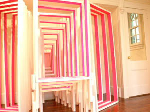
Is sculpture trying too hard to be painting? Maybe, but much of the best work heads right back to the floor. In one piece, three sets of wood frames stand back to back, growing smaller as they converge toward the wall. They may allude to three-part mirrors in a fitting room or to a painting's stretcher. They also look at first like public sculpture—until they, too, find their specificity in the site. One can walk around them or enter them, but only in the mind's eye.
Where could Cordy Ryman go after this? For a while, he pursued his gallery's meanderings through smaller spaces and art fairs. Still, that could entail certain compromises, especially for an artist who leaves one so unsure when to call a work site specific. At the very least, he had to dismantle a ten-foot triangle over the desk when one gallery departed the Bowery. Not to worry. He may well have taken some of it with him in 2013 to a museum in New Jersey, to help piece together some of his largest work yet.
Scrapping abstraction
Windowboxing expands on a triangle, with a bit of a plateau on top, to cover much of a museum wall. It must have burst apart here and there in the process. The wood tiling has become open squares of varying sizes, like stretchers or picture frames in search of canvas—or like his earlier Door. Many nestle within others, upright or diagonally, as if in storage, while two by fours tilted up and out to hold up the rest. I should hate to call it a system of support. The brightly colored inside edges, in yellow and red, and ample surrounding space add to the work's lightness and resemblance to plain old painting.
Others with him at the museum obsess way too much over painting without actually doing it. In Katie Armstrong's hand-drawn animation, the male narrator fantasizes about meeting Frida Kahlo on a train, before she morphs into a force of nature—running deer, to be precise. Less charmingly, Jordan Eagles pours real blood from a slaughterhouse into Plexiglas and resin. Just in case any of his Red Giants does not glow suitably enough or reek enough of death, he backs some with copper. At least Andres Serrano and Chris Ofili came by their precious bodily fluids the old-fashioned way, with a Catholic upbringing. Here the only "Sensation" is kitsch.
 As Windowboxing suggests, Ryman is sparring with the architecture, just as in his corner pieces. He is also playing with the old metaphor of a painting as a window onto the world—here with multiple windows looking every which way and none. One might think, too, of Allan McCollum's "surrogate paintings," those frames and matte surrounding only black, but without the hectoring, dismissive irony. Ryman always leaves open the possibility for painting, geometry, the handmade, and art as object, very much like his father, Robert Ryman. He just has to start again from their scraps. And that includes the scraps of his past.
In the next largest piece, scraps of art and other debris compete on an equal footing. One of four rectangular fields recycles wood from an older work, while the other three settle for whatever he can find. Each imperfect tiling has its own color scheme. The differences suggest the logic of theme and variations in older hard-edged abstraction, another kind of recycling, but without a fixed vocabulary of primary colors. The pattern could even serve Ryman as his flag painting, after you know who. Then again, the changes could simply point out how much room is left to play around.
Smaller panels might almost be paintings rescued from the garbage and still in need of repair. Oreo Velcro refers to its creamy black and white, not to actual cookies, but then not much here derives from an art supply store. One can see mitred wood here and there beneath the plywood, sawdust, cardboard, and paint. What one cannot see is a stretcher—or anything to stretch. If these small panels do less to engage the architecture and sometimes elude me as well, still they insist that, all along, the scraps are of painting. In fact, back on the Lower East Side just weeks later, for what a show calls "Adaptive Radiation," Ryman puts both painting and two-by-fours through even more paces.
They can disrupt the image or the picture plane, collide again with their frames and the corners of a room, or cluster with so little paint that one might not even notice how their varying lengths reshape the rectangle. One variation on his early corner pieces looks like little more than a branch blown in from the street, except for its bands of color. Again the two largest paintings play off the gallery most effectively. One set of slim beams angles off the floor, slides up, and arcs past the stairs, only to return across from where they began. His Rafterweb Scrapwall comes almost to the top of the two-tiered space beyond, as well as out onto the floor, like a majestic Islamic carpet. If all that starts with squares, each square distinguished by the disarray of smaller blocks within it, they are building and scrapping abstraction—like a still later work, from 2015, and a chimera.
Minimalism as chimera
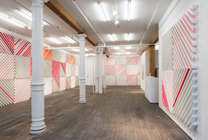
Actually, Chimera 45 is only a trial run, from an artist who treats everything as an experiment. He plans to extend it for a two-person show with Roxy Paine at the Columbus College of Art and Design, in Ohio, but he is not starting small. Already sixty-five squares cover three walls not far from the Bowery—and sixteen or seventeen times that many pieces of wood. Each square, four feet on a side, consists of diagonals that alternate direction from square to square, and most diagonals have paint on just one side. The bright colors, often red and electric pink, are as unpredictable as their application. The gallery speaks of his work as "caught between sculpture and painting," but Ryman will not allow himself to be caught.
The resemblance to Sol LeWitt wall drawing is unmistakable, and so are the differences. Like LeWitt, he begins with fixed rules, but only so that a design can race unpredictably across the room. LeWitt, too, has worked with both wall drawing and sculpture in wood with still plainer geometry—but never at once. For his generation, a medium must stay true to itself. Ryman's father already treats the material support for a painting as part of the work, whether a metal panel or the bolts that hold it to the wall. Yet he, too, is making a single medium as explicit as it can be.
Chimera 45 is two things at once, if not three. One cannot miss its design or its projection into the room. Paint runs over the side of the wood, in outright puddles on the edge. Even the rough-hewn geometry has its limits. Pieces more or less make it to the edge of their square, and squares never make it to the top of the wall. Wood here is both the materials of architecture and distinct from the gallery's own.
Ryman flirts with conceptual art, but only to make it firmly material. Unlike LeWitt, he likes working by hand, rather than leaving the entire execution to assistants. He draws back from illusion as well. Every line in LeWitt wall drawings must follow the rules, and the results must look closer to chaos. Ryman allows himself only one illusion, that of scale. A prototype of just four squares looks larger than its wall-size companion, because it starts above the floor.
His is also becoming both more ambitious and more painterly. In earlier work, a vertical might stick to its corner of a room or not, and segments might cover the space above a gallery desk like bricks until they just happened to quit. Here they keep going. The gallery's back room has smaller and less regular works that approach collage and painting. Text by Michel Butor, the unbound pages partly folded and stacked, refuses to be caught between architecture and the artist's book. One can still see the artist's hand and flip the pages, albeit forward.
An irregular return to Minimalism is common enough right now. Painters like Merlin James are showing the backs of stretchers or coming off the wall. Many nurture irregularities, too, in resistance to the impersonality or star power of more popular abstract painters. Bridging media has become practically the hallmark of emerging artists, at the expense of an avant-garde's bold assertion and critical spirit. Part of Ryman lives in the cracks between his large squares. But the cracks are growing.

Cordy Ryman ran at Lesley Heller through October 27, 2007, at the Visual Art Center of New Jersey through March 24, 2013, at Dodge through May 12 of that year, and at Zürcher through May 5, 2015. I also refer to his meanderings before 2013 with another gallery, DCKT. Portions of the earliest review first appeared in Artillery magazine. A related review looks at Cordy Ryman in midtown.


