Papering the Walls
John Haberin New York City
Wei Ja, Lin Yan, Dawn Clements, and Claire Pentecost
One thinks of works on paper as small, meticulous, and fragile. With Wei Jia and Lin Yan, one might be running up against a brick wall. They marry East and West, fine art with pattern and decoration. However, they also carry painting and drawing into architecture, and it is not clear whether they are reconstructing the room or tearing the walls away.
Erik Sommer works in everything but paper, but his paintings make the gallery walls seem to peel away as well. Kadar Brock beats up paint and paper as if it were an extension of the Sheetrock, while Dawn Clements works on paper only to recreate, in full scale, the converted industrial space in Brooklyn behind her. 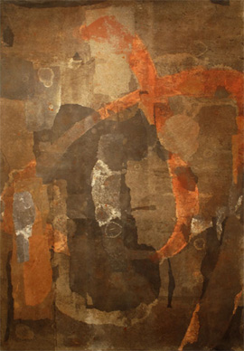 How fitting that, four months later, the Fire Department had briefly to shut the gallery down. (Pierogi had neglected to file with the city for expected occupancy.) At this rate, oil on canvas will require a building permit.
Claire Pentecost draws right on her studio walls, with or without paper. It could be an invitation to watch her rent check pay off or her mind at play. In each case, the intimacy of an artist's studio becomes painterly in texture, architectural in scale, and contested urban ground. Critics have wondered if the handmade will ever recover, after far too many showy installations. These artists suggest that it has never gone away. It has just become part of the city.
Brick walls and wallpaper
Lin Yan in fact simulates a brick wall, much as Zhang Hongtu confronts barriers in China under Mao, shaping paper into rectangles and the grooves between them. Ink and other media soak into them, but also lend them form. Paper also flies off at the edges, like posters left to peel from a wall. Elsewhere her collage exaggerates the texture of rice paper, to the point of fabric. The roughness, though, also adds solidity. Her texture can change abruptly halfway through, or the color may change from black to white, as if revealing something underneath.
With Wei Jia, a paper wall has suffered changes, too. His surfaces are mostly flatter, but also layered and weathered, stained by muted brown or green acrylic. Successive advertisers might have come and gone, and once I even imagined a face. Larger and lighter brushwork looks like graffiti. The characters may or may not be Chinese letters, at least to my western eyes, but no matter. One is not likely to decipher a work's history.
Of course, traditional Chinese painting can take up an entire wall. However, the husband and wife artists both stick to the scale of Western canvas. If anything, as with Jia's characters, they might be zooming in on a small fragment of a mural. He invites one to step back and enjoy the color, the image, and the taste of the city. She invites one up close to appreciate the loose edges. They call the show "Intertwining Layers."
At her best, she thrives on the opposition between solidity and flight. More than a vertical piece like a stiff dress, I liked loose white furls peeling off a square center. In another work, the brickwork becomes the stripes of an American flag. As with Jasper Johns, this white flag refuses to flutter or to keep the proper distance on a pole, and memories of Johns's encaustic contribute to its texture. She also makes invention out of the necessity of a display case, itself an artifact of paper's fragility. The flag's stars, etched on the case, escape their field.
For real—or at least illusory—decor, one might look to Virgil Marti. Actually, fake wall decoration is still wall decoration, and that is half the point. The other half is that fake is cheesy and kind of fun. Garish round sofas and cushions, out of the hotel from hell, nestle amid the silkscreen illusion of gray swag curtains. There hang a cross between animal pelts and vintage mirrors, chrome plated in the cheesiest of colors. Next time you need a place to stay, and the Chelsea Hotel is too proper for you, you know whom to ask.
This is hardly a new dynamic. Plenty of artists work between drawing, painting, and architecture—including Gedi Sibony or Cordy Ryman. Similar ideas underlie the appropriation of street art's gestures for abstraction, as with Mark Bradford. At the Studio Museum, he makes numbers from well-worn billboard fragments, paint, and string. They look less pretentious than Bradford's actual billboard scale. They also give Johns a silvery finish.
Watching paint peel
In jpeg, Erik Sommer's paintings look like rock face, with the craggy, flowing grays of calcium deposits and erosion. In person, they look as if they had begun to peel away. They also look brighter, for they share their materials of paint, cement, plaster, and spackle with human walls. Here and there the torn whites may reveal a dark, muted color beneath, and the well-worked surfaces have settled into a kind of all-over painting. As a proper formalist would insist, by peeling outward they identify surface with object. So much for "watching paint peel" as a metaphor for tedium.
From cave painting to abstraction, Sommer is taking the long view. 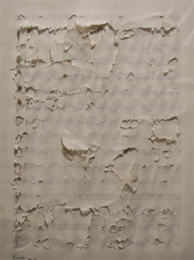 The smallest could pass for an unusually scruffy white square by Robert Ryman, Cordy's father, while the largest squares could pass more a more urban Spanish abstraction. (They gallery offers reassurance that they will not devolve further.) Something else, though, is at stake in the transformation of architecture into art. This is the Lower East Side, where galleries have replaced "Loisadas" and gentrification and merchandising have displaced graffiti. It is also where old materials like cement and plaster have given way to plasterboard and paper.
Nearby, Kadar Brock makes the contested ground explicit in his exhibition title, "Unclaimed Space." Not that Rivington Street has much unclaimed space, counting just the galleries there, in Freeman Alley, or around the corner on Chrystie or the Bowery. However, the paintings run large and flat like Sheetrock—with visible paper folds as the sole formalist geometry. Where peeling and caking hints at Sommer's underpainting, Brock goes right for erasure. He has worn the surfaces hard, leaving black spots and ovals along with hints of color in some corners. Even the folds stand for wear and tear.
Deconstruction adds theoretical underpinnings, on how meanings can multiply "under erasure." One can see it in action in late Modernism, as with Alberto Giacometti or Andy Warhol and his Cow Wallpaper. There, too, hints of street art survive, in Warhol's films and collaborations with Jean-Michel Basquiat. But Modernism sought a reconstruction of the urban scene long before. Work between drawing, painting, architecture, and sculpture dates back to at least Russian constructivism. Utopia can have surprisingly loose edges.
Thanks to Robert Rauschenberg, one can see the encounter between construction and erasure explicitly in an Erased de Kooning. Joe Diebes displays an erased Bach score alongside video of his own hyperkinetic cello concerto. Did the French original for "under erasure" in Jacques Derrida, sous rature, mean something more like a crossing out? Diebes pulls off an equally frantic overwriting of a late Beethoven string quartet onto a single sheet. Civilization can survive all sorts of assaults in the name of high or low art. The Lower East Side just adds urgency and dangers.
Meyer Vaisman has mimed Victorian wallpaper as silkscreen, and Jacob Kassay took off late this fall in auction prices by letting silver wear and tarnish, like a hologram of the art world. (I reviewed him with more fancy unfinishes by Xylor Jane, Jonathan Callan, Jason Tomme, Jennifer Reeves, and others.) Had he just flattered wealthy collectors with the promise of fine silver and street cred? People asked the same thing about drips and enamel in a Jackson Pollock before anyone was buying. These artists may not have figured out where they stand in the housing or status wars, and they may invite more interpretation than they can bear. They do, though, make a fine excuse to look beneath the surface.
Double boiler
Face it: one goes to the Boiler at Pierogi for the boiler. With it, one can almost resist Williamsburg's relentless drive further and further east. Without it, one might not have come to the gallery's debut, guided by Jonathan Schipper, to watch ice melt. Without it, too, one might not have noticed that a large gaming table by Brian Conley left the space as desolate as an actual war zone. Fortunately, Dawn Clements likes it so much that she doubles it.
The space, which opened as the economy tanked, both resists and maps the area's gentrification, and so does Clements. They lead one away from the action and a declining handful of galleries, past old warehouses and new condos, across from a park and a bowling alley. Once inside, one sees pretty much nothing but bare walls with their back to the tall black monster that defines the space and narrows its entrance. This gallery is anything but a white cube, and she makes it blacker. One work on paper spans a corner, while another takes part of the remaining wall. Both stop abruptly, as if they could not keep up with the room itself. 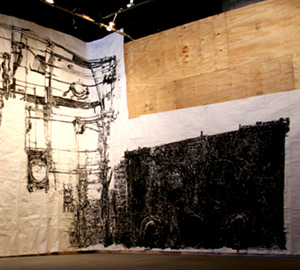
Both also represent the neighborhood, although not in the way I first thought. The first sheet starts pretty bare, with staggered, connected horizontals like a fire escape, plus repeated circles like hubcaps or sewers. Clements models each in convincing depth. As it turns the corner, the scene darkens into a horizontal slab and the circles multiply. The ink takes on the texture of the paper and the wall behind it. Once again, crossing out becomes multiplication, and drawing becomes architecture.
The second sheet has stairs like any number of Brooklyn stoops, dominated by a baroque patterning. I looked outside to see if they reflected the street outside, which obliged me to face the boiler. And then I got it. The first sheet depicts two sides of the dark monster, more or less to scale. I should have known. But then, how could I have ever turned my back?
As for the second, the pattern coheres soon enough to an enormous chandelier. It and the stairs behind thus conflate past and present, inside and out, much as the larger drawing converts two side views into a panorama. Clements similarly mixes architecture and cultural history at the 2010 Whitney Biennial. There she combines elements from a 1946 movie, though without the brute simplicity of a wall in Brooklyn for Thomas Roma. She has something in common, too, with the colossal real and imagined networks in Julie Mehretu, Terry Winters, or Elliott Hundley. They, however, are more comfortable in the banking community than the outer boroughs.
At their extreme, installations that trash the gallery have become a norm in their own right, and influential critics have begun to back away. They have every right to complain. However, all these artists suggest that one need not choose between craft and installation. One can forget the big dealers and find one's own big deal. I would love to call their multiple perspectives mind-bending, like the thought of Clements's drawing the boiler so faithfully with her back to it. Mostly, though, I just relished the saturated ink, the double boilers, and the actual space between them.
Work in progress
One often looks at works on paper as works in progress. They offer a window onto the artist's mind and the artist's studio. Claire Pentecost's "Interior Studies" are just that—to the point that one can forget that they are photographs. The subject takes over, and the subject is drawing.
Pentecost works directly on the wall, in pencil and whatever lies at hand. That includes the wall itself, seen always in close-up, and the bolt locking the door. Her room comes to seem not just an intimate world, but a small one, and the artist seems never to leave it. That may sound like a child's fantasy or a prisoner's dilemma. It may sound like a feminist nightmare, as in the classic short story by Charlotte Perkins Gilman, "The Yellow Wallpaper." Or it may sound just a little obsessive and neurotic.
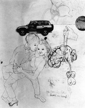 The drawings hint at all of the above, with obsessions like drugs, food, eyes, and tears. Men may or may not belong in this world, but their obsessions sure do, and they supply much of the childishness and the comedy. George Bush struts in his flight suit, before literally losing his head. He might take a particular interest in Three Women Wearing the Same Pair of Breasts. Microphones rush up to a cow's udder, as at a press conference, while a gun sparking, a button assures one, brings "major improvements." A man embraces a woman in heels, swaying with her head thrown back, but he has the face of a little boy and is still teething.
The photos often linger over the exact same spot over time. A drawing, in Pentecost's delicate but funky outlines, may become a collage with leaves, like a tree in springtime. Then the leaves may stiffen and die as if with summer and fall. Additions, erasures, and a healthy smear of white paint all take their toll—and allow for second, third, or any number of other thoughts. From the changing subject of one group, the camera appears not to have moved through at least three presidential administrations. By the time Obama's earnest smile takes over the flight suit, a 7-11 "Big Gulp" lies crushed below beside Bush's head.
The progressive darkening, crowding, and overgrowth of leaves implies a certain sadness, but always with the artist in control and the possibility of renewal—and, critical theory would insist, reinterpretation. A syringe into a brain (like, yes, your brain on drugs) at least provides a high. Left to themselves, women can actually relax among the leaves. One woman sits holding hands with a monkey, both with tails that curl out into a passion flower, but with the wild tendrils of a sea anemone. As the addition of pencil words puts it, "little curls, big curls." Above them, in a second shot, the two play patty-cake in profile.
Perhaps the true subject is mixed media, but the medium is photography. It has the appearance of process art, but the photographs are unchanging. One often classifies drawings as preliminary, for a painting, or finished, for presentation. Here the drawings are preliminary to photographs for presentation. It all gives new meaning to the artist in her studio. I wonder if she left to attend the opening.

Wei Jia and Lin Yan ran at Cheryl McGinnis through March 27, 2010, Virgil Marti at Elizabeth Dee through February 20, Kadar Brock at Thierry Goldberg through December 23, Dawn Clements at The Boiler at Pierogi through May 7, and Claire Pentecost at Higher Pictures through December 11. Mark Bradford ran at the Studio Museum in Harlem through March 13, 2011, Erik Sommer at Rooster through January 2, and Joe Diebes at Paul Rogers/9W through January 8.
