Making the Grade
John Haberin New York City
Dik F. Liu
I want to start by insulting Dik Liu. He is an academic painter. He is back at it again, in fact, more strikingly than ever.
Nasty, isn't it? And here most critics warm up slowly to their job of derogating artists. I like to get that part out of the way early, before their work has a chance to fight back. 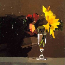
Liu is, in fact, a teacher as well as a painter, at Long Island University, the School of Visual Arts, and other institutions here in New York City. Now four solo shows, the most recent in 2006, have taught me something, too. His still lifes and paintings from live models, in oil on wood and in pencil, point up a curious side of art training and, while he is at it, modern art, too. I mean getting it right.
It's academic
"Art is not to be taught in Academies," Oscar Wilde once wrote. "The real schools should be the streets." It was not always that way, because there had not always been classes to cut.
Academies can trace their origins to the Renaissance workshops, but their century or so of dominance reflected tensions in art starting only in the late Baroque, when Jean-Siméon Chardin himself took charge of the French Academy. The inherent chaos of a private market had to confront the weight of the past, and both were now firmly in the hands of collectors, the ancestors of the museum institution today as it faces down its opponents. After some three hundred years of oil painting, painters had to face both the power of tradition and their distance from its origins. With the decline of the workshop system, artists may at last have stood above mere artisans, but they still needed training. Besides, the English appreciate most anything that goes with the word royal.
With his usual wit, Wilde was helping to define another way out, the twentieth century. In the century before, artists had disrupted the academies and salons. Now art movements replaced schools. One could safely ignore traditionalists entirely, other than for their lasting contribution to bad taste. In one essay's title, Clement Greenberg, the great defender of Abstract Expressionism, contrasted not the avant-garde and realism, but "Avant-Garde and Kitsch." An eccentric master of still life like Giorgio Morandi represents an alternative history altogether.
Not that the next few years, with Andy Warhol and Robert Rauschenberg, lacked some surprises on that score! Vegas kitsch may well have taken over America. Even CBGB, the Bowery's emblem of authenticity years before the East Village art scene, is likely to end up there. And yet modern art had attained a history—and with it, unprecedented success.
Tradition held, but to be appropriated, not emulated. After Modernism's triumph, art had a comfortable middle ground between formal institutions and lone rebellion. Artists quite sensibly aspired to neither one. With the instantly famous show of "shock art" in London's Royal Academy, one can see the divisions in a country so old-fashioned that few artists ever had that chance. In the United States, the closest one has to formal rules is white wine at openings.
The dirty secret is that plenty of artists survive only in academies, although of a different sort. Some painters become stars, and plenty give up. The rest keep on going through whatever means they can, most often by commercial work or teaching. Since Liu is a teacher, then, I could say that the wine at his openings was acceptable and stop. I must now admit, however, that I really enjoyed each show, too.
The bass line
still lifes already imply a margin of safety, accessibility, and academicism. I see all that, but I am repeatedly surprised, too, by the boldness of Liu's paintings. To be honest, his entire career would appall a formal academy of centuries past. From the first time I encountered his work, in 1998, the colors have thrown me back and drawn me in. Standing back, I still enjoy how color alone creates so much depth. As Liu puts it himself, "every color has a spatial illusion." Some of the brightest color goes into shadows, like the slim line between an object and the table on which it rests. Liu likes to compare a shadow, with all its range of potential colors, to the bass line of a fugue.
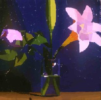 He is not Bach, at least just yet, but he does treat a whole painting, shadow and object, as one—as surface. If that sounds like abstraction, it should: Liu's earlier work was abstract, and there, too, he trusted his eye to create coherent illusion on a tiny scale. One problem with the word academic is the way it hides the work's ties to Modernism. Much of the fruit from a second show of still life, in 2001, looks abstract up close, like objects in color-field painting.
In both shows, Liu was already building his reality up from strips of paint. In these, he paints directly on wood—with a palette knife, the tool of pretty much all his work. As I allowed myself the intimacy of coming up close to these small panels, I saw that he applies thick colors flatly, leaving clear traces of the palette knife intact. In his hands this coarse tool of nineteenth-century realism somehow evokes the transparent light of a fine brush (and my amazement only increases as I reread my words many months later). Liu jokes that his colors look bright only because a gallery is so well lit, and there is something to that. When a painting depends on oil color, it sops up as much light as it can get, and it deserves to do just that.
That second show of still life plays harder than the first, with the blade of the knife more visible. Strokes grow obvious but flat, without an expressionist crust. A great admirer of Paul Cézanne, Liu thus makes the painted surface more than ever a subject within the work. At the same time, the blade lets the artist play against a modernist prejudice. It lets in the possibility of metaphor, with the act of creation just one subject of metaphor among many. I thought of the tradition of gold leaf—or the leaves of the flowers within the paintings.
To challenge either formalism or illusion further, the strokes do not follow a flower's physical leaves. Indeed, they cannot to succeed in the service of surface, depth, and, above all, light. Just as the strokes separate more and more, colors in the latest show become brighter than I remembered, deepening the illusion. One notices the effect just as much in apparently quiet tones. In one, a pale, grayish tan defines a projecting wall just slightly different in color from the wall above. The illusion has become both more casual and more virtuosic.
Perhaps I simply chose the wrong the metaphor for the knife blade and its physical layering or resistance. Realism here becomes what Liu calls "an architecture of color." That makes the accuracy of the first of the two show's handful of drawings more interesting, too. The pencil work looks delicate at first, but it has the same spatial clarity as in the oils. My favorite one calls attention to the filament and wattage label on the treacherous round end of a light bulb.
Bright and brighter
Speaking of not so dim bulbs, Liu jokes that he has a narrow stylistic range, from bright to brighter. At his third gallery showing of realism, in 2004, one could watch them face off from across the room, and there are no losers.
Elsewhere that same spring, I claimed that the critical impulse and beauty alike point to a multiplicity of lineages and associations. No wonder I must return to a realist. Other shows in Chelsea had me slipping gracefully from video into stonework and oil and canvas, and that alone points to why getting retro for a moment can pay off. This time, Liu sometimes painted from live models, although the props and the walls on which they lean already recall still life. So does the scale and, of course, the intensity.
For Liu, bright does not mean favoring yellows and pale hues. Nor does it does mean primaries alone, although the careful accretion of small patches to produce a full range of color and space makes me think of Pointillism. One who sees the paintings only in reproduction is in for a pleasant shock. But he gives the same intensity and saturation to an earthy ground or the wildest floral shade.
In fact, many of these paintings have few colors other than flesh. Nudes, from the chest up, hair drawn back, blow balloons or bubble gum. Another brings to her mouth forkfuls of, one is assured, a "medium-rare steak" while her breasts barely stay out of her plate. So that is why women dress for dinner.
Across from them, Liu upped the ante still further on his deliberately constructed still lifes. The construction of light from broad, layered strokes of oil remains. One may still note the skill at accounting for the palpable, its transparent container, and the uncertain depth of ground. However, one feels closer than before to the flowers, the palette knife, and the brush. The colors look thick and flat up close, but they explode outward.
The contrast is obvious. The nudes may recall the sober brightness of Roman portraiture or the studied illusion of transience in academic painting. I retreated across the room, where a bomb was going off. However, they have much in common. They both confront painting as about time and restraint with painting as an object of pleasure. It could stand as the very theme of still life in art.
Easy to please
Immediacy and control, an object of vision and an object of consumption—painterly realism has always exploited those paradoxical temptations, rarely more so than in still life. Think back to Caravaggio and his early Madonna di Loreto or basket of fruit, glistening and rotting, as it teetered so luxuriantly close to the edge. With Liu's latest show of still life, in 2006, one wants to approach more closely than ever.
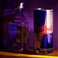 The technique of oil on board continues to serve him well. He can afford less impasto now without losing the attractions of paint and subject matter alike as objects in the visual field. He can depart further from smooth flesh tones and primaries while enhancing the illusion of intense light and shadow. He may trace the front of a ledge in acrid yellow and the rear wall in shades of purple. However, both look quite ordinary, and they do not in the least undermine the transparency of a bottle of clear liquid or the expected red letters on a white and blue can.
Also in contrast with the nudes, he gains in force by a return to contrasting shades of dark and overt, layered highlights. Do art schools warn against falling back on daubs of white? I was about to congratulate the artist on the tribute to Frans Hals and the Dutch, who offered a few temptations of their own. However, on close inspection even some of those whites turn out to mix with color. Perhaps because of the increasing control over larger effects, the show's best work attempts larger scale as well. These panels run about thirty inches on a side, and they look larger still.
Consumption now has another meaning as well, much as it did in all those Dutch pictures of beer steins and mince pie. If a painting is an object of pleasure, some are easier to please than others. Maybe birds and insects would have relished those earlier flowers, but that bottle belongs to Absolut Vodka, and the can has the familiar Red Bull logo. Other paintings describe slightly crumpled bags of junk food. Together, they suggest the typical diet of students these days. An artist does learn something from teaching.
On the one hand, the choice boasts an indifference to subject matter—and certainly to social commentary. It links the work to formal and academic tradition. On the other hand, it boasts just a little too much for one to believe in the indifference, much as when Pop Art made the same decision. As with Pop Art, the subject updates still life for the present and a culture of consumption. It draws one in, even when one is half ashamed of oneself. The larger paintings, in which the objects exceed life size, make the attraction that much more compelling.
Of course, as illusion must, the paintings fool the eye. Getting closer does not make the details come into focus. It simply lets one observe more accurately the shadow.
Trusting to others
Scientists distinguish precision from accuracy. One can weigh a grain of sand right down to the ten-thousandth decimal place and still be off by half a ton or so. If Blake is right about a grain of sand, without art one can be off by an infinity. 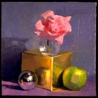
Modern art does not often value precision. Raphael's sketches may have been meant increasingly to guide workshop productions of his Madonnas, but Sol LeWitt's wall drawings require execution by the hands of others, just as Surrealists had entrusted their imagery to the unconscious. Frank Stella in his iconic black stripes depends on freehand edges quite as much as Rothko's floating rectangles after they came free of their roots in the urban landscape. These artists do not, however, disdain accuracy. Perhaps the model is still Monet and his astounding evocation of light and depth. It is another way of trusting to others—by way of a trust in color, right down to the colors of a shadow.
Liu's work may still seem too cautious for true comparison with names like those. He says modestly that "painters like me use colors as though they were Lego blocks," but these are adult toys and maybe a little serious as toys go. They do remind me a little of why that word academic gets thrown around these days less to justify Modernism against a dark past than to tarnish it. Yet with each successive exhibition, Liu pushes Modernism's history a little harder. Let me continue my own little history lesson.
Since the 1980s, some historians have tried to revive the prestige of Salon painters, blurring the lines to Impressionism, just as Impressionists blurred more than a few lines in oil. Young artists, meanwhile, have frequently parodied Modernism as one more kind of institutional kitsch, a white male institution at that. What interests me is that the word academic has held onto its nasty edge, even as academic art and modern art get to look sillier together. Call them prep courses at the New York School.
They are not altogether silly yet, though. An academy, be it an art school or a modernist's fields of color, can be numbing. No, no, it has to be, but in the hands of a painter it will continue to hold surprises and require care. Rather than paint, leaves, or even Lego blocks, the blade strokes can suggest yet another metaphor—a jigsaw puzzle. As in gray prints by Jasper Johns, a puzzle hides exactly what it places up front on the surface. I think of that gray wall again, with its near blankness under intense studio or gallery light.
Liu has long enjoyed throwing in a few surprises. He gave up painting in cow's blood for oil, just when the dark overtones of bodily fluids were getting popular, even noteworthy. Since then, more than one sweeping survey exhibition has legitimized abstraction, and so he has found something even more conservative than his grids. All that comes without even irony, although humor does surface when he turns to portraiture. Before I get too annoyed at the caution, however, I prefer for now to remember the boldness—and the care.
The real school
In more ways than one, New York City students are the closest thing I can name to Wilde's "real school," the street. "It is what one looks at, not what one listens to, that makes the artist," Wilde added. Teachers like Liu have to look, to grade, and even to correct. If they can get away from the idea that this must mean a right and a wrong style of painting, they can start to think of how to get it right. 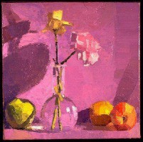
Color is another "real school." When Roy Lichtenstein, Gerhard Richter, and Richter in his late work talk about their images as formal design, I see artists turning their back on the work so as to get back up onto their pedestal. Still, as good artists go about their business, they must constantly, as Liu says, "suspend belief in the depicted subject and motif."
I still approach Dik's shows too gingerly. When I first wrote about his still life, after that visit to Soho in 1998, I actually hoped that the reader would spot the left-handed compliments. Somehow, he never seems to mind. Perhaps he trusts that I shall have caught on over the years. Perhaps he is the one growing alongside me.
I refuse to judge. He remains a realist taking the old problems terribly seriously. More and more, though, he lets one have fun while he works. More and more, too, he lets one think about all that hard work of the eye and hand. Both the painter's and viewer's imaginings must help in constructing the jigsaw.
Is that pre-modern, postmodern, or that scary century in between? Half sheepishly, half with pride, Liu says on his Web site that discovering Rothko made him cry. Do not, however, expect yet another metaphor for the flat strokes, in someone's tears. Not from me at least.
Easel-scale panels like these earn their accuracy the hard way, adding Liu's personal note of shy intimacy. He is dead right when he claims that for him "a composition is just how these different colored shapes talk to each other." I enjoyed the conversation.

Dik F. Liu's still lifes ran through June 2, 2001, at Allen Sheppard and his paintings from nude models through June 12, 2004. A show exclusively of still life, but from commercial products, ran through November 25, 2006. His earlier show back in Soho ran through February 4, 1998. With apologies to my reader, whether for cutting corners or pushing one's attention span even further, I have modified built successively on earlier reviews of these shows, although without a palette knife, to give the artist his due.
