Unwrapping the Bowery
John Haberin New York City
The New Museum and the Lower East Side
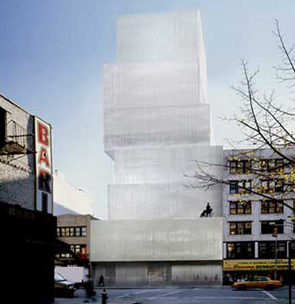
New Yorkers have been waiting for a museum like this. The New Museum of Contemporary Art even looks like gifts waiting for someone to open them. Its seven stories rise casually over the Bowery like boxes stacked under the tree. For those who prefer a secular holiday, they come without gift wrapping in the cool grays of winter rain. They look past the white stone of older institutions or the glass of condos rising left and right.
Frank Lloyd Wright designed the Guggenheim Museum's broadening spiral as a challenge to New York City's "boxment." The New Museum's structure manages to do just that while embracing the box. But will it offer a gift to contemporary art, though, or will it defer to the buzz of the Lower East Side and the latest Chelsea trends? As will appear in an accompanying series of reviews, the opening group show, "Unmonumental," reinforces the mixed messages of the building itself. A postscript looks at the architecture one year later, with delightful help from a parody by Howard Saunders. 
From architecture to event
At the New Museum, a glass lobby front allows just a peek inside, cut off by the winding metal back of the bookstore shelves. A slim row of windows at the fifth floor gives the museum's tiny education center a view down Prince Street. They offer much-needed relief from the room's low ceilings.
Otherwise the blank, cantilevered shapes pay wry homage to Marcel Breuer's Brutalist architecture for the Whitney on Madison Avenue. (Up in Boston, with the Institute of Contemporary Art, Diller Scofidio + Renfro preferred to confront that past.) The gray mesh siding may hint, too, at his aluminum and steel Bauhaus furniture, and similar materials add decorative notes within. The pile also has fun with a modern museum's proverbial white cube. At the same time, its plainness, damaged concrete floors, and warehouse interiors fit right in for now with its disappearing industrial neighbors.
In other words, the New Museum sends more mixed messages than an interview with Andy Warhol. It can look austere or ethereal, one of a kind or a tribute, the end of an era or the seed of the Lower East Side's future. It can look spacious, dramatic, or too cramped even to allow seating. No wonder the word got out, and anyone looking for the old New Museum in any of its incarnations will be in for a surprise. Call it the new new New Museum.
Marcia Tucker founded the institution in 1977, in private quarters in Tribeca. At its first real home in Soho, starting in 1983, it offered a rebuke to its art world neighbors as much as an invitation. It spared one the controversy that surrounded the big boys, from the Guggenheim's fashion shows to the Whitney on the black male. Yet it showed women artists and political art when formalism or male expressionism reigned. It even showed abstract artists such as Richard Tuttle when they had gone out of fashion. In its temporary Chelsea space, it kept a balcony for new media all the time, while other museums still could not catch on—except that the terminals kept freezing, with staffing too low to reboot.
The New Museum at last announced that it had outgrown Chelsea, with the promise of new architecture already making news. Even then, it drew fewer people to Andrea Zittel than could live comfortably in her mobile homes—but that was 2006. Only a year and a half later, the opening of the brand new building ran thirty straight hours. Tickets sold out in advance, and when I got there the following weekend lines still stretched out the door. The museum itself seemed caught by surprise. The lines might have moved more quickly if the staff had mastered selling tickets and checking coats.
The new building, by the Japanese firm SANAA, is both architecture and a cultural event, like so much postmodern architecture or, in the photographs of Wijnanda Deroo, an actual empty museum. The last New York City museum built from scratch, the Dia Center, gave up the ghost to the X-Initiative and then to nothing, just as the Chelsea galleries it inspired exceeded critical mass. The Whitney has yet to take its place downtown at the foot of the High Line. The reopened Museum of Modern Art plays it safe, and the thoroughly aimless Guggenheim long shied away from restoring to Frank Lloyd Wright his original color scheme, as seen in a model still in the Frank Lloyd Wright archive. Who, then, can resist heading for the Bowery? Who can resist heading downtown anyway?
Mixed messages
No wonder New Yorkers were waiting. As Ugo Rondinone writes in party colors over the entrance, "Hell Yes." Yet in the December excitement, one could easily overlook the mixed messages. It takes some patience to tally up so many conundrums, and they serve as a heady reminder of how much art's role has changed—along with its audience. The museum arrives on the Bowery under Lisa Phillips, a curator at the Whitney during Tucker's Soho years and a mainstream trend spotter. It arrives, too, with the names of donors like Dakis Joannou on everything from the bathrooms to the standard-issue water fountains.
The New Museum promises to anchor Lower East Side galleries, already numbering more than thirty. Yet it literally turns its back on them and other heirs to Chelsea, with its face toward Nolita's fancier stores and brunch spots. Perhaps it imagines itself as the official gatekeeper to the hip. One looks for the velvet ropes. From the cramped basement to the soaring fourth floor, each exhibition level has a higher and higher ceiling, as if the building itself were flying upward. Yet the main halls, although twice the old building's floor space, amount to just three rooms.
Okay, who wants more room for yet another of the art scene's insanely sprawling group shows? The promise of more haunts the building all the same. The staggered boxes allow narrow skylights above each gallery. Yet they let in little sun compared to the sunken ceiling grid of steel and fluorescent lights. More thin, narrow light tubes serve as punctuation down the service stairs.
A thrilling stairwell (named, of course, for a donor) ascends the fifty feet from the third to fourth floors. Along the way, a tiny alcove allows a pit stop and perhaps even some art, starting with sound art as record of performance by Sharon Hayes. Yet its four-foot width makes it hard for even two people to pass. On the busy first few weekends, mismatched couples had plenty of chance to fail. Meanwhile one must resort to what amount to fire stairs for any other floor—and just try to figure out on first attempt which of two stairwells one can actually take without setting off an emergency. Otherwise, one has to wait for the elevator, with its cattle-car interior and the acid glow of a translucent green ceiling.
Even before setting foot in the inaugural show, one might wonder about the new museum's commitment to the new. The Whitney, for one, has a larger and more intelligent bookstore, with room for more exposure to contemporary art and ideas than the museum's own publications and coffee mugs. As for the new gallery scene, one gets a glimpse of the younger crowd from the New Museum, but only on weekends. A top-floor observation deck then allows fabulous views of the industrial fabric south and east.
Even before a show, then, one can ask how well the architecture works. One might usefully remember that last museum built especially for New York City. As the institution that started the Chelsea boom, the Dia Center, too, promised something new and exciting downtown. It stimulated art's economy, but its building did a poor job of housing art. With the expansion of the Virginia Museum of Fine Arts coming up, the balance is finer, but public excitement still takes priority.
The power of the purse
Fall 2007 in fact brought a chilling Sunday Times profile of the financial fallings out at Dia. It told of a board member, Leonard Riggio, able almost single-handedly to make Dia:Beacon a reality. It told, too, of his anger when plans for a new downtown location fell apart. It told of a director then losing his job, after struggling to keep money flowing, plans advancing, and clashing egos under control. If all this has the arc of high tragedy, it, too, has the jagged shape of the Dow Jones average. Behind the perils of an arts institution lies a second story line, about the unquestioned power of the purse.
The board member could not just raise and command funds. He could write most of the checks himself. He could also walk off when Dia failed to find a location worthy of his name. No one in the spat seems to have had much interest in collecting art rather than real estate, not unlike Thomas Krens at the Guggenheim. Rather, the director acted basically as a funds manager. Dia has come a long way from the Soho dealer, Heiner Friedrich, who got it started.
Can one find signs of hope in the story's ending? A new director brings curatorial experience. He also brings real understanding that Dia and New York alike lost a great deal when the foundation abandoned Chelsea. Yet he, too, ends up resigning within months, as the news unfolds in March 2008! Perhaps like the New Museum, Dia, too, may yet find a new home, even having ceded a site to the new Whitney Museum, and and growth already swirls elsewhere. When it comes to the New Museum, however, it should have one looking beneath the cloud-gray skin.
These days, everyone gets to smack down MoMA, in its equally bland, soaring, and unhelpful new galleries by Yoshio Taniguchi. In an insightful review of Martin Puryear, Arthur C. Danto focuses just as much on the troubling galleries that Puryear masters. Not long ago, Danto notes, art seemed destined for monumentality, and MoMA built a museum to match. How glamorous it seemed the evening of its 2004 opening—before one had to deal with art. Now even Richard Serra has avoided the atrium.
The New Museum's architects, Kazuyo Sejima and Ryue Nishizawa, may yet face the same rebukes as exhibitions continue. For now, they have created not just the first totally new museum building in decades but a truly new museum. In time, however, it may come to depend on the Lower East Side more than the other way around.
SANAA must have begun with a vision of the museum exterior and its site, but did its interior and its role as a museum come only as an afterthought? Will the buzz of an evening on the Bowery wear off once that starts to matter? Already, the growth of Lower East Side galleries sends some of the same mixed messages as the architecture, and so does the museum's opening show, "Unmonumental."
Postscript: the urtext
The New Museum may have opened on the Bowery with "Unmonumental," but its architecture looks more monumental every day, even before Kapwani Kiwanga will transform its white cubes in years to come. A year past its opening, the metallic surface that seemed to dissolve into sky looks flat and sleek. SANAA's stacked boxes that seemed so playfully haphazard—or ready for unwrapping this very day—now resemble a step pyramid. Who knows which dynasty of art will end up buried inside?
It comes with acquaintance, as one starts to realize that the museum is here to stay, and so is the Lower East Side behind it. A cooler eye could well have seen the changes coming. The building already seemed more to bar the way to the gallery action than to provide a gateway. Its cramped stairwells, high-ceilinged interiors, tiny bookstore, and scarcity of sunlight already made it more than a little dysfunctional as a museum. The junkyard of "Unmonumental" or, soon after, "After Nature" already reached too hard for profundity and for the right to define contemporary art. Thursday evenings, when the museum becomes free, gatherers must empty the lobby and form a line in the cold, as for an exclusive club.
On its first anniversary, the space held a retrospective of Elizabeth Peyton. Who better serves as portraitist to art's cult of personality and the music scene's velvet ropes? For a moment, though, one could imagine the museum living and learning. With Peyton and then Mary Heilmann, the New Museum used partitions more effectively to cope with the exhibition spaces, and Heilmann returns the museum to its tradition of artists stubborn or quirky enough to have lingered on the margins. The boxes on the outside no longer necessarily translate into a big-box store inside. Maybe next holiday season, it will even come gift wrapped.
For Howard Saunders, it already does. In his doctored photo, it comes bound in rope and shiny white fabric, as if Christo had come back to town. It looks tailor-made for the treatment, too. Saunders also turns his eye on the building's clumsy monumentality. He calls his project URmonumental. The Ur sits handwritten in red across and below the printed prefix, like a proofreader's correction.
He got the idea for his urtext on his return home from "Unmonumental" to Hudson, New York. A flea market there felt to him an improvement on the show's assemblages, and he set out to photograph its "random arrangements." Some of them indeed suggest Surrealism's "chance meeting on a dissecting table of a sewing machine and an umbrella," although not all the operations are exactly a success. His self-published booklet, I find, opens with a quote from me: "Biennials and recycling centers alike fill up quickly." So, I guess, do blogs, and I am grateful for the compliment.
Saunders's booklet and Web site try a few too many things in a small space, like a random assemblage themselves. Along with everything else, they throw a bone to Jerry Saltz, who admired the New Museum, and annoyance at Stanley Fish, the literary theorist turned pundit, who did not. They apply the same editorial devices of red inserts and yellow strikeouts to further text about the museum, all available on t-shirts. They convinced me that the New Museum has not reached the level of a small-town flea market just yet. Could Manhattan museums come way too close to an extended advertisement for a clothing line?

The New Museum of Contemporary Art reopened December 1, 2007, in architecture by SANAA, the firm directed by Kazuyo Sejima and Ryue Nishizawa. "The Patron Gets a Divorce" by Joe Nocera appeared in the Sunday New York Times Magazine on October 15, 2007. Howard Saunders maintains his project online.


