The Pop in Surrealism
John Haberin New York City
Judy Pfaff, Sari Dienes, and Lucy Kim
Judy Pfaff is letting one in on something. Between the two galleries of "Run Amok," one can glimpse both her good side and her dark side. Only one thing: which is which?
Pfaff has always allowed painting to run amok, to the point that it is no longer quite painting. Not that I have a better word for it. It cares too much for the wall to be quite sculpture or installation either, and its use of materials as her elements of color and composition look back to shaped canvas as well. This time, though, is more of her art lurking beneath the surface? A generation before, Sari Dienes, too, raised painting off the wall, in every sense of the term, and she made explicit the path between Pop Art and Surrealism. Now with castings rather than rubbings, Lucy Kim finds her own way between the two—and between two and three dimensions. 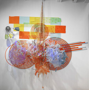
The dark side
Judy Pfaff is full of ideas and everyday objects, and they have a way of spilling into one another and into sculpture. At one gallery, one can revel in her good side—or at least her bright side. A light fixture welcomes one right off the elevator. Does that cluster of flexible lamps shed the idea of light more than light itself? No matter. They are only the first of many sources of illumination.
One expects them in a top-floor space filled with light. One also expects the effrontery of Pop Art and color, in a gallery that specializes in artists, established or neglected, who thrived before conceptual art. And Pfaff delivers, with materials tumbling or moldering out from the wall. Disk-like arrangements bulge like sculpture by Lynda Benglis, but with trash instead of angels. Larger ones hint at motion, like "Exotic Birds" from Frank Stella but without the geometric logic. That light fixture is only the beginning of a wall-sized mural, if a mural can be that translucent and 3D.
Light appears explicitly in fluorescent tubes cutting horizontally through more than one work, not solely in white, but also in each work through the light it collects. Like the annoying older man in The Graduate, I have one word for you, plastics. Besides the crinkly kind, like wrapping for a sculpture still unseen, Pfaff includes rigid circles, often bright orange, that glow from transmitted light along an edge. Black circles, not quite concentric, could well spin to present a familiar optical illusion—like disks once appropriated by Marcel Duchamp. If all that sounds like overstated office equipment, work in the back room extends more fully into three dimensions, like kitschy tables.
Maybe this is not her good side after all. The large tabletops bear the grain of natural wood, but in shapes from one's worst Scandinavian shopping spree. But then two floors down, things grow darker still. One piece looks like the burnt remnants of the tables above, while others have sprouted pointed antlers. Some are only a bit darker, but the flowing beyond two dimensions has clearly gotten out of hand. Others have the scalloped edges of her lighter constructions, but with the dull gleam and threatening enclosures of Lee Bontecou.
One could credit or blame the second gallery for her dark side. Its edgy program reaches from contemporary camp to global Surrealism, almost always using the floor as well as the walls. Or is this Pfaff's good side after all? After years of watching as humans pollute the seas irrevocably with nondegradables, she is clinging to life. Scalloped metal can represent shells, and collage on all four walls presents an entire natural history of the seas. Try to figure out what has been lost.
The wall panels, while nearly flat, have acid colors and synthetic materials of their own, including color film and plastic disks. Meanwhile the upstairs work includes black circles, not quite concentric, that could spin to present a familiar optical illusion. In another sense, however, Pfaff is just making things visible and explicit, in however many dimensions it takes. Much of the apparent wood is acrylic, foam, and resin, and much of apparent damage amounts to exposed turns in its steel support. A few doors down, Amelia Biewald throws in an entire deer not to mention an artificial fireplace for her Big Brass Light Opera. Her scalloped edges belong to fabric, perhaps its stage curtain but fallen to the floor. Not bad, but no living things were killed for Pfaff's work, only good taste and the very notion of space.
Rubbing the right way
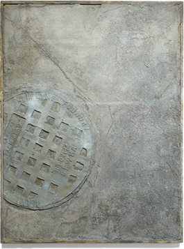
When Sari Dienes appeared at the Drawing Center, she brought a welcome reminder of everyday New York. Her rubbings of manhole covers belong to the city's infrastructure, and one could only imagine what lies just outside the basement "lab." The perfect circles in black and white update the shared immediacy of Minimalism and Pop Art for the streets, much as Drawing Center's renovation has brought it more fully into Soho in the present. Besides, a lab by its nature is still experimenting. Only surprise: Dienes was at her peak from 1953 to 1955, with an impact on Robert Rauschenberg, Jasper Johns, and Mark Rothko.
I have to take her gallery's word for that, and dealers have a stake in boasting, but I can well believe it. Large circles and found imagery take one right to Johns's targets, and their presence as art takes one to his discomforting habit of placing those targets not at a distance, as if for practice, but in one's face. Dienes cast still more manhole covers in rough plaster not so far from Johns in gray, in work meant for the wall. They could be crumbling before one's eyes or piercing them. As for Rauschenberg, her borrowings are combine paintings before the letter. Cotton pads, the kind used in surgical dressing, preserve life to much the same degree as his stuffed goat, but without violating animal protection laws.
Where Rothko's generation marks the "triumph of American Painting" (or, to those left behind, "how New York stole the idea"), Dienes suggests a continuum—from Dada and Surrealism to the creepiness and camp of art today. Such is her gallery's ongoing subject, as with Pfaff the month before, and such is its three-person show. Where Dienes seems surprisingly ancestral, Addie Herder and Stella Snead look older than their years, although all three have died. They have in common Sherwood Studios, on West 57th Street, in the 1950s and 1960s. Dienes herself fashioned that cotton gauze into floating rectangles of red ink that Hans Hofmann at the nearby Art Students League might have taken as his own.
 Herder and Snead never do set aside prewar Europe. Snead became a painter in London, and her photo collage clings to Surrealism's dark absurdity. The hard edges of her cutting and pasting, with no attempt to hide the discontinuities, go back to the movement as well. Who is that grinning character with white skin, black makeup, and a bludgeon at the base of a pyramid, somewhere between a Mexican god for Salvador Muñoz and a cartoon superhero, with a rhino and wildcat guarding or challenging one another above? Who just dove into the water at the base of the World Trade Center, his legs miming the Twin Towers? Maybe Ground Zero is different now, but it is not yet ancient history, and it is startling to see it in art so rooted in the past.
Herder looks even more at home in the 1920s, in work as late as 1982. She fits cut paper into small abstractions, with the emphasis on fragments. One even sports the text Stück, German for piece. What goes around comes around, and what might have begun as bits of a matchbook or a deck of cards ends up recreating one. Herder, who also worked in Paris, is at her best there. She constructs street scenes in depth, like shoebox models.
Born in 1898 and the oldest of the three, Dienes tosses off watercolor and ink near the peak of Abstract Expressionism, in 1949. Soon enough things get nastier, in the cotton of raw bodily sensation, but still as abstraction. The plaster manhole covers enter more fully the space of the gallery. All three series surround the rubbings, in ghostly colors on a single raised platform on the floor, for a storm sewer is also part of a city's long history. Dienes may be conducting only a modest experiment, but an experiment in time and New York.
The bell jar
When Lucy Kim calls her show "A Parrot in a Bell," she surely something has gone wrong, but what? Will she be aping what she hears, without understanding, or just making a lot of noise? Will she be redoubling the demand for attention or, by placing one source inside the other, muffling them both? Will she, like her title, be working way too hard? Maybe all the above, but I have a feeling she knows it. She is smart enough to get the viewer working hard as well.
For starters, one works to connect it all to a single artist. A tall abstraction looks conventional enough, in three irregular fields of bright primary colors. Three smaller works then seem conventional only in their rebellion, like Arte Povera, in taking the first apart. Each suspends torn fragments of a single color from a simple black frame, like neurons without a network. Dare she call them Back to Basics? Work in between harkens back to still older conventions, one in harsh green and the other a comforting gray, but both, as for Ken Currie, milking oil on canvas for the illusion of a curtain.
Or so it appears, for she works in paints, resins, and glue on burlap, and, as with Sam Moyer, at least some of the folds are real. Perhaps all they have in common with an actual stage curtain, apart from the folds, is the implication of drama. They challenge one's emotional expectations as well, for the harsh green is Clean Like Spring Rain—while the comforting gray is Darkly. 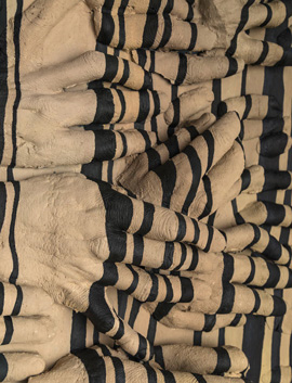 Then, too, light crosses the green as if from a window bearing its own drama, as in Alfred Hitchcock and Rear Window. As if for confirmation, the title of another work refers to "Garbo's gaze," and there the folds appear to belong to sheets. And crossing them are naked arms disturbingly close to an embrace.
They are, however, a more or less reliable clue as to what is going on. Kim approached Garbo through body casts of an actual couple, identified as Sean and Susan. The entire show begins with casts as a direct impression of what lies before her, perhaps in deference to the parrot. Then Kim pounds them like a bell, before introducing paint, folds, recastings, and other distortions. Sean and Susan, she insists, bear the shadow of Greta Garbo's eyelashes. Maybe, she imagines, they were watching her on TV when they fell asleep.
As usual, she is working too hard, but so will others. No one could conceivably spot the pop-culture imagery that runs throughout the show. One will, though, adjust soon enough to the pounding and folding, as what looked like painting takes on a third dimension. It dares one to identify the work strictly with the body, abstraction, or just plain carrying on. It took more than a hundred casts of teeth for Tomorrow, Tomorrow (Leeza Smiles), and the loops crossing them, as if deposited by Mary Heilmann or Tony Feher, refer to without exactly representing Leeza's red hair. Tomorrow and tomorrow and tomorrow. . . .
As Kim's sensory side takes hold, in both surfaces and references, the work can feel almost grounded, even when the imagery is disturbing. Black drips down across pale hands, like sausage, cigarette butts, or something out of Eva Hesse and her Expanded Expansion. A comb parts hair (So Long Waves), and squashed oranges could almost give off their juice and an aroma. Orange pillars dominate by far the largest work, but what are they? I decided not to worry. If the show does not always make sense, surely you, I, and a few dozen other bodies are complicit.

Judy Pfaff ran at Loretta Howard through December 20, 2014, and at Pavel Zoubok through November 15, Amelia Biewald at Magnan Metz through November 22, and Sari Dienes at the Drawing Center through November 15 and with Addie Herder and Stella Snead at Zoubok through December 20. Lucy Kim ran at Lisa Cooley through February 15, 2015.
