Backlash
John Haberin New York City
Luc Tuymans, Krzysztof Wodiczko, and Sam Durant
And now, the backlash. When plans for a museum at Ground Zero came under fire, the hush of its defenders sounded as funereal as any monument to the dead. Once Governor Pataki finally killed the International Freedom Center, however, everything changed. It did not happen all at once, but breaks in the silence grew, until any pretence that a site plan represents the will of New Yorkers—or for that matter still exists in some coherent form—has become impossible to maintain.
As the debate continues, the site remains hardly more than a sad hole in the ground. And yet political art has survived with hardly a pause in production. In fact, despite the intensity of the disputes, the surface calm in fall 2005 work took me by surprise. Luc Tuymans lets slip hardly a sign of political commentary amid his dull gray paint. Meanwhile, to name at the start just two others, Krzysztof Wodiczko and Sam Durant approach exactly the kind of memorial that Lower Manhattan still lacks. 
A postscript picks up Luc Tuymans five years later. Is his gray taking on the weight of history?
Safety last
Following the demise of the Freedom Center, The New York Times spoke up again, almost immediately, but now plenty more are listening. And they are listening to the essential role of art, including political art, at the confluence between private feelings and public debate. More and more articles have asked how New York lost its urban vision, as forcibly by Michael Kimmelman, and three members of the World Trade Center Memorial Foundation have resigned in protest. Mayor Bloomberg has promised a greater role downtown, rather than just at the West Side rail yards. He has also pointed to the stranglehold of those self-appointed advocates for families of the dead.
And no wonder, when a majority of New Yorkers do not trust Pataki to handle the site. Most, polls say, no longer care what goes up, as long as the parties would just stop arguing and start building. Even the media outlet that did the most damage, The Daily News, now calls Bloomberg's past statements "bland." Apparently discovering that culture is not so un-American after all, The News has also touted the Smithsonian's participation in rebuilding, although I am not holding my breath. As a further irony, the National Coalition against Censorship's Annual Celebration of Free Speech and Its Defenders this year honors, yes, the Drawing Center. Perhaps it will remind the Center to speak more freely next time.
Many continue to tackle art after 9/11, and two exhibitions focus on the only two downtown architects remotely pushing the envelope. The Met, for one, makes room for its first architecture exhibition in memory thanks to a new curator for art since the nineteenth century, Gary Tinterow. Santiago Calatrava, whose temporary PATH station already holds so much promise, exhibits models of the permanent station and apartment towers of spiraling cubes. Unfortunately, these rest amid some incredibly pompous sculpture, such as wiggly metal arms based on the parabolic arches that support his glass roofing downtown, giving not so much ominous as comic overtones to the bone white so typical of his architectural frames. They offer a clue to his thinking, but they also wrench his buildings out of their urban context and overlook his real genius for engineering—for what Cheryl Kent has termed the quest "to dramatize and mystify the physics of structure." They also take what looks most daring in his buildings and reduce it to assembly-line knockoffs of Constantin Brancusi or The War of the Worlds.
Meanwhile, Daniel Libeskind has a surprisingly dense gallery survey. I say surprisingly, because Libeskind entered the game as master planner, with limited control of architecture, and one knows him most for a Holocaust memorial rather than tall buildings. He turns out to have several projects well underway, all favoring a slight twist on the glass wall. Even more than in his proposed Freedom Tower, he tends to retain a smooth façade, perhaps bending it slightly away from the surrounding grid without quite refusing to follow function. One might call it Frank Gehry light, but perhaps Ground Zero or a National September 11 Memorial at this point could stand a compromise. New York itself deserves a fresh tribute to both Modernism and progress.
Observers of the arts are helping, too. Nicolai Ouroussoff, architecture critic of The Times, and, twice in two weeks, Mark Stevens have criticized New York's inability to do more than play it safe. Both found a symptom in "Safe: Design Takes on Risk," a strangely upbeat and risk-free exhibition at the Modern. In New York magazine, Stevens treats it as little more than a pretext, with barely a paragraph on its display of stylish, more or less practical objects before turning to public spaces. I have missed Stevens, who has appeared less often recently, perhaps devoting that time to his biography of Willem de Kooning. Yet while I appreciate his belief in taking rather than just taking on risk, I have to quarrel with how he defines safety—and whom he blames for ensuring little else.
It makes no sense to equate security in the sense of, say, baby strollers, razor wire, or cuddly stuffed animals with political or artistic conservatism. Stevens misses the boat, too, in ascribing delays at Ground Zero to heightened fears of terror. Worst of all, he attributes both the delays and the fears to New Yorkers generally. No, the public interest has collided with the economic interests of the World Trade Center's lease holder, the agenda of Iraqi war supporters, conservative media able to play on words like patriotism and terrorism, and politicians willing to play along. Does that sound like the fragile coalition guiding Republicans nationally? What a coincidence.
Curtains for America
Images of America can hardly help evoking strong feelings these days. Not that Hans Haacke has ever needed an excuse, and he is back to hector me about the dreaded American flag—with a contorted version draping the full height of Paula Cooper's cathedral space. Curtains to America! I could also have included here a parody of TV news and goodness knows what else by Jon Kessler. Feminism naturally also shapes political responses, especially from established contributors. Mary Kelly's Love Songs envisions a spooky Miss America pageant, largely black except for the lights on a contestant's naughty bits, while a dark procession of Mourning Women by Nancy Spero just above floor level looks even more enigmatic.
Others have connected what Exit Art calls "Love/War/Sex" or Martha Rosler calls "Great Power." When it comes to political art, however, Luc Tuymans offers the modest pleasures of realism and domesticity. If he lets his domestic realism go a bit haywire, almost like the documentary chill of staged photographs by Thomas Demand, that adds to the fun, too.
Tuymans has always run the risks of political art. He wants to say important things without painting one-liners. He wants to remain allusive without reducing his message to utter obscurity. I often find him the worst of both worlds, exactly when other artists are responding to 9/11 and America's role by rising to anger and fear or by locating personal meanings. Then again, I have to remind myself that I am usually just as insensitive to William Kentridge's didacticism and elusiveness—and that some people have felt the same thing about Bob Dylan.
Tuymans has the global reach befitting an artist from Belgium, home to so many international organizations that the United States refuses to honor. His soft, gray palette could indeed stand more for detached, bureaucratic art than for the glories of his home's Northern Renaissance past. He even calls the exhibition "Proper." However, he has a definite talent for making everything as familiar and not quite one's own as a former home.
The out-of-focus photorealism suggests a plainer Gerhard Richter and Richter's late work or Bradley McCallum, and that immediately drew me in and risked turning me off. The subjects, mostly objects in interiors, seem both casual and concrete. The arbitrary compositions, cutting off one's sense of place, allow the objects and interiors to slip easily into a vague and more luxurious past. The colors and portals may make one think of cabins in a luxury liner. And then one notices the portrait of Condoleezza Rice. She obliges one to recreate the exhibition's narrative in the present.
Tuymans no doubt means all this as a parable of America's crumbling empire, much like Ed Ruscha's Course of Empire or a terrorist cave for Thomas Hirschhorn. That ambition brings out the worst in him, the slippery quality of the work itself. He seems not to notice that Rice carries too many associations and too few specific ones. Why else would one pay political cartoonists? However, if one does not ask his work to bear so much weight, it becomes that much more suggestive. Besides, if his subject matter slips gracefully into the past, seriously dating his work, then I shall not have to worry about a Rice presidency.
Two memorials
As Tuymans suggests, even anger can acquire nuance, as in the paper arsenal of Sarah Frost. As years pass, the edge may never fully go off grieving, but it gains in the context of a fuller life. That certainly applies to the aftermath of 9/11 and to years of needless war, but it could as well describe controversial efforts to come to grips with past crimes and to memorialize their victims. That paradox, of deepening anger and more complex responses, colors two exhibitions in Chelsea, for Krzysztof Wodiczko and Sam Durant. For a good thirty years, Wodiczko has invoked a police state, and his postmodern devices have had a way of staying on message a little too long for their own good. With "If You See Something . . ," he manages to let the message take shape and intensify in the listener's ear, while also insisting on the distance between the overheard and the understood.
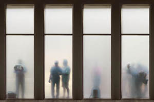
From the start, responses to 9/11 have often turned on the artists' own inability to speak amid an overwhelming multiplicity of voices. Wodiczko uses darkness and soft, competing murmurs to force one to resolve one's own proximity to lives in the balance. In one room, projections create the beautiful but troubling illusion of silhouettes behind frosted glass, while small speakers throughout add competing narratives. With difficulty, one can separate them, only to hear little more at first than people isolated and in transit, but why and where? In a second room, a man speaks of his shame and yet pleasure at killing, over altars each consisting of little more than a pedestal and a candle. One can see the glass slabs and candles as memorials, but they and the voices also invoke another kind of ritual, of confession.
Of course, the title refers to those terror warnings in the subway, and the killings, by an American soldier, take place in Iraq. The subjects under glass are addressing not their own misdeeds and alienation, but unjustified detention by the police. Both rooms create connections between surveillance and violence, with the gallery-goer at once the watcher and the subject. Compared to some literal-minded group shows recently in response to the Patriot Act, he places more demands on the imagination. Even more, he makes imaginings the very subject of one's fears.
As "Proposal for White and Indian Dead Monument Transpositions" suggests, Durant proposes not just art as a memorial, but a transformation of other memorials in the process. He asks to turn half the Washington Mall into a monument to the Indian wars. He would remember white settlers with twenty-five pillars alongside the reflecting pool. Five more shafts, for Native Americans, form a smaller circle in front of the Washington Monument, as if gathering in protest. The pillars themselves mark thirty further transpositions, the appropriation of existing monuments across America, each chosen for its avoidance of image or text. If the preponderance seems to deny the greater suffering of Native Americans, Durant makes that denial a further commentary on distorted memory.
At Paula Cooper, the main room allows space for long rows of objects, and it shapes their almost pathetically disparate, decorative shafts into a Minimalist grid. If Barnett Newman had his broken obelisk, Durant has his demented ones. The walls record information on the original monuments, with titles that sound all too ready-made for the wrong occasion. In the smaller front room, a few more pillars surround a mock-up of the site, as if the Mall, too, found itself relegated to the graveyard. If only the proposal required superhuman pillars on a comparable scale relative to the Mall. Then, Wodiczko might conclude, the eyes of the dead truly are looking down on the art and the nation.
For all its good intentions, I found the whole thing much too glib, like posters by a man Durant himself has curated, Emory Douglas. Durant wants the dignity of history and the comfort of derision. His studied banality makes his multiple perspectives as blank and comic as the objects he appropriates. The forms appropriate so much contemporary art that transposition itself becomes a meaningless gesture. Ironically, the uniformity of Durant's gesture redoubles the erasure of history, including the difference between white and Indian deaths. Forgetting divisions, as with Maya Lin and her great memorial on the Mall, can become the first step in healing—or the perpetuation of amnesia—but at least the sheer number of exhibitions this fall promises to restore memory.
Postscript: brooding on politics
If his sitters did any more brooding, Luc Tuymans would be responsible for an avian population explosion. In his most celebrated image, he crops off Condoleezza Rice at the hairline and dark red lower lip, leaving only a knit brow and raving eyes. In his latest work, from 2010, a man at last stands full figure, but oh the price he pays. Speech reduces the speaker to silence. His wrought gestures suggest not command or communication, but tension and isolation. The very spotlight seems to follow the train of his thoughts inward.
The man, a handout explains, is a player in the Belgian arts, as is Tuymans, and power here has its privileges. A woman in proper riding gear asserts them. So does a distant stage with a seething audience, an empty conference room, a tall sailing ship on the high seas, or a vat of molten gold. The painter knows villainy when he sees it, even in his own circle, and he want to make sure that others know it, too. He just does not want others to envy it. He also does not want them to have too easy a time figuring it out.
"Corporate" approaches a slide lecture, the kind that depends on bullet points and titles. One need them to identify the f-curve of a violin with a corporate logo, the stage as an arts panel, or that ship with the British East India Company. Got it—the birth of monopoly capitalism, imperialism, and the opium wars? Probably not, but you better. Tuymans shares his political imperatives with Marlene Dumas, along with the blur, the near monochrome in dark gray, and the worked flesh that stands for torture and torment. Maybe they should paint each other.
For all that, his ghosts are finally coming into the light. The light surrounds the speaker and the arts panel, and color is becoming a resource and not just a weapon. The vat of gold looks almost like a flower, while a factory seems at the center of a toxic storm. Again and again Tuymans strives ever so hard for brutality and mystery, like the face out of an advertisement rendered faceless. And every so often he succeeds. Ironically, it may not be because of the blur.
For Richter, color fully penetrates the blur and gray. For Richter, too, an image of terror instantly recognizable, but also unnervingly sympathetic. Even the blur makes a picture both distant and more familiar, like an image captured off the TV screen. It also roots Richter's skilled representation in automatism and abstraction. Tuymans is a little like Richter after a righteous correction from Hans Haacke. Alternatively, he is a little like Hans Haacke at that, but with a painter's guilt at images that give themselves away.
In the end, Tuymans is struggling with the very potential of political art. When it works, it is because the personal is the political, and art is at the intersection of both. When it fails, it is because one takes over from or apologizes for the other. For some, his version of Condoleezza Rice has displaced the one in the newspapers—but will that sailing ship from the 1600s follow me whenever I rant at Wall Street or order an IPA? At least sometimes, the figures behind the blur, like the speaker or the arts panel, are friends.

Santiago Calatrava ran at The Metropolitan Museum of Art through March 5, 2006, "Safe: Design Takes on Risk" at The Museum of Modern Art through January 2. Daniel Libeskind ran at Max Protech through November 5, 2005, Hans Haacke at Paula Cooper through December 23, Mary Kelly at Postmasters through December 3, Nancy Spero at Galerie Lelong through December 3, and Luc Tuymans at David Zwirner through November 19 (and, in the postscript, through December 21, 2010). Krzysztof Wodiczko ran at Galerie Lelong through October 22, 2005, and Sam Durant at Paula Cooper through October 31. On January 4, 2006, a notorious suggested component of the International Freedom Center, the Drawing Center, proposed a move to the South Street Seaport, close to where the Fulton Fish Market has just departed, presuming that it could eliminate the fishy smell from its own role.


