Objecthood as Realism
John Haberin New York City
Hu Bing, Ted Victoria, Bill Walton, and Bill Jenkins
In 1967, at the height of Minimalism, Michael Fried wrote of "Art and Objecthood." He argued that Minimalism had failed as art and become theater. By bringing the viewer into the work, as onto the stage, it had entered the world.
The essay has had lasting influence for a reason that Fried never intended. It did not just describe Minimalism, but complimented it. It pointed to the work's critical spirit, just when philosophers faced with Andy Warhol Brillo boxes were speaking of the "end of art." It pointed to something quite old-fashioned in spirit after all, in how a new art could make its viewers newly aware of their world. Art had become again not just a formalist's material object, with ends all its own, but an invitation to look. And, not unlike Pop Art, it did so with subjects drawn from life. 
A factory out of prewar social realism could have surrendered its parts to that space between art and the world. And like popular culture, they could seem as real and attentive as still life. Now several artists go one step further. A trompe l'oeil painting becomes marvelous when it inhabits that space, but also unsettling, so why not ordinary things? Hu Bing risks being mistaken for commercial enticements, but the "sheer transformations" of her "shattered debris" are irreversible. Ted Victoria crosses between the imaginary and real as easily as Surrealism, with his own commodity fetish and illusions, while Bill Walton and Bill Jenkins thrive on objects with a modesty that not even Minimalism could have known.
Shattered glass and toppling masonry
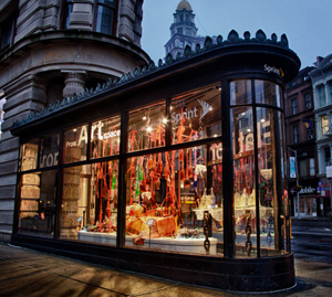
For me, the Flatiron Building will always be that slim, looming triangle in classic photographs, going back to Alfred Stieglitz in 1903. Only look close for a while at the ground floor, in the Prow Art Space, and one finds a different kind of drama. Sake bottles are cracked or broken off at the top, and shards lie piled below and beside them. More broken bottles hang from the light tracks, in cheesecloth like nylon stockings. Hu Bing is there a few hours a week expanding the work, through its closing, watching out for sharp edges. As so often with art, look but do not touch.
For a moment, one can overlook the dangers, but not the temptations. One could almost imagine that the space has become a retail outlet. The glassware covers a triangular pedestal, part of the architecture that almost nestles against the glass windows—and more bottles sit on a glass table on top of that. The table setting has a stiff tablecloth of resin-coated fabric. A still finer intimation of housewares hangs in the fabric, in rich shades of dark red. They look that much more luxuriant after dark, lit from within.
When a thorough cleaning of the exterior revealed light stone some years ago, I was disappointed, but change was in the air. Madison Square has become a well-maintained gathering place, with Eataly across the street and condos to all sides. Illegal lofts and Billy's Topless have given way to the Museum of Sex nearby, but recovery also brings the temptations of art. The glass-enclosed corner, where Fifth Avenue and Broadway converge, has become the Flatiron Prow Art Space—and try not to object that "flatiron prow" is a mixed metaphor. The project space began as a pop-up exhibition that also played so well against the neighborhood's retail culture. Gwyneth Leech drew so much attention as she filled the space with her drawings on takeout coffee cups that the adjacent phone store has given it a longer life.
Both installations exploit the prow's exposure on both sides and its constraints, as have Xin Song and Lin Yan, by progressively filling it. I had been wondering what happens to the bottles left over from countless openings. (And just think what comes next, after caffeine and wine.) Still, Hu Bing shifts the emphasis from performance to process, from drawing to color, from piling up to breaking down, and from disposability to preservation and destruction. Born in Shanghai, she knows them well from the Cultural Revolution, and she appeared in a group show of Asian Americans, "Translucent, Transparent, Transported." She calls this "Shattered Debris Sheer Transformation" (with, presumably, a pun on sheer).
I thought of a phrase from William Blake that haunts Stephen in Ulysses: "I hear the ruin of all space, shattered glass and toppling masonry, and time one livid final flame." That puts too much weight, on associations of aspiring artists with alcohol and sex, although some of the cantilevered table display really has collapsed before the show's end (making up in irony, I suppose, for a real loss in visual euphoria). The tactile sensation lingers too long for Romanticism's ruins anyway, thanks in part to the room's actual masonry column—or to clouded white glass and warm colors illuminated from within. Some green glass extends beyond the edges of the pedestal, defying gravity thanks to fabric and resin. The installation and its dangers also have something in common with "relational esthetics."
At the Part Avenue Armory in 2009, Ernesto Neto even constructed domed tunnels from nylons much like Hu Bing's. He still offers overgrown child's play, draping his fabric in hammocks and curtains over whiffle balls. As infantile exhibitions go, though, they seem more grown-up this time, both because curtains better respect the architecture and because one can fall. Besides, this time the contents include flower pots at once tacky, organic, and fragile. Remember pleas not to overlook the decorative arts, from traditional glass in the art of Islam to fabric as for Sheila Hicks or to ceramics for Betty Woodman? But then one should not be afraid to shatter them.
Commodity fetish
Dada and early Surrealism may have taken art down a peg, but they stood more than a little in awe of the thing itself. A urinal, a fur-lined teacup, God as plumbing fixture, the eroticism of a turning wheel—the discomfort lies as much in them as in them as art. Interpretations tend to run either to anti-art or to nightmare, but either way the object never quite becomes available. It is almost the opposite of the demystification of household design for the Bauhaus, although even a classic Dutch chair of the time all but promises an electric shock. Kurt Schwitters derived the title for his constructions, Merz, from commerz, and this art scorns what a Marxist would call commodity fetish. It does not scorn the fetish.
Fair enough, but consider what has changed in nearly a century, down to Susana Solano, Joseph Zito, and today's signature Neo-Minimalism. By comparison, a "combine" from Robert Rauschenberg is downright cheerful. Rauschenberg reflects postwar American optimism, his own relaxed personality, and maybe a gay artist's insistence that sexuality is not neurosis. The older model may have more in common with the sleek shadows of early formalist photography than with Rauschenberg's neo-Dada—much less the neo-neo-Dada of Jeff Koons or the Young British Artists. So, as it happens, does Ted Victoria. His work even looks like a cross between a Joseph Cornell box and an archival print, only it is hard to pin down the archive.
On the face of it, "Hidden Traces" amounts to ghostly projections rotating slowly, to the point of not at all. The subjects surely belong to some past age, like an old telephone, a revolver, or a razor blade—the kind that Luis Buñuel and Salvador Dalí might have used to slice an eye in Un Chien Andalou. They may seem insistently whole, like a feather or a pair of pliers, or insistently broken, like a pencil angled out of the picture frame. Lips opening and closing within a tiny picture frame have a Surrealist's sexuality as well. The traces are muted and blurry as in old photographs, to the point that the sharpness of the pliers or the redness of lips stands out that much more. They are also strikingly 3D.
One might put them almost any time in the past, only not today. They recall a camera obscura or, much later, a hologram—but by the time of true-color and natural-light holograms, the image was actually quite sharp. I know, because my own hologram in freshman lab was not. Then, too, early holograms did not rotate, although they shared something hallucinatory with early collage: they seemed to approach without ever coming closer. Like childhood memories that Freud sought in a fetish, they refuse to stay down while receding ever further into the past.
In reality, these things look three dimensional because they are. Victoria puts them in a box and lights them up. The sole projection shows a vodka bottle with the liquid flowing up—or on fire. The artist simply flipped the projection upside-down while digitally altering the label, although even that engages old-fashioned optics. A lens necessarily performs its own inversions. Meanwhile one can imagine twenty-somethings playing with matches and trading shots.
Just how much sexed-up creepiness can one stand before art descends to gay fashion statement? I am not so sure, and Glen Fogel at the 2011 Moving Image art fair sure did. He projected immense, rotating engagement rings, but his critique of consumption depended on desires that not everyone shares. Without that investment, the video was indistinguishable from advertising. Victoria's images, too, include a ring, although a novelty toy, in the same box with a toy tire and toy gun—but again, not a billboard but the thing itself. He may camp it up too much for my taste, but Jacques Lacan (that French theorist of the unconscious) would have admired an Imaginary that depends on the Real.
Modesty and Minimalism
After so many overblown installations and so much hype, a backlash had to come, but it may not come made to order. At the Whitney Biennial, Matt Hoyt fills small shelves with even smaller objects, each with its own polish and its own mystery. Any one of them might have taken days or even geologic time, for their appearance of fossils or relics. Here and there, Michael E. Smith leaves objects from his own life, like clothes or a basketball, now and again crusted in oatmeal. One could easily overlook both artists on the way to something else, but would one have missed the next big (or small) thing? Are they to be treasured or cast aside?
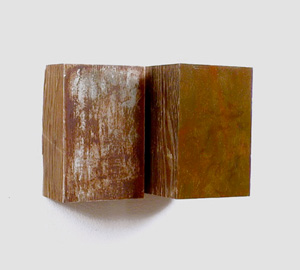
 Bill Walton has survived many a boom and bust, along with more than enough trends, and he, too, leaves the gallery almost empty, but on the Lower East Side he puts either Biennial artist to shame. A sliver of aluminum wedges open two small slabs of wood. Two drinking glasses rest on a shelf, one face up and one down. Light brown cloth, folded not so neatly across their open end, brings out their solidity and opacity. Elsewhere dull green paint covers one plywood vertical and leaves the other exposed, while two other blocks differ arbitrarily in width and in their patina of white and copper. Each has its own history of craft and neglect.
The artist has taken pains, but did they go into construction or destruction? He adopts Minimalism's geometries and materials, like the zigzag of two black folded copper sheets on the two right-angled black wood shelves. However, they work more as freestanding objects, with a life of their own. A lead pipe wraps around a branch, but it could easily be the other way around, and paint cans have yet to emerge from their tight box on the floor. Walton inherited his father's trade as a printmaker, and one can think of the entire show as movable type. After social media and the "society of spectacle," Minimalism's industrial roots can look downright old-fashioned.
Where Hoyt evokes primitive tools and ancient bones, Bill Jenkins sticks to modern hardware and remnants of the night before. And where the others hold out a spare documentary history, he relishes clutter and Surrealism, much like Rosa Loy. A marble shares a dish with a light bulb, and he manages to rattle it around on the Web without breakage. String weaves in and out of bedsprings, not unlike the white 3D grid of another Biennial artist, Cameron Crawford. Rough plaster like limbs lies on disposable black plastic on the floor. The gallery speaks of the artist's "formal inertia," but he seems uncomfortable with formalism while not going anywhere fast.
The gallery has a fondness for artists that play against its storefront architecture, to the point that sprayed dots on a supporting pillar look more like trash than the art. Still, Minimalism and installation again have a disarming modesty and familiarity. Jenkins displays an air filter, with the black coating described only as "smog." Rocks fail to block a vent cover, but they do serve as a coarse geometry and even coarser filter. Artists like these have not exactly taken a pneumatic drill to the gallery floor with Urs Fischer, and the dealer could hardly afford it. But have they changed the equation entirely all the same?
A backlash has come, toward an "objecthood" beyond Michael Fried and his wildest dreams, with a greater modesty and a greater care for the handmade. It just may not come out so different after all, whether to Minimalism or to Japan's Mono-ha. Instead of painting and sculpture, it may look ready for or stolen from the mass media and the trash. It may be as fragile as for Sarah Sze, as much a part of her studio as for Leslie Hewitt, as much a performance as for Rodney McMillian, as entropic as for Do Ho Suh, and as confessional. It may be more puzzling than satisfying, but what you see is what you get—and very much in the present tense. Art is not about to roll back the years since Rauschenberg's combines after all.

Hu Bing ran at the Flatiron Building through June 9, 2012, organized by Cheryl McGinnis, Ernesto Neto at Tanya Bonakdar through May 25, Ted Victoria at Schroeder Romero & Shredder through April 21, Bill Walton at James Fuentes and JTT/Jasmin Tsou through April 15, and Bill Jenkins at Laurel Gitlen through April 15.


