The Energy Is Back
John Haberin New York City
Michael Goldberg and Abstraction
Gary Petersen, Gianna Commito, and Robert Kushner
As Michael Goldberg got older, he settled increasingly above the fray. It made sense for an artist who had nothing to prove—especially after the 1970s, when the fray seemed increasingly to preclude painting. Yet it came at a cost.
Arguably the last surviving Abstract Expressionist, he had his students at the School of Visual Arts and his studio on the Bowery, where he suffered a fatal heart attack on the next to last day of 2007. He had his place away from the battle, an estate near Siena, where he spent five months of each year. Somehow, though, the monuments go to generals, and Goldberg earned mostly a polite dismissal. Born in December 1924, he bore the dreaded label "second-generation Abstract Expressionism." 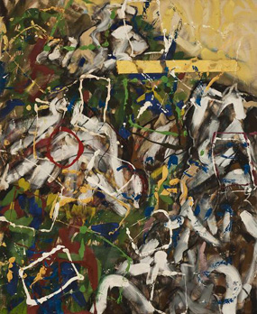 He kept painting like one, too, with all the first generation's ferocious energy. If abstraction has recovered that energy, with such painters as Gary Petersen and Gianna Commito, surely to his mind it never lost it.
Goldberg may finally be getting his due. A 2013 retrospective in Jacksonville, Florida, missed New York, but "Making His Mark" brings a healthy selection to Chelsea. The show picks up Goldberg in his sixties and takes him almost to his death, from 1985 to 2005. If the title sounds more appropriate to an artist just starting out, he seems hardly to have evolved. Even within those twenty years, one would be hard pressed to date a painting by appearance alone—and a good thing, too. As a postscript, not that abstraction alone can benefit from excess and energy, as in an artist now in his fifties, Robert Kushner.
Sticking it out
Of course, "Making His Mark" refers to the artist's working methods. Michael Goldberg loved oil stick, for the way it presses up against canvas, in broad smears or freehand traces. He transferred newsprint to canvas as well, along with string. Both approaches imply a grid beneath it all, which he happily worked against long before what a museum has called "chromatic figuration." Black curves add up to interlacing diagonals barely able to contain the color. In by far the show's largest work, at nearly fourteen feet across, pink and blue shimmer from beneath cascading horizontals of black and white.
If the kid from the Bronx was still making his mark right up to the end, much like Walter Darby Bannard, he started in a hurry, too. This member of the New York School really was from New York, and he was taking classes at the Art Students League by age fourteen. He was among the youngest hanging out at the Cedar Bar with Franz Kline and Willem de Kooning, both of them influences. He had returned from World War II, injured but alive, and was back at the Arts Student League under Hans Hofmann, like Lee Krasner, Jackson Pollock, and Michael West and Albert Kotin before him. Leo Castelli included him in the legendary Ninth Street Show that propelled New York to the center of the art world, in 1951. He exhibited with Knoedler, back when it stood for far more than fraud, and he took over the Bowery studio (which he shared with his wife, Lynn Umlauf) from Mark Rothko himself.
Art was a treacherous way to make one's mark, though, even then. Following the Ninth Street Show, a collector arrived at his studio and spent $10,000, a sizable sum back then. He spent part of it on an electric blanket, but creature comforts were not so easy to sustain. Just a few weeks older than Joan Mitchell, he shares her intense color and bright white ground, which for both play a nearly equal role. Yet he never felt the need like her or Pat Adams for a newer art of color-field painting—or for a later scene that pronounced painting dead. And he paid a price for it, in dismissals and neglect.
Cy Twombly moved to Italy entirely without also moving to the fringe, but Twombly like Judy Glantzman later seemed hot on the trail of the old masters, while Goldberg was still making his mark as if nothing had changed. Why did he not have a signature, like Pollock's drips, Kline's black, or decades later Andrea Belag in her arcs? And then why did everything look so much the same? His work after 1985 offers a welcome chance to tease out the sameness. Interpretations of Abstract Expressionism long divided between the poles of Clement Greenberg and Harold Rosenberg, of grid and gesture. Goldberg makes clear how much they share—and how much they remain relevant for art to come.
He treats paintings and drawings much the same way. Oil might be the medium for works on paper, along with blackboard chalk from an artist never above lecturing, while canvas might hold pastel and charcoal as well. And both hold a distinct range of color and feeling. Goldberg runs to violet and orange along with primaries and plenty of black. He includes lipstick reds unlike even de Kooning's—and that without a woman like Sonia Gechtoff in sight. Paint takes on physical weight, but without Hofmann's floating rectangles.
Formalism and action here get along just fine, thank you, like Minimalism and glitter for Richard Van Buren. In two works from 1992 right on newspaper, oil and pastel might have landed with an audible splat. Words appear at least once, and they may seem out of place, but they serve as a reminder that the felt immediacy of Abstract Expressionism offered a path to Pop Art as well. The blacks and harsh colors could also lead right to street art, Michael Stewart, and Jean-Michel Basquiat. Goldberg may, for all I know, have detested them both, but he claimed the influence of jazz improvisation long before the younger artists in the Whitney's "Blues for Smoke." The art world's battles keep intensifying, and the stakes keep getting higher, but this once one can rise above the fray.
Keeping busy
How busy does abstraction have to get before it becomes wallpaper or a map of urban infrastructure? Why not ask Piet Mondrian? Painting, he might remind you, can be both serious and fun. The very emblem of rigor, the Dutch artist created some surprisingly off-kilter geometries. After Fernand Léger and Futurism, he showed how Cubism's refusal to stay put could fit quite well into the picture plane. Now that abstraction is back big time, it can still remember its origins, and Gary Petersen and Gianna Commito are both keeping it busy.
It is not easy to escape the legacy of postwar abstraction and formalism, and it is not even clear that one should try. Many still adopt loose brushwork, to the point of painting as "business casual," others just a few shapes and colors. Siri Berg cuts off circles so that color seems to pass right through the edges of the plane. Early work by Duane Zaloudek does much the same, give or take that his ovals sprout testicles. Kellyann Burns prefers rectilinear compositions and Ayn Choi pours, but with rough boundaries that attest to their construction. It may be business as usual, but it is not at all a bad business.
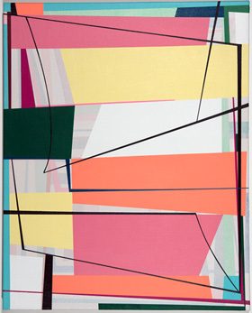 Petersen keeps things moving, but he is at least as dedicated to geometry. He stacks what one may remember as nested rectangles, like a kind of Bushwick academicism. Yet he compresses those elements into shifting quadrilaterals, crossed by black lines just off the grid that have a way of expanding or tapering as well. Talk about refusing to sit still. Two large paintings very much engage the wall, because he painted directly on it to the full height of the gallery. His surrounding canvases will never look the same again.
Commito does not so much expand outward as tunnel inward. Her casein colors compete with one another and the grid. Just when one thinks that one has pinned them down, one runs up against vertical chevrons at a painting's center. They incorporate memories, she says, of "residential architecture, particularly nineteenth-century farmhouses in Maine." And there they harken back to prewar America's encounters with Cubism, in Charles Sheeler. Somehow the same man whom Ford hired to document its factories also owned a Pennsylvania farmhouse, and his paintings hone in on its stairwells and Shaker furnishings from dizzying angles.
Sure, artists keep making compromises. They can be creative compromises, between abstraction and representation, as with Albert Oehlen or Sue Williams. They can also be thoughtless compromises, between making a painting and making an impact. That can breed pretty pictures that do their best to pack in everything at once. And those on the margins may not have anything more to say on their own. Still, it helps to think about how painting found itself in this dilemma.
An ironic generation ago, with Neo-Geo, abstraction aimed for a comeback, but as a concept. With wallpaper for Philip Taaffe, prisons and circuit diagrams for Peter Halley, and picture frames for Meyer Vaisman, busy was itself a concept. Even now, amid today's eclecticism, it takes guts to drop the scare quotes. For now, Petersen and Commito manage to approach Pattern and Decoration while remaining visceral. Go ahead, if you like, and accuse them of painting stacked picture tubes and rural nostalgia, but they remember: Modernism was shaking things up all along.
Becoming lusher
Robert Kushner is becoming lusher. He may not aim for the looser brushwork of Titian after sixty, in all its force and beauty. He may not equal two of his acknowledged influences in their late years, Henri Matisse and Pierre Bonnard. Few can match the sweep of Matisse cutouts or Bonnard's late interiors. Still, these days there may be no other route to an old master than the literal one, by aging, and Kushner takes advantage of it. An already showy artist shows off more than ever with age.
Not that his work looks any less familiar. He calls the show "baroque" with a small B, a term that could apply to Pattern and Decoration, the movement that gained him attention in the 1970s. And he still paints flat against the picture plane, like wallpaper in deep, bright colors. He has used gold leaf for some time now, too, often against vertical or horizontal bands of color. His flowers and leaves pass between flat forms and calligraphic outlines, with a debt to Asian art. They also recall Georgia O'Keeffe and O'Keeffe drawings, another artist concerned for both abstraction and observation—only Kushner has headed in the opposite direction from the arid landscape of New Mexico, to Maine.
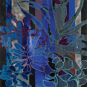 Lush he is, though, especially up close. Kushner now mixes marble into his ground, for surfaces at once more palpable and painterly. Palladium has joined the gold leaf as well. A circle of gold looks like the moon or the setting sun. The play of drawing and geometry has grown lusher, too. Where his flowers have often had white outlines, now those outlines are sparer, like windows onto the color within.
If that makes them ghostlier, late Titian can dissolve into shadows, too—and he has influenced gestural abstraction for Jackie Saccoccio. The Venetian painter meant a Pietà, set against the illusion of heavy stone, for his own tomb. O'Keeffe has her intimations of death as well, with those desert skulls. Still, Kushner has little taste for darkness. Lushness for him is, first and foremost, about pleasure. The gold and dominant blue reflect only light.
That can make him easy to like and hard to respect. Pattern and Decoration was prescient in privileging craft and the decorative arts. With Valerie Jaudon, Joyce Kozloff, and Miriam Schapiro, the movement forged a "feminist revolution." Yet it also went down awfully easy, just when other artists were taking on new media, risky performances, museum institutions, and far more critical strategies. It could well be the original "zombie formalism," but without the formalism. Cheap pleasures and showy sophistication pretty much define Jeff Koons as well.
A little baroque goes a long way. Still, Kushner's pleasures and sophistication are real, and so is the sheer physical sensation. His huge murals for Danny Meyer restaurants and, in tile, for a subway station do their job of filling the space. The greater role of the bands brings out his more rigorous side as well, much as Jaudon's intricate geometry connects her to Minimalism. The fluid space between realism and abstraction is newly contemporary, too. Love it or fear it, one may as well linger over the lushness.

Michael Goldberg ran at Michael Rosenfeld through March 14, 2015, Gary Petersen at Theodore:Art through February 22, Gianna Commito at Rachel Uffner through February 22, Siri Berg at Hionas through February 7, Duane Zaloudek at Monitor through March 1, Kellyann Burns at McKenzie through February 8, and Robert Kushner at D. C. Moore through February 14.
