6.14.24 — Bob and Weave

There are moments in “Weaving Abstraction” at the Met that feel suspended between centuries. Does MoMA seek the origins of modernity in the aftermath of World War II for “Crafting Modernity” This exhibition reaches back to antiquity. Yet it ends in much the same years and much the same artistic circles.

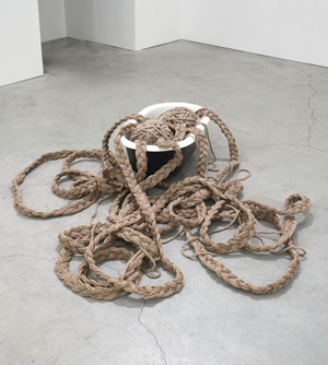
Are they telling the same story after all? The Met’s mere handful of recent artists can hardly encapsulate weaving or abstraction. Their pairing with art of the Andes has its own suspense nonetheless, through June 16. Sheila Hicks's Overflow (Sikkema Jenkins, 2006)
The exhibition’s full title speaks of “ancient and modern.” Centered on the Andes from as much as twenty-seven hundred years ago, it unfolds in space otherwise dedicated to modern and contemporary art. About halfway through, a panel could almost be a direct response to Minimalism. Its thousands of feathers affixed to cotton strings form a thick, soft surface that divides neatly into four rectangles, alternating between light yellow and blue. More yellow flecks the blue, as if about to take flight. Like the Post-Minimalism of Eva Hesse, it might be an extension of an animal or human body—or the human imagination.

The show features four women who came to prominence in just the last century, and they may feel suspended not just in time, but also in place. Anni Albers took up fabric at the Bauhaus but fled to America in 1933 and worked for sixty more years in exile. Sheila Hicks studied with her husband, Josef Albers, at Yale. Lenore Tawney studied with another refugee from the Bauhaus before joining the “fabric art” movement along with Olga de Amaral. What seems at first like a sprinkling of recent art, for contrast and relevance, gathers momentum over the course of a long room. By the show’s end, it has come to the very brink of the present.

It may seem like a mere excuse to approach either the present or the past—a routine excuse at that. More and more, museums are insisting on other times and other cultures, like Cycladic art at the Met. The museum has been slipping contemporary art into older contexts as well, like Korean art. More and more, too, artists have been turning to tapestries and fabric as their means of painting. It can serve as a further call for diversity, as well, to recognize “women’s work.” And now the Met heads to not just the rural South, but to the arid hills of South America.

But is there truly, as the Met puts it, an “Andean legacy”? The Bauhaus had its mission to promote craft as art, as a model for design. Albers did visit an ethnological museum back in Berlin. Yet her austere patterns have more to do with Modernism than ancient checkerboards. Hicks does not so much as take up weaving, although her dyes have parallels in ancient art. Her loose strands or the slits in Tawney’s slim black hangings, almost like gowns, may recall ancient “open looms.”

Peru is harder still to pin down, and the curators, Iria Candela and Joanne Pillsbury, make no attempt at chronology. They open with rich color from perhaps the 1500s, in a tunic of red and gray, before doubling back a millennium before to a coiled headband—and then further back to mystery figures from before the present era, their slim black tongues sticking out from sharp teeth beneath wild eyes. No wonder historians cannot assign many works to a single century, not when the culture left no written records. One cannot know when clothing served for necessity, for kings, for votive offerings, for gifts to secure peace, or for exchange. One cannot know either whether women produced a single one. One can know the lack of the very idea of abstraction.

Still, the Met is on a mission, too—to introduce the ancient and Incan cultures that the Spanish killed off. It is also insisting on women artists. de Amaral broadens fabric beyond what the Andes ever knew, with gold leaf, paper, and gesso on a “gridded wall.” Hicks is lushest and most varied of all, from densely curving colors to bare white descending in tassels as her Linen Lean-To. Its cryptic patterns may suggest an unknown language. But then the knots in ancient khipus may have communicated something, too.

Read more, now in a feature-length article on this site.

6.12.24 — Local and Global Color

Give Melissa Cody some credit. When she titles a tapestry I Am Navajo Barbie, she is not cashing in on the movie. She created the work more than ten years ago.

She is also just one of three artists boasting of their defiance, their heritage, and nontraditional media at MoMA PS1. They differ only in how far they range beyond those platitudes—and how close to the culture that threatens to swallow up them all. What starts as political correct and artistically pro forma takes on local and global color, and I work this together with earlier reports on the Native American art of Natalie Ball and Beau Dick as a longer review in my latest upload. Melissa Cody's Untitled (courtesy of the artist, MoMA PS1, 2022)

Cody seems happy to limit herself, but her American dream is more than a passing fancy, through September 9 (with additional work at Garth Greenan through June 15). She calls her show “Webbed Skies” to honor the Spider Woman—not the superhero or the heart of a Latin American novel, but one who descended from the skies to bring weaving to the Navajo/Diné people. Cody’s motifs, she says, evoke western mountains, whirling logs, and the snake that threatens to undermine them all. She also remembers her father’s descent into Parkinson’s disease, and her colorful work could be an act of restitution. So might block letters woven here and there just short of legibility beyond a plea for lost love. If all that seems a lot to ask, it is.

Is there still room for Barbie, and can the work reflect the ambivalence of her hopes? Not really, but she does have a gift for color. Many an artist these days uses hangings to evoke craft traditions, but hers set the elements of tradition just slightly askew. Her patterns depart from symmetry just enough, like in a video game, and her natural and unnatural colors clash and glow. What look at first like Native American blankets in the latest Whitney Biennial end up neither entirely old nor new. They could be equally out of place on tribal lands or in a pricy design outlet.

Pacita Abad is more colorful still, because she works larger and sucks a great deal more into the picture. Single figures can resemble totems, but from what world culture? Denser designs approach abstraction. One might not know it from her opening room, through September 2, but they also acquire narratives about communities on six continents. She does pick up a needle and thread, but in a collage of found materials and found imagery from a long career. She died in 2004.

Abad survived under the Marcos regime in the Philippines before moving to Thailand and again moving on. Her images of home seem both active and defiant, behind apartment windows or barbed wire. Her totems have heavy eyes and unsightly grins that could attest to sheer fatigue or the demon within. Lady Liberty herself makes an appearance, as LA Liberty. She, too, expresses global displacement, but Abad’s New York still looks like home. Her eclecticism, like Cody’s ambivalence, may never quite add up, but neither, I suspect, do their own feelings.

Regina José Galindo trades in craft for video and ambivalence for nothing but defiance, through August 26. She stands naked, proud and impassive, as a bulldozers digging up the Guatemalan earth closes in. If she appears to protest wealthy developers, it is only a metaphor, you see, for decades of civil war. If she also has white gunk all over her upper body, it is just more of the work’s chill. It could use some local color. Her art is genuinely unnerving, but what if the bulldozers will not back down?

Read more, now in a feature-length article on this site.
6.10.24 — Promoting Promotion

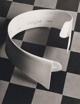
Where was my ad blocker when I could use it? Where was it, say, in 1844? That was when Henry Fox Talbot photographed fine glassware by any standards, but just what was he advertising? His print is not saying, and neither is the Met. It is nonetheless “The Real Thing,” opening a show of that name of product photography, through August 4. It sums up changes in how photography saw itself as well as things—and how advertising emerged as a product, too. Paul Outerbridge's Ide Collar (Bruce Silverstein gallery, 1922)

Talbot could hardly count as advertising, when the very idea was hard to conceive. Photography took too much care and attention for that, and publications able to handle it did not exist. Besides, the medium had other purposes—as staged dramas, portraits, or experiments. Fragments of bishop’s miters were surely not for sale, although the anonymous photograph might have been. Is the Met, then, cheating or seeking a broader context in history? The show’s subtitle speaks of “Unpackaging Product Photography,” but where is product photography without the package?

Art has long had a love-hate relationship with photography—and photos with packaging. Each year the AIPAD photography fair bends over backward to look like art, while the Jewish Museum has exhibited magazine photography and the International Center of Photography a provocative fashion photographer who died of AIDS. Then, too, art has always promoted images, going back to Renaissance princes, pharaohs, and kings. And the Met explains its earliest photos as promoting the medium. In truth, it is also looking for an excuse to display its collection and gifts from the Ford Motor Company. It proceeds modestly, though, with a small show.

Advertising in the modern sense emerged with the twentieth century, awkwardly at first but reluctant to give up claims to modern art. A sample from around 1913 features (seriously) the National Blank Book. Reproducibility became more than half the point, with golf balls, drill bits, and soaps. It was not, though, the only point, and Stella F. Simon leans on a violin’s elegance around 1930 to compose a picture. Many identified themselves with a movement, like Piet Zwart with De Stijl in the Netherlands and many more with Surrealism—were advertising not surreal enough in itself. André Kertész doubles a fork and redoubles it with its shadow.

Grete Stern and Ellen Auerbach as Ringl + Pitt could embrace advertising while mocking it. Others had fewer doubts. August Sander photographs for once not a German worker, but what a worker might produce—light bulbs spiraling into darkness and depth. James Van Der Zee sets his eye this time out not on salons, town cars, and the Harlem Renaissance, but on a wig. Is it product photography, a preparatory study, or merely a discard? The wig rests off to the side against a black background, looking as small as can ever be.

Advertising, too, has its evolution, from the blank book. Of course, it acquires text. While the Met’s online image for the show features a shoe, in the actual ad it is subordinate to the stylish wearer, who can boast that “I Know Value.” Paul Outerbridge first poses a shirt collar against a tilted checkerboard, for the play of flatness and depth, black and white. Twenty years later, in 1940, his color photo turns to coffee drinkers (of A&P coffee), one in an apron and the rest in suits, as a meeting among men. He might be moving from product photography as an art to the thing in itself.

Advertising began before the turn of the century, but without photography. Just down the hall, “The Art of the Literary Poster” spans what one used to call the gay nineties, through June 11, for what readers then might have called the new woman and the modern man. Covers for Harper’s, by Edward Penfield, appeal to the reader’s sophistication, with images like a March hare that play on the month. Calendar and poster art by Will H. Bradley, Joseph Christian Leyendecker, and Ethel Reed show a life of leisure and activity, like cycling and tennis. All have much the same art nouveau styling, from the Leonard A. Lauder collection. One might still receive a calendar in the mail today a as fund raiser, for those lucky few with a big kitchen and not a cell phone in sight.

Read more, now in a feature-length article on this site.

6.7.24 — That Rascally Rabbit

Was Peter Rabbit an environmentalist? Maybe not, but his creator was. Beatrix Potter fought for England’s Lake District as a natural reserve, and she willed her considerable holdings to the National Trust to make it so. To ask the Morgan Library, she had a love of nature since childhood, and it informs the naturalism of her friendly creatures and her art.

An exhibition gets both main galleries, a rarity, through June 9, to recreate what she saw and the home she knew. This is not, the Morgan insists, just for kids. Call it child’s play, if you wish, or call it art, with loans from the Victoria and Albert Museum. Beatrix Potter's Walled Garden, Ees Wyke (courtesy of Frederick Warne & Co., Victoria and Albert Museum, c. 1900)At the very least, as the show’s title has it, it is “Drawn to Nature.” Potter would have appreciated the gentleness of the pun. Soon after in America, Wanda Gág brings a greater darkness to both children and nature—and I work this together with reports to come on Gág and Walton Ford, another admirer of animals, as a longer review and my latest upload.

As for Peter’s politics, I am not so sure. He does, after all, raid his neighbor’s garden to gobble up as much of it as he can, like a corporate farmer today. Or was he just a rabbit, reclaiming his habitat from human incursion, like a proper environmentalist? Standards back then were different, and Potter, with her brother, collected everything in sight. (They dissected dead animals as well.) She learned from zoos and science museums, counting everything, however humble, as fellow beings and friends.

Potter drew insects and made a particular study of wild mushrooms in watercolor. She could never match the crisp sublimity of John Constable, although she admired him, and an 1850 still life by William Henry Hunt, of a bird’s nest and blossom, stands out from hers for its intricacy and color. Still, her mushrooms seem almost to tremble, and that, too, suggests her closeness to what she observed. Her landscapes stop short of Constable’s clouds, in favor of the land before her eyes. When she does cut loose, it is for the middle distance, a place to which she could belong. She reserves her most startling color and perspective for a valley or a garden path.

Her brush leaves its mark back and forth in gray, for ripples beneath a boat on otherwise placid waters. This is nature, but inhabited by insects, animals, and humans alike. It is also, sure enough, a lake. Potter might seem an unlikely naturalist. Born in 1866, she grew up in and around London, but she relished vacations in Scotland and summers in the Lake District, to which she dreamed of returning for good. She got her wish at last with a late marriage and increasing income from children’s books and their merchandising, which she took the lead in developing.

She called the property Hill Top Farm, which itself sounds like a children’s book, but this was hilly country in fiction and in fact. She also took farming seriously, like everything else. She managed flocks of sheep personally, just as she insisted on miniature or folding books and designed her own end papers. The family made its money from the textile business, which may have influenced her close care in such things as bedspreads and wallpaper. The Morgan places related photos and sketches within quaint walls to convey their intimacy. She grew up with Wedgewood pottery as well.

She was always a proper Victorian, from a childhood that John Singer Sargent might have painted to her death in 1943. That includes her faith in science, which her family encouraged with the gift of a pocket microscope. An uncle, a chemist, introduced her to a Bunsen burner. It also includes the moral basis of her stories. Engaging as he is, Peter never makes it home from his trespasses without losing his clothes or gaining a whipping. They were nice clothes at that, down to a gentleman’s blue coat and shoes.

Still, Potter took comfort in his human impulses and gave comfort as well. The first of her books came out in 1902, but it had its origins in a “picture letter” nineteen years earlier to a sick child. There is no getting around, too, a serious case of the cutes, but such was her calling. From the moment her brush turns to warm-blooded animals, the faces get shyer and more endearing, even as they acquire more closely observed fur. But then, to her credit, Peter grows older over the course of the books, and one can excuse him and his cousin, Benjamin Bunny, for their place between species. When they head off to scavenge for goodies, they, too, are drawn to nature.

Read more, now in a feature-length article on this site.
6.5.24 — Courting India

India today is divided by religion, geography, and class—and united by little more than its divisions. Yet it has had a distinguished tradition—and a long, extended moment of royal grandeur in its art.

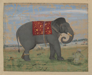
The Howard Hodgkin collection at the Met lingers over centuries of Indian court painting, with an eye toward nature but a special fondness for its artifice and its rituals. Even flowers seem at a certain remove, filtered by memory and designed to impress the dynasties that cultivated them. Could Hodgkin, the British artist, still have the delights of observation and artifice, possibly Ilyas Khan Bahadur's Elephant and Keeper (Howard Hodgkin collection, c. 1650–1660)not to mention elephants? In the show’s title, they all rest under vast “Indian Skies,” through June 9.

India is the world’s most populous country, crammed into the seventh largest by area, much of it in poverty for all its reputation in technology. And its prime minister is determined to exploit its hatreds and divisions in the interest of raw power, much like a certain right-wing leader in the United States. Hodgkin’s collection itself spans four royal courts and geographical divisions from north to south and plains to the Himalayas. Yet all four keep returning to a just a few themes and comparable styles. You might find Mughal faces more subtly shaded and Deccan flatness more tempered by color, Rajput and Pahari art more crowded and colorful still, but you might still struggle to tell them apart.

Successive invaders only added to its conflicts and traditions. As the show begins, around 1600, Persia has retreated from its hopes for conquest, and Hindu gods and godesses return often in the work, but one can still see the influence of Islamic art in a taste for patterns and anecdotal detail. By the show’s end, after 1900, the British empire has reduced the last maharajas to figureheads, and the Indian court along with court painting is coming to an end, too. In between, trade is bringing European painting to the mix as well, and it shows. For all its breadth, Hodgkin’s collection centers on the early 1700s, and its totality parallels what Europe called the Baroque. If it is also an art of flattery and conformity, the late Baroque had its academicism, too.

One may turn to non-Western art for its antiquity, like Cycladic art at the Met now, and the sheer length of its history, like recent shows there of Buddhist art and “Africa and Byzantium.” One may turn, too, to Asian art for its sense of timelessness, scholarship, and solitude, and indeed a rehanging to bring out poetry in Chinese art opened just days before “Indian Skies.” India here, in contrast, is a recognizably modern world. It is a hyperactive world as well. Themes run to wedding processions and hunting, where each figure has its own story. That and profile portraits, with a bearded chin jutting forward because this ruler is in command.

The show opens in the middle. Two dynasties have the room to the left, the remaining two to the right. Chronology is out of the question, but it would be hard to discern anyway. Hodgkin, who died in 2017, is unavailable as curator, but John Guy and Navina Najat Haidar devote the central room to him and, sure enough, the elephants. They accommodate royal riders while reducing them to nearly comic proportions. And the elephants, too, keep busy, on a rampage or joining in the hunt.

Museum-goers are used by now to shows of private collectors, flattering a potential donor while leaving the collector absent in all but name. Hodgkin, though, was a painter not so easy to forget, and the show’s nominal beginning includes two of his paintings, one titled Small Indian Sky. You may know his abstractions in oil for their wide, thick frames that both contain and accommodate the paint. What interested him in India is less clear. He must have liked the wild surfaces, articulating depth within flatness like Modernism itself. A limited palette and touches of bold may have reminded him of his own bright primaries, but I can see a closer parallel only in a single and very exceptional Indian painting that veers onto a field of tart yellow.

This is not a history of Indian art, and those new to that history may still have questions. I hesitate to display my ignorance by writing. Still, it has that marvelous collision between stasis and cultural divisions. Chinese and Western art appear in the flowers, but with a scratchy shorthand rather than elegant calligraphy of the first or the translucent brightness of the second in flowers from Flemish still life to Claude Monet and Georgia O’Keeffe. Intense reds in crowd scenes interrupt the muter colors of opaque watercolor. They bring nature itself to court.

Read more, now in a feature-length article on this site.

6.3.24 — On Shifting Ground

How do you cover a thousand years of art in two small rooms? You proceed as if nothing has ever changed, in a Native American tradition that extends to this day.

For “Grounded in Clay: The Spirit of Pueblo Pottery” at the Met, a millennium is a single collective moment. It is curated by collective, too—the Pueblo Pottery Collective of artists, poets, and scholars. Nearly sixty members select a work apiece and, in wall text, relate it to what they love. The result is gorgeous and, of course, grounded, through June 4, but not much in the way of history.

For the collective, pottery sustains a people and a tradition. It has its uses, for cooking and storage, but also its spiritual and artistic value. The show divides into four sections for utility, ancestors, elements, and connections through time and space, but do not dream of keeping them apart. One curator introduces Anthony Durand, a much admired potter with a bold, distinctive style, by quoting his grandmother, who “taught me that our pottery is made for functional use.” Even a puki, or potter’s wheel clotted with red clay, could also carry water. For his own jar, Durand thoughtfully supplies a lid.

In turn, for all those hundreds of years, pottery displays much the same patterns of broken parallels, spotted here and there with animal life. It is making and remaking a people and their beliefs. Last, it has room for an individual’s contributions, like Durand’s broad horizontals in black and gold. If one had any doubt that a work could do three or four things at once, those “elements” are the earth and water of moist clay, the fire that makes it pottery, and the air of a potter’s inspiration. Can it still, though, speak of a single community and an unbroken tradition? A year after indigenous “Water Memories,” also in the Met’s American wing, and Civil War–era black potters in the Lehman wing, I have my doubts.

The show has its ground zero in the southern half of New Mexico, but crosses borders in every direction. As for chronology, forget about it. The curators pick their favorites, but the work falls where it may. History itself gets a pass, including the brutal history of Indian wars and white displacement. For that, you will just have to begin in the present, with Jaune Quick-to-See Smith at the Whitney (and I work this together with my earlier report on Smith as a longer review and my latest upload). What so much as distinguishes the Pueblo? Even there, you are pretty much on your own.

The curators, with scholarly support from the Indian Arts Research Center of the School for Advanced Research in Santa Fe and the Vilcek Foundation, supply a map. They also list nearly two dozen tribes, in both their own language and common usage. Plainly this is contested ground. Yet they stick to an upbeat narrative with a happy ending, like so much attention to diversity today. For more, one can always continue into the Diker collection, on long-term view, including pottery amid the decorative arts, often from much the very same place. You may hardly notice where either show begins or ends.

For all that, the Met does a service by introducing recent artists in context. Monica Silva, Rachel Namingha Nampeyo, Juanita Johnson, and Emilia (Emily) Lente Carpio use gentler curves like waves, for a time more concerned with a people’s place in nature. I might even guess at an evolution in time—but bear in mind that early work, after a thousand years of wear and tear, may not be as crude as it looks. Around the first European contact, glazed jars become smoother and more deeply glazed, with all the polish of colonial art. The most recent artists grow more personal. They may all but eliminate the bowl in favor of abstraction from nature, like black turtle figurines by Greg Garcia and a corrugated bowl in deep red by Helen Naranjo Shupla.

They may become more self-conscious, like Jeralyn Lujan Lucero with a seated woman beside her own tiny bowl. They may become downright whimsical as well, like a face jug by Lorencita Pino and a figurine by Felipa Trujillo, although a free-standing figure by an unknown artist dates as early as 1900. It makes sense that the curators keep citing their grandmothers, as artists and judges of art. It is not just that they set a model for working away, as women. They are also close enough to the present to belong to the curator’s experience, but far enough the past to harbor memories of their own. A loose sense of time is simultaneously a tradition.

Read more, now in a feature-length article on this site.

« Newer Posts