Layers of Thought
John Haberin New York City
Victor Pesce, Brice Marden, and Claire Seidel
David Novros and Suzan Frecon
Abstraction has had more than a century to sort itself out, but who is counting? In late Modernism, it could be rich in gestures or rigorous in its geometry. For a while, people were saying, painting is dead, but it seems to have come back to life as something else again.
Many artists now do their best to confuse imagery and other media with abstract painting, and often as not they succeed. Still others play by the old rules. Some artists, though, are none of the above, with simple shapes that resolve into layer upon layer of color, form, and thought. Victor Pesce recalls Milton Resnick, who often played the representational artist within Abstract Expressionism. Brice Marden and Claire Seidl make the layering explicit, while David Novros and Suzan Frecon make a point of spare designs and visual clarity. Could they be on to the same thing? 
Morandi as Pop Art
Victor Pesce's career ended quietly enough. He had a following and a fine gallery, with nine solo shows there in his lifetime, plus an earlier stay in the South Bronx at Fashion Moda. He had five favorable reviews in The Times alone, all while slightly under the radar for most of us, making his art. It ended quietly enough on the surface of his oils as well. A block, a flower, or a shoe rests mostly singly on a shelf or table, the better to amplify its weight, geometry, and isolation. Even shadows barely disrupt the contrasting fields of color.
Look back, though, and things change. Paintings from more than twenty years, until his death in 2010, start at the end, as if to insist on what he had left behind. Now, any show with dogs should have one running for one's life, preferably in the opposite direction from posters and greeting cards, but a barking dog from 1995 looks anything but cuddly. Deep green tinges its dark, restless silhouette, reaching to its eyes, in jarring contrast to the background in a lighter green smeared with yellow. The sharp white of its lower teeth does not look comforting, all the more so as they lack individuation or a matched set above. A paler lump of white below the dog's jaw is all the more massive and undefined by comparison.
Before the dog come closely cropped faces, with the same blank intensity. Pesce reduces eyes, eyebrows, and slightly open mouths to near parallel streaks. He compresses other features further still against flesh. Go back again to the early 1980s, and the faces are there, but intensity has taken over from the blankness. The expressionist jumble escapes reduction. Deven Golden writes of their place against a "primordial darkness," but darkness fights its way in only at the edges, and it can hardly be any more primordial than the human beings.
For one final twist, Pesce in 1978 was painting abstractions, with brighter colors and tighter grids. Heavy daubs fill the modest canvases from one end to the other. Exactly when did he find himself, and did he ever? Had he found a kind of repose by the end, as the Giorgio Morandi for a new millennium? Had Pesce even reached an accord with real life, with the geometry of disposable coffee cups? Was he caught all along between exaggeration and reticence, or had he attained a more potent combination?
Born in 1938 in Flushing, he had a stint in the Army, a course with Milton Resnick, and a degree in arts education only at age thirty. He might have felt himself late to the party of all-over abstraction. Then again, one can see a continuity throughout, in the search for a new Minimalism. All along, the tactile matters as much as the visible, even before it becomes a block floating against table and wall. Like Ron Milesicz, Pesce treats both abstraction and representation as models of reality, in both senses of the word. When he did not use found materials, he built his blocks from paper.
He might even have found a reasonable fit with his time. Others were declaring the death of abstraction in 1981, just when he, too, was moving away. And others now are working between abstraction and representation. Golden quotes him as saying that, all along, "he was attempting to paint the landscape in the faces." Regardless, he was leaving nothing to chance, as when he painted object before background to minimize oil's translucency and reflections. And yet everything seems to have landed by chance, as if from another world.
Something to add
At seventy-two, not every artist has something to add. Brice Marden does—and not just seven new canvases, a dozen large works on paper, and a room of older drawings. He also adds gray, in a border to either side. But addition was always a vital part of his painting. Curves and ground weave and trace over one another, sometimes fading out at their own edges, in degrees of brightness, opacity, color, and shadow. Each painting's date, the entire range of years since Marden's 2006 retrospective, also makes clear how painstakingly it grew. However, its stopping short of the edge is something new.
For the catalog, Jeffrey Weiss describes the addition in formal terms, as "a complex play of color and value in pictorial space." For me, the gray acts more as the paradox of a neutral point of reference in an indefinite space. And Marden's underpainting recedes more than ever before. The strips also represent a margin, identifying the central field with a page and its characters that much more with calligraphy. A trip East helped inspire his transition in the 1970s from nearly monochrome compositions to long, gentle lines an inch thick, with their echoes of Asian art. Marden has traveled again since his retrospective, and he calls the new series "Letters." In an age of globalization, one could call it his letters to the world.
One can see the verticals, too, as in quiet dialogue with his own earlier paintings. In fact, for a time his work had fields at top or bottom. Now in gray, the additions are literally self-effacing (not to mention a little boring). They are also figuratively so, refusing the "all-over painting" of Jackson Pollock. Meanwhile, by still extending to the top and bottom of the canvas, the increasingly muted central swirls refuse self-expression in the western tradition of a framed, signed image. They are a majestic signature all the same.
 For some time, gestural abstraction has promised a sure route to academic drivel, especially on an easel scale. Wallace Whitney gets away with it by making a real virtue of drivel—or even taking it literally. He combines broad strokes out of Willem de Kooning with watery colors closer to Arshile Gorky, like expressionist sign painting. Roger White replaces de Kooning's or Gorky's echoes of human flesh with the clothing to cover it. What look like flat, floating shapes out of early Ad Reinhardt derive from shirts and rags. Today even an apparent return to esthetic purity embraces signs of the times.
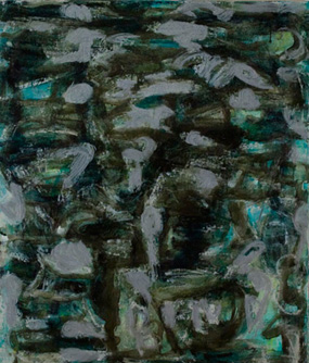
Claire Seidl comes closer in form to Marden himself. She works in layers not always easy to order or to tell apart. The topmost often approach calligraphy, in thin marks that sometimes break up entirely. Up close their textures, from liquid to dry, contrast with the denser painting below. From further back the entire composition may resemble brickwork or water. One could take the reds or greens for substance, shadow, or reflections.
Seidl's photographs from a few years ago work much the same way. In time, the dark interiors settled into people and furniture. The paintings use color freely, but with the same sense of darkness. The deeper the pictorial space, the closer it comes to shadow or surface. For all I know, it might have swallowed up her whole family again. That could give new meaning to the term second-generation Abstract Expressionism.
What has changed?
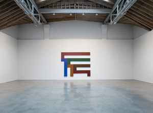
Some art will never wow me—and a good thing, too. David Novros painted just as abstraction and Minimalism were converging into crisp fields of color, and he pursued their rigor with a vengeance. His sober hues avoid the drama of Barnett Newman, while capturing his human or superhuman scale. Murano glazes give acrylic the texture of oil without its hints of depth. Stretched canvas supplies the sole compositional element. By comparison, Marden can seem traitor to the cause.
Where James Turrell creates perceptual special effects, Novros in work from 1969 presents a perceptual jigsaw puzzle. Like Christian Haub in dyed acrylic sheets, he even assembles it for one. Sometimes he assembles the rectangles into larger ones, and sometimes he turns them into a cryptic alphabet. Side by side, they dare one to detect a loss of symmetry. They identify painting at once with the wall and the painted object. They may lose something of their rich and varied thickness on the way from Soho's quiet spaces to Chelsea, but they never look dated.
In the gallery, one could dismiss Suzan Frecon, too, as tasteful. I know I did. Large but not too large, her major paintings consist of two wood panels, stacked vertically and each of the same scale. Ovals swell rather than burst outward from the central and lower horizontal, in muted primaries as if seen by night. I thought of Adolph Gottlieb, but chastened by Minimalism. And then I found myself in her West 39th Street studio one evening, thanks to the Elizabeth Foundation for the Arts.
Its studio program grants its artists space for two years, with open studios in mid-October. More than a few artists stood out, in many media, both there and in open studios that same weekend in Chelsea. Frecon's studio work is smaller but positively demands attention. Gold, in a wide vertical band, may add a final layer both visually and materially apart. It makes the underlying oil colors that much richer and more private, bringing the painting closer as well. Formalism may have some life in it after all.
What has changed? Certainly the gallery's white box matters, just as for Novros, and at David Zwirner painting can hardly help looking stranded and polite—even when, like Lisa Yuskavage and Yuskavage drawings, it bends over backward to shock. Perhaps, too, the smaller work was just better. I mostly find open-studio weekends a total drag. Still, amid a market in need of established names and rising stars, EFA and Chelsea have a welcome mix of emerging artists, newly established ones, and older ones like Marjorie Welish who fortunately keep plugging away. I apologize that I shall not single out more by name—but I could never fairly review all the studios out there, and you will not have had the chance to see them.
Perhaps it is getting harder to make great painting, because it is getting harder to make great art. After the "originality of the avant-garde," it is harder even to speak of "greatness" without the quotes. There are still plenty of wonderful artists and exhibitions, but art's expanding field more easily swallows them all. Where Clement Greenberg once asked a medium to be true to itself, now impurity is the point. Painting was never dead after all. The only trick is that it has come back as more than pure painting.

Victor Pesce ran at Elizabeth Harris through July 26, 2013. Brice Marden ran at Matthew Marks through December 23, 2010, Wallace Whitney at Horton through November 13, Roger White at Rachel Uffner through December 19, Claire Seidl at Lesley Heller through December 19, and Suzan Frecon at David Zwirner through October 30. David Novros ran at Paula Cooper through September 26, 2009.


