Abstraction, What a Concept!
John Haberin New York City
Besides, With, Against, and Yet
Tamar Halpern, Skyler Brickley, and Amy Sillman
Critics and defenders of abstraction can agree on one thing. Painting has narrowly escaped death, with conceptual art the murder weapon. Only one problem with this story: if painting has come alive, it has done so while borrowing happily from conceptual art. Reality, what a concept!
That paradox deserves more critical attention, for all the big-budget installations in big-sticker galleries. Not surprisingly, a better window onto the present comes with a nonprofit. "Besides, With, Against, and Yet" brings together twenty-two intelligent and frustrating artists who combine "Abstraction and the Ready-Made Gesture." But the idea spills over into dozens of shows, including Tamar Halpern in, significantly, the project room of a Chelsea gallery and Skyler Brickley not far away. It pretty much dominates the Lower East Side. 
It also gives renewed interest to Amy Sillman, who has been hammering at the idea for a few years now and has her best show yet. (A related article looks at her previous work.) She may even find the appropriate balance between conceptual, abstract, and representational art. She might, that is, if her work did not deny the whole idea of balance.
And yet . . .
It had to happen, given abstraction's past claims to theoretical rigor, coupled with dead sharks and trashy installations all but devoid of ideas. It had to happen, too, given the sheer diversity of conceptual arts and styles in "the forever now." Color-field painters can take on the scraps of abstraction or traces of figuration, like Seth Price and his enigmatic silhouettes, David Humphrey and his couples locked in struggle, Ellen Berkenblit with horses and women, Grace Carney with women alone, or Elliott Green between abstraction and landscape. They can use the materials of process art and photography, like the silvery stage sets of Jacqueline Humphries or the silver halide tarnish of Jacob Kassay. They can incorporate and obliterate both gesture and text, like Jutta Koether, or urban infrastructure, like Tony Ingrisano. They can use splatter and geometry alike ironically, like Guyton/Walker (or Wade Guyton)—who have turned an entire gallery into a cross between a studio and a billboard.
"Besides, With, Against, and Yet: Abstraction and the Ready-Made Gesture" argues for all that—and with every one of those artists. So, in fact, have I often enough, and the links just now will take you to many gorgeous examples of the revival of abstraction in not in the show as well. How, then, can a show this impure and capacious look so cool and opaque? Price in the past has taken on political overtones, Guyton and Walker have set out tacky furniture, Humphries has made silvery reflections into almost an extension of the human body, and Kassay's organic geometries can darken before one's eyes. Here they look resolutely conceptual and abstract, as if to bring out the worst fears of either side. The show's very title speaks of ambivalence and incomplete grammars.
Soft tones dominate, but not as mysticism or magic. Like Polly Apfelbaum's carpet rolls on the floor, they could stand for an art that has turned inward. Not even Alex Hubbard's cross between paint-spattered work pants and Mark Rothko, Cheryl Donegan's colorful emblems of painting, Nate Lowman's stenciled logos, and Blake Rayne's skewed geometries break the uniformity. Debra Singer, the curator, does go lightly on extensions and simulations of abstraction in new media and photography. Still, the very next show features Amy Granat, not long ago in "Strange Magic." For now, a tribute to painting and conceptual art leaves one wondering about the possibility of making art or making meaning after all.
There is joy in mudville, despite formulaic group shows of "abstraction expanded." More often than not, Chelsea gets a little too gleeful, where reality is awfully muddy. The Kitchen in fact deserves some credit for putting a damper on just that. Despite the cutting-edge theme, it may even be deliberately backward looking. It prefers the term "ready-made" to "appropriation," as if to set aside Neo-Geo, critical theory, and politics. "The Pictures Generation," it seems to say, has outlived its usefulness.
For all their virtues, the Kitchen's artists leave one hungry for more—much more. Some may look the same month to Philip Taaffe's decorative orientalism. Some may fall back on Exit Art for seven more lackluster painters. Some may look to Will Daniels's still-life photorealism. He hopes to make abstraction flame out like, literally, shining from shook foil. Some may look to Les Rogers, for an often delicious cross between Clyfford Still and Henri Matisse without the textiles and cutouts.
Some may find all this and more in one of the Kitchen's artists, Blake Rayne. His solo act combines so many lively conceptual strategies that it approaches groping for rigor. Some may look instead to Jack Tworkov from 1960 to 1975, as he slowly contracts Abstract Expressionism to fine gray brushstrokes. Some may prefer Jackie Saccoccio, whose collision of the grid and drips leans on the floor to bring both that much further into this world. Some may no longer know where to stop looking, and that may say more than any of the artists ever could.
Deep, dark, and dangerous
These artists suggests a newfound freedom, even a trend, and yet not a movement. That makes it precisely the dilemma of art right now in one room. Forget for a moment all the debates over big money and overblown installations. That debate allows painters to air their frustrations, but it already looks for a villain to the past. The departure of Jeffrey Deitch for LA MOCA could well close a chapter on New York art. The real question is whether artists, thriving or marginalized alike, with so much freedom can still go against the grain.
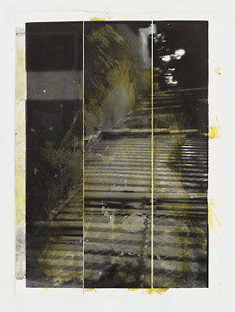
 Tamar Halpern definitely tries. Literally, she goes against the grain of digital printing, its dots and gaps that she makes pronounced before smearing them with more ink. Figuratively, many near-abstract photographers merge the clarity of photography and of color-field painting. Errin Shirreff and Sara VanDerBeek even take (or fake) Minimalist sculpture as a subject. Halpern makes a mess, in layers of printing and ink that deepen one another's surfaces and colors. She might have taken an acid bath to late Rauschenberg.
For her contribution to "Knight's Move," a group show at SculptureCenter, the curator explains that she starts with scenes near at hand or from studio models. In her solo show, the images look deep, dark, and dangerous. You would, too, smeared in blue, black, and red—although they make me think of the caverns of New York, both above and below ground. However, the gestures on top do not, as with some other good mixed-media artists, look at all like graffiti. They often spill across the edges of the screen prints, making them seem more centered and thus deeper. They do not supply text to help identify the scene or, conversely, to contradict their identity.
The mix of handwork before and after printing muddles foreground and background along with the media. It also obliges one not to get hung up on the opposition between new media and the handmade. It can get glib quickly, but then so can Rauschenberg. Maybe that is why I like most when I can strain to make out a source, even if I fail. However, the depth, in the layerings and the image, and surface keep me looking. Without pop-culture appropriation, both ink and image constrain one to opposing visions of reality.
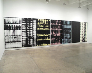
Skyler Brickley may come closer than any to the rigors of abstraction and conceptual art. In his ghostly near monochrome, he could be turning a hospital scan on them both. The repeated elements do more than suggest digital traces. Brickley indeed created them digitally, blew them up, and applied them to canvas with a roller. At the same time, their refusal of imagery echoes a formalist's identification of painting with the wall. He even calls them Wall to Wall.
However, their eerie colors, irregular marks, and mural scale also imply a human presence behind the roller, as for Mark Wiener in black and white. Their scale also makes them into a kind of empty stage set, with the entire gallery the theater. And that may be their most conceptual turn after all. Brickley adjusts each piece to the wall by composing them of multiple canvases, each the dimensions of a movie screen turned on its side. That places the gallery-goer in the audience for a projection rather than on stage. Still, one will have to keep looking hard and wide for the giddy impurity of art in a digital age.
How many light bulbs?
Everyone's poster child for impurity, for once, is downright meditative. It sounds unlikely, if not insulting to her. Fans often see Amy Sillman as the second coming of Philip Guston, and her paintings still have his spiky feet, along with unidentifiable or unspeakable body parts. They also have some of his acid colors—and her sketches his acid sense of humor. How many artists does it take to screw in a light bulb or to screw up Abstract Expressionism? Maybe, Amy Sillman says, more than you think.
An entire wall of them, nearly floor to ceiling, opens her latest work. Taken together, they invite more than enough chaos. More ink on paper unfolds on the four walls of another room, in a row like an extended comic strip. A bare bulb evolves into a flashlight, which then turns on half-formed human bodies like those of Elizabeth Glaessner and Jordan Kasey. A light bulb, too, belongs to Guston's iconography, as does the artist's turning it on herself. The buttocks and increasing confusion, though, may be hers alone. 
The sketches look as if they took thirty seconds to conceive and maybe half that long to make, but this show still takes time—and she has praised Charles Mayton, an artist who dwells on the city and country of his dreams. Maybe meditative is the wrong word (as opposed to, say, just hang in there), but I kept coming back to think about it. More than ever, Sillman paints large and what the gallery release calls "quasi-abstract." Expressionist lavender and green co-exist with fields of sky blue. The hint of a leg can slip out from the grid or anchor it. Describing her last solo show, in 2006, I thought of Guston crossed with Richard Diebenkorn, but she could easily choose her own ambitious history.
I kept coming back to that show, too, in part because I could never be sure that I liked it. I revised my review of it at least four times, in a course from puzzled to rave to pan and back again, and I am not at all sure how it will read to you now. I wondered if Sillman's casual allusions say enough of anything, beyond art-world jokes for insiders. What has changed since then? In part, I have, because so has art. Three years can be a long time in a trendy world, and now the shifting borders between abstraction, representation, conceptual art, and cartoons are just part of the game, as with Laura Owens.
Maybe Sillman has, too. The new paintings are less busy, with less of a central construction hogging the picture plane. A limb can signify the tactility of oil paint or vice versa—not so very far from the formalist goal of painting as object after all. (That and the subject of the painter's self-enforced isolation link Guston's best-known work to his roots in Abstract Expressionism as well.) Up close, Sillman's brushwork leaves dry or crumbling streaks that are palpable. The wall of drawings forms a grid, and the strip of drawings thins out at the end to a few heads and then a solitary one.
The obvious pun on the shape of a woman's head and a light bulb closes the loop, in a mocking tribute to the artist's creative idea. Sillman likes painting after all and wants it back. In a booklet, costing just a dollar on the honor system, she also insists how much better oil looked in galleries under incandescent light, before fluorescent lighting in white cubes and demands for energy efficiency. She calls the show "Transformer (or How Many Lightbulbs Does It Take to Change a Painting)." I would restore the question mark, and I may change my mind about her yet again, once I get over reveling in the joke. For now, I like the question more than I can say—and her painting as well.

"Besides, With, Against, and Yet: Abstraction and the Ready-Made Gesture" ran at The Kitchen through January 16, 2010, Philip Taaffe at Gagosian through February 20, "New Mirrors: Painting in a Transparent World" at Exit Art through February 6, Will Daniels at Luhring Augustine through February 6, Les Rogers at Leo Koenig through February 20, Blake Rayne at Miguel Abreu through June 26, Jack Tworkov at Mitchell-Innes & Nash through February 20, Jackie Saccoccio at Eleven Rivington through July 9, Tamar Halpern at D'Amelio Terras through June 19, Skyler Brickley at Marvelli through February 13, and Amy Sillman at Sikkema Jenkins through May 15.


