Cracks in a Wall of Light
John Haberin New York City
Sean Scully and Brice Marden
Should one see painting as an object or as the purely visual art? Formalism took that puzzle as the meaning of art—and as a directive for artists. Since the first Minimalist and postmodern cracks in that fabulous two-dimensional façade, however, that directive has seemed dated. Abstraction, one used to hear, has died.
Remarkably, abstraction has survived by taking those cracks for its subject matter. Just as remarkably, two concurrent retrospectives follow artists who have pursued its implications all that time. Sean Scully calls his work "Walls of Light," but one could see neither the walls nor the light without the spaces between the stones. Even better and more influential in American art, Brice Marden has turned the cracks into calligraphy—and then covered them again and again in oil. In a postscript, I ask how their work has made me see gallery exhibitions by younger artists differently as well. 
Walls of light
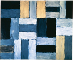
For over twenty years, Sean Scully has been building walls of light, and he attributes it all to an experience in Mexico. There he discovered the fall of sunlight on Mayan stone, and it has given his paintings ever since the character of patient observation and equally painstaking construction. He forms them of interlocking horizontal and vertical fields, each field consisting of bars perhaps a couple of feet long and half a foot thick. He may place two bars around a third of contrasting color, or he may submit them all to variations on light and dark. He typically works on the floor with a broad brush, which gives the bars the smooth, slightly rounded edges of worn stone. Even a pale blue or acid yellow can appear muted, as if reflected off dark matter.
A point of origins may sound suspect, but it tells a story, one of self-discovery. So does the return to an ancient civilization—or the theme of seeing the light. That theme just happens to unite any number of color fields beginning well before 1980, from Hudson River landscapes to Modernism's "make it new." Passage through a wall of light animates more than a few insipid TV dream sequences, but also the illusion of solid air from James Turrell, rectangles of colored thread from Fred Sandback, or operatic video from Bill Viola. One could call it a productive myth. Scully insists that he applies the same methods year after year to the studio light in America and Europe.
Besides, the Irish-born artist has entered his sixties, and his education in London, at Harvard, and in New York had long inclined him to monochrome abstraction. Conversely, most of the paintings at the Met date from just the last few years. He names Henri Matisse and Mark Rothko as influences, and Rothko, too, came over the course of a year to his floating rectangles. The sober palette of red, black, and yellow also reminds me of Marsden Hartley. Dan Flavin and Ellsworth Kelly had their very different walls of light, each with an implicit opposition between art as object and visual record. One can see Scully as uniting wall and light—or, alternatively, as letting the two duke it out. His thin, layered, clearly visible brushwork, for example, could stand for the transparency of oil or the texture of stone.
Each term can itself pull in more than one direction, and in each case the ambiguity links Scully further to Henri Matisse or to late Modernism. As with Matisse in The Red Studio, a wall can mean flat surface or thick, shallow space. He hints at both when he leaves space between some bars, so that the ground shows through, while others overlap a bit. One can see either device as an architectural construction or a flattening out. Typically the ground appears lighter or brighter than the foreground image, and one can choose to identify that with flat canvas or light scattered off stone. Mayans perhaps, but certainly Aztecs and Incas developed cut-stone masonry from a simple post-and-lintel architecture to the plan for temples, terraced cities, and entire empires of the sun.
Light, similarly, can mean different things—either actual color or reflected light, something seen or something represented. Scully often adds the name of a color to a work's title, after Wall of Light. Just as often, it does not correspond to the predominant paint color. While suggestive, that also points to a limitation. The walls may look like concrete, but I could not myself notice much concrete difference between paintings produced in gritty New York, dreary London, sunny Barcelona, and the exurbs of Munich. One is likely to remember the exhibition's beauty and the synchrony of its ideas more than individual works, although I cannot chase one field of gray saturated in blue-green out of my head right now.
These walls of light work best on a grand scale, the scale of an actual wall, where the sensation of looking takes on weight. One can see paintings at a distance, as a barrier and as an extension of the artist's gesture. Jackson Pollock, of course, worked on the floor, too, and one can hardly help describing Scully's bars in human terms—as roughly the width of a hand or the length from elbow to finger tip. They also work surprisingly well in prints, a tribute to his concern for texture and technique. The paintings of intermediate scale look, wrongly, like sketches, although the Met's long, mezzanine with small rooms at either end handles scale well. Mostly, I clung to the succession of large works along the skylit central rooms, where something does love a wall.
The cover-up
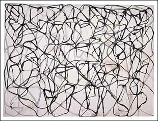
Brice Marden covers his traces. Not that he hides them, not even a little. Up close, his stark early monochromes reveal so many signs of his knife, spatula, and brush that they appear scarred by paint itself. He then left a bottom strip bare, to show only the damage. In later work, since the mid-1980s, sinuous curves have the clarity and color of an enormous cartoon, and they weave over one another so that not a sign gets lost. For a time, at the very peak of geometric abstraction, he even allowed drips.
No, Marden simply covers every inch, again and again, until one can no longer look beyond the image or object to its history—much less to the artist's. Think of it as action painting without the action or what Pierre Soulages called "beyond black." In those dark works from the 1960s and 1970s, Marden would work oil and beeswax into one another, up to and over the very edge of the canvas. One can see the lip when two or three panels, each a single shade, abut each other.  The harshest of blues and greens look like shades of gray, and their glow seems to arise entirely from within. They serve as experiments in how much paint can absorb the light and how little it can give back.
He calls one early painting Three Deliberate Greys for Jasper Johns, and indeed Jasper Johns lingered over both gray and encaustic. However, Marden puts equal emphasis on the deliberate. For a short time he introduces horizontal panels, like posts and lintel, and then at last comes the calligraphy. Maybe he saw that he never could efface his gestures, so as a literalist he may as well take them as composition and as subject matter. Well into the 1990s, glazes cover some of the curves, emphasizing the layering and translucency of oil, and Marden never, ever accepts bare canvas or linen. When, at first, drips extend the outline of a curve, they arise from the action of gravity on a picture leaning vertically against the wall as he worked, not from brushwork or chance.
Clearly what you see is what you get, not quite like Jasper Johns after all, but with a rigor that makes other abstract art seem downright squeamish. Like Frank Stella, his compositions derive from the edge, but Stella's geometric logic approaches conceptual art by comparison. Like Ellsworth Kelly, he uses shaped panels to embody the fall of light, but his shapes never depart from rectangles. Like Robert Ryman, he nurtures monochrome, but Ryman makes one attend to the bolts holding a work to the wall. For Marden, art functions as object only by virtue of his painting it. Like Scully, he sees a painted field as alternately mass and light, but never with the illusion of stone.
One could almost say that the curves set his art free. His early work influenced every abstract artist I knew, down to the messy tactility of some today, and it still dominates his space in museum collections, but I found it inapproachable. Now I could lose myself following Marden's paths as they nestle into an edge before weaving back into uncertain depths. One could mistake each one for a continuous brushstroke, except that their crossings have the contradictions and confinement of a Piranesi prison. However, they have none of the illusion of space in other artists who emulate Abstract Expressionism's shallow arena now, whether for white curves or still life. By the late 1990s, as their shapes smooth out and they increasingly seek the edge of canvas, they deny Pollock's gesture and symmetry more rigorously than ever.
Marden has said that his calligraphy derives from Franz Kline and Chinese art, but never from language. His retrospective keeps the labels far from the work—one last protection of image and object from writing. Postmodernists would throw a fit at the separation of art and text, and he never has lost his high-modern dream of covering his traces. However, the more obviously busy they get, the more they demand contemplation. The smooth curves run more and more to primaries, and his latest work may use a brightly colored ground as well. In the show's last room, two six-panel works go on view for the first time, and he may finally make me shut up and look.
A postscript: neo-formalism
Thanks to Scully and Marden, abstraction had pride of place once again in New York museums, just when I should and do know better. For a second or two, I could hardly believe that art had ever left it for dead. Paintings in Chelsea have looked stranger and better for it, too, with Philip Taaffe and more coming up in the spring. If one has a fondness for hard edges or for pattern and decoration, call it a fringe benefit.
Like history, art never really repeats itself, except perhaps as farce—and why not? It helps even a formalist these days to look for elements of postmodern play. In the galleries this same fall, I had to see Pat Lipsky differently. Her rectangles have harder edges than Scully's, and she could well have squeezed the space from between the stones in his "Walls of Light." However, his close tones had me seeing the transparency in her varied blues, like cathedral glass. They also allowed me to see her staggered, vertical panes as taking rapid turns as image and ground.
In Postmodernism, of course, everything comes around twice, even repetition. Jackie Saccoccio likes walls, too. She interrupts her wall drawings with brightly colored paintings, so that one objects connect more readily to their environment. The trick made me nostalgic for the more expanded spaces of Matthew Ritchie a few weeks earlier—and, before that, among other more ambitious networks in the Whitney's "Remote Viewing."
Like Saccoccio's, Fiona Rae's canvases also looked perhaps a bit too pleasant and familiar. Up close, the whirl gives way to cartoon flowers, doggies, and whatever gobs of paint strike her fancy. Think of Sue Williams without the ability to emulate or parody Abstract Expressionism. Then try to imagine a British artist less determined to shock than an American one for a change.
Callum Innes, too, has a much-needed boost from New York's exposure to Marden. Innes, always good for a few big, sedate rectangles, grew restless long ago with his own visual finish. He has in fact used turpentine to wipe it away. The hills and valleys of streaky black also make me think of fire paintings by Makoto Fujimura. They share the latter's weakness, slightly bland images, but without his incredible technique and the pounding his surfaces take on the way to completion. On the other hand, I got a postmodern kick out of painting based on erasure.
As it happens, Fujimura is extending the technical wizardry and attention to surface textures, this time in gold leaf, and I could feel his own walls of light slowly building up and breaking down. Innes, too, gets better—in the back room, where he returns to his rectangles. As often in his work, the paintings here look clean and geometrical, until one notices the softer edges, brushed in or washed down by turpentine. Think of the strip at the bottom of an early Marden. However, Innes has recently left more of the canvas brightly colored and simply white, and those rectangles, too, can now read as both color fields and erasures. Ironically, Fujimura does better by settling for more, and Innes by pushing hard for less.

Sean Scully ran at The Metropolitan Museum of Art and Brice Marden at The Museum of Modern Art, both through January 15, 2007. Pat Lipsky ran at Elizabeth Harris through November 11, Jackie Saccoccio at Black and White through December 30, Fiona Rae at Pace through December 2, and Callum Innes at Sean Kelly, though December 9. Makoto Fujimura Sara Tecchia through January 13, 2007. A disclaimer: my cat is named Scully, after the artist.


