Light, Space, and Museum Atriums
John Haberin New York City
Renzo Piano and the Whitney's Future
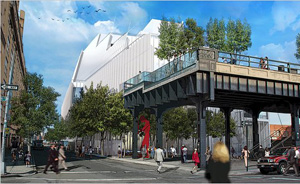
When a new Whitney Museum opens by the Hudson in May 2015, will American art have found a new Hudson River School and a fitting home—or just another oversized museum atrium? It may depend on which version of Renzo Piano wins out. All are on display in 2013 in "Fragments," a survey of thirty years.
It could be the young radical who, with Richard Rogers, changed the face of Paris with the Pompidou Center. It could be the mature architect who covered the California Academy of Sciences in Golden Gate Park with grass, mounds, and photovoltaic cells, to reach out to nature and to its built environment. It could be the architect of the addition to the Morgan Library, with that bane of contemporary museums—yet another multi-story atrium promising a public space while sacrificing space for art. Or it could be the architect that the Morgan and, by my count, nine other art museums in the United States alone have sought out for his willingness to preserve and protect what they knew. Most likely, it will be all of them. If one thing distinguishes Piano, it is his flexibility. 
A survey comes at just the right time, when those questions are in the air. The Whitney's director has already begun reaching out to the press, to show off developments and to win allies for a work in progress. As a related review explains, it also comes just as Robert Irwin is making clear what the museum will have left behind. His once-in-a-lifetime recreation of an installation from 1977, the same year that the Pompidou Center opened, shows a nearly bare floor of Marcel Breuer's Madison Avenue building as a work of art. I shall just have to wait to review the new building when it opens (and I invite you to read my 2015 review). For now, a concise history of Renzo Piano supplies a welcome context.
Safe and sound
Deference to clients, by goodness knows how many corporate architects, tends to mean cookie-cutter versions of the International Style. For Renzo Piano, in contrast, flexibility is very much a part of a modest stylistic signature, although one can easily overlook it. As Hal Foster puts it, he has a knack for both "the local craft of building and the enterprise of business," for all the tensions between them. One often think of him as a museum's safe choice, quite apart from the radicalism of the Pompidou Center. When people speak of that building, they tend to speak first of Richard Rogers, the British architect who worked with him. And they did place in front of it the safe choice of a sculpture by Alexander Calder.
Yet the building belongs to them both, and it is hard to forget its strangeness, like photographs of an actual empty museum for Wijnanda Deroo. Both Piano and Rogers had long hair when they won the commission (along with another Italian, Gianfranco Franchini) for a library, theater, and museum for modern and contemporary art. Their open steel framework looks like a parking garage—or like the International Style turned inside out. Pipes, ducts, and the snaking tube of an escalator disrupt the geometry, highlight the industrial parts one may prefer to forget, and add a sense of play. Originally color coded, in bright colors at that, they could be laughing at or with the modernist ideal of "form follows function." The museum's worst critics called it monstrous, and the public came in droves.
I still remember the excitement of a visit in 1983, when it helped me appreciate late Georges Braque as much as Pablo Picasso. Born in 1937 to a family of builders, Piano was young only by the standards of big-budget architecture, which relies on established names and, for the most part, white males. (Three cheers for the early emergency of Maya Lin.) He had worked on his own and with Louis I. Kahn when he formed the firm with Rogers. He went off on his own with the Renzo Piano Building Workshop in 1981. Had he left his radicalism behind?
Perhaps, but consider how each of his versions may well be coming to the Whitney, captured in progress by Yvonne Jacquette and Jacquette's New York, or the forthcoming Lenfest Center for the Arts at Columbia University. With the Centre Georges Pompidou, André Malraux as the French minister for cultural affairs sought to reorient Paris, uprooting the food markets of Les Halles so that art and culture could come to the Beaubourg. The Whitney continues a shift in the balance of New York as well, from museum mile downtown. In Paris, placing services and passages on the building's exterior, along with an innovative system of trusses, leaves the interior column free. And even before partnering with Rogers, Piano had been experimenting with unusual materials and supports, including reinforced polyester. The Whitney will also dispense with columns, to allow shifting walls and a freer space for art.
Perhaps most of all, Paris gained a major museum, and Piano has focused on cultural centers ever since. I want to deride him as a museum stand-by, but it is his choice, too, when he could be making serious money in the private sector. His next works were spaces for music—one of them conceived, he says, as a giant musical instrument itself. The exceptions, such as an airline terminal in Tokyo, obviously belong to the public sector as well. Even his project for IBM was a modular traveling pavilion, as an element in public outreach. The Whitney continues the pattern.
Then there is the second Piano, like Rem Koolhaas giving priority to the environment. Building after building of his makes a point of its sustainability or energy efficiency—in the case of the Menil Collection in Houston, what he calls a "solar machine." Visually, they tend to keep a low profile of at most a few stories above ground. More than a few have indoor gardens. A private dwelling nestles its single story into the hills, invoking the vernacular of a ranch house and the Colorado landscape. A museum in Basel imported stone from Argentina, but to approximate materials from surrounding earth. The Museum of Modern Art has pitched Le Corbusier as sensitive to context, but this is the real thing.
Emptiness or equilibrium?
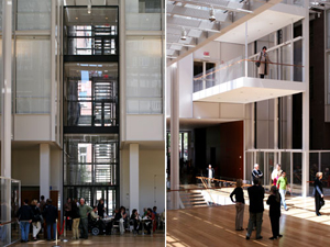
London Bridge Tower might well be a direct response to Norman Foster's green, curvaceous tower—affectionately and not so affectionately nicknamed the Gherkin (pickle, to you Americans). Piano planned the white glass of his "crystal pyramid" so that it "disappears into the sky." He also surrounds it with an open concourse, the better to engage pedestrian traffic below. Even his one skyscraper, for The New York Times, claims to derive its parallel bars from the street grid. His work for the Harvard University art museums reorients them facing not the campus, but the community. As for the Whitney, it takes as its point of reference another pedestrian passage, the High Line. It also plans a vast, open interior as a public gathering space, with the galleries only beginning on the fifth of eight floors.
And that brings one back to museum atriums. It is not so easy to sort out Piano's modesty and welcome from his grand aspirations and wasted space. His idea of a public space need not be hostile to art, not to mention coffee or concerts. His serenity may border on blandness, but it also has nothing in common with the boxy New Museum or the ongoing disaster of the Museum of Modern Art—with towering museum condos, little room for the collection, and threat to an adjacent architectural gem in the former Museum of American Folk Art. Museums keep turning to him to preserve their presence and culture with good reason. His addition to the Art Institute of Chicago counts on natural light and a bridge to the old building, and his changes to the Morgan or the Isabella Stewart Gardner Museum in Boston raze nothing. His addition to Kahn's Kimbell Art in Museum in Fort Worth even stands at a polite distance from the original while, as if in deference to the master, while echoing its vaults permeable to the light.
No one hates work this fine, and buildings like the Pompidou Center and the California Academy shine out from textbooks. I look forward to the Morgan each and every time. It also stands apart from the modest renovations to the Drawing Center and the Met's European galleries, which above all do no harm. The Gardner even reverses expectations by parking artist studios at the ground floor, with a tall box as a "floating volume" above. Still, there are all those private gardens and public spaces. Is Piano just one more part of a pernicious trend? Is his design sense too presumptuous, too lacking in originality, or both at once?
 It just might come down to that last hallmark of his design, flexibility. One can call it caution or anonymity, and no question but the industrial carnival of the Beaubourg has pretty much vanished in later work over the years. Central St. Giles, a mixed use project in London, indeed razed some obviously urban buildings in favor of charming lime, peach, and yellow ceramics. And form may follow function after all. Parco della Musica, in Rome, places three concert halls off the foyer, just in case no one of them suits the crowd. As for the Whitney, after a lifeless 2014 Biennial, one will just have to see.
The exhibition has its own idea of flexibility. The gallery calls it "equal parts library, reading room, school classroom, and natural history gallery," not unlike a school room in a park for Hugh Hayden. In practice, it is four rows of modest tables, packed with models, blueprints, touchscreens, and text. Better get reading. They also have fragments of arches and materials, like the polycarbonate vaults of the IBM traveling pavilion, to emphasize Piano's concern for the basics. What they do not have is a sense of being there.
In part, a gallery can do only so much. A museum can have walls of photographs and life-size reconstructions, but not even Gagosian has enough money and space to throw around. In part, Piano's career, too, is even now a work in progress. So are a full quarter of the twenty-four projects on display. Whatever the merits of the Whitney's move to the Meatpacking District, across from a potential park on a pier designed by Thomas Heatherwick, and I have considered those and Heatherwick's sculpture and his Little Island park elsewhere, one can only look for clues and wait—even while the Whitney next offers this very floor to T. J. Wilcox and a penthouse view. One can also pay those last visits to the old building and to Robert Irwin, and try, just try, not to despair.

Renzo Piano ran at Gagosian through August 2, 2013. Related reviews look at the Whitney's earlier decision to move to the Meatpacking District and the opening of the the Whitney's new home in May 2015. Hal Foster wrote about Piano in The Art-Architecture Complex (Verso, 2013).


