New York on the Rise
John Haberin New York City
A New Decade in Architecture: 2020
Is this the city I remember? Well, yes and no. New York City would not have it any other way, and neither would urban architecture.
The city I remember
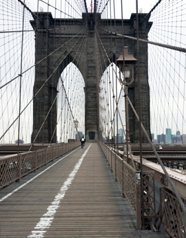
I am old enough to remember the pinball parlors north of Times Square as a treat for a little boy, even along a sordid and none too touristed stretch of Broadway. I can remember as an adult crossing the Brooklyn Bridge without elbow to elbow crowds. And suddenly its near empty magnificence was back, thanks to Covid-19. A Monday crossing was bittersweet all the same. John A. Roebling had the vitality of New York in mind all along when he proposed a master plan for the world's longest suspension bridge in 1867.  He meant its stonework and cables to sustain up to eight times the traffic he expected at its opening in 1883.
What of the city's vitality now, shuttered by social distancing? How much can afford to return any time soon? With galleries and museums shuttered and reduced to "virtual exhibitions" and art therapy, one can still take in New York's architecture, which was bittersweet enough, thank you, even before the plague. It has never seen so much construction, apart from the years after World War II. Does that portend only gentrification and displacement—or also renewal? Maybe both, but urban growth was already slowing.
This could be a banner year in the big city, at the expense of big money and outsized dreams. It sure may not seem that way, I know, but (as always in the city) changes are in the air. Allow me, then, a survey of change at its best and worst. I would hate to see growth stop altogether, but will it continue for only the wealthy? Not necessarily, in the face of skepticism, anger, and a slowed economy—and one can take stock of them all in architecture. It can promise something enduring, even as the city thrives on change. It could almost be the city I remember, but, sure, it has a lot to overcome.
Hudson Yards arrived in 2019, as the unliving symbol of mammoth inequality. Scaffolding is everywhere, making sidewalks a nightmare, and from them emerge almost uniformly horrific high rises. As the year drew to a close, two prominent firms proceeded with plans to demolish Park Avenue buildings that are landmarks in everything but their formal designation. A big new wing for the Museum of Modern Art nestled under a residential high rise was a real-estate deal in itself, and the Stavros Niarchos Foundation Library soon to come looks no better. The AT&T building, also in midtown, still struggles with Philip Johnson's Postmodernism. It is reconsidering its lobby façade and retail spaces, which stand so blank and empty.
In each case, someone is showing off and someone is served, but not you. Remember the Woolworth Building, unveiled in 1913, on Broadway just south of City Hall Park? It was once the world's tallest building, and the architect, Cass Gilbert, added two small carvings to the lobby ceiling. One has Gilbert himself presenting the building, the other F. W. Woolworth, of that empire of five and dime stores, counting his change. It could serve as a metaphor for architecture even now. To rub it in, one can no longer enter the lobby since the building's conversion to luxury apartments.
Still, there are signs of hope—from the return of the Ford Foundation to, at last, widespread criticism of museum expansion. Does that mean the worst is past? Probably not, but consider, too, some of my unfavorite architecture for what New York must now outgrow. Not at all surprisingly, they confront their neighbors on behalf of the few. They also point to the crucial choices ahead. The inequities of the recent past persist, but the good news is that people are catching on.
Grounds for hope . . .
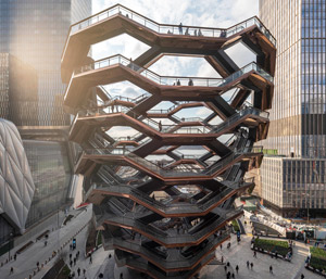
Hudson Yards is monstrous enough, with more monstrous towers yet to come. It has a mall that could better suit the suburbs and a tall sculpture, by Thomas Heatherwick (also at work on Little Island a mile to the south), that serves guests at a nearby hotel as a vertical running track. It has its own subway station, leaping across neighborhoods and stopping short of connecting others, once again on behalf of wealth. The extended subway line skips the chance to enhance the gallery district to the south or to revive the Javits Center to the north as a serious candidate for conventions. At least the PATH station Oculus by Santiago Calatrava, another upscale mall, helps integrate the World Trade Center offices and memorial into Lower Manhattan. Now if only Goldman Sachs a few blocks from there had not suddenly closed access to its lobby murals by Franz Ackermann and Julie Mehretu.
 For all that, it is not at all easy to disentangle the bad from the good. Hudson Yards also has a performance space in The Shed that pretty much works for equally grandiose art. The Oculus, while way late and way over budget, is striking in its tiers, breadth, illumination, and resemblance to a giant shellfish. It also connects downtown Hudson River walkways to east side subways. One can almost overlook that The Shed amounts to a pay per view gallery of contemporary art, while the Oculus draws mostly tourists. And if all that leaves you unsure what to think, you can see the trade-offs elsewhere as well.
The High Line is at last complete, with a short spur crossing Tenth Avenue—and, for its opening, a bust by Simone Leigh. It still obliges a forced march along a narrow track jammed with tourists, and it still makes it impossible to overlook the unimaginative and overpriced condos crowding out Chelsea galleries below (despite one last building from Zaha Hadid). Still, I am growing used to its neat divisions in function. The south end has its café and event space, the middle its well-maintained plantings, and the north end its more leisurely curve to the west. I can almost see why it draws such crowds and offers a model for other cities. I just do not have to like it.
And that glimmer of hope, however faint, is only the beginning, with a show of "Reconstruction: Architecture and Blackness" still to come. Bad as the condos are, they may already belong to another era. The luxury market was soft even before the crash. More to the point, the condos, Hudson Yards, and its subway stop reflect Mayor Bloomberg's priorities, not today's. His successor may not have got what he wanted in affordable housing and failed to upgrade public housing, but his set-asides of the first are a breakthrough, and the second will have to overcome many years of neglect. Better yet, the need for both is getting plenty of press.
More optimism lies in an unexpected corner—public reception, much like that press. Time and again, critics have swooned over the latest thing, only soon enough to walk their praise back. MoMA's 2004 expansion is a case in point. When it comes to Hudson Yards, though, they piled right on. They also piled right on the Met's finances in taking on the Met Breuer. Fairly or not, it cost the Met's then director his job.
Artists are fighting back, too, by calling attention to wealthy donors and museum boards. They have prompted the removal of one donor's name from a museum, and they have obliged a board member at the Whitney to step down. As the roles of artists, critics, and the public begin to change, institutions will as well. Could the role of architects also be changing? Against all odds, MoMA's 2019 expansion is a big success—as is Pace gallery, the first of several Chelsea mega-galleries underway. The Modern cannot undo past mistakes, but it can accommodate them better and stage two shows of Asian architecture at once, while Pace gets to start over from the ground up.
. . . and the very worst
The worst still has its passionate intensity—and the money to disguise its lack of conviction. Regular readers here will know how much I hate ten-best lists. A critic should promote enthusiasm and understanding, but not just by picking winners. So how about instead my personal five-worst list in New York architecture (and a bonus sixth)? Of course, it begins with Hudson Yards. With any luck, it may coincide mostly with yours.
If I asked you for the city's most disfiguring buildings, you would surely continue with three pencil-thin towers not far from Central Park South—or a lesser eyesore at the foot of Madison Avenue, so cold that the fast-food chains at its base do much to humanize it. It is amazing that the towers even came about, given the lack of reason for global wealth to buy into anything but the very top floors. If I asked you, too, for the city's most notorious failure, it would still after more than fifty years be Penn Station (and I shall just have to see whether Moynihan Train Hall changes my mind). On both counts, you have my vote, too. I can only once again second Michael Kimmelman, the architecture critic for The New York Times, in calling for a brand new station, although that looks less likely than ever. Work on access through the stately Farley Post Office continues across the street, while Madison Square Garden looming above is not going anywhere any time soon.
People often lament the destruction of the old Penn Station in 1963. They do not nearly often enough point out how easy it would have been to better its replacement. It would have taken starting the towers above just a few feet higher, to allow higher ceilings and a little sunlight. It would have taken more natural circulation, a central node akin to the clock in Grand Central Station, a waiting room that looks less like an interrogation chamber, and anything but the look of linoleum walls and floors. Even in the mid-1960s, that was not too much to ask, so as not to weigh the city and commuters down.
So what else? If anything could be more ostentatious in its indecency, it would have to be Astor Place Tower, the twenty-one story condos by Charles Gwathmey from 2005.  Their stacked curved and upright geometries, like their reflective green glass, have little logic other than to push others away. Notice something? Everything thus far came about from a single cause, the profit motive, and for a single aim, to stand apart. Gwathmey's luxuriant apartments insist on looking out, while you will never look in.
Not that a refusal to play nice with neighbors is confined to luxury. 3 Park Avenue, set on a diagonal to 34th Street, rises without windows for fifteen stories—with a vast, dark sheet of windows above merely extending the slab to face you down. It gives new meaning to Brutalism, with the red bricks of a medieval fortress instead of concrete, while confining a high school's entrance to a dismal tunnel running its length. Finally, let me add a building that many love and fought to preserve, Saint Vincent's hospital in Greenwich Village. Its notched semicircles above and below a gap shift relative to one another as you turn your head. It could be grinding its teeth at its likely fate, and I feel it grinding into me as I pass.
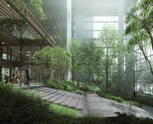
That refusal is the key, as Paul Goldberger pointed out in panning Astor Place Tower from the start. A great building tries neither to mimic its surroundings nor to disdain them. Rather, it transforms the past to every side, as part of the vitality of an ever-changing city. At 3 Park Avenue, the city tried both failed approaches to history, in turning to Shreve, Lamb & Harmon, the firm behind the Empire State Building, well after Shreve, Lamb, and Harmon had all passed away. At the Ford Foundation, now open once again to the public, Kevin Roche, John Dinkeloo, and Dan Kiley showed how much more New York can do—even as Roche and Dinkeloo were to go on to have a hand in Hudson Yards. If the present moment means anything, it is that architects and the city itself once again have a fighting chance.

I invite you to follow the links for more considered discussion of each, from commercial architecture to museum expansions. Related articles look in particular at Covid New York, art after Covid-19, galleries after Covid-19, museums after Covid-19, and consequent "virtual exhibitions," Hudson Yards, Penn Station, Moynihan Train Hall, the Ford Foundation, and the Museum of Modern Art. As a further irony, the sheer mass of 3 Park Avenue adds to and disguises structural defects in the lower floors and the overhang to a plaza out front. A lengthy repair includes adding steel rods to the exterior brickwork, like a lame attempt at decoration.


