Taming the Atrium
John Haberin New York City
The 2019 Museum of Modern Art
After two days, nearly five hours, and no end of provocations in the new Museum of Modern Art, I needed a little creature comfort. And I found it in Claude Monet's Water Lilies. His triptych angled gently toward me to either side, just as I remembered, while two more canvases had the walls behind me, immersing me in their waters. The soft black sofa felt good—but not half so much as his great, late return to nature and approach to abstraction.
For a moment, I could have been back in the old MoMA, before three rounds now of expansion. It was free all day Monday back then, and I could take it slow, week by week and room by room, as my introduction to modern art. The Modern has defined modern art for others, too, since 1939. Only now, I was the entire breadth of the museum away—not just from the old entrance, up the Bauhaus stairs, but from Post-Impressionism as well. I was in a whole new building at that. I had experienced the colossal, confusing, and still often comforting new architecture, rehanging, and mammoth installations. 
Amenities and choices
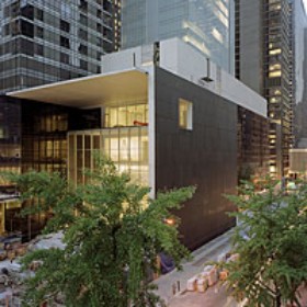
With each expansion, MoMA has threatened to reduce Monet's horizontal strip to a Band-Aid. With Cesar Pelli in 1984, the core designed by Philip L. Goodwin, Edward Durell Stone, and later Philip Johnson still held its ground. With Yoshio Taniguchi in 2004, that core fell victim to an empty spectacle. It left insufficient space for the collection or an honest history of modern art. With the long, bleak lobby and tall, bleak atrium, one might have entered not a museum, but an airport or shopping mall. The new MoMA cannot undo that, but the airport has acquired some amenities and the mall some decent choices.
The new architecture is still as much a real-estate deal as an expansion. An apartment tower has displaced the former Museum of American Folk Art, ceding its lower six floors to MoMA. With that westward addition, the museum now runs a good half block of prime real estate toward Sixth Avenue. If the tower, by Jean Nouvel, has the chill of the Hudson Yards, at least one is not likely to look up from the confines of 53rd Street to see it. And the new architects, Diller Scofidio + Renfro (in collaboration with Gensler) know the Yards well, from work on its performance space, The Shed. Thankfully, after completing Boston's Institute of Contemporary Art in 2006, they also know something about museums.
A stone canopy now offers a warmer welcome, as does an airport-style lounge to the left. The bookstore has moved downstairs from there, but it looks if anything more dramatic now through windows from the street. The main lobby looks emptier and less functional than ever, apart from a mirrored light and sound sculpture by Philippe Parreno, but then the admissions counter has moved to the left, too. If text above by Haim Steinbach, hello.again, looks more like online advertising than a welcome back, ground-floor galleries to the west are now free of charge. "Energy" runs from an early mainframe computer to wind power and photovoltaics—every one of them as aspects of sculptural design. You can also take the west elevators to the collection.
Choices, choices. Also from the west elevators, you can head for the sixth-floor terrace café. Its modern but informal design is more welcoming now, too, with stucco wall sculpture and color accents by Kerstin Brätsch. You can still turn instead to the right of the lobby, into the garden (also free) or up into the atrium. Or you can hang a sharper right to the escalators, bypassing the atrium entirely. Either way, rest assured that you can still enter the galleries via Paul Cézanne, Vincent van Gogh, and Starry Night. You are more likely to ask for its location, the museum reports, than for anything other than the bathrooms.
Also helping to tame the dreaded museum atrium, a mezzanine above it holds a "creativity lab"—quite apart from the art lab for kids in the education wing way east. This lab is for adults, although you might not know it from the results. Better still, you have so many routes to the permanent collection because they connect. At last, the atrium is subordinate to the art. The galleries just past the atrium now hold contemporary art from the collection rather than a temporary exhibition. If board member interests in contemporary art drive museum expansions way too often, like the Met Breuer, remember that modern art was contemporary once, too.
The westward passage on each floor offers one last amenity, space for temporary installations. In one, Amy Sillman curates work from the collection, salon style, with the same eclectic taste as in her painting. Sheela Gowda makes fragments of door jambs and window frames feel like home. And David Tudor recreates his 1973 Rainforest in conjunction with Composers Inside Electronics Inc. Transducers inside piping and an oil drum suspended overhead turn industrial castoffs into sound. You may feel that you have stumbled onto any one of these installations by a lucky accident.
Navigating the maze
You may encounter the entire collection as a series of lucky accidents. You will have many more choices to make once you are inside. On the High Line, the same architects have tourists on a forced march, from the Meatpacking District on up. Here they leave you to a maze, and you may never know for sure where you are being led. If you manage to cover it all, you are bound to retrace your steps more than once. It is only the first sign that the Modern has adopted a decidedly nonlinear approach to modern art.
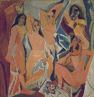
Postmodern critics have long criticized textbook histories for reducing Modernism to "science marches on." They may criticize Modernism's movements, manifestos, and male egos for much the same thing. Art ain't marching anymore, not here, and nowhere more obviously than across from Les Demoiselles d'Avignon. At the center of an adjacent wall, colorful people dance or flail wildly against a field of gray. Has MoMA discovered an overlooked contemporary of Pablo Picasso, perhaps a woman? And did she against all odds make Picasso's cramped, angry, fragmented brothel into a precursor of Pop Art?
Nope, for Faith Ringgold painted her American People series in 1967. In that same room, sculpture by Louise Bourgeois plays off against Picasso's bulkier women, while Alma Thomas in 1973 brings her daubs of color to a room for Henri Matisse, even before a show of his Red Studio. Women and people of color have entered history. They have within a generation as well, like Hilma af Klint in Sweden with early abstraction and with flowers—or Tarsila do Amara in Brazil with its successors. Fresh Widow, the found window frame from Marcel Duchamp, in turn enters a whole room for the luxuriantly decorative interiors of Florine Stettheimer. Just in case you missed the point, the label credits him only as his female pseudonym, Rose Selavy.
If diversity is in, movements are out. Not once does Georges Braque face Picasso's Cubism, while af Klint and Robert Delaunay turn up with Italian Futurism—and Picasso's woman at a mirror with Dada.  Combining Russian Constructivism with de Stijl in Amsterdam serves both purposes, for it allows the curators to highlight Natalia Goncharova and Olga Rozanova as women in early Soviet art. Berenice Abbott stars in more than one room for photography, on themes of the human body and the skyscraper. Each room in fact has a theme, and different media appear throughout rather than in separate departments. By all means start with Starry Night, but the next room opens onto early cinema, with a subway tunneling ahead to Grand Central Station, express.
Pre-opening critics are ecstatic, just as they were in 2004, but are they right? For all the importance of diversity, the artists themselves thought in terms of ideas, associations, and movements. Margarete Schütte-Lihotzky did in 1927, in designing what she presented as the Frankfurt Kitchen—now just outside Claude Monet. Before the critical pendulum swings the other way, though, MoMA is smarter than this story. It may not think in terms of movements, but it does stress a context in time and place. More than one room's title amounts to a date, while four rooms have the theme of war—from World War I through the Mexican Revolution and onto Vietnam. When it comes down to it, those leaps decades ahead have received so much attention because they are so rare.
They get rarer, too. By the floor for postwar art, I was praying that the curators would not throw the latest thing in sloppy painting in with Abstract Expressionism—or the latest conceptual art in with Josef Beuys. They do not, but then the floor for contemporary art has more than enough emphasis on visual impact and ideas on its own. Juxtapositions of Joan Semmel with Senga Nengudi or Marlene Dumas with Ana Mendieta and Mrinalini Mukherjee, as contrasting images of a woman's body, are striking enough. Think of exceptions like Ringgold, too, as accents and insights rather than a departure. She is depicting riots from the 1960s, as Die, and the blood on her rioters brings them all the closer to the tensions in Picasso's women.
Ambition and distraction
If I have got any of this wrong, all that will change, as works rotate in and out twice a year, starting with MoMA's "fall reveal" in 2020 and again the next year with more photography and cinema. And if that sounds audacious, given MoMA's once definitive history, bear in mind that the Whitney has again rehung selections of its holdings and will do so often again. For now, though, nothing can upstage the architecture or the collection. The largest space for temporary exhibitions complements both. Think the museum has gotten out of hand? The artists in "Surrounds," it says, are "united in the scale of their ambition."
With its themed rooms and west corridor, the entirety of the new MoMA can feel like one clever installation after another at that. Did I mention that Yoko Ono has another corridor, wishing for world peace in two dozen languages? Did I mention Haegue Yang, who covers his sculpture with bells and lines the atrium with glitter and handles? (No, the Korean artist did not have me climbing the walls.) Well, here are eleven more— each on view for the first time, each from the museum's collection, and each a room to itself. Galleries that connected to accommodate first Adrian Piper and then Bruce Nauman as recently as 2018 now feel downright manageable.
Does large have to mean monumental, any more than that Modernism has to mean an institution? The curators, led by Quentin Bajac, hope to challenge that idea. The artists present less a range of public works than a range of feelings. Outside the galleries, Sheila Hicks has her colored threads cascade from ceiling to floor, like a living waterfall. Jennifer Allora and Guillermo Calzadilla set out ten massive rocks as choir risers for boy sopranos. The work, they want to believe, is monumental or even sacred, but also singing. 
Others are less hopeful. Never one to resist overstatement, Mark Manders sets his bleak factory amid sculpted images of the dead, while Sadie Benning finds an all-seeing eye looking everywhere in photography. Hito Steyerl tells the story of a financial analyst turned mixed martial artist, but beware the social commentary or the comedy. Seating for his video, he warns, has jagged edges. Most heavy-handed of all, Janet Cardiff and George Bures Miller use their relentless machine to act out "In the Penal Colony" by Franz Kafka. If you have forgotten, the prisoner dies from his very sentence etched into his body.
Still others associate size with a collection that can never reach closure. Dayanita Singh has her Museum of Chance and Arthur Jafa his pulsing, thrilling, and frightening compendium of African American lives. For Sou Fujimoto, Architecture Is Everywhere—on slim pedestals, where potato chips and jelly beans will have to serve as architectural models. Sarah Sze has cleaned up her studio, imported into the museum, while a swinging plumb line threatens to knock it back down. Rivane Neuenschwander dirties things instead, with sticky tape on the walls, ceiling, and floor of an otherwise empty room. Its off-white looks almost subtle enough for Agnes Martin, but do dust off your clothing when you get home.
Tired of thinking big? Tired of addition and subtraction as ambition and distraction—even now at the Philadelphia Museum of Art? You could voice your own critique of museum expansions like this one, even as critics revel in them. Or you could always end your visit, like me, with Monet. Then, too, you could skip the whole deal in favor of half a dozen more temporary exhibitions. For all their sheer volume, they avoid blockbusters in favor of modesty, living artists, and diversity.

The Museum of Modern Art reopened on October 21, 2019. "Surrounds" ran through January 4, 2020, Haegue Yang through March 31. Related articles look at its past expansion and new exhibitions, as well as revisiting the expansion in December to see how it holds up. Another related review puts this in context of a decade in architecture.


