Join the Club
John Haberin New York City
Amy Sillman, Bob Nickas, and the Lower East Side
Sometimes, even a critic has to say it: I just do not get it. Now, that should bother you as well me. If I miss the point, why should you trust my judgment?
For once, however, my befuddlement may come of use, in more ways than one. It lets me call attention to a halfway decent painter, a theoretically top-heavy group show, and their limits. I hope to hint as well at the dynamics of fame and fortune these days.
Amy Sillman brings the cool of an art-world insider to the heat of abstract painting. Bob Nickas has sustained "An Ongoing Low-Grade Mystery" for more years than I can count. Both hint at today's commercial aspirations. Dealers pitch simultaneously to a broader audience and to insiders. 
Worse, as of 2006 that dilemma extends well beyond Chelsea. Increasingly, downtown galleries seem an extension of the club scene, with the same highly selective barriers to entry. Does Chelsea have its big bucks, celebrities, and plenty of crowds to gawk at it all? Downtown has its culture, too, just as in music, bars, and restaurants. Prepared to make a scene? (A follow-up review carries Amy Sillman into 2010, while another follow Sillman in 2016.)
Vague ambitions
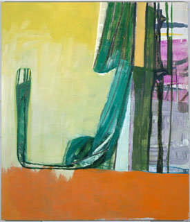
I caught Amy Sillman three times. Of course I did, for I still return to abstract painting as often as I can. It shows my age, and I kept returning back when abstraction had sunk below the radar. I have highlighted recent shows featuring careful study of postwar traditions—or ripping traditions to shreds. How then, could large paintings with wild, loopy designs leave me untouched?
Surprised to find raves everywhere, I had yet another reason to go back, and I did. I enjoyed the work more on each trip, and if I still did not get it, I do not simply blame myself or the artist. Art does not exist for my sake anyway. Sure, my reluctance to join the chorus of praise might appease Raphael Rubinstein, who begs critics to hold up higher standards—as if anyone could agree on what those might entail. But my not getting it shows a problem with Rubinstein's role for the critic as referee: what if I do not know what I am talking about?
This once, though, stupidity may come in handy. Sillman's never quite delivering the goods may well define her at her best. Art should tease one with possibilities. Critics have praised her lavishly, but in curiously vague terms, and I can see why. She calls one painting The Elephant in the Room, and I think I may have stumbled on it at last: ambitious but ambiguous aims are part of the point.
Her paintings have the bright tones, thick lines, and wide-open spaces of mid to late Willem de Kooning. One catches more variations in thickness the more one looks. Yet Sillman never approaches quotation. Does that certify a painter's authenticity, or is she just failing to grapple with her influences—and how would one know? When Sue Williams plays off late de Kooning, she strikes some as tired, others as a savvy combination of loving care and postmodern critique. Either way, however, Williams makes me look first at painting for its own sake, and then she makes me take that loving conception of art at more than face value.
Sillman offers a second guilty pleasure, her way of letting recognizable shapes slip in and out of focus. A black line may veer into an arm—or a part of the human body I want to touch but never can pin down. I thought of the funky, cartoon outlines popular in art these days, right down through Joyce Pensato. Yet Sillman never lets one describe a painting simply as representation, allegory, or cultural artifact. She seems ill at ease with formalism and yet happy at not having found something to dispel its charms. The funky lyricism, like the mix of soft and acid colors, has equal parts Philip Guston and Richard Diebenkorn.
You must love Sillman for what she misses—or not at all. You will not see virtuoso gestures, but rather apparent impulses that took more than a brushstroke to form. You will not see a composition guided or determined by geometry, but you can dive into all the white space you could wish. You will not see a central image, but you can watch her dark verticals gather in the surrounding color. You will not get the pleasure of watching those elusive limbs teeter on the edge of significance, but you will have great fun discovering them nonetheless. I have my doubts that the work conveys anything at all, but I am coming back many more times to find out.
Mysteries in red
You call this monochrome? Would you even call it red? A group show called "An Ongoing Low-Grade Mystery," sure took me by surprise. Three years ago, Hunter College assembled "Seeing Red," with painting very much as Josef Albers would have it—strictly by the color chart. I kept thinking of all that Hunter and Albers left out. Or so I thought, for I did not think of the half of this.
Do red knots in wood make Sherrie Levine a colorist or even a painter? Had I ever seen so much red dominate the enclosed Perspex in a Donald Judd as here, from 1962? Would I have noticed the color of thread that Carol Bove shapes into geometric Moonspikes? Should one think of color fields when confronting Wayne Gonzales's silkscreen of Lee Harvey Oswald or the usual coconut lanterns from Guyton/Walker? Should I notice the near uniform tint when William Eggleston at Los Alamos first explores color photography? How about when Wolfgang Tillmans tilts photography toward abstraction?
These days, Albers might prefer the palette in Photoshop to the Pantone flip book or "Color Chart" at MoMA, but he would be clicking and flipping nervously indeed. Perhaps the all-over compositions and bare geometry in Matthew Brannon, Oliver Mosset, Ann Pibal, Dan Walsh, or Alan Uglow might have tempted Albers to admiration. Then again, he might have taken umbrage at the very thought of Neo-Geo in place of pure perception. He definitely would have had trouble with Yoyoi Kusama's arrangement of points as sensual overload rather than structure.
My own first sensation was just that, overload. I saw living proof of art's possibilities. Abstraction may have leapt off the cutting edge, but it still has a lively battle between perception and understanding. However, look closer, or perhaps stand further back, and the dominance of Neo-Geo and other media seem less of an accident. The show omits, for example, associations of red with blood or "the lady in red," as in the noir imagination of Judith Eisler. A curator's ingenuity and the work's variety may play to the imagination, but high concept rules.
Bob Nickas began his variations on red years ago, in the East Village scene. He has witnessed recreations of that first exhibition, but not always, he says, with his permission. Recreation itself allows several meanings for an exhibition—including play, evolution of its forms, and outright quotation. Each of these picks up a suitably postmodern theme, from dismantling the "originality of the avant-garde" to dissemination and appropriation. Light up those coconut lamps.
Nickas claims that his murky title describes the exhibition's shifting origins. However, he also acknowledges that the phrase occurs in a Donald Barthelme story about, yes, a gallery. He has appropriated from the master of appropriation. Nickas's formalism and Postmodernism alike may feel like a throwback. However, art again exceeds my expectations and his own intentions, and that is the real mystery.
Inside out
If you hate Chelsea, leave. At least one top critic has suggested just that. Sick of art's growing commercialism, and gossip, and inside jokes? Scrap the shopping mall entirely. Head off the mainstream, for neighborhoods where artists and dealers can set their own terms. And plenty do.
As repeated visits to the Lower East Side (and later "Lush Life," a show about its tensions) have reminded me, however, escape may take more than geographical distance. You will be assimilated—if not to mall rats, then to something just as impure. Ironically, the mall may come off as the more inclusive after all. Insider dynamics now shapes art on the fringe.
This spring, at an Armory Show, I caught galleries on their way to abandon Williamsburg for Chelsea, exactly as East Village galleries once celebrated their success by moving to Soho. Talk about history repeating itself, the second time as farce. Artists may feel down and out, but visitors want to feel downtown and inside. Should I call it art-world democracy or exclusivity?
Moving beyond Chelsea does not come easily, either financially or creatively. No wonder many galleries that have departed for more lucrative climates. Roebling Hall keeps its Brooklyn space, but pretty much for group shows. Others, too, are scaling back expectations, and emerging galleries have not made nearly the same impression. If Sillman herself calls one painting The Elephant in the Room, she could be talking about the pressure on creative artists.
In past forays beyond Chelsea, I reported how downtown galleries, too, often fold their tents for Tenth Avenue. Worse, they may hide their face from the uninitiated. One west Soho space concluded a conference on mobile homes—pushing much the same limits of architecture, art, and design as does Andrea Zittel. However, one had to pay for the entire event in order to view the work. Even the Affordable Art Fair charges admission, and I wonder exactly how to define affordable these days. Accessibility has other limits, too.
One gallery has slipped its Lower East Side moorings for the East Village, just in case you hoped for a new and more democratic nexus. Near its former home, a prominent outsider held its weekend opening on Sunday evening, as if to ensure that casual visitors missed the party. That Rivington Street venue had not updated its online list of exhibitions in some time, so you had better get your invitation. Just down the street, a trendy bar hired a PR firm to promote the vaguely risqué illustrations on its walls, a luxury artists must envy—and a guarantee of doors closed to art during the day. Perhaps the most celebrated gallery of the lot still looks from the outside like an electrical supply store, has no Web site, remains closed on half my visits, and has resisted adding me to its mailing list after multiple requests. Imagine if I had not raved about shows there.
Club fiends
If Chelsea resembles a mall scene, then, downtown resembles a club scene, with ropes stiffer than velvet. I am not knocking the sincerity of artists or dealers. Rather, I ask whether the fringe can ever again lower the barrier to artists and publics. Without that, can nonprofits, artist collectives, and creative dealers do much to change the conditions of art after an avant-garde? Can even the best intentions? Maybe a dispersal of small spaces throughout Brooklyn will help, but it could also further isolate art from its public.
Do not feel all that surprised either if downtown art, like a club scene, develops a fetish for style. I never did figure out the colored marks on the wall or the tape of Bach playing in fits and starts against an icy wasteland, by Gary Neill Kennedy and Joanna Malinowska. Of course, their gallery still lurks in the back of a lobby one may never dare to penetrate. Further east, past a legendary bialy shop, Josephine Pryde uses blue-toned photographs of stylish people and dust to ask about the servant class supporting all this high life. Yet one needs the secret code to locate the allusions.
Barbara Pollack strictly encodes her political message, too, behind innocuous staged photographs of a model UN. On video, Pollack also glibly juxtaposes a "real" dance club with a pyramid of bodies in emulation of Abu Ghraib. And I shall tell you something scary: I actually enjoyed all these, to a point. Regardless, I refuse the join the club. Who wants inside jokes out on the fringe?
As it happens, I did not get the best joke until I found it in my pocket while walking away. Like you, I often grab a postcard when I think a show merits remembering, when I lack a gallery guide to help with closing dates, or when I just like the picture. Leaving Pryde's gallery, I felt guilty, for there seemed only a couple of cards left. I could not help thinking that I had swiped private property. The card already held a mailing label—for Lisa Phillips, The New Museum, 583 Broadway. Returned to sender.
As with everything else on the Lower East Side, if you have to ask, you cannot afford to laugh. Let me spell it out anyway. The New Museum of Contemporary Art quit its Soho address in 2004, and it has parked itself in Chelsea while planning for larger quarters. Phillips, director ex officio, came to the New Museum following a stormy curatorial career at the Whitney. Addressee definitely not unknown.
Maybe, just maybe, Reena Spaulings has tuned out the last two years, and maybe the post office no longer forwards mail to West 22nd Street. Then again, Spaulings is in the business of promoting art. Its peculiar name masks an artist collective, and its pretend Chinatown awning entered the 2006 Biennial as yet another inside joke: it named the Chinatown store after one of the Whitney's major funders, and it cut off her name for good measure. If I still doubted that I had fallen for a plant, I now noticed that the mailing label covers another. Presumably, Spaulings "repurposes" undeliverable mail as a duly fashionable act of appropriation, and it needs someone like you to appreciate it, to save that postcard, and perhaps to save art from itself.

Amy Sillman ran at Sikkema Jenkins through May 6, 2006. "An Ongoing Low-Grade Mystery," curated by Bob Nickas, ran at Paula Cooper through July 1. Gary Neill Kennedy and Joanna Malinowska ran at Canada through June 4, Josephine Pryde at Reena Spaulings through April 28, and Barbara Pollack at Participant, Inc. through June 25.


