Recycling Painting
John Haberin New York City
Amy Sillman, Lauren Silva, and Nick Goss
Artists who stick to painting often complain that the deck is stacked against them, but what a packed deck. Forget about "zombie formalism." Formalism is the least of it.
One of the leading painters between abstraction and allusion is back, with digital art and washes on top of her punning and commanding brushwork. Amy Sillman packs so much in that she can even call her concluding work Panorama. Two others make the softness of washes and the hardness of digital prints their theme. Lauren Silva does it with silk, like costumes for an exotic dancer, but the real flow is in color. Nick Goss has his fabric, too, but as work for a washer and dryer. With luck, the cycle is just beginning. 
Stuff happens
Amy Sillman has made her mark by showing that abstraction can throw in everything but the kitchen sink and not just survive, but thrive. So is there anything left to add? You bet. She calls her latest "Stuff Change," and by any ordinary measure it is stuffed. One opening wall alone has a good two dozen Bathtub Drawings, with ever-changing variations on her themes in black and white. For all that, she has never so clearly left her mark.
Sillman gained notoriety for big canvases with broad fields of color and broad strokes. The latter may or may not gather into body parts out of a graphic novel—or, more to the point, out of Philip Guston. Guston became a hero to at least one corner of Postmodernism by rebelling early and often against the authority and high seriousness of abstraction. He had his generation's improvisatory approach, starting with Guston's abstraction, but with macho gestures as cruel, vulnerable, and cartoonish as his imagery. Now, though, he was enlisted in a revival of painting, as a medium that no longer had to prove itself as abstraction or realism. And no one embodied the new style more than Amy Sillman.
One can still make out a limb, a testicle, or two in her latest, like Blue with Legs. For the most part, though, one does not have to try. Those brushstrokes and washes have a life of their own. They also carry through several different series, each with its own scale, colors, and media. They lend a large show a greater openness and unity. She might almost be reversing Guston, bringing his boldness closer to abstraction, just when Frank Stella of all people is moving away.
This being Sillman, she cannot resist a pun, on painting or otherwise. The show's title translates stoffwechsel, the German word for metabolism (and so much for the zombie in "zombie formalism"). It has a serious point as well, from an artist living much of the year abroad. Metabolism is coarse and physical, but also slow and steady, and the show has more than one time scale on display. Across from the works on paper, a still more rapid fire set of changes plays out digitally. The clumsiness of computer drawing takes on new meaning.
Things slow down sharply after that, with a return to painting. A few canvases are the first and last works here mounted on the wall. And they go big, like Tough Girls, in color. Then come other variations on monochrome. A row of Pink Drawings translates the strokes and washes into overlapping shades of red on white. The allusion to flesh tones may not be accidental.
Finally, a room's worth of tall paintings in more muted shades, set side by side, add up to that single Panorama. Its mottled browns arise from screen prints, with paint over that. The entirety rests on shelves at most a foot off the floor, the tops leaning against the four walls. As usual these days, anything goes, to the point of looking easy, but here as both mural and physical presence. So many shows these days pack in a history of abstraction without adding enough on their own, for all the further abundance of geometric abstraction or gesture and shimmer. With Sillman, though, there is always more, and any problems in the past may well be mine.
All that sheer clever or derivative art out there has its pleasures. A short run by Frank Porcu begins as an anatomy lesson from a seasoned instructor, with labels. Some of the poses quote the late Renaissance, when anatomy meant something, while elsewhere a limb turns into an elephant trunk for Dumbo. The virtuosity of black, white, and colored chalk also gives way throughout the run to instruction as performance art. You can supply your examples of when the revival of painting just gets tiresome. It is, though, very much alive.
Silk and cyberspace
Lauren Silva embraces paint and collage, and then some, but the work first takes physical shape as digital prints on silk. Here materials count. Take the fineness of silk, a texture that flows against one's skin as for Katarina Riesing in paint, only pixilated. Take the sheerness of silk and the sheer mass of a printer, the luster of silk and the brightness of a monitor, the slow weaving of a silkworm and the blinding speed of changes in cyberspace, the product of nature and the product of an obsessively digital culture. And do not forget that pixilated means both coarse-grained and just plain mad. Either way, this is a wrap.
In fact, it wraps around a stretcher, so that the image continues along the sides. That makes sense for abstract art, which to a formalist has to call attention to itself and its materials. It is also inevitable, when Silva has to print out the image before stretching it or applying paint. It might even update formalism for the digital age. Yet there, too, she is limited by neither one. This is anything but "pure painting," but also as painterly as they come.
It belongs to its time, when abstraction is back, but with big helpings of other media, other imagery, and the glibness of twitter and video games. It even looks a bit like painting by Sillman, with bright colors that teeter on the edge of something familiar. A sense of motion or stained canvas competes with more cartoon-like outlines, like Wassily Kandinsky crossed with Donald Baechler. One might pretend to recognize close-ups of grass, reeds, or shower curtains. One might look for a pocket history of abstraction, most notably color-field painting. I think that would be asking both too much and too little, from an artist with a personal style and little academicism, but it does point to her exuberance and eclecticism.
A previous show had larger paintings, like billboards for products that no one could identify. These are not exactly small, although a few are easel size. They still feel immersive, thanks to both scale and color. Silva calls them "Chrysalis," yet another helpful contradiction. A chrysalis is firm and hard, but also something cast off to give birth to a butterfly. Maybe she is unusually good with paint programs, but these had to become silk to come to life.
Color-field painting has its echoes, too, with Carolanna Parlato. She has the natural colors, underlying grids, and ample white space of Joan Mitchell, but with a greater emphasis on layering and opacity, as for Judy Rifka. She even shares the exhibition with a realist. Sandy Walker's oil crayons depict the pines and rocks not of Paul Cézanne and Cézanne drawing, but the Pacific Northwest. They, too, come surrounded with white space, in part to express the isolation of a dense and mountainous landscape. Yet they also appear to materialize out of nothing at the center of the composition, like something present and immediate.
Parlato represents nothing, with no hint of the eclecticism of these other artists. She is working within Modernism. She can, though, invite one in to see her use of the palette knife for scraping, smearing, and shaping near rectangles, along with poured paint and irregular brushwork. Up close, too, one can see the deliberately muted tones, from mixing acrylic paste into pigment. Still, the compositions can take on the look of a garden or expressionism. Once again, painting seems to have survived by accepting its imperfections.
My beautiful laundrette
A show called "Bluing" ought to include plenty of blue, and Nick Goss obliges. It floats upward in repeated rectangles like kites in the sky. It bulges across a composition in simulated waves, assisted by oil pastel. It stains into linen, in oil, acrylic, fabric dye, and salts. It approaches collage, standing out from the stained surface thanks to screen prints. Plainly Goss cannot get enough of it.
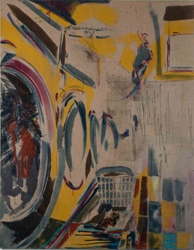
 One can almost forget that he has space for much else as well, including yellow, red, the linen's soft tan, and especially white. They share a watery texture and acid brightness, with the blue itself closer to denim than the sky. They seem less to have poured than run. That makes sense, too, because bluing is a commercial term for bleaching, so that clothing stains give way to brightness—and so that pale colors have the illusion of true color enhanced by white. And Goss found inspiration in an actual Laundromat, as Americans would put it, in West London. He could well have called the show, My Beautiful Laundrette.
Remember the movie, with real lives in less than fashionable and secure London? One can, with a little hindsight, see washing machines or dryers converging in a row, in exaggerated perspective, with a laundry cart by their side. Their doors appear again as near circles in an abstract grid, like pictographs for Adolph Gottlieb or indeed other work based on urban infrastructure by Tony Ingrisano. One can start to imagine other paintings as stepping inside the wash cycle, for what one title calls a Midnight Swim. Other titles offer a reminder to Add Bleach, Powder, or Cascade. Could that advice apply, too, to the artist?
A self-reflexive reading matters more than a literal one, and so does one's first impression of sheer color. A midnight rinse makes sense for a family-owned business as a meeting place for all hours and all sorts of needs, just as in the movie, but midnight has its own associations with deep blue as well. Goss reflects the current revival of painting as mixed media, between gesture and digital reproduction and between abstraction and realism. He takes only so much interest in his subject matter, whether as illusion or sociocultural particulars. His ultimate subject is a fluid process, much as he based sculpture on folded paper for a 2014 summer group show, and it works only to the extent that the colors become specters and the images become ghosts. Talk about cascade.
Much the same applies to Mariah Robertson, but with a greater lushness. Her repeated outlines push against one another like waves, in crests of deep color. She, too, situates the work between the appearance of poured paint, almost out of Morris Louis, and its origins as photograms. And she, too, situates the making of a work in time, in a process of multiple exposures. Like Goss with his salts and bluings, she even describes her medium as a "unique chemical process." Never mind that the same phrase applies to everything, from painting to a human life.
Robertson shares the show with Jennie Jieun Lee, who makes ceramics a messy process as well, replete with surface damage and colors. Ceramics as clotted abstraction is trendy, too, as with Arlene Shechet. Craft is in, at least when it looks sufficiently arty. Robertson, though, gets far more from her disciplined compositions and raw color. It bursts out, one exposure at a time. Am I blue?

Amy Sillman ran at Sikkema Jenkins through March 12, 2016, Frank Porcu at Lodge through February 19, Lauren Silva at Zieher Smith & Horton through February 6, Carolanna Parlato and Sandy Walker at Elizabeth Harris through February 13, Nick Goss at Simon Preston through February 21, and Mariah Robertson and Jennie Jieun Lee at 11R through February 7.


