4.9.25 — Passing or to Come

In 1924, eleven years after J. P. Morgan’s death, the Morgan Library opened to the public. His son relied on it too little to keep it to himself and respected it far too much. Its outreach has grown ever since, from galleries where Morgan once had his home to the garden where visitors can imagine walking beside him.

The Crusader Bible's Saul Defeats the Ammonites (Morgan Library, c. 1250)It still has the feel of a private treasure that they, too, can call their own. A nook out by cafeteria has children’s books for those too young and too in love with words to prefer high tea. It may have lost its serenity and dedication since Renzo Piano added an atrium, but now another presence walks alongside you as well, Belle da Costa Green.

Jack Morgan rehired his father’s personal librarian and appointed the Morgan’s first African American director. Did you know that they were one and the same? If not, you are hardly alone. In her own time, Green passed for white. An exhibition calls her “uncompromising,” but was it a compromise or an act of defiance? For its centennial, the Morgan seeks “A Librarian’s Legacy,” through May 4.

The Morgan’s anniversary celebration began with a display of Morgan’s Bibles and, in delicious counterpoint, Medieval money. And surely anyone who worked so closely with a wealthy man who fashioned himself a scholar had to respect his tastes. And, sure enough, “A Librarian’s Legacy” gives due space to illuminated manuscripts like The Crusader Bible. It shows off not one but two Rembrandt prints, including one long known as The Hundred Guilder Print for its public presence and its cost. Still, she plainly exceeded Morgan’s scholarship and shared his tastes. This was not a compromise but a true collaboration.

How, though, did Belle Marion Greener, a black kid from Washington, D.C., become Belle da Costa Green? And how did she become the librarian of an outstanding collection while still in her twenties? The curators, Philip Palmer and Erica Ciallela, give her both the museum’s most prominent galleries—the first for her story and the second for her work. Born in 1879, she grew up in the north of the city, closer to Howard University, the historically black college, than to the Capitol. Still, her father, headmaster of a segregated school, was the first black graduate of Harvard, and her mother’s family valued class and education as well. They had a society wedding.

On their separation, her mother took her to New York and changed their name. It was a new life, with bustling streets and a picnic up the Hudson. She served as librarian at Princeton before leaving for Morgan in 1905, while its Charles F. McKim building was still underway. Still, it was the age of Jim Crow, public lynchings, and racism that embraced its name. A photo by Alfred Stieglitz shows Jean Toomer, a leader in the Harlem Renaissance who became a Quaker and left for rural Pennsylvania. Passing, it seems, is what you make of it.

Greene made the most of it, and the press found her irresistible for her achievement, good looks, and fashionable comportment. So did such photographers as Charles White, who shows her profile, her head duly raised. When she lets her guard down for a smoke, that was a pose, too. The show’s second half centers on her imposing desk, but she did not sit still. She took her expertise and selections from the Morgan to New York’s Public Library and the 1939 World’s Fair. She oversaw conservation of a work after Botticelli that hung and still hangs among lesser Renaissance paintings in Morgan’s study.

Just what, though, did she contribute? The show has plenty of evidence, including ledgers and a library card, but few answers. Past shows have slighted her in favor of Morgan and present-day curators, but still she has her range, from the Middle Ages to twentieth-century work that her patron might never have swallowed. She thanked Abraham Walkowitz personally for his 1913 Human Abstract. And, in her own less than obvious way, she had her race. Years before, her father had appeared with Frederick Douglass in a print of leading black Americans, and one of her last acquisitions was a letter from Douglass, before her death in 1950.

Read more, now in a feature-length article on this site.
4.7.25 — A Buddha Nature

Does a dog have a Buddha nature? A Zen master’s no was brief and clear, but then who knows what else a dog might smell on a street near you?

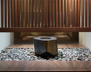
Then, too, nothing is unequivocal in a koan—or in a thousand years of Japanese art from the Mary and Cheney Cowles collection at the Met. Its real and promised gifts are substantial enough to fill ten rooms off the museum’s Asian wing and its Chinese art, space enough to give a folding screen, a book, or a single scroll an alcove to itself. Isamu Noguchi's Water Stone (Metropolitan Museum, 1986)Sculpture alone could make you feel that you have entered a darkened temple or a tea house, with nowhere to stand apart from its guardians. An arrangement without regard for chronology may make you wonder if anything has changed or can ever change, until, that is, you stumble onto the present.

The show opened just days after a rehanging of the galleries for Chinese art right next door, to feature painting and calligraphy—often as not meaning poetry, and I work this together with my earlier report on that art as a longer review and my latest upload. And the show’s title promises to separate the three, as “The Three Perfections,” through August 3. Yet nobody’s perfect, and the Japanese insist on it. Think of Buddhism as the way to peace? Here the very first sculpture, a god, bears a sword to protect enlightenment from the likes of you. Another deity has a “wisdom fist.” And yet wisdom itself cannot transcend human imperfections, for all its resounding no.

Seekers of enlightenment still debate Zhaozhou’s no. For the Met, no means no, but could the Zen master have meant only the common image of a dog as a lowly creature? For a believer, everything in this world has a Buddha nature, and a dog has only to realize it. No wonder the sternest of guardians have a wider nature. In statues, the gods frown, but their robes flow freely, and gold enhances every fold. Nothing here is immune to delight, where even a stone for the artist’s ink may bear gilding.

Zhaozhou himself says nothing in what I hesitate to call a portrait in the Cowles collection, nine hundred years after his death. In a screen to his left, a bird rests on a tree looking gloriously upward. To the right, more lowly birds seem almost comic figures—but then the sage looks eccentric, too, with his scraggly beard and a knife, perhaps a writer’s tool, fallen to the ground. Here no means yes, and yes means yes to the world you know. Chinese art flaunts its connection to the past, with reverence. Here everything enters the present.

A black stone fountain, set on white pebbles, conveys a felt peace and physical motion that even the ancients rarely knew. It is not a recreation of a long-ago tea garden, but sculpture by Isamu Noguchi from the Met’s modern wing. Calligraphy itself looks to the past for an artist’s present impulse. Japan adopted Chinese writing for a phonetic alphabet of less detailed, freer marks, and an artist had to learn both. Wall text displays a poem as thirteen Chinese characters and again phonetically, from the Japanese, as two full lines. But then, as a translation has it, “our joy is limitless.”

The Japanese writing system may appear separately, in graceful curves or as little as three letters and a spot of ink. Or the systems may blend into one another and into realism. Those curves adapt easily to stones, streams, and flowers. A single scroll may combine writing, patterning, and flowers. One god rests on a lotus, where attendants bring their presences and shadows as well. Who needs another wooden god with eleven heads?

When China enters the eighteenth century, its nods to the West speak of an empire’s decline. Japanese art is just getting going. A scroll of “immortal poets” gives them individuality and a sense of humor that Chinese art never felt. A growing emphasis on color allows trapezoids that add perspective, although not Europe’s linear perspective. It also allows a story, like the eleventh-century Tale of Genji, to unfold in an enormous folding screen. Like views of Edo from Hiroshige, at the Brooklyn Museum, it could take place in a far older landscape or in Tokyo today.

Noguchi himself invites contemplation of both past and present. Water Stone could be a found object or painstaking carving, with an eye at once to tradition, Modernism, and Minimalism. Water from this fountain does not spout up but rather ripples off the black tabletop onto white stone. A blond wood screen descends to maybe shoulder height. It sets the space of the ceremony apart from the viewer, who can nonetheless linger and belong. The work presents a complementary view from the other side, obliging a second encounter after a prolonged exposure to Japanese art.

I shall never get over my suspicion of a museum’s catering to collectors in exchange for gifts. I cannot easily explain this show’s arrangement—or a title that its wealth of materials hastens to ignore. It also includes a glass deer from Kohei Nawa in 2011, an oversized paperweight that I should just as soon had never appeared. Then, too, there is no challenging Chinese painting, calligraphy, and poetry. That is why Japan took it as a model. Still, neither is there challenging Japan’s thoughts of transcendence and its all-too-human refusal.

Read more, now in a feature-length article on this site.
4.4.25 — Control Freak

Piet Mondrian at the Guggenheim makes a fine introduction to a classic of modern art. Still, with only thirteen works, it can be little more than an introduction—especially when it comes to the stern, lively, off-kilter abstract paintings that made him someone to remember.

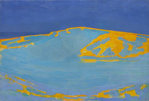
As I noted last time, you can look back to Mondrian’s 1996 retrospective and my review then, which looks further, too, at the significance of works in series within modern art. Allow me, then, an excerpt, with links to more. Piet Mondrian's Summer, Dune in Zeeland (Solomon R. Guggenheim Museum, 1910)

Maybe I am imagining it, but it does not hurt an artist’s rep if the name begins with an M. Monet, Matisse, Miro . . . but Mondrian? Yes, indeed. The painter known above all for his austerity has taken everyone by surprise, including the critics. They have found the exhibition at New York’s Museum of Modern Art a little less deep and a lot more fun than anyone could have expected. Mondrian turns out to be as joyful and decorative an heir of Monet as anyone could want.

I am not (altogether) joking. The reviews could well have been written in collaboration. They start with Piet Mondrian, unmarried at his death, with the thin features and wire spectacles of a European schoolmaster. Could this man, they marvel, have delivered the flash of a painting called Broadway Boogie-Woogie? The museum’s own bookstore managers panic at keeping up with the unanticipated demand snaking out the door.

I have to admit to the same relieved surprise. Mondrian’s work looks imposingly regular, its near-symmetry earned the hard way. A small square of primary color just balances a large square in another corner, which in turn could easily teeter over the edge of confusion without a saving black bar someplace else. Taking it all in is like holding one’s breath.

This show comes like one long, relaxing exhale. It begins with brooding landscapes and modern still life painted in Holland. In these and later paintings influenced by the Analytic Cubism of Picasso and Braque, outlines escape to take on an active life of their own. The delicacy of the lines resembles nothing in Picasso, however.

Also as in Cubism, the corners of the image appear to have dropped out. In this way, ordinary things and abstract forms can float, suspended for contemplation. The fragmentation slowly opens up Mondrian’s art to fields of calm, steady white.

In his best-known paintings, a firm rectangle returns, the areas of bring color expand, and the lines reach out to the painting’s unframed edge. Under their pull, the center no longer holds. Rather than enforcing symmetry, Mondrian kept on finding novel means to break it. He always starts with a form and lets his paint stretch it apart.

Later still, after the painter’s move to America, the color rectangles stay bright but grow smaller. They take on increasing activity, like blips on a crawl screen. Shortly before his death, they indeed come to recall the staccato accents of New York City thoroughfares. With the tribute of appropriation, Melissa Gordon even likens them to the front page of a newspaper

This show’s secret turns out after all to lie in that formula for a blockbuster. It asks that one reconsider why art sought the appearance of anonymity. It asks why symmetry breaking like his had such vitality. Paradoxically, modern art has depended for its color and variety on works in series.

Read more, now in a feature-length article on this site.
4.2.25 — Above It All

Piet Mondrian can seem above it all, and perhaps he was. His abstract paintings make no concession to the viewer—not the enticement of color or hints of people, places, and things. You must value them for what they are. They are not even “in your face,” like the sharp brushwork of Willem de Kooning or the nasty smiles of his women. In one of his earliest works, though, he really is looking down from above, as the earth and sea sharply curve away. Find your footing if you can.

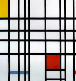
Mondrian’s planet leads off a focus exhibition of just thirteen works at the Guggenheim, drawn from the museum’s collection, through April 20. It is not an oval, no more than his Ocean four years later, in 1914, for it fits nearly and properly into a rectangle. He makes clear, though, that the painting reflects the curve of the earth itself. He is painting a dune in Zeeland, in his native country, where the ocean is never all that far away. Piet Mondrian's Composition in Red, Yellow, and Blue (Palazzo Grassi, Venice, 1921)He has come to the westernmost province of the Netherlands, also its least populous, but then who would dare populate his art? Patches of undistinguished color set off its elements. And then the warm blue of sea or sky looms up to fill out the canvas, much as Mondrian itself finishes off Ocean in monochrome.

He would never allow his subjects to divide a canvas, but he is still disrupting things. The Guggenheim has just two of his more famous compositions, from 1922 and 1939, their thick black lines containing and failing to contain upsetting fields of red, yellow, and blue. In one, the black stops just short of an edge and could well have begun elsewhere. Mondrian also turns squares to create diamonds, where the sense of cutting things off at the edge is that much more apparent. He may omit color altogether, leaving nothing to slow the collision of line and field, black and white, and yet everything is, pointedly, complete. It is, as he called his idea of an art movement, simply De Stijl.

It may not make compromises, but is it austere? Not when the colors and lines keep coming, and not when a diamond in black and white can hang high on the wall like the iconic monochrome of Kazimir Malevich in Soviet Russia. Not, too, when he could adapt to exile in New York with his late Broadway Boogie Woogie, now in the Hague. How did he get from Theosophy, an early interest, to jazz? How could he not? One could almost call his entire body of work a matter of theme and variations.

Is it consistently abstract? Not that either, although a modest success allowed him to quit work on still life. Still, he found his first mentor in an uncle, a still-life painter, and, like Georgia O’Keeffe, he drew both abstraction and single flowers. Like hers, they come alive from a point of view up close, which allowed him, he felt, to focus as ever on line and structure. A blue wash made some of them easier to sell, but color once again can seem incidental. Love them for themselves or as a step toward abstraction.

A selective show like this one can challenge what you thought you knew while summing up a career. But then a 1996 Mondrian retrospective at MoMA did both already. It came a long time ago now, not long after I began this long-running Web site. It changed my mind about him and allowed me also to explore whatever “theory” concerning Modernism was in the air. Allow me, then, not to begin over again, but to invite you to read on from the link just now. Here I focus on the Guggenheim in focus.

Just how, then, did Mondrian get to abstraction? The story does not run in straight lines, unless you count Mondrian’s black vertical and horizontal lines of varying thickness. His Ocean seems to mark a transition from his earthscape in Zeeland. He constructs an ocean from a dense array of black crosses, like piers, but also like his later black. A still life centers on a flower pot on a crowded table—and then a painting nearly identical in size makes the pot its sole clearly recognizable shape. Yet he painted both the same year.

Was this a constant back and forth or a turning point? There is no denying the primacy of his later abstract art, although he also called it Neo-Plasticism, for it, too, was malleable and changing—not uniform, but in balance. Still, look again at his earth view to see what was already in place. Its curves refuse a familiar point of view, much as the Mercator perspective in an atlas must squash a globe onto the page. Mondrian’s abstract art is a similar challenge to the single-point perspective since the Renaissance. It is his inhuman perspective on Modernism and New York.

Read more, now in a feature-length article on this site.
3.31.25 — Nothing Really Changes

Has anything changed in forty-five years on Daufuskie Island? Will anything ever change? One can only wonder on coming to photographs of black Americans by Jeanne Moutoussamy-Ashe at the Whitney, through April 27. She must be wondering herself.

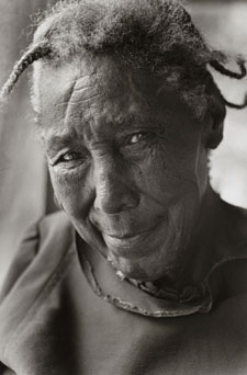
Jeanne Moutoussamy-Ashe's Lavinia (Blossum) Robinson, Daufuskie Island (Whitney Museum of American Art, 1979)Daufuskie was never an enchanted island, no more than the Deep South. For Moutoussamy-Ashe, though, it has become a heritage and a hidden treasure. Born in 1951, she published her series in 1981. Yet surely wedding parties still gather in their Sunday best in front of Union Baptist Church. Surely the bride still dresses in white, as does the bridesmaid walking discretely behind. Surely the men still fish in the warm air and turgid waters of the American South and still share their catch by boiling crabs. And surely Lavinia still smiles.

Or maybe not. Lavinia, known to anyone who cared as Blossum Robinson, was already getting on in years in 1979 when Moutoussamy-Ashe took her picture leaning so close to the camera that one could reach out and touch, and the community must have looked to her often for warmth and wisdom. The photographer began her visits to the island two years earlier and could hardly tear herself away. Still, everything comes to an end, and these are “The Last Gullah Islands.” They became a book, displayed along with thirteen photographs in the floor for the Whitney’s collection. It has a room to itself where Wanda Gág went on view last year, like an enclave from the fury and melancholy of America’s cities and early modern art.

African Americans came early to the Gullah Islands, and they, too, came for freedom and comfort. Former slaves acquired property off the coast of South Carolina after the Civil War, and they could fairly be proud of it. Moutoussamy-Ashe has a fondness for creature comforts herself and did much of her work for mass magazines. One can recognize the pyramid of wedding guests from any number of photos of weddings, graduation ceremonies, and extended families. It suits a place where family and community must easily blend together. She could not resist shooting another wedding, in Central Park, on her return to New York City—and, speaking of weddings, she married Arthur Ashe.

Much else, too, looks a tad conventional even in its modesty and misery. A ramshackle house and its windows barely hold onto a shutter or the wash on a line. “Aunt Tootsie” tends to her own wash while eying her children. A car with an impatient rider has blown out its windows, and a young woman leans up against a screen door that plunges her into near darkness. She becomes a study in introspection. Do I belong here, she might as well ask? Does anyone?

Still, not everything is magazine ready, and the questions keep coming. Moutoussamy-Ashe studied with Garry Winogrand, who knows the strangeness of people as much as anyone, and she became an AIDS activist when it counted most. Sometimes, too, convention does its job of keeping the past familiar. The Geechee islanders would have liked it that way. A boy carries the American flag at the head of a procession for graduation. Pride and patriotism belong to them, too.

Graduations, weddings, homes, and people—these are not portraits or events, but a way of life. It is not street photography where there are not all that many paved streets, and not documentary photography when nothing really changes. Is it trying too hard for human dignity? One could ask that about a lot of art right now, with its due celebration of diversity. Still, I can almost hear that smiling older woman, the folds in her clothes seeming to continue of their own accord in her wrinkles. Dignity is fine, but it’s me, Lavinia.

Read more, now in a feature-length article on this site.
3.28.25 — Control Freaks

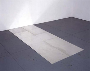
One more excerpt this week of this site’s rich history, after a look in depth last time at a work by at Rembrandt. If I may stop a tad short of the present in art’s history, I take you back to the site’s beginning. Carl Andre’s 1995 show was too good to be true. This was Minimalism as fine sculpture—or at least designer furniture. Its purity would outlast the passing tastes of a multimedia age, much less another weekend in Soho. The handsome, polished surfaces proclaimed no less, or did they?

Carl Andre's Tenth Aluminum Cardinal (Paula Cooper gallery, 1978)On a closer look, one could start to see why performance art and Minimalism grew up together. Both put the artist as actor right in the space. Both celebrate chaos while tormenting the viewer with blankness and boredom. Both challenge the community to a game, and the artist refuses to be the first to quit. And yet the community may find at last a gesture of welcome. Every so often I like to use this blog to excerpt an extended essay in review of a single artist and invite you to read more. Here I take you back to almost the beginnings of this Web site, some eighteen years before my home page even had a blog.

Entering at Soho’s pioneering gallery, Paula Cooper, I faced only the bare walls. At my feet, two broad paths curved slowly toward the far corners. I mistook their smooth, off-white paving for marble, but the actual cedar planks were hardly less refined. They touched at one corner, angled apart precisely to remap the room.

Clearly I was mistaken, too, in thinking of paths. A sign by the door forbid me to touch, let alone leave a footprint. For three decades, Carl Andre has made plain materials laid flat to the ground into his signature, and this time no one was going to efface it. He might as well have set his literal mark on woven paper, to be preserved behind glass. The alleged participatory art of the 1990s and “relational esthetics” may seem far away.

Careful not to nudge the curves one inch aside, I walked hesitantly forward, and the floor narrowed uncomfortably beneath me. Only another visitor stood between me and a dead end. As I looked at him and back at the door, I knew I stuck out. A safer part of the floor lay maybe a yard away. I considered jumping, but I might not make it, so I retraced my steps to the gallery entrance. The phrase “walking the plank” started to sound all too pointed.

In the modernist insistence on materials, Postmodernism has seen a reductive arrogance. They note the signature of the creative genius, the artist’s insistent control over the viewer’s experience. Feminist critics know, too, that “he” is almost always the right pronoun. To add injury to mythic insult, Andre may have caused his wife’s death. Yet as I leaned gingerly over the hard wood he had so lovingly prepared, I thought how different, how unpretentious, Minimalism once seemed—like a model for the subversive everyday art of Joseph Zito and Neo-Minimalism today.

From the first drawings scrawled on cave walls like graffiti, art has shouted, pleaded, seduced, and cajoled: “look at me.” Often it served kings and churches. Increasingly it had to please new wealth—or the artist alone. Either way, it said, “I control what goes through your head.” All that changed with the 1960s. It was time for artists and patrons to stand aside so that others could take a look around.

Now there was world enough and time to enter the experience of what one sees, and what you saw was what you got. With Tony Smith in sculpture or with Minimalism, even seemingly prefabricated art turned from the denotation of oil painting to the connotation of the everyday. Recall that man who stood between me and a dead end. He was really quite at ease, his back arched comfortably against the wall. Something made me too want to hang around. As I at last turned to go, he reached out his arm to welcome his girlfriend.

Read more, now in a feature-length article on this site.

« Newer PostsOlder Posts »