The Great Indoors II
John Haberin New York City
New York Architecture 2004: Heading Inside
Whatever happened to summer sculpture? It grew larger, like tall buildings, or smaller, like scale models. It slipped inside, where it blended into a gallery's interior architecture.
In a accompanying reviews, I began a summer survey with work that hid indoors in other ways, from carpeting by Rudolf Stingel to Janet Cardiff and George and George Bures Miller as they recreate Central Park as a plaintive voice and a vanished world. Other works, though, strive more overtly for architecture. They, too, ask how art has turned the urban environment into indoor representation, thanks to Andreas Gursky and "Tall Buildings." Its scale models of towers range all the way from London and the Far East to Lower Manhattan. The international cast suggests how, in today's art market, even New York has become a small corner of the global village. 
Through the roof
The trend to treat exhibitions as global villages began well before the summer. It had much to do with an increasingly vast, impersonal art market, not to mention globalization of other kinds. In 2004 alone, the international art scene spilled across two New York piers. A museum dedicated to American art exhibited other nations' views of America. The Chelsea scene had metastasized beyond into a mirror of urban sprawl, as if the more spaces art had, the fewer chances artists had to make a difference. Other open landscapes retreated to the scale of an artist's book.
Well before summer, too, artists learned to recreate indoors the sprawling architecture of contemporary art, what one show calls its "Burgeoning Geometry." Perhaps video and installation art always have. Now, however, artists have to face the formidable combination of exclusiveness and pluralism—what Jerry Saltz in The Village Voice has called art's Super Paradigm. Thomas Kuhn, the philosopher, had introduced paradigms in The Structure of Scientific Revolution. He meant models so powerful and pervasive that they constrain science's interpretations of the world—almost as much as Michel Foucault's epistemes constrain people and politics, not to mention a politics of architecture. In the art market, however, not even a revolution is super enough.
So super size me. Andreas Gursky's latest photographs blow up the human landscape with almost frightening skill, like the inhuman landscape of Darren Almond. Those who saw his retrospective at the Museum of Modern Art may remember its chilly grandeur. Like Thomas Struth, he learned from Bernd and Hilla Becher to study urban vistas. However, the older photographers' patient documentation, water tower by water tower, shows the city as a ramshackle, human product, much as David Goldblatt, Jo Ratcliffe, or Zwelethu Mthethwa does in South Africa. Like those of Jeff Wall, Gursky's institutional façades and interiors erase their own creators, not to mention the occupants.
Even the Bechers' city, without landmarks or life, has a human scale, like the studio views broken across frames by another German photographer, Barbara Probst. The American Realism and American stories of John Sloan and others, too, found a city in its rooftops. Gursky, in contrast, looms over even the largest spaces from an all-encompassing, seemingly impossible point of view. The Bechers project a city as continually unfolding, even as the source of its most precious resource seems always about to crumble. Gursky packs all the world into every frame, as if the photographer had morphed into a digital network, with byte-sized people. In short, he and his teachers rest precariously on opposite edges of the modern/postmodern divide.
Gursky's latest exhibition, of just ten large color photographs, looks more superhuman than ever. His scale and patience for that one shot, if anything, have grown, but something has changed in the process. He covers the globe, from Asia to the Americas. He moves outdoors, to cattle farms. He embraces the fear staring out from a prison or the mob scene of a Madonna concert. People matter now, but their aims have become almost unrecognizable in return, and so have the place and subject of photography.
Gursky delivers an unnerving sequence of discoveries. What looks at first like an abstract pattern locates itself in the familiar. Its apparent structure vanishes, only to become subject again to the artist as control freak. A still younger photographer in the tradition, Christoph Morlinghaus, at least brings the banality down to earth. What makes it so compelling and yet far from final is that the control seems entirely real.
What's in a name?
Perhaps the greatest outdoor sculpture ever remains the New York skyline, even before Christo's The Gates colors it saffron, but this summer even that turns first into a colossal fantasy and then into an installation indoors. In one of its farewell exhibitions, along with Lee Bontecou, MoMA QNS offers futuristic architectural models. And, as usually happens with art, the future is already here—whether one likes it or not. Not all of "Tall Buildings" will make it taller than four or five feet, but enough have already done so to shake up anyone's idea of home.
The element of fantasy begins with a name. Santiago Calatrava calls his design Turning Torso, although it looks more like a traditional skyscraper failing a wind-shear test. Television Tower, by Rem Koolhaas and Ole Scheeren, echoes the heavy glass rectangle of a picture tube. Londoners may smile at Norman Foster's tapering East End skyscraper, which remains only partly occupied and which everyone calls the Gherkin. But dare I call it a phallus—or a vibrator? It is earning too much respect for a critic's cheap shots, and in the London scene the best jokes are in galleries anyhow.
Names matter. In art's Super Paradigm, everything needs a brand name. No wonder the trend has spread to architecture. No doubt the trend began years ago, when the Empire State Building meant more than the name of a property's owner. But it has taken on new urgency in the global city.
Once, very much concerned to impress someone special by showing off my home town's high points, I pointed to that midtown east tower known as the Lipstick Building. But it doesn't look at all like lipstick, she said. Not yet a writer but already a know-it-all, I found myself at a loss for words. I have had more practice as an art critic, but impressing women is something else again. Then again, what do men know about lipstick?
She was right, too. The pink monster has an oval rather than circular cross-section. One ought to call it the Deodorant Building. Perhaps someone had and then thought better of it. A mild provocation, followed by extra measures to preserve the architect's fame and dignity, would suit Philip Johnson's career.
These days, however, it would be the Deodorant Building. Stylized outlines have become the norm—and so has the marketing savvy to go with them. Could the winning design for Ground Zero have succeeded without the handle of a Freedom Tower? A competing proposal, by United Architects, has a broad base and sharp taper, topped by a thin, circular tower for, no doubt, the privileged few. If only the architects had the sense to call it the Single Malt. It might be winning the support of a Republican mayor, governor, and president right now.
Looking down on architecture
The vogue for naming skyscrapers, often in conjunction with unusual shapes, does more than contribute to their identity—and a city's. The names amount to branding in another sense as well, as marketing tactic. One has to get these things built, shepherding them past clients, competitions, zoning authorities, experts on wind shear safety, and the political winds.
Artist renderings have much the same function, of course. They convey sunlight, trees, open space, and a comforting degree of pedestrian traffic that could never conceivably exist. They favor light colors that wash out how much an overpass will cut off an avenue's vista. Like Zaha Hadid's paintings in bright red, they deny how a column of steel, glass, and stone will weigh down upon a public plaza.
Scale models help sell as well as envision a plan, too. "Tall Buildings" has no interesting in hiding the fact. Rather, like a diorama in traditional art or for Lori Nix and Kathleen Gerber, it celebrates the gap between model and reality. The huge room of scale models adds up to one large installation. Its "unreal city," to quote Charles Baudelaire via The Waste Land, would have frightened and thrilled the poet of light and darkness in equal measure. One realizes that, just as looking at a painting takes imagination, skill, and experience, so does evaluating a model. And one learns the advantages of forgetting for a moment what one has learned.
Plans for urban architecture, from prefabricated homes right down to New York's High Line, always redouble Modernism's utopia, even before installation artists like Phoebe Washburn build a model city to the point of its own ruins. The artist's dream combines with the modernist ideal of reinventing a city, literally, from the top down. And one does see these models from the top down. Taller than any Lego set I ever imagined as a child, they nonetheless maintain a human scale, even on waist-high pedestals. Calitrava's monster of twisting materials would no doubt make for an unbearable experience. Here, it can look as delightful, as disorienting, or as foolish as an overgrown child's toy—or, dare I say it, as art.
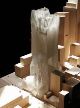
Some versions artfully bring out the nature of a model itself. Norman Foster's infamous Gherkin in overgrown miniature all but sheds its iconic green skin. It focuses on the underlying lattice of steel, rendered here in white. Others just settle for piling on the scale, much the way some obsessive artists have been using networks of tiny, modular materials. A tower for The New York Times, partnering Frank Gehry with David Childs (of Skidmore, Owings & Merrill), could pass, appropriately enough, for a recycling container bursting at the seams.
In life, the same arching framework might leave too much space for glass and too little for daylight. With Japanese architecture today, it could rebel against a framework as well. Here one sees only the fussiness of a frame. But then, "Tall Buildings," paradoxically enough, is all about forgetting to look up.

Andreas Gursky ran at Matthew Marks through June 26, 2004, and "Tall Buildings" at MoMA QNS through September 27. The second part of this article discusses 2004 summer sculpture, including Franz West, Peter Wegner, and Rudolf Stingel with his carpeted Grand Central Station. I turn again to a decade in architecture in 2020.


