When Painters Knew
John Haberin New York City
Spilling Over: Painting Color in the 1960s
Adolph Gottlieb
When the Whitney displays art from the 1960s as "Spilling Over," it is not just talking about poured paint. It means, too, the sheer pleasure of painting in color, the kind that spills off the canvas and up against the senses. Can that pleasure survive the decade's belief in modest means and shaping geometry?
The display is all about limits and their transcendence. It sticks to just eighteen artists, each with a single work from the museum's collection. Many have sat in storage now for more than twenty years. Only eight of the artists are white and male, to make the case for women and people of color as defining what it meant to spill over.  This may have been the last time that painters thought they knew just how to paint. Along with a similarly modest and ambitious survey of Adolph Gottlieb in Chelsea, it can have you believing, if only briefly, that they were right.
The sky's the limit
The 1960s were not yet painting's darkest hour, but rather its lightest. Artists after Helen Frankenthaler were thinning paint in order to pour, and with Minimalism it could vanish entirely, leaving only the support and the room. Artists like Mary Corse and Robert Ryman dealt in white on white, and a West Coast movement along with Corse dedicated itself to Light and Space. Others entered the light in the pixels of video art and the body in performance. Before anyone knew it, many had declared painting dead. By the relentless logic of late Modernism, it almost had to be dead, in order to be reborn as painting.
For the Whitney, though, painting was very much alive, in living color, with more of the Whitney's collection a floor away. A title like Triumph of Bacchus, by Bob Thompson, speaks proudly of pleasure and excess. Bare silhouettes in yellow, red, and orange pop right out of the lush green of a forest and grassland. The figures make no bones about their nudity or gestures toward open sky. Still, as bacchanals go, this one is relaxed and stately. No one looks all that drunk, a bird flies toward what might be a beating heart, and even a giraffe looks well adapted to an agrarian civilization and to art.
Thompson's flat colors and slow dance look back to Henri Matisse, while his blue and green animals recall the Blue Rider group in Munich before World War I, including Wassily Kandinsky and Franz Marc. If that were not enough to marginalize Thompson as a primitive or a throwback, he was also black. For advocates of "pure painting" on the one hand or African American identity on the other, he was out of touch. Black abstraction faced much the same dilemma. For Emma Amos, "Every time I think about color, it's a political statement." Was it really, and was anyone listening?
The curator, David Breslin, has his dilemmas, too. He has to recognize the diversity of painting in color, including representation like Thompson's. Alex Katz fits right in, with a cutout of Edwin Denby, the dance critic. As always, Katz links color for its own sake to Pop Art, while cutting across the arts. Wall text looks for evidence of landscape in Frankenthaler and Marcia Hafif, although that takes some doing for both. Still, the very subject for Frankenthaler, stacked color fields, links her work to the physical presence of a mesa or female torso.
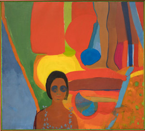
Even more, the museum wants to recognize art's expanded field in the present. Amos was the sole woman in Spiral, the 1963 arts alliance with Charles Alston, Romare Bearden, Norman Lewis, and Hale Woodruff in New York. She is also new to the Whitney's collection and, I suspect, to most visitors. A second recent acquisition introduces Kay WalkingStick, a Native American. Both represent themselves against irregular shapes much like Thompson's—and with the same mix of bright and mute colors. WalkingStick has her evidence of landscape, too, in a blue painting behind her that could pass for a window, because here the sky's the limit.
At the same time, along with broadening the canon, the show has to pull off a narrowing. Subtitled "Painting Color in the 1960s," it has to represent a decade of the art object as an end in itself. And then it has to identify that end with an intensity of color. Color as delight may suggest Western art's lightest and most decorative period ever, the Rococo. The selection has to prune away the excess, much like Thompson in taming the god of wine. How it navigates the dilemma renews the very notion of delight in art, with lessons for the present.
Narrowing and diversity
Aiming for diversity, it turns out, is the easy part. Amos appeared only recently in a show about Black Power with a full floor for abstraction, as did Sam Gilliam and Frank Bowling. Just over two years ago, the Whitney offered a retrospective of Carmen Herrera—that, too, a recovery, for a woman past one hundred. Right off the elevator, Herrera treats the division in a tall diptych as the base for a slim green rectangle. It becomes a second cut, affirming and disturbing the limits of the canvas. And Frankenthaler did introduce Morris Louis and others to poured acrylic.
 What, though, about the narrowing? What could conceivably make the show about color, when Herrera works mostly in white, and almost every artist of any era works in color? One can forgive pretty much any excuse for a focus on the permanent collection, much as with exhibitions of Constantin Brancusi and Joan Miró at MoMA. The Whitney's move to the Meatpacking District was supposed to be all about finding space for just that. And the eighth floor's skylight is perfect for a display of light and color. Museum lighting can easily bleach out the unprimed canvas in Frankenthaler or Louis.
Still, a creative narrowing does appear in what the show leaves out. It avoids Frankenthaler's more wide-open gestures, with their links to Abstract Expressionism. It has color mixing in Richard Anuszkiewicz, but not the bolder optical illusion of Bridget Riley (who, of course, was British). It has the blinding color of Miriam Schapiro, before her work with Judy Chicago and the Feminist Art Project, but not the gentler hues of Agnes Martin. Wall text situates the work in color-field painting and Op Art, but it does not so much as mention Minimalism. Then, too, there is what the narrowing leaves in.
It has Frank Stella between his black paintings and shaped canvas, so that nothing distracts from color in two dimensions. It has Kenneth Noland on a scale of fifteen feet across, where the stripes of varying width play out against each other—and a white stripe against the bare ground. It has Josef Albers in red, with none of the dryness of many an Homage to the Square, and Ellsworth Kelly at his brightest, too. Much the same red dominates a Septehedron for Al Loving as well. Robert Reed adopts a broad brush for his blues, so that they both embody and represent brushstrokes, much as with David Reed (no relation) many years later. Gilliam's unstretched canvas hangs against the wall like a hammock, so that one can almost nestle one's head into its stains.
The diversity should still have one asking: how has it changed the dialogue between pleasure and formalism? Apart from Loving, the black artists run to murkier colors and more representation—and Loving's echoes of the picture's edge are more intricate than Stella's and more at home with illusion. Bowling's blur multiplies the shape of South America, to honor the African diaspora. Amos and WalkingStick bring a self-awareness to their self-representations, with wide eyes like Jackie Kennedy sunglasses for one and daubs of paint for private parts in the other. In a show about intensity, they add nuance.
They can hardly help placing the 1960s in context of today. They could not have appeared at all alongside Stella in the show that launched the decade, "Sixteen Americans" at the Museum of Modern Art. (That show had just two women, Jay DeFeo and Louise Nevelson, although group shows from Alan Solomon at the Jewish Museum soon brought more.) The whole idea of spilling over sounds rather like art in the present, when anything goes. Try to imagine a survey of this decade with just eighteen artists or sixteen Americans. Still, painting today could stand a little pleasure, a little narrowing, and a vision.
The silence and the splat
Kapow! Splat! Roy Lichtenstein might have added those words to a speech balloon, exclamation points intact. And while he never did, they could supply the soundtrack for the entirety of Pop Art. Then, too, they could have run through the mind of street artists after Jean-Michel Basquiat leaving their mark with a vengeance. But Abstract Expressionism? No way.
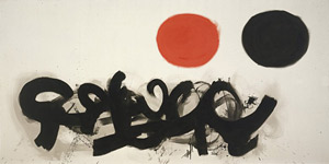
No way, that is, except that Adolph Gottlieb brings them to mind in painting after painting, only starting with one called Blast. Like most artists then, he made his name with a signature motif. (Willem de Kooning, with his alternation between raw women and smeared abstraction, came with an exclamation point all his own.) For Gottlieb, that meant a vertical format and a defiant pairing. Often a single color field, close to a circle, floats well above a mess of brushwork, like signs in a private language. Each in its own way lands with a splat.
The floating color approaches that of larger rectangles for Mark Rothko, a close friend and co-author of a manifesto for Abstract Expressionist New York. Gottlieb's colors cannot match the depth of Rothko's, the invitation to contemplation, or the later turn almost to black, but they have gradations to die for, especially at their edges, like halos. They might have landed on the canvas and spread out on their own. As for the bottom half, Gottlieb might have flung an entire pot of paint at the painting—and (to borrow from John Ruskin on J. M. W. Turner) in the public's face. Crossing smears really do have the flavor of graffiti, and their recourse to black has later echoes in Jean-Michel Basquiat. They could turn up in any number of artists today equally versed in comic books and the revival of painting—along, of course, with Kapow! and Splat!
Painting could be effacing itself or "under erasure," as demanded by Jacques Derrida, the French philosopher. Critical theory, when in fashion, also liked to think of art as text even when the artist lacks for words. Four rectangles at the top of one painting, with rounded edges and the addition of white, could pass for a mathematical formula, with the smallest a minus sign. A down arrow blatantly refuses "this end up." Gottlieb, though, is looking not so much ahead as back, to the symbolism and Surrealism that Rothko and Jackson Pollock were leaving behind. It helps account for why he often lives today in their shadow.
More than they, Gottlieb nurtured his ties to tradition, as in an early still life. Like Barnett Newman two years younger, he was a New Yorker in a Jewish family. Born in 1903, he was also older than Arhshile Gorky, the movement's tormented elder statesman, and studied at the Arts Student League, where Hans Hofmann ruled the roost. He visited Paris and spent much of his trip in the Louvre. He moved later to Provincetown, and the division of his canvas suggests a horizon line in landscape, for all his dedication to abstraction. The lower symbols sometimes gather into a dark sea.
With just over twenty large paintings, his gallery cannot offer a retrospective, which is not a bad thing. It sticks mostly to his and the movement's peak years in the 1950s, with seven museum loans. A great artist will never look this good again. It shows Gottlieb's constant play with and against his signature, as the color fields morph into symbols or the busy brushwork into fields of paint. He has turned his own art upside-down. Like his contemporaries, such as Pollock with drips or Newman with his "zips," he had the ability to sustain at once the serenity, the silence, and the splat.

"Spilling Over: Painting Color in the 1960s" ran at The Whitney Museum of American Art through August 18, 2019, Adolph Gottlieb at Pace through April 13. A related review looks at an early still life by Adolph Gottlieb.


