Abstraction's Way Out
John Haberin New York City
Ida Kohlmeyer, Ana Tiscornia, and Kate Shepherd
More than a century ago, Hilma af Klint devised her own higher mathematics on her way to modern art. With her cryptic and colorful symbols, she may have created the first abstract paintings.
Fifty years later, Modernism was dominant but aging, and Minimalism at once affirmed the norm and challenged the very idea of heroic abstraction. What you saw was what you got, and it might not look like art. And Ida Kohlmeyer responded with a symbol system of her own. Was she abstract painting's future or looking for a way out? It has been looking for both ever since. With her, Ana Tiscornia, and Kate Shepherd, it does so with seemingly minimal means and in the hands of women. 
Symbols without Symbolism
As galleries reopened (cautiously) in the face of Covid-19, I kept hearing the same wistful refrain: this or that show had only just opened when it had to close. The very last show at the Met Breuer, a retrospective of Gerhard Richter, departed with few to say goodbye. Imagine the deferred hopes of less famous artists and their dealers. Now that painting is back big time, crossing genres and media, the silencing of less over-the-top abstraction took on an eerie relevance. So, too, did the silencing of women.
Hilma af Klint and Ida Kohlmeyer may have seen art's future, but they were looking to their own future as well, as women and as artists, at the price of standing apart. Kohlmeyer called several works Cloistered, but the term could apply to both. For many, af Klint's 2019 Guggenheim retrospective came as a revelation, and Kohlmeyer appears at a gallery that specializes in overlooked artists with roots in Abstract Expressionism, like the women in "Perseverance." Not that Kohlmeyer was unaware of the "New York School," only not in New York. She studied with Hans Hofmann in his last years in Provincetown, Massachusetts, well after he taught Lee Krasner and Jackson Pollock here in the city. Mark Rothko became a mentor, while finding a studio in her New Orleans garage.
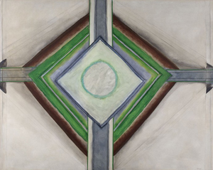
Born in Louisiana in 1912, she pursued an MFA only in her forties, and she moved back to her hometown as a professor and an older woman. No wonder she falls just outside the textbooks. She did not make a point of gender, but nuns live in cloisters, too. If that invites religious readings, af Klint had described her more ambitious work as a temple. Still, like so much of her time, Kohlmeyer seems anything but mystical, even in her visions. Circles, stars, and arrows are what they are, although seemingly in motion. Arrows point outward, bursting the confines of the canvas while affirming art as object.
The show sticks to work from the late 1960s, when the art object was on the spot. She could treat painting itself as sculpture, with stacked cubes and a four-pointed star in wood resting on its two-point base. She had adopted cloud-like colors, under Rothko's influence, but she dropped the soft edges in favor of a clear, hard geometry. At the same time, she was turning her back on Minimalism. Rather than flatness and denial of illusion, she favored overlapping forms and shading. Whatever it was that she had discovered, one can almost touch it.
Was it a woman's body, with symbols for its felt sensation? af Klint, who had her own Star, also called a work Eros, but one may never know for sure. Philosophers like Ludwig Wittgenstein argue that there is no such thing as a private language—in the sense of a language accessible to oneself alone. Art is unique though, in being both public, because others can see it and give meaning to it, and private, because someone made it. You may find it fussy, but she may not care. It can seem derivative, in its insistence on abstraction, or merely obscure, but it was increasingly her own.
Symbolism in the nineteenth century was something of a misnomer, for dark narratives by Gustav Klimt and others with little in the way of writing. af Klint worked her way out of it by taking the term literally. Symbols appear as signatures and as gestures in Abstract Expression as well, as in Adolph Gottlieb, Franz Kline, or Bradley Walker Tomlin. Kohlmeyer simply foregrounds them and gives them a life of their own. These days, one may associate them with the breakdown of language in outsider art, while artists like Karla Knight can treat outsider art as a playground. Kohlmeyer, who died in 1997, takes her symbols seriously indeed, and it is up to you to decide whether the arrows will pierce your heart.
The space between
Art today can seem all about excess, even after the male theatrics of Mike Kelley and other bad boys. With the return to painting, including women in abstraction like Vivian Browne and their "Labyrinth of Forms," the most disciplined of abstract art can entail big gestures and coarse objects, optical richness and crowded narratives. Visitors to this Web site will have seen them all. Still, for all that, older artists often command silence, even as their recovery gives them a voice. It can be silence within the work as for Mary Corse, Agnes Martin, and Vija Celmins—or silence from you. For Ana Tiscornia, it demands attention to quiet spaces between works, too.
 Of course, there is poetic justice in both trends. Emerging markets necessarily run to excess, and no end of rising stars are clamoring for attention. Meanwhile too much of the past, including art by women, has been passed over with hardly a word. (Thumbs up to a Nolita gallery for recent shows of Merrill Wagner, Regina Bogat, and now Lynn Umlauf.) Both trends, too, the excess and the restraint, can become formulas, with no end of shows that look awfully familiar. Even Tiscornia's scrappy work amounts to scraps, like leftovers, and one could easily pass them by.
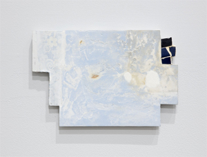
She works small—smaller still if one takes into account the number of elements within a painting. They may look like scraps of fabric, although she works in acrylic, pencil, and plaster on paper and wood. Only the occasional floral pattern interrupts their near monochrome and baby blue. They hang reasonably well apart and at irregular heights, as left there by accident. They refuse to cover the gallery. At the same time, they are refusing to stay in place.
They could be fragments of a single work in progress, and that larger work could be the gallery itself. The floral patterns suggest wallpaper, while the plaster suggests the underlying wall. The wood includes dowels rescued, no doubt, from used furniture, if not from Joseph Cornell. If the paintings can pass for interiors, they could also stand for banisters. Like Cordy Ryman, Tiscornia bridges painting, drawing, design, and architecture—which is to say another kind of space between. She speaks of her architecture not as a building, but a coming apart.
The coming apart could be autobiographical. Tiscornia, in her sixties, has moved to New York from Uruguay, and the sense of displacement and dissolution could have political overtones as well, right down to the show's title, "Left, Right, and Center." Still, her art remains abstract rather than argumentative. One should not make big claims for it either, but no matter. It speaks most loudly in its well-worked surfaces, especially the plaster. It has the restraint of Minimalism in the Americas, but with room for gestures.
To turn for a moment to a man, Roger Tibbetts likes well-worked surfaces in a mix of media, too. Born in 1949, he also works mostly in black and white. Even large painting looks minimal, despite its deep blue and lack of symmetry. The most obsessive working leaves holes in the surface, like stars in a constellation, while the blue could represent the sea. They could be fragments of a planetarium or a natural history. Modest claims can sometimes suffice.
Seeing yourself in paint
They sure do for Kate Shepherd, who works within the shallow space of paint, but with more than enough room for two. One can hardly help joining her there, even with nowhere to stand and nothing to identify it or to call one's own. The temptations begin from the moment one enters her spacious Chelsea gallery, with over a dozen near monochromes rich in color. They would be tempting enough taken as a whole, even without a glimpse of several more in a room to the side or just around the corner in back. You will want to come closer, too, if only to see how she does it. It is less obvious than first appears.
The short answer is layering. Even blues close to black may contain yellow and red, visible just beyond the surface on the side, much as bright colors pour out from even the darkest Veils by Morris Louis before her. The layering extends to the support itself, wood thick enough to show the variations in light and dark of plywood panels. Shepherd positions herself within late Modernism, including the idea of art as object—an idea visible in the choice of paint as well. Where early Frank Stella ditched oil for house paint, she works entirely in enamel. The longer answer lies up close, in the variations within a surface.
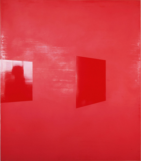
Some areas are reflective, with the hard edges of a tilted square. Adjacent or surrounding areas have a greater softness, much like oils, but not owing to another medium. Rather, she has sanded away the gloss, before applying and sanding some more. Monochrome as excess has a history, too, as with Robert Ryman, Gerard Richter, Anne Truitt, and later Mark Tansey. Yves Klein even got to trademark his blue, but Shepherd is not on an ego trip—not when she can invite you in. Still other paintings have passages of light and dark and a rich grain, suggesting further hand labor, but that is deceptive as well. These paintings began as photographs, and the grain is the stippling of the digital and of a silkscreen. 
The lights and darks bring home the uncertain space, but it is there in the geometry as well. The tilt suggests perspective, of what might be walls, mirrors, or windows. And those are reflective, too, much like vinyl for Juan Uslé or enamel. It does not take long to see the space as architectural—and a luxuriant space at that. Either Shepherd can afford quite a studio, with windows the length of a wall, or she can turn her camera on the gallery itself. The glossy squares could also be paintings, and she leaned paintings against the walls for her photographs.
One way or other, this is also art about art, right down to the hoary metaphor of a mirror or window onto reality. Illusion enters to the point that, from a distance, one might mistake at least one parallelogram for painting on the side of a panel. It would also be art about you, if only because it is about seeing, but you can see yourself reflected in enamel—until, that is, you move. Shepherd updates her Modernism for a time of the observer as observed and cameras everywhere. Still, it is not threatening, even with "Surveillance" as the series title and Eavesdropper as a painting (the only one with a clear person). The paintings welcome one in.
Western painting placed itself in the shared space of the viewer well before Minimalism. It put viewers on close terms with a portrait sitter or made them worshippers. Diego Velázquez leaves viewers dazzled and at sea with the mirrored space of Las Meninas, and Jackson Pollock tangles them in his drips. Shepherd is not quite in that class, but then who is? Still, she has been pursuing color as architecture for at least twenty years, including painting on the wall itself and anticipations of the digital. I am only now starting to feel at home.

Ida Kohlmeyer ran at Berry Campbell through July 2, 2020, Ana Tiscornia at Josée Bienvenu through February 22, Lynn Umlauf mostly recently at Zürcher through February 28, Roger Tibbetts at the New York Studio School through March 1, and Kate Shepherd at Galerie Lelong through July 30.


